Mastering Regression Analysis in Excel for Business Insights

Forget the dense statistical textbooks. This is your practical, no-fluff guide to using regression analysis in Excel to make smarter, data-backed business decisions. Imagine being able to forecast next quarter's sales based on ad spend or pinpoint exactly which marketing channels drive the most sign-ups.
From Data to Decisions with Excel Regression

Regression analysis turns your spreadsheet from a simple list of numbers into a predictive powerhouse. It helps you uncover the 'why' behind the numbers so you can plan your next move with confidence. This is where we'll go on a hands-on journey to make a complex tool feel simple and immediately useful for your business.
At its core, regression is all about understanding relationships. It lets you quantify how a change in one thing (like your marketing budget) affects another (like your sales revenue). By fitting a line to your data, you're essentially creating a mathematical model to predict what might happen next.
Making Sense of Business Data
Real-world professionals, from marketing managers to financial analysts, lean on this powerful tool to answer critical questions every single day. The best part about running a regression in Excel is how accessible it is. You don't need a Ph.D. in econometrics or fancy, expensive software to get started.
Let's look at some common business scenarios where regression really shines:
- Marketing Attribution: A B2B growth marketer needs to know which channels—email, social media, PPC—are actually contributing the most to new leads.
- Sales Forecasting: A sales manager has to predict next quarter's revenue based on the number of reps and their current pipeline value.
- Operational Efficiency: An operations lead wants to understand the relationship between machine maintenance hours and production output to create better schedules.
In every one of these cases, regression provides a structured method for moving from raw data to clear, quantifiable insights.
Business Problems Solved by Excel Regression
So, what kinds of questions can you actually answer? This table breaks down common business challenges and shows how regression analysis in Excel provides the solution.
This is just a glimpse of what's possible. Once you get the hang of it, you'll start seeing opportunities to apply regression everywhere.
The Power and Simplicity of Excel
Regression analysis is a powerful statistical method for modeling relationships between variables, and a solid grasp of statistics is key to mastering it. Luckily, Excel handles the heavy lifting, letting you focus on what the numbers actually mean.
The integration of regression analysis tools into Excel back in the late 1960s and early 1970s was a game-changer for business analysts. It's estimated to have cut analysis time by a whopping 70% compared to doing it all by hand. Today, with over 1.2 billion Excel users worldwide, it remains a cornerstone of data-driven work, helping modern product-led growth teams refine their ideal customer profiles (ICPs) with real-time stats.
By translating data patterns into a predictive formula, regression analysis gives you a repeatable method for testing hypotheses and making informed decisions, moving beyond simple ad-hoc reporting and gut feelings.
This guide will walk you through the entire process, step-by-step. We’ll cover everything from getting your data ready and running the analysis to interpreting the output and visualizing your findings. For a broader look at different analytical approaches, our guide on the fundamentals of the ad hoc reporting definition might also be helpful. Let's get started and make your data work for you.
Preparing Your Data for Accurate Analysis

Before you can even think about running a regression, you have to get your data in order. This is the part everyone wants to skip, but it’s arguably the most important step for getting reliable results from your regression analysis in excel.
Think of it like cooking: even the best recipe will fail if you use bad ingredients. The same "garbage in, garbage out" principle applies here. A messy, incomplete dataset will only lead to a misleading model, no matter how sophisticated your analysis is.
Structuring Your Dataset for Success
First things first, let's get your data organized. Your Excel sheet needs a clean, columnar format where each variable gets its own column, and every row represents a single observation (like a specific day, a customer transaction, or a marketing campaign).
You absolutely need to identify and separate your key variables:
- Dependent Variable (Y): This is the main thing you're trying to predict or understand. It’s the "effect." In a sales context, this might be "New Leads Generated."
- Independent Variable(s) (X): These are the factors you believe are driving the change in your dependent variable. They are the "causes." For our example, this could be "Website Traffic" and "Social Media Engagement."
Make sure each of these has its own dedicated column, with all the data properly aligned for each time period or observation. If your data is jumbled, you might need to clean it up first. Getting good at this can save you a ton of time; you can learn to Master Data Parsing in Excel to make this process much smoother.
Handling Missing Values and Outliers
Let's be real—real-world data is never perfect. You’re almost guaranteed to run into missing values or outliers that can throw your entire analysis off track.
When you find gaps, you have a few choices. Deleting the entire row is an option, but only if you have a massive dataset where losing a few records won't matter. A better approach is often to impute the missing value, maybe by filling it with the mean or median for that column. This lets you keep the rest of the data in that row.
Outliers are another headache. These are data points that are way off from everything else, and they can pull your regression line in the wrong direction. A quick scatter plot is a great way to spot them visually. If you see a point floating far away from the pack, dig in. Is it a typo, or was it a genuinely unusual event? Go ahead and remove confirmed errors.
Building a robust model means being deliberate about your data. Every decision you make during this preparation phase—from handling outliers to structuring columns—directly impacts the accuracy and reliability of your final regression output.
Enabling the Analysis ToolPak
To run a proper regression in Excel, you’ll need to switch on a free, built-in add-in called the Analysis ToolPak. It comes with Excel but isn't turned on by default. Don't worry, it's a quick, one-time setup.
For Windows Users:
- Navigate to
File>Options. - Click on
Add-insfrom the menu on the left. - Down at the bottom, make sure "Excel Add-ins" is selected in the
Managebox, then clickGo.... - Tick the box next to
Analysis ToolPakand hitOK.
For Mac Users:
- Open Excel and head to the
Toolsmenu. - Choose
Excel Add-ins.... - Just check the box for
Analysis ToolPakand clickOK.
Once that's done, you'll see a brand new "Data Analysis" button on the Data tab of your Excel ribbon. This is your command center for running regressions and a bunch of other statistical tests. Taking a few extra minutes to enhance your raw data can lead to much richer insights. For more on this, see our guide on data enrichment services.
Running Your First Regression in Excel
Alright, with your data cleaned up and the Analysis ToolPak ready to go, it's time for the main event. This is where we stop talking theory and start building our first predictive model. We’re going to look at the two best ways to run a regression analysis in excel, and each has its own strengths.
First up is the Data Analysis ToolPak. It’s a fantastic starting point because it gives you a comprehensive, easy-to-read output. After that, we’ll dive into the LINEST function—a much more dynamic approach for anyone whose analysis needs to update as the data changes.
Using the Data Analysis ToolPak
Think of the Analysis ToolPak as your go-to for a detailed, static snapshot of your data's relationships. It's perfect for a one-off analysis or when you need a full statistical summary to review and share.
Let's ground this in a real-world B2B scenario. Imagine we're trying to figure out what drives customer churn. Our dependent variable (Y) is 'Churn Rate,' and our independent variables (X) are 'Average Usage Hours' and 'Number of Support Tickets'.
Initiating the Analysis
Getting started is simple:
- Head over to the Data tab on the Excel ribbon.
- Find and click the Data Analysis button (it’s usually on the far right).
- In the pop-up window, scroll down to find Regression, select it, and click OK.
This brings up the main regression dialog box, which is basically your control panel for the whole analysis.
Defining Your Variables and Options
Inside the Regression window, you'll need to tell Excel what's what.
- Input Y Range: Select the entire column for your dependent variable, header included. In our case, that’s the 'Churn Rate' column.
- Input X Range: Select all the columns for your independent variables. This is important: they have to be next to each other in a single block. Here, you’d highlight both the 'Average Usage Hours' and 'Number of Support Tickets' columns.
- Labels: Check this box. You absolutely want to do this. Since you included the headers in your selection, this tells Excel to use those names in the output, which makes the final report a million times easier to understand.
- Output Options: Decide where you want the results to live. 'New Worksheet Ply' is usually the best choice. It keeps your raw data sheet clean and puts the report on a fresh tab.
Once you have everything set, click OK. Excel will instantly generate a new worksheet with a detailed summary of your regression. This static report is now ready for you to start digging into.
Excel's regression capabilities are a workhorse in manufacturing, where engineers model how predictors like pressure and fuel flow impact temperature. For B2B pros, the same logic applies to marketing campaigns: regress email sends and CTA clicks against ROI to find the coefficients that actually drive revenue. You can find more of these powerful applications and insights on real-statistics.com.
Leveraging the Dynamic LINEST Function
The ToolPak is great, but its output is frozen in time. If your source data changes, you have to run the whole thing all over again. For any project where data is constantly being updated, the LINEST function is a much smarter tool for the job.
LINEST is what’s known as an array formula, which just means it returns a whole block of values across multiple cells. Once it's set up, you have a live model that recalculates automatically anytime your input data is tweaked.
Setting Up the LINEST Formula
The syntax for LINEST can look a little scary at first glance, but it's pretty simple when you break it down: =LINEST(known_y's, [known_x's], [const], [stats])
- Select an Output Range: Before you even type the formula, highlight a blank area of cells. For a model with two independent variables, you’ll need a space that's five rows deep and three columns wide to fit all the stats.
C2:C101is our 'Churn Rate' (the Y values).A2:B101is our 'Usage Hours' and 'Support Tickets' (the X values).- The first
TRUEtells Excel to calculate the y-intercept. - The second
TRUEtells Excel to return all the extra regression stats. - Execute as an Array Formula: This is the magic step. Don't just press Enter. You have to press Ctrl+Shift+Enter (on Windows) or Cmd+Shift+Return (on Mac). This tells Excel you're entering an array formula and to populate it across the entire range you selected.
- A "fan" or "cone" shape: If the points spread out as predicted values get bigger, you've got heteroscedasticity. This means the error variance isn't constant, which can make your p-values totally unreliable.
- A curved pattern: A clear U-shape (or an upside-down one) is a dead giveaway that your model is missing a non-linear relationship. You might need to add a squared term (like X²) to capture that curve.
- Points not centered around zero: If the residuals are consistently above or below the zero line, your model has a systematic bias in its predictions.
- Select your two columns of data (your independent and dependent variables).
- Head to the
Inserttab and choose the Scatter chart. - Right-click on any data point in the chart and select Add Trendline.
- In the
Format Trendlinepane that appears, check the boxes for Display Equation on chart and Display R-squared value on chart. - Count Your Categories: Let's say your "Region" column has three options: North, South, and East.
- Create New Columns: You'll make two new columns—always one less than your total number of categories. Let's call them "Is_North" and "Is_South."
- For any row where the region is North, "Is_North" gets a 1 and "Is_South" gets a 0.
- For any row in the South region, "Is_North" gets a 0 and "Is_South" gets a 1.
- For the East region (which is now your baseline), both "Is_North" and "Is_South" get a 0.
You should now see a dynamic block of regression stats. The top row gives you the coefficients and the intercept, while the rows below show the standard error, R-squared, F-statistic, and other key metrics. The best part? Change a number in your original data, and this entire output updates instantly. This makes LINEST incredibly powerful for dashboards or any model where you need to see the impact of changes on the fly.
How to Interpret Your Regression Results
Alright, you've run the analysis, and now Excel has spat out a summary report. At first glance, it can look like a confusing wall of numbers. Don't worry, this is where the real story lives—the actionable insights that can actually shape your business strategy.
Think of this summary as the diagnostic report for your business question. Every number has a specific meaning, telling you about the strength, reliability, and practical implications of your model. Our job now is to translate this statistical output into plain English.
The whole process is pretty straightforward. You start with clean data, run the analysis, and then dive into the output to find the answers.
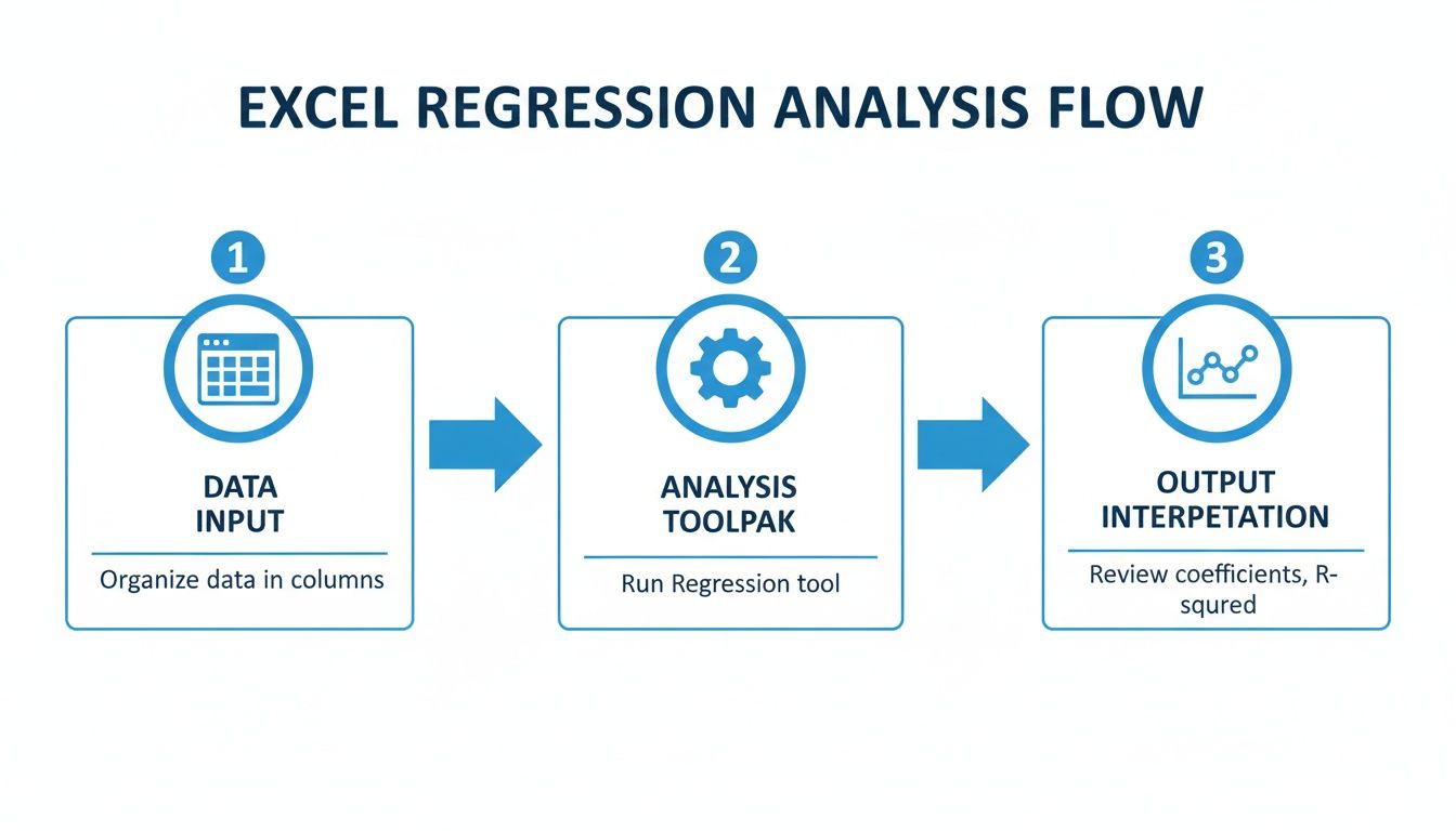
This visual breaks it down: organize your data, use the Analysis ToolPak to do the heavy lifting, and end up with the summary report we're about to decode.
Assessing Your Model's Overall Fit
Before you even glance at the individual variables, you need to know if your model as a whole is any good. Is it actually explaining anything, or are the results just random noise? Two key metrics in the Regression Statistics table give you this high-level view.
First up is R-Squared (or R²). This value tells you the proportion of the variation in your dependent variable that your independent variables can explain. It’s a number between 0 and 1, usually shown as a percentage.
For example, an R-Squared of 0.75 means that 75% of the changes in your outcome (like sales) can be explained by the factors in your model (like ad spend and website traffic). A higher R-Squared generally suggests a better model fit.
Next, find the Significance F value. This number tests the overall statistical significance of your model. It answers the crucial question: is it likely that the relationships we're seeing in the data happened purely by chance?
A low Significance F (typically less than 0.05) is what you're looking for. It means your model is statistically valid and that the relationships it has identified are almost certainly not a random fluke. If this number is high, your model is unreliable, regardless of what the R-Squared value says.
Decoding the Coefficients Table
This is where the magic happens. The coefficients table breaks down the specific relationship between each independent variable and your dependent variable. This is where you find the precise, quantifiable impact of each factor you're testing.
Each row corresponds to one of your variables, plus the Intercept. The intercept is just the baseline value of your outcome variable when all your independent variables are zero.
The most important column here is "Coefficients." This number tells you how much your dependent variable is expected to change when the corresponding independent variable increases by one unit, assuming all other variables stay constant.
For instance, if the coefficient for "PPC Spend" is 250, it means that for every additional dollar you spend on PPC, your revenue is predicted to increase by $250. Simple as that.
Checking for Statistical Significance with P-Values
A big coefficient might look exciting, but it means nothing if it's not statistically significant. That's where the P-value comes in. The p-value for each coefficient tells you the probability that you'd see this relationship just by random chance.
The golden rule is to look for p-values less than 0.05. A low p-value indicates that the coefficient is statistically significant, meaning you can be confident that the relationship is real and not a fluke.
Let’s pull all of that into a quick-reference table to make it even clearer.
Key Regression Statistics Explained
This table is your cheat sheet for quickly evaluating your model's health and the importance of each variable.
If a variable has a high p-value (greater than 0.05), you should seriously consider removing it from your model. It’s likely just adding noise and not contributing any real predictive power to your regression analysis in excel. By focusing only on the significant variables, you create a much more robust and trustworthy model for making key business decisions.
Validating and Visualizing Your Model

So you've run the numbers and have a shiny R-Squared value. But a strong predictive model is so much more than that—it has to be statistically sound. Now comes the crucial part: checking your work, hunting for potential issues, and building real confidence in your findings.
This is where you stress-test your model. You need to look beyond the summary statistics and dig into the model's underlying assumptions. If those assumptions are broken, your predictions could be way off base. We'll kick things off with the most important diagnostic tool you have: residual analysis.
Checking Assumptions with Residual Plots
When you run a regression in Excel, it automatically spits out a list of residuals. These are simply the errors—the difference between what your model predicted and what actually happened. Analyzing these errors is the single best way to see if your model is a good fit.
To do this, you'll create a residual plot, which is just a scatter chart with your predicted values on the horizontal axis and the residuals on the vertical axis.
What you're hoping to see is complete, random chaos. A healthy residual plot should show no obvious patterns at all, just a random spray of points bouncing around the zero line.
Here’s what to watch out for:
A well-behaved model has residuals that are randomly scattered around zero. Any pattern in your residual plot is a red flag, telling you that your model's structure doesn't fully capture the underlying trends in your data.
Identifying Hidden Issues in Your Model
Beyond the standard assumptions, a couple of other common gremlins can sneak in and undermine your regression analysis in excel. One of the biggest troublemakers is multicollinearity.
This happens in multiple regression when two or more of your independent variables are highly correlated with each other. For instance, if you include both "Daily Website Visitors" and "Number of Ad Clicks" as predictors, they're almost certainly moving together.
Multicollinearity won't necessarily tank your model's overall predictive power, but it wreaks havoc on the individual coefficients and p-values. It becomes impossible to tell what the true, isolated effect of each correlated variable is.
Excel doesn't give you a direct multicollinearity stat like a Variance Inflation Factor (VIF), but you can spot it by running a correlation matrix on your independent variables. Any high correlations (think above 0.7 or 0.8) are a sign of trouble. If you find it, the simplest fix is often to remove one of the correlated variables—usually the one that's less critical to your business question.
Creating Powerful Visualizations in Excel
Once you're confident your model is solid, it's time to bring your findings to life. A table full of coefficients is great for an analyst, but a sharp, clear chart is what will convince your stakeholders. The goal here is to make your insights impossible to ignore.
A scatter plot with a fitted trendline is the classic, go-to visual for a simple linear regression. It gives you an instant snapshot of the relationship between your variables, with the trendline showing your model's prediction.
Here's how to whip one up:
This single chart not only illustrates the relationship but also slaps your model's formula and its explanatory power right on the canvas. For more advanced visualization ideas, our tutorial on creating a heat map can be super helpful for displaying correlation matrices.
Presenting your validated model visually transforms it from a statistical exercise into a clear, data-driven story.
Answering Your Top Excel Regression Questions
As you start running regressions in Excel, you'll inevitably run into a few common head-scratchers. This isn't about dry statistical theory; it's about troubleshooting the real-world issues that come up when the numbers don't look quite right.
I've put together the most frequent questions I hear. Think of this as your practical field guide for when an output seems weird or you're ready to take your analysis to the next level. Getting these details right is what separates a flimsy model from one you can actually trust.
R-Squared vs. Adjusted R-Squared
One of the first things people get stuck on is the difference between R-Squared and its smarter cousin, Adjusted R-Squared. They seem similar, but they tell you very different things about how well your model is performing.
R-Squared tells you how much of the variation in your outcome variable can be explained by your predictors. It’s a decent starting point, but it has a massive flaw: it always goes up when you add more variables, even if those variables are completely useless. Throw enough random data in there, and R-Squared will make your model look great on paper.
Adjusted R-Squared, on the other hand, is much more honest. It penalizes your score for adding predictors that don't actually improve the model's fit. This gives you a far more realistic picture of your model’s true power.
A big gap between your R-Squared and Adjusted R-Squared is a major red flag. It’s a strong signal that you’ve probably included one or more irrelevant variables that are just adding noise, not real insight.
What Do I Do with a High P-Value?
You've run your regression, and a variable you thought was important has a p-value of 0.35. What now? A high p-value (typically anything over 0.05) is a clear sign that the variable is not statistically significant.
Simply put, your data isn't showing a reliable relationship between that predictor and your outcome. You can't be confident that the effect you're seeing is anything more than random chance. The standard practice here is to remove that variable from your model and run the analysis again. This usually results in a cleaner, more powerful model.
How to Handle Curves (Non-Linear Relationships)
What if your scatter plot looks more like a curve than a straight line? Good news—you can still model this, even though it's called "linear" regression. The secret is to transform your variables.
All you need to do is create a new column in your spreadsheet for the square of your independent variable (X²). From there, you just run a multiple regression using both your original variable (X) and its squared version (X²) as your predictors. This technique, called polynomial regression, allows your model to fit a curve to the data, which often captures the real-world pattern much better.
Using Categories Like "Region" or "Product Type"
Regression needs numbers to work its magic. So what happens when you have categorical data like "Region"? You can't just type 'North' or 'South' into the model. The solution is to create what are called dummy variables.
This is a simple trick to convert your text categories into a numeric format (0s and 1s) that regression can handle. Here’s how it works:
You can now use these new 0/1 columns as independent variables in your regression. This allows you to measure the specific impact of a category (like being in the North region) on your outcome.
Turn your data-driven insights into real revenue. With Breaker, you can create targeted newsletter campaigns and automatically grow your subscriber list with professionals who match your ideal customer profile. Stop guessing and start growing. Discover how Breaker can build your B2B audience.