Ultimate Guide to B2B Landing Pages for Leads
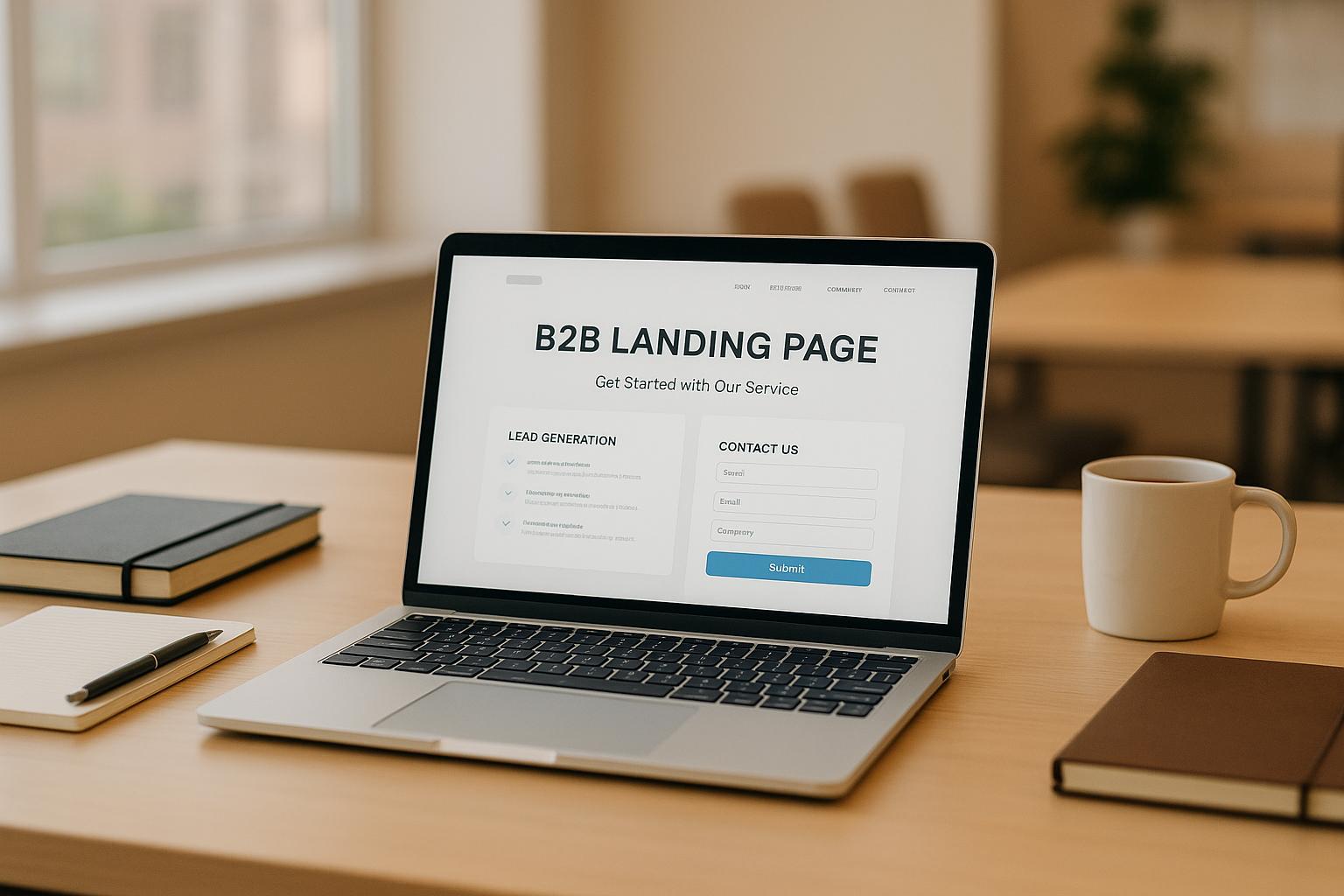
B2B landing pages are your gateway to turning visitors into leads. They focus on capturing business prospects' contact information by addressing their specific needs and pain points. These pages are distinct from B2C landing pages, requiring more trust signals, clear ROI demonstrations, and a professional tone to cater to longer sales cycles and multiple decision-makers.
Key Takeaways:
- Focus on simplicity: Use a clear value proposition, concise text, and a single call-to-action (CTA).
- Trust matters: Include testimonials, client logos, and measurable results to build credibility.
- Mobile-first design: 58% of B2B emails are opened on mobile; ensure fast load times and user-friendly layouts.
- Effective forms: Ask for minimal information upfront and use multi-step forms to boost completion rates.
- A/B testing: Experiment with elements like headlines and CTAs to optimize conversions.
Quick Comparison: B2B vs. B2C Landing Pages
| Feature | B2B | B2C |
|---|---|---|
| Sales Cycle | Longer | Shorter |
| Decision-Makers | Multiple | Individual |
| Lead Value | Higher | Lower |
| Focus | Trust, authority | Emotion, urgency |
| Offers | Whitepapers, demos | Discounts, flash sales |
Your landing page is the first step in building relationships with potential clients. By addressing their pain points, showcasing expertise, and offering value in exchange for contact information, you can drive better results. Let’s dive deeper into the essential elements and strategies for creating high-performing B2B landing pages.
How to Build B2B Landing Pages That Actually Convert
Core Elements of High-Converting B2B Landing Pages
Building a B2B landing page that drives conversions involves mastering five key components. Together, these elements guide potential customers from curiosity to commitment, addressing the unique needs of B2B decision-makers.
Clear Value Proposition
Your value proposition is the cornerstone of your landing page. It should immediately convey the unique, measurable benefit your solution offers. Think of it as your page’s first impression - it needs to be clear, compelling, and results-driven.
The most effective value propositions focus on specific outcomes rather than vague promises. For example, instead of saying, "Improve your marketing", try something like, "Cut SaaS Churn by 34% in 90 Days" or "Streamline Lead Generation with One-Click Integration." Place this message prominently in your headline or subheadline, and back it up with concise bullet points that highlight key benefits. Avoid confusing industry jargon - clarity always trumps cleverness when it comes to B2B conversions.
Effective Call to Action (CTA)
Your CTA is where interest turns into action, so it needs to stand out and motivate. Use a contrasting color to make it pop against the rest of your design.
The wording of your CTA should be action-driven and value-focused. Avoid generic phrases like "Learn More" or "Submit." Instead, use options that tell visitors exactly what they’ll gain, such as "Download the 2025 Playbook" or "Get My Free Demo." Place your primary CTA in multiple locations - above the fold and again further down the page - to maximize visibility. Stick to one main CTA per page to keep things simple and avoid overwhelming your audience.
Social Proof and Trust Elements
B2B buyers are naturally cautious when considering new vendors, so trust signals are essential. Social proof helps reduce hesitation by providing evidence of your credibility and success.
The most impactful social proof includes recognizable client logos, testimonials with measurable results, and third-party endorsements like G2 rankings or certifications. For maximum effect, position these elements near your CTAs to reinforce trust at the moment prospects are deciding.
For example:
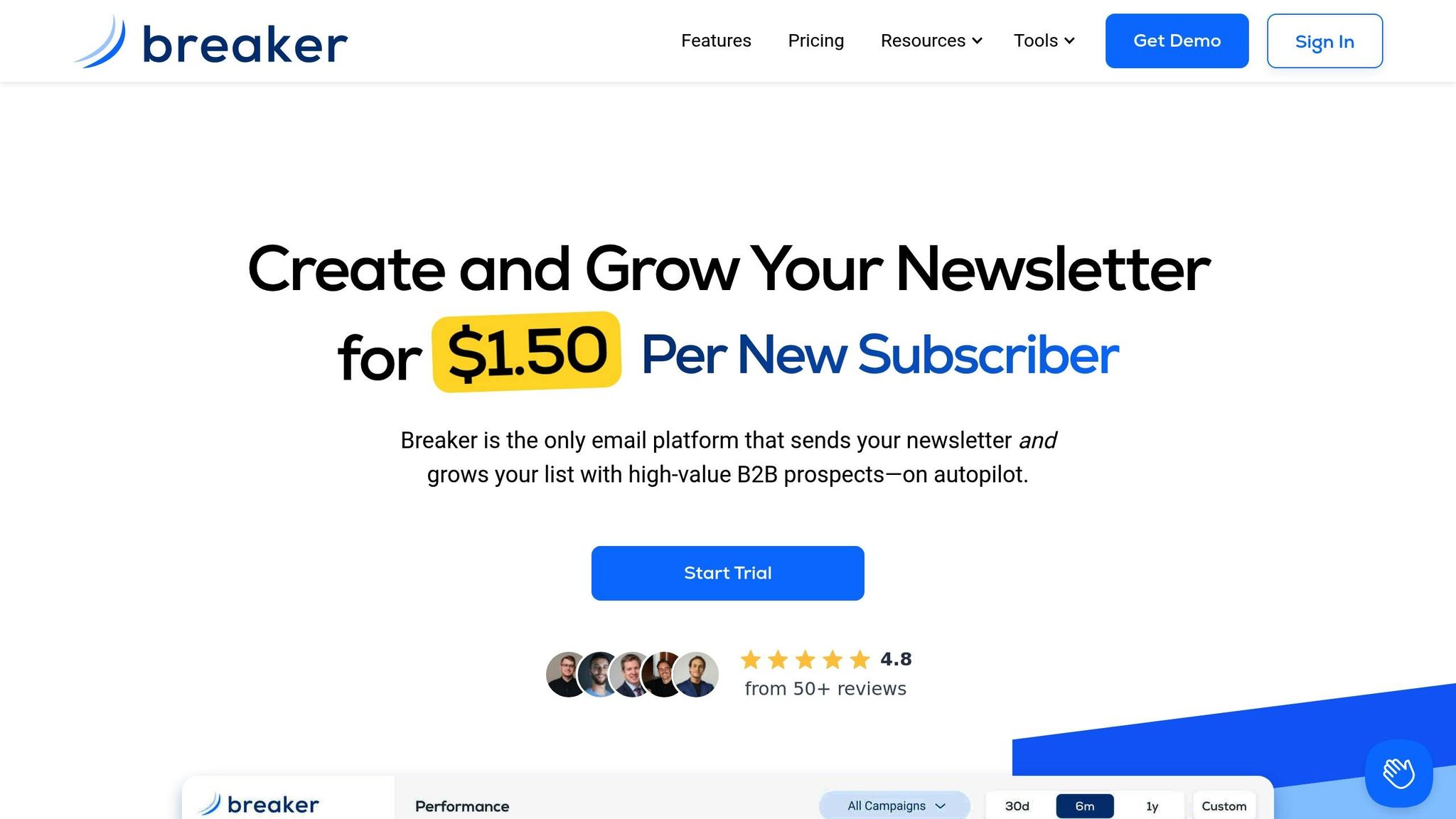
"We tripled our sponsor revenue and doubled our community memberships with breaker. Well over a 10X ROI." – Davis Richardson, Advisor, Jordan Belfort
"I was skeptical at first, but breaker delivered. Our newsletter is growing by 5,000 subscribers each month." – Peter Lohmann, CEO, RL Property Management
These testimonials work because they include specific results, named individuals, and their professional roles, making them relatable and credible to other decision-makers. Platforms like Breaker, with a 4.8/5 average satisfaction rating from B2B marketers, can use such endorsements to strengthen trust and drive conversions.
Clean Design with Focused Content
When it comes to B2B landing pages, simplicity is your best friend. Every element on the page should either reinforce your value proposition or guide visitors toward your CTA. Eliminate distractions like navigation menus or sidebar links that pull attention away from your primary goal.
Stick to a single-column layout with plenty of white space to create a clean, easy-to-follow structure. Use short paragraphs and bullet points to make your content scannable - executives don’t have time for dense text. Supporting visuals like product screenshots or explainer videos can be helpful, but they should complement your message rather than distract from it. The goal is to ensure visitors quickly grasp your offer and see how it addresses their business challenges.
Lead Capture Forms That Convert
Your lead capture form is the final step in turning interest into action, so it needs to be as frictionless as possible. Start by asking for only the essentials - typically a name and business email address. You can collect additional details later through follow-up interactions.
For longer forms, breaking them into multi-step processes can make them feel less daunting. For instance, instead of presenting 10 fields at once, split them into three steps with 3–4 fields each. This approach often improves completion rates.
Make sure your forms are mobile-friendly, with clear labels and proper error messages. Since many users access landing pages on their phones or tablets, a seamless mobile experience is critical. Add privacy statements like "We never share your data" to address potential security concerns and reassure visitors.
| Element | Best Practice | Key Benefit |
|---|---|---|
| Value Proposition | "Cut SaaS Churn by 34% in 90 Days" | Delivers immediate clarity on results |
| CTA | "Download the 2025 Playbook" (contrasting) | Drives action with clear value |
| Social Proof | Client logos, measurable testimonials | Builds trust at decision points |
| Design | Single-column, minimal distractions | Keeps focus on the main goal |
| Lead Form | Multi-step, minimal fields, mobile-ready | Reduces friction, boosts completions |
B2B Landing Page Optimization Strategies
Once you've nailed the basic elements of your landing page, the next step is optimization. This is where the magic happens - turning a decent page into one that drives significantly more conversions. For instance, improving your conversion rate from 2% to 5% could mean thousands of extra qualified leads annually.
Mobile-First Design Approach
Designing for mobile users is non-negotiable. With the majority of users browsing on their phones, a mobile-first approach ensures your page performs well on smaller screens, reducing bounce rates and improving user interactions. Start by designing for the smallest screens first, then scale up.
Focus on a single-column layout to suit vertical scrolling. Your headline, value proposition, and call-to-action (CTA) should all fit within the initial view - no horizontal scrolling required. Use a font size of at least 16px for readability, and ensure buttons are large enough (44px or more) to tap easily with a thumb.
Don’t forget about dark mode compatibility. Replace solid backgrounds with transparent PNGs and choose color schemes that work seamlessly in both light and dark modes. Test your forms on actual mobile devices to catch issues like keyboard overlays that might block the submit button.
Here’s an example: A SaaS company revamped their landing page with a mobile-first design, simplifying the layout while keeping their branding consistent. The result? A 20% drop in bounce rates and better engagement from mobile users. Once your mobile design is polished, the next step is speeding up your page.
Page Speed Optimization
Page load time is critical. A slow-loading page isn’t just annoying - it’s actively costing you leads.
Start with image optimization. Compress images to under 100KB without losing quality, use modern formats like WebP, and implement lazy loading for images below the fold. Lazy loading ensures images only load when users scroll down, speeding up the initial load time.
Next, clean up your JavaScript and CSS files. Remove any render-blocking scripts that delay the page from appearing quickly. If you’re using tracking pixels or chat widgets, make sure they load after the main content. And ask yourself: Do you really need that fancy animation? Often, simpler is faster.
For example, one company reduced their hero image size from 800KB to 150KB and removed unnecessary scripts. The result? A 30% faster page load time and a 12% increase in conversions.
Don’t overlook hosting and caching. A fast hosting provider and efficient caching can make a big difference. Aim for load times under 2 seconds and regularly check your performance with tools like Google PageSpeed Insights. Once your page is running at top speed, it’s time to refine your content with A/B testing.
A/B Testing for Better Results
A/B testing helps you figure out what works best for your audience. The trick is to test one element at a time so you can pinpoint what’s driving the improvement. This process fine-tunes your landing page, ensuring it aligns with user expectations.
Start with the high-impact elements most likely to influence conversions. Headlines are a great place to begin - experiment with different value propositions, benefits, or ways to address pain points. Next, tweak your CTA button. Changes like adjusting the color, text, or placement can make a surprising difference. For example, switching a CTA from “Get Started” to “Download Your Free Guide” can yield better results.
Simplifying forms is another powerful tactic. Testing fewer form fields or splitting longer forms into multiple steps has been shown to boost conversions by up to 50%.
Run your tests until you’ve gathered enough data to draw meaningful conclusions (usually at least 100 conversions per variation). Keep detailed records of your findings - what works for one audience segment might not work for another. These insights will serve as a valuable resource for future campaigns.
The best B2B marketers treat optimization as a continuous process. They rely on data-driven decisions, not gut feelings, and aren’t afraid to test unconventional ideas.
| Optimization Focus | Key Actions | Expected Impact |
|---|---|---|
| Mobile Design | Single-column layout, 16px+ fonts, 44px+ buttons | 20% reduction in mobile bounce rate |
| Page Speed | Compress images <100KB, remove blocking scripts | 12% conversion increase with 30% faster load |
| A/B Testing | Test headlines, CTAs, form fields systematically | Up to 50% improvement in form completion |
Optimization isn’t a one-and-done task. User behaviors shift, new devices hit the market, and your audience’s needs evolve. Regularly review your analytics, identify areas for improvement, and keep refining. Over time, these small adjustments will add up to big results.
sbb-itb-8889418
How Breaker Enhances B2B Landing Page Performance
When it comes to improving B2B landing pages, strategies like mobile-friendly design and A/B testing are essential. But the right platform can take your results to the next level. Breaker builds on proven optimization methods, simplifying lead generation into a more efficient, data-driven process. Here’s how its features help drive results.
Automated Lead Generation and Targeting
Breaker takes the guesswork out of finding leads. Its automated system pinpoints and delivers subscribers that match your ideal customer profile. This means the traffic coming to your landing pages is already pre-qualified, leading to higher conversion rates.
By defining your ideal customer, Breaker’s AI-driven algorithm handles the rest. It uses custom targeting, data enrichment, and compliance filters to deliver highly relevant prospects.
"Define your ideal customer, and Breaker handles the rest. Our algorithm delivers engaged, exact-match B2B subscribers - so you grow without guesswork or wasted spend."
This automation pairs seamlessly with your landing page campaigns. Instead of attracting random visitors, you’re engaging people who are genuinely interested in your offering. The result? Better lead quality, higher conversions, and smarter use of your marketing budget.
For instance, a SaaS company in the U.S. incorporated Breaker’s targeting tools into their campaigns and saw immediate benefits. By leveraging Breaker’s ability to deliver exact-match prospects, they boosted their conversion rate by 27% while also improving the quality of their leads.
Real-Time Analytics and Performance Data
Breaker gives you instant access to the metrics that matter. With real-time analytics, you can monitor key stats like open rates, click-through rates, and subscriber growth, helping you make quick adjustments to improve performance.
This immediate feedback loop ensures you’re not relying on assumptions. Instead, you can see exactly which landing pages are driving engagement and which ones might need tweaking.
"Get instant visibility into open rates, click-throughs, subscriber growth, and more. No digging, no delays - just clean, actionable insights so you can optimize every send."
The numbers speak volumes. Breaker users report an average open rate of 74% and a click-through rate of 48%, far surpassing industry averages. Such high engagement levels confirm that your targeting and messaging are hitting the mark. And with these insights, you can act quickly to refine your strategy.
Easy Integration with Landing Pages
Breaker integrates seamlessly with your setup. The platform offers embeddable signup forms that fit directly onto your landing pages, making lead capture effortless. These forms automatically sync with your CRM and email tools, removing the need for manual data entry and ensuring timely follow-ups.
Simply embed Breaker’s form, set your targeting preferences, and connect your CRM. Leads flow automatically into your nurture sequences, while the platform handles email validation and deliverability to ensure your messages reach the right people.
This integration supports both organic and paid strategies, adapting to capture leads efficiently regardless of how traffic arrives. Whether through content marketing or paid ads, Breaker’s forms are designed to work smoothly.
The impact is clear. That same SaaS company also benefited from Breaker’s automated lead routing to their CRM. Faster follow-ups led to a 15% higher lead-to-customer conversion rate over just three months.
| Breaker Feature | Landing Page Benefit | Typical Results |
|---|---|---|
| Automated Targeting | Higher-quality traffic and leads | 27% increase in conversion rates |
| Real-Time Analytics | Faster optimization and decisions | 74% average open rate, 48% CTR |
| CRM Integration | Seamless lead flow and follow-up | 15% higher lead-to-customer conversion |
Common B2B Landing Page Mistakes to Avoid
B2B marketers often make missteps that can derail their landing page performance, driving away potential leads. Recognizing these common issues is key to creating pages that genuinely convert.
Confusing Messages and Overloaded Content
One of the most frequent mistakes is overwhelming visitors with too much information. When decision-makers visit your page, they typically spend just 8 seconds deciding if it’s worth their time. Many landing pages try to pack in every feature, benefit, and detail, but this approach tends to backfire.
Busy professionals want quick, clear answers. If your page doesn’t deliver a focused value proposition right away, they’ll move on.
Keep it simple. Start with a headline that communicates a single, clear benefit. For example, instead of a vague statement like, "Our comprehensive enterprise software solution leverages advanced analytics to optimize business processes", go for something direct like, "Reduce SaaS Churn by 34% in 90 Days".
Eliminate distractions like unnecessary navigation links or multiple calls-to-action that compete with your main goal. By cutting down on clutter, you create a smoother, more effective experience for users across all devices.
Poor Page Speed and Mobile Experience
Page speed matters - a lot. A delay of just one second can slash conversions by 7%. The mobile experience is just as critical, especially since 58% of B2B emails are opened on mobile devices. Unfortunately, many landing pages treat mobile as an afterthought, resulting in small fonts, cramped layouts, and buttons that are difficult to tap.
This kind of inefficient design can frustrate users. If a visitor struggles to fill out a form on a crowded mobile interface, they’re likely to give up. To improve performance, compress images to under 100KB, remove render-blocking JavaScript, and use lazy loading for content that’s below the fold. Design with mobile in mind by using a single-column layout and touch-friendly buttons. And always test your page on actual devices - not just simulators - to spot real usability issues.
Missing Trust Signals
Trust is non-negotiable for B2B buyers. On average, they need at least 7 touchpoints before making a decision. Despite this, only 50% of B2B landing pages include social proof, even though it’s a proven way to boost conversions.
Without trust signals, your landing page can feel unverified, especially to decision-makers who are cautious about spending company resources. Clear evidence of success is essential.
Incorporate trust-building elements like client logos with statements such as "Trusted by Fortune 500 Companies", snippets of case studies (e.g., "How [Client] Achieved 230% ROI"), testimonials from well-known businesses, and third-party badges like G2 rankings or security certifications. Place these trust signals near your call-to-action to reinforce credibility at the critical moment when visitors are deciding to convert.
By addressing these common mistakes, your landing page will better resonate with B2B decision-makers and set the stage for stronger conversion rates.
| Common Mistake | Impact on Conversions | Quick Fix |
|---|---|---|
| Overwhelming content | High bounce rates and visitor confusion | Focus on one value proposition and use bullet points |
| Slow page speed | 7% conversion drop per second delay | Compress images and remove render-blocking scripts |
| Poor mobile design | Lost leads from 58% of mobile traffic | Use a single-column layout and touch-friendly elements |
| Missing social proof | Reduced credibility and trust | Add client logos and testimonials near calls-to-action |
Building B2B Landing Pages That Generate Leads
Creating B2B landing pages that truly convert means bringing together all the right elements into a seamless and conversion-driven experience. These design principles work hand-in-hand with mobile optimization, speed improvements, and testing strategies to deliver a page that drives results.
Start with a headline that clearly communicates a specific and measurable benefit, like "Cut Onboarding Time by 50%." Pair it with a single, focused call-to-action (CTA) such as "Get the Free Demo". This straightforward approach eliminates confusion and directs visitors toward the desired action.
Design with mobile users in mind by using single-column layouts and touch-friendly features. Keep load times fast by compressing images and optimizing scripts. These technical steps ensure that visitors stay engaged, no matter what device they’re using.
Incorporate trust signals near your CTAs to boost credibility. Add client logos, testimonials, or snippets from case studies at key decision points. For B2B buyers - who often require multiple touchpoints before converting - these elements provide reassurance and build confidence.
Simplify your lead capture forms. Reducing form fields from 11 to just 4 can increase conversions by as much as 120%. If you need more detailed information, consider using multi-step forms. These break the process into manageable chunks, making it less intimidating while staying mobile-friendly.
Tools like Breaker take lead generation a step further by automating targeting, precisely matching audiences, and providing real-time performance analytics. Its integration with landing pages ensures you’re reaching the right decision-makers with high deliverability rates, keeping your leads engaged and relevant.
Consistently improve your landing pages through A/B testing. Experiment with headlines, CTAs, and layouts to identify what resonates most with your audience. Remove navigation links and other distractions to keep the focus on your main conversion goal. Let data - not assumptions - guide your decisions.
The best B2B landing pages respect visitors’ time, build trust, and keep the experience focused. When done right, this approach turns casual visitors into qualified leads, ready for your sales team to engage.
FAQs
How are B2B landing pages different from B2C, and why does it matter?
B2B landing pages are all about generating leads that are genuinely interested in what you’re offering. They do this by focusing on content that provides real value, offering detailed insights about products or services, and fostering a sense of trust for the long haul. On the other hand, B2C landing pages are designed to grab attention fast, spark emotions, and drive quick decisions - whether it’s making a purchase or signing up.
Why does this distinction matter? Because B2B audiences usually need more detailed information to make informed choices, often with input from multiple decision-makers. In contrast, B2C audiences are more likely to act on a whim, which means keeping things simple and appealing to emotions is the way to go.
What’s the best way to use A/B testing to boost conversions on my B2B landing page?
A/B testing is an effective way to fine-tune your B2B landing pages and boost conversions. The process is simple: create two versions of your landing page with slight variations - this could be a tweak in the headline, a different call-to-action (CTA) placement, or a modified layout. Then, split your audience randomly between the two versions and closely monitor key metrics such as conversion rates, bounce rates, and user engagement.
The data you gather will reveal which version resonates more with your audience. Once you've identified the better performer, implement those changes to enhance your page. By repeating this process regularly, you can keep refining your landing page for even better results. Using real-time analytics tools can make tracking and adjusting your strategy smoother and more efficient.
What mistakes should I avoid when creating B2B landing pages for mobile users?
When creating B2B landing pages for mobile users, it's important to steer clear of common mistakes that can negatively impact user experience and reduce conversions.
Start with mobile responsiveness. Your page should adjust effortlessly to different screen sizes, ensuring it looks great and functions well on any device.
Next, focus on button design. Avoid buttons that are too small or awkward to tap. Instead, make them large enough and leave enough space around them for easy interaction - no one likes struggling to hit the right spot.
Keep the layout simple. A cluttered page can overwhelm visitors, so aim for a clean, focused design that highlights the most important information.
Lastly, speed matters. Optimize your page to load quickly, and make sure essential content is visible above the fold. This way, you’ll capture attention right away and keep users engaged.
By prioritizing these elements, you’ll set the stage for a smooth and effective mobile experience that resonates with your audience.