Top Newsletter Design Trends for 2025
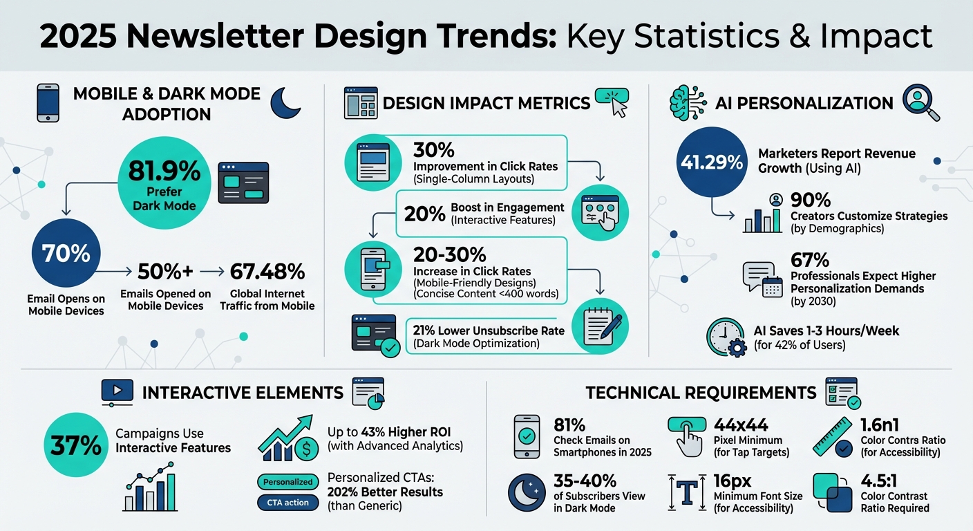
Want your newsletters to stand out in 2025? Here’s the deal: smart design choices are no longer optional. With over 50% of emails opened on mobile and 81.9% of users preferring dark mode, your newsletter’s layout, interactivity, and personalization can make or break engagement.
Here’s what you need to know:
- Mobile-first layouts: Single-column designs improve readability and click rates by up to 30%.
- Dark mode optimization: 81.9% of users prefer it - ensure your emails look great in both modes.
- Interactive features: Carousels, polls, and AMP elements boost engagement by up to 20%.
- AI personalization: Tailored content drives results - 41.29% of marketers using AI report revenue growth.
- Clean typography and white space: Bold fonts and uncluttered layouts improve readability and brand trust.
- Email authentication: SPF, DKIM, and DMARC ensure deliverability and protect your reputation.
These trends aren’t just about looking good - they’re about driving better results, stronger engagement, and higher ROI. Keep reading to learn how to implement these strategies effectively.
2025 Newsletter Design Trends: Key Statistics and Impact Metrics
B2B Email Design Trends 2025: What's Working (and Why)–Logan Sandrock Baird
1. Single-Column Mobile-First Layouts
As newsletters continue to adapt, single-column mobile-first designs are becoming essential for staying relevant with 2025 trends.
Mobile Responsiveness and Accessibility
With over 70% of email opens happening on mobile devices, single-column layouts eliminate the hassle of pinching, zooming, or scrolling sideways. They guide readers smoothly from the headline to the call-to-action (CTA), creating a clear and linear reading path.
But it’s not just about convenience. Accessibility plays a key role here. Using a minimum font size of 16px ensures your audience can read your content without straining their eyes. Pair that with high-contrast color palettes (at least a 4.5:1 ratio), and your text remains easy to read, whether it’s bright sunlight or a dimly lit room. This clean and streamlined approach doesn’t just look good - it encourages stronger engagement, as we’ll explore next.
User Engagement and Interactivity
Mobile-friendly designs can increase click rates by 20%–30%. Newsletters with a clear structure and concise content - under 400 words - see 22% higher click-through rates. Why? Single-column layouts ensure your most important message and CTA are “above the fold,” meaning they’re immediately visible to readers on mobile screens.
For B2B audiences, this layout mimics the feel of a personal email, helping readers feel more connected. That personal touch matters. When your newsletter feels like a conversation rather than a marketing blast, engagement naturally improves. Make sure your CTA buttons are at least 44x44 pixels for easy tapping and use high-contrast colors to make those buttons pop.
Brand Consistency and Visual Appeal
Consistency across devices is key to reinforcing your brand. For example, using transparent PNG logos ensures your branding remains intact in dark mode. Emails designed to work in both light and dark modes have a 21% lower unsubscribe rate, which helps retain your audience.
"Well-designed emails will enhance every other part of your strategy. Making sure all of your channels' designs align will make your brand more recognizable and make all your assets perform better." - Lisa Livingston, Principal Customer Success Manager, Klaviyo
Stick with email-safe fonts like Arial, Verdana, or Georgia to avoid rendering issues across email clients. Keep body text at 16px or larger and headlines over 20pt for easy readability on mobile. And don’t underestimate white space - it’s not wasted space. Instead, it directs attention to your key elements and prevents clutter, keeping your readers focused and engaged.
2. Text-First Minimalist Designs
Text-first minimalist designs focus on clarity by stripping away unnecessary digital distractions. Instead of relying on elaborate visuals or intricate layouts, they prioritize clean lines, generous white space, and strong typography to deliver your message effectively. This approach not only improves readability but also enhances engagement while maintaining a consistent brand image.
Mobile Responsiveness and Accessibility
Did you know that over 65% of internet traffic and most B2B email opens happen on mobile devices? Text-first designs are perfectly suited for this, as their simplicity adapts seamlessly to various screen sizes, ensuring your content looks sharp everywhere.
Accessibility is another strength of this design style. High-contrast combinations, like black text on a white background, make it easier for users with visual impairments to read. Avoid embedding text in images - this ensures screen readers can process your message effectively. Plus, with 82% of Android users preferring dark mode, designs that rely on HTML text instead of graphics remain clear and legible. Keeping body text concise (100–150 words) further improves readability and keeps your audience engaged. By focusing on simplicity, you create a more inclusive and user-friendly experience.
User Engagement and Interactivity
Text-first designs align with mobile-first principles, creating a sense of personal, one-on-one communication.
"The minimalist approach removes extra elements, allowing the text to stand out and convey the message clearly and directly."
- Ankit, Writer, EmailOctopus
By resembling a personal email, this design style strikes a conversational tone that resonates with B2B readers. Strategic use of negative space directs attention to your call-to-action, reducing distractions and making your message stick.
Brand Consistency and Visual Appeal
Minimalism doesn’t mean sacrificing your brand’s identity. In fact, it puts your typography front and center. Pair bold display fonts for headlines with clean sans-serif fonts for body text to maintain a polished and professional look. Stick to a simple color palette - usually neutral tones with one accent color for buttons or links - to keep the design sleek and cohesive.
"Minimalism doesn't mean boring – it means clarity, confidence, and impact."
Consistency matters. Uniform logo placement, font choices, and color accents across your newsletters create instant brand recognition. Standardized headers and footers also provide a familiar framework for your content. And don’t forget to test your designs in both light and dark modes to ensure they remain visually appealing and accessible, no matter how your audience chooses to view them.
3. AI-Powered Personalization
AI-powered personalization is changing the game for newsletters, turning them into tailored experiences that feel uniquely crafted for each recipient.
User Engagement and Interactivity
Gone are the days of simply adding a recipient's first name to an email. With AI, newsletters can now adapt to a recipient's industry, job role, or even their stage in the buying process. This level of personalization isn’t just a nice touch - it delivers results. In fact, 41.29% of marketers who use AI have reported revenue growth.
AI also takes engagement up a notch with behavior-based triggers. Imagine a prospect visits your pricing page or downloads a whitepaper - AI can automatically send them a personalized follow-up at just the right moment. Machine learning dives deeper, analyzing patterns to predict what buyers need next and even optimizing the timing of your emails for maximum impact. It’s no surprise that 90% of newsletter creators now customize their strategies to fit their subscribers’ key demographics.
Technological Innovation and Functionality
The technology driving AI personalization has come a long way. Today’s AI tools can create personalized content on the fly, adjusting messaging based on subscriber data. Features like dynamic content blocks allow marketers to swap out messaging or offers depending on a recipient's industry or lifecycle stage, ensuring each email hits the mark.
"In 2025, B2B email marketing success isn't just about sending newsletters - it's about delivering hyper-personalized, automated, and data-driven experiences."
- Meghan Hultquist, HQ Digital
AI also streamlines optimization. It can run A/B tests on subject lines, calls-to-action, and email copy, while fine-tuning send times based on individual engagement patterns. For creators, AI can save a significant amount of time - 42% of those using AI for brainstorming and content tasks report saving between one and three hours each week. These advancements make it possible to stay efficient without losing the unique voice of your brand.
Brand Consistency and Visual Appeal
Even as AI personalizes content, your brand’s voice and identity remain essential. Striking the right balance between automation and human oversight ensures that while AI handles the technical side, your editorial team keeps the messaging authentic and aligned with your brand. Tools like modular design systems help maintain a cohesive look, even when AI generates different content for various audience segments.
Looking ahead, personalization expectations are only going to grow. By 2030, 67% of professionals believe subscribers will demand significantly higher levels of tailored content. To build trust, many brands are now openly sharing when AI has been used in their emails, adding disclaimers like "This email was AI-assisted".
For B2B marketers, platforms like Breaker are leading the charge in AI-driven personalization. With tools that automate lead generation, target audiences with precision, and provide real-time performance analysis, Breaker ensures your newsletters are not only engaging but also stay true to your brand’s identity.
4. Interactive Elements Like Carousels and Polls
User Engagement and Interactivity
Interactive elements are reshaping newsletters, turning them from simple one-way messages into dynamic, two-way conversations. Instead of just reading, subscribers can now actively engage by clicking through carousels, answering polls, or exploring expandable sections. For B2B marketers, this is a game-changer. These elements help gather "zero-party data" - direct feedback from users - that can fine-tune future content and improve audience targeting.
Here’s a stat to consider: 37% of email campaigns now use interactive features built with HTML and CSS, and these can boost conversions by up to 20%. When paired with advanced analytics, this approach can deliver up to 43% higher ROI. Popular interactive tools for 2025 include embedded polls, clickable carousels, accordions, search bars, and even "offer reveals". These features not only grab attention but also increase how long subscribers stay engaged with your content.
Technological Innovation and Functionality
The tech behind these interactive emails revolves around "states" and "events." Essentially, this refers to the current condition of an element and how it changes when interacted with. For instance, developers use CSS pseudo-classes like :checked to control interactive elements. A great example comes from Volkswagen, which created an email that let users view a car model in four different colors.
"Design in email marketing is not art; it is engineering. It is about navigating a minefield of technical constraints to deliver a message that is legible, accessible, and actionable." - Stuart L. Crawford, Creative Director, Inkbot Design
AMP for Email takes things further, enabling features like real-time surveys, dynamic forms, and layouts that feel like mini-websites. For heavier assets, such as 360-degree product views, brands like Joggy use Content Distribution Networks (CDNs) to ensure emails load quickly. And don’t forget: Gmail clips emails that exceed 102KB, so keeping file sizes manageable is critical.
Mobile Responsiveness and Accessibility
With 81% of people checking emails on their smartphones in 2025, your interactive features need to work flawlessly on mobile devices. Design elements like buttons and poll options with a 44x44 pixel tap target, and stick to a single-column layout to avoid horizontal scrolling.
Accessibility is equally important. Use ARIA attributes like aria-label and tabindex to make carousels and polls navigable for screen readers. Ensure a color contrast ratio of at least 4.5:1 for text, and always include a static fallback for email clients like Windows Outlook, which don’t fully support CSS-based interactivity. Remember, poorly formatted emails get deleted in under three seconds by 70% of mobile users. Precision in design and accessibility isn’t just helpful - it’s essential for keeping your audience engaged.
5. Dark Mode Optimization
Brand Consistency and Visual Appeal
Dark mode isn't just a trend - it's a preference for a significant 81.9% of mobile users. This means your newsletters need to shine on both light and dark interfaces. Without proper adjustments, brand colors and logos might lose their clarity due to automatic background inversion.
To address this, update visual assets to include transparent PNGs with light-colored strokes. This simple tweak ensures your logos stay sharp and recognizable in dark mode. Additionally, embed key text as HTML rather than relying solely on images. This guarantees the text remains legible no matter the mode.
Technological Innovation and Functionality
Around 35–40% of email subscribers view content in dark mode, making it crucial to adapt your designs accordingly. Utilize CSS media queries like @media (prefers-color-scheme: dark) to create versions tailored for dark mode. Then, thoroughly test your emails using tools like Litmus or Email on Acid to ensure compatibility across different clients.
Keep in mind that email clients handle dark mode in various ways - some partially invert light backgrounds, while others fully invert colors. To safeguard your message, aim for a 60:40 text-to-image ratio. This balance ensures that even if images fail to load, your core message remains clear.
Mobile Responsiveness and Accessibility
Dark mode offers more than just style - it reduces eye strain, cuts down on blue light exposure, and extends battery life on OLED and AMOLED screens. To make your content accessible to everyone, maintain a high contrast ratio between text and background colors. This not only improves readability but also supports users with visual impairments. Finally, test your emails in both light and dark modes across multiple devices to catch and fix any issues early.
sbb-itb-8889418
6. Bold Typography and Custom Fonts
Brand Consistency and Visual Appeal
Bold typography is a powerful tool for building brand recognition in 2025. It grabs attention in crowded inboxes and helps create emotional connections in spaces where logic often dominates. Much like how AI-driven personalization tailors content, bold typography customizes your visual message to resonate with readers.
Pair distinctive display fonts for headers with clean, sans-serif fonts for body text to design newsletters that are both striking and easy to read. Establishing a clear typographic hierarchy - using large, bold headlines alongside concise copy - ensures your key messages stand out. This approach works particularly well for newsletters aiming to deliver a personal, one-on-one feel.
Mobile Responsiveness and Accessibility
Typography needs to be as responsive as the rest of your design, especially with mobile devices now accounting for 67.48% of all internet traffic. Your fonts should scale seamlessly across smartphones, tablets, and desktops. To achieve this, rely on live HTML text rather than embedding text in images. This not only speeds up load times but also ensures legibility when images fail to load and simplifies A/B testing. Stick to single-column layouts to prevent cramped text or horizontal scrolling on smaller screens.
Accessibility is equally important. Use high-contrast color combinations for text and backgrounds to meet accessibility standards, and include email-safe fallback fonts like Arial or Verdana in your CSS. This guarantees a consistent look even when custom fonts fail to render.
Technological Innovation and Functionality
To ensure your typography displays correctly, use CSS fallback stacks. Here's an example:
font-family: 'BrandFont', Helvetica, Arial, sans-serif;
This setup ensures email clients default to system-safe fonts when custom ones aren't available. For Outlook, rely on MSO conditional CSS to enforce safe fonts. Additionally, keep your HTML file size under 102KB to avoid Gmail clipping your message, which can interfere with tracking pixels and unsubscribe links. Maintaining a 60:40 text-to-image ratio can also help keep your email out of spam folders.
7. Monochromatic and Retro Color Palettes
Brand Consistency and Visual Appeal
Monochromatic and retro color palettes are gaining traction as brands continue to prioritize mobile-first and dark mode design principles. These palettes rely on different shades of a single color or a combination of two contrasting hues to create a clean, unified look. This simplicity not only enhances brand recognition but also reduces cognitive effort for users, making it easier to focus on the core message. Additionally, these palettes integrate well with modular design systems, ensuring consistency across platforms.
Modern B2B brands are leaning into emotionally resonant and personality-driven palettes, a smart move considering that millennials now make up 60% of lead B2B buyers and financial decision-makers. As ClearB2B aptly puts it, "Minimalism doesn't mean boring – it means clarity, confidence, and impact". Retro-inspired palettes, meanwhile, tap into nostalgia to create a deeper emotional connection with audiences. Whether you aim for a sleek monochromatic scheme or a retro vibe, these refined color strategies can reinforce your brand identity while setting the stage for engaging interactive elements.
User Engagement and Interactivity
The colors you choose play a direct role in how users engage with your content. A popular technique involves using a greyscale monochromatic base while incorporating bold, contrasting colors to make call-to-action (CTA) buttons pop. Research shows this approach can significantly boost clicks and conversions. This strategy ties into color psychology - warm tones can create a sense of urgency, while cooler tones foster trust and professionalism.
Color blocking is another effective tool for organizing content. By dividing sections with complementary colors, you can establish a clear visual hierarchy that guides readers through your message. However, it’s important to avoid pairing two highly saturated hues, as this can cause visual fatigue and detract from the overall experience.
Mobile Responsiveness and Accessibility
With mobile devices accounting for 67.48% of all internet usage, your color palette must work seamlessly across various screen sizes. High contrast between text and background is essential for readability, but pure black or white tones can strain the eyes. Instead, opt for softer shades like off-black or off-white to make your content easier to read. This is especially relevant now that 81.9% of users have dark mode enabled on their devices.
Testing your palette in dark mode is key to maintaining legibility. Adjust your logo and other design elements to ensure they look great in both light and dark contexts. Don’t forget to include descriptive alt-text for any retro illustrations or monochromatic graphics, ensuring that visually impaired users can fully engage with your content. These thoughtful color choices align with the broader design trends shaping newsletters in 2025, ensuring your brand remains accessible, engaging, and visually appealing.
8. Consistent Branding with White Space
Brand Consistency and Visual Appeal
White space isn’t just empty space - it’s a powerful design tool that helps define your brand. By cutting down on clutter, you guide readers effortlessly through your content while making it easier for them to absorb information. For instance, a case study revealed that redesigning a newsletter with a single-column layout, live text, and more white space increased open rates from 12% to 28% and boosted click-through rates by an impressive 200%. This thoughtful use of space not only simplifies the layout but also reinforces your brand’s visual identity.
When used consistently, white space creates a polished, professional rhythm. This approach is especially impactful in B2B marketing, where a minimalist design can project confidence and reliability.
"Design in email marketing is not art; it is engineering. It is about navigating a minefield of technical constraints to deliver a message that is legible, accessible, and actionable." - Stuart L. Crawford, Creative Director & Brand Strategist, Inkbot Design
User Engagement and Interactivity
White space doesn’t just look good - it works hard to engage users. By framing CTAs (calls to action) with ample space, you ensure they stand out rather than getting lost in a busy design. Pairing this technique with a greyscale palette allows a single brand color to shine, drawing attention to the most important elements and driving conversions. In fact, personalized CTAs deliver 202% better results than generic ones, proving that clean, focused layouts can directly influence your bottom line.
Mobile Responsiveness and Accessibility
Beyond aesthetics, white space plays a crucial role in mobile readability. With 67.48% of internet traffic now coming from mobile devices, ensuring your content is easy to read on smaller screens is a must. A text-to-image ratio of at least 60:40 not only keeps your HTML lean (important since Gmail clips emails over 102KB) but also ensures your message remains clear even if images don’t load. For a clean and scannable layout, left-align paragraphs longer than three lines and use white space strategically on the right side.
9. AMP for Interactive Email Content
Transforming Newsletters with AMP
AMP for Email changes the game by turning your static newsletters into interactive, functional mini-apps. Imagine your recipients RSVPing to events, filling out forms, or browsing product catalogs - all without leaving their inbox. With features like carousels, accordions, and real-time search bars, AMP keeps content dynamic and up-to-date. For example, inventory levels or poll results can refresh instantly, delivering a seamless experience.
Unlike traditional HTML emails, which often require users to click links and wait for external pages to load, AMP enables instant actions like submitting forms or registering for webinars directly within the email. This cuts down on delays, making it easier for B2B marketers to engage their audience while reducing friction.
Boosting Engagement Through Interactivity
AMP turns your email into more than just a message - it becomes a conversation. Features like live polls, shopping carts, and dynamic forms let your subscribers interact with your content directly. To ease your audience into this new format, start small. For example, include a single poll or a basic form to avoid overwhelming users.
However, not all email clients support AMP. It’s crucial to check whether your audience’s email providers can handle AMP content. For those that can’t, include fallback options like HTML/CSS-based buttons to ensure your email remains functional.
Optimizing for Mobile and Accessibility
With mobile devices driving 67.48% of internet traffic, your interactive emails must work flawlessly on smaller screens. Design elements should be at least 44x44 pixels to make them easy to tap, and keep your HTML file size under 102KB to avoid Gmail clipping.
Don’t forget about Dark Mode. Since 35–40% of users view emails in Dark Mode, test your interactive content to ensure it looks great in both light and dark themes. Use transparent PNGs for logos and double-check that your CSS styles hold up when colors invert, so your emails deliver a consistent experience no matter how they’re viewed.
10. Email Authentication for Better Deliverability
Technical Implementation
Getting your newsletter into inboxes instead of spam folders hinges on proper email authentication. The "Big Three" protocols - SPF, DKIM, and DMARC - are now non-negotiable for bulk email senders, especially with providers like Gmail and Yahoo. Here's how each works:
- SPF (Sender Policy Framework): Confirms which IP addresses are authorized to send emails on your behalf.
- DKIM (DomainKeys Identified Mail): Adds a cryptographic signature to verify your domain's identity.
- DMARC (Domain-based Message Authentication, Reporting, and Conformance): Links SPF and DKIM to provide instructions for handling messages that fail authentication checks.
Despite their importance, adoption rates show room for improvement. While 66% of senders use both SPF and DKIM, only 53.8% have implemented DMARC. Even fewer - just 37% - enforce stricter DMARC policies like "Quarantine" or "Reject". As Alison Gootee, Deliverability Advocacy Specialist at Sinch Mailgun, explains:
"DMARC actually fills in a gap that SPF and DKIM both kind of left behind, introducing the concept of alignment… it closes that loophole and makes sure that you are who you say you are".
Another emerging tool is BIMI (Brand Indicators for Message Identification), which displays your verified logo directly in recipients' inboxes before they even open your email. However, BIMI adoption remains low - only 3.8% of 72 million tracked domains are BIMI-ready - largely because it requires a strong DMARC enforcement policy. When implemented correctly, these authentication measures not only improve deliverability but also establish visual trust through logo verification.
Brand Consistency and Visual Appeal
Once the technical groundwork is in place, aligning your email protocols with your brand identity strengthens trust and credibility.
For example, setting up a custom tracking domain ensures your sending reputation is isolated from others using the same email service provider. This extra layer of protection keeps your reputation intact.
The stakes are especially high as Gmail now penalizes sender reputations for emailing disengaged subscribers - those who haven’t interacted in six months. To maintain a strong reputation, keep your bounce rate below 4% and rotate your DKIM keys every 6 to 12 months to prevent unauthorized spoofing. Unfortunately, nearly half of senders (47.7%) admit they only rotate keys after a security breach. Marcel Becker, Sr. Director of Product Management at Yahoo, emphasizes:
"The ideal policy is p=reject. That's what DMARC is for. Ensuring that your domain cannot be spoofed and protecting our mutual customers from abuse".
Conclusion
The world of newsletter design has shifted dramatically, and staying behind the curve could mean missing out on engagement and revenue opportunities. For instance, personalization alone can boost open rates by 26%. Meanwhile, 67% of professionals anticipate that by 2030, subscribers will expect even more tailored content. The data is clear: creators who neglect personalization often see the lowest revenue, while 90% of successful newsletter professionals already customize their strategies based on subscriber demographics.
Technical details also play a critical role. For example, keeping HTML file sizes under 102KB prevents Gmail from clipping your content. And with 81.9% of mobile users opting for dark mode, optimizing your newsletters for this setting ensures readability across devices.
Efficiency is another key factor. AI-driven tools can save teams between one and three hours each week, and interactive features like polls have been shown to increase click-through rates by as much as 30%.
To successfully leverage these trends, having the right tools is essential. Breaker’s platform is designed with these needs in mind, offering automated lead generation, real-time analytics, and mobile-friendly design. Its newsletter builder supports mobile-first layouts, advanced personalization, and performance tracking - all while ensuring high deliverability rates critical for B2B marketers. With unlimited email validations and built-in deliverability management, you can adopt these trends without worrying about technical hurdles or risking your sender reputation.
From mobile-first designs to AI-powered personalization, these trends aren’t just optional - they’re essential for staying competitive. The data backs the investment, and platforms like Breaker make it easier than ever to put these strategies into action, even for teams without dedicated design experts.
FAQs
How can I make my newsletter compatible with dark mode in 2025?
In 2025, making sure your newsletter works seamlessly in dark mode isn’t just a nice touch - it’s a must. With many email clients now offering dark mode, ensuring your design looks great in darker themes helps keep your content readable and your brand consistent for subscribers who prefer this setting.
Start by using flexible color palettes rather than fixed dark backgrounds. This approach allows your design to adapt naturally to both light and dark modes. Also, opt for transparent assets like PNGs or SVGs, which maintain their quality regardless of the theme. And don’t skip testing! Check your newsletter in dark mode across popular email platforms to spot and fix any contrast issues before hitting send.
Pair dark-mode compatibility with clean, mobile-friendly layouts and carefully chosen visuals - like emojis or GIFs - to create a polished, engaging experience. That way, your newsletter will shine for every reader, no matter their theme preference.
How does AI enhance newsletter personalization for B2B marketers?
AI has transformed newsletter personalization by crafting content that aligns with each subscriber’s specific interests, behaviors, and position in their buying journey. Instead of bland, one-size-fits-all emails, AI enables a level of communication that feels personal and relevant. The results? Personalized emails can drive 26% more engagement than their generic counterparts.
By examining past interactions - such as clicks, email opens, and CRM data - AI can automatically group audiences into segments and add dynamic touches like tailored subject lines, product suggestions, or customized calls-to-action. This happens seamlessly and at scale, saving marketers from the hassle of manual customization while delivering highly targeted experiences.
AI doesn’t stop at personalization; it optimizes timing too. By predicting the ideal moment to send emails for each subscriber, it increases open rates and minimizes spam complaints. Tools like Breaker leverage these AI-driven features to automate lead generation, match newsletters with the right audience, and provide real-time insights into performance. The result? B2B marketers can create newsletters that are both deeply personal and highly effective.
Why is designing newsletters for mobile devices so important?
Designing newsletters with a mobile-first approach is essential these days, as most emails are now opened on smartphones. A cluttered, desktop-centric design can frustrate readers, lower engagement, and even hurt deliverability. Focusing on mobile ensures that key elements - like headlines, calls-to-action, and images - stay sharp, easy to read, and simple to interact with. Plus, it helps optimize load times for cellular connections, which is a big deal for on-the-go readers.
A mobile-first design doesn't just look good - it performs better too. Simplified layouts naturally draw attention to your most important content, making it easier for readers to act quickly, which aligns perfectly with the fast decision-making habits of today’s busy professionals. Tools like Breaker can make this process a breeze by offering responsive templates and real-time analytics, allowing B2B marketers to create sleek, high-performing newsletters that truly connect with their audience.