Ultimate Guide to Signup Form A/B Testing
Signup form A/B testing helps you find what works best to boost conversions by comparing two versions of a form. For B2B marketers, this is crucial for collecting high-quality leads while optimizing costs. This process is a key part of a comprehensive B2B lead generation checklist. By testing elements like form fields, CTA buttons, or layouts, you can improve both the quantity and quality of leads entering your pipeline.
Key takeaways:
- Why it matters: Even small tweaks can lead to big results. Example: Removing one field saved Expedia $12M/year.
- What to test: Headlines, button text, form length, placement, and trust signals.
- How to test: Run experiments with clear goals, track metrics like conversion rates and abandonment, and ensure statistical accuracy.
- Advanced strategies: Segment tests by user type (e.g., mobile vs. desktop) and balance lead quality with volume.
Signup forms are a powerful tool in B2B landing pages and the wider funnel. Testing them strategically can turn more visitors into engaged leads.
Complete A/B Testing Process for Signup Forms: From Setup to Analysis
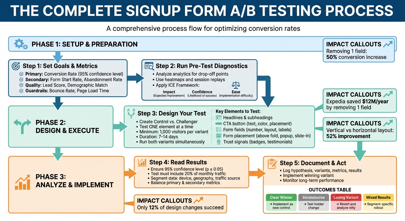
How to Set Up Signup Form A/B Tests
Setting Goals and Choosing Metrics
Start by defining a clear conversion goal. The most common aim is to boost your conversion rate - the percentage of visitors who complete and submit your form. This metric is a direct indicator of how effectively you're turning traffic into leads, helping you get the most out of your marketing budget.
But conversion rate isn't the only thing to watch. It's also important to balance lead quality versus quantity. For example, adding more fields to your form might reduce the total number of signups but attract more serious prospects. For B2B marketers, a smaller group of highly engaged leads often delivers more value in the long run.
Keep an eye on metrics like Form Start Rate and Abandonment Rate to identify areas of friction. If users begin filling out your form but don't finish, it could signal issues with the form design or user experience.
Lastly, set up guardrail metrics to ensure your changes don't harm your site overall. Metrics like bounce rate, page load time, and downstream engagement (e.g., email open rates) can help you spot unintended side effects. For example, a tweak that increases signups but slows your page significantly might not be worth it.
| Metric Category | Key Metrics | What It Tells You |
|---|---|---|
| Conversion | Form Submission Rate, Click-Through Rate | How well you're converting visitors into leads |
| Behavioral | Form Start Rate, Abandonment Rate | Where users encounter friction in your form |
| Lead Quality | Lead Score, Demographic Match | How closely signups match your ideal customer profile |
| Guardrail | Bounce Rate, Page Load Time | The overall health of your site and user experience |
With these metrics in place, you can analyze user behavior to identify problem areas before starting your tests.
Running Pre-Test Diagnostics
Before diving into testing, review your analytics to see where visitors are dropping off. Tools like Google Analytics can highlight problematic form fields, while heatmaps show where users click, scroll, or pause.
Session replays provide even deeper insights by letting you watch how users interact with your form. For example, if users repeatedly click on a non-interactive element or seem stuck on a particular field, you’ve likely found a pain point. These observations help you form a hypothesis - a clear statement linking what you’ve noticed to the change you believe will improve the user experience. For instance, if users hesitate at a specific field, you might hypothesize that simplifying or changing the input method could reduce abandonment.
To prioritize what to test, use the ICE Framework. Score potential changes based on:
- Impact: How much improvement you expect
- Confidence: How likely the change will succeed
- Ease: How simple it is to implement
Focus on high-impact, high-confidence changes that are relatively easy to roll out. This approach ensures your efforts are both effective and efficient.
Designing and Running Your Tests
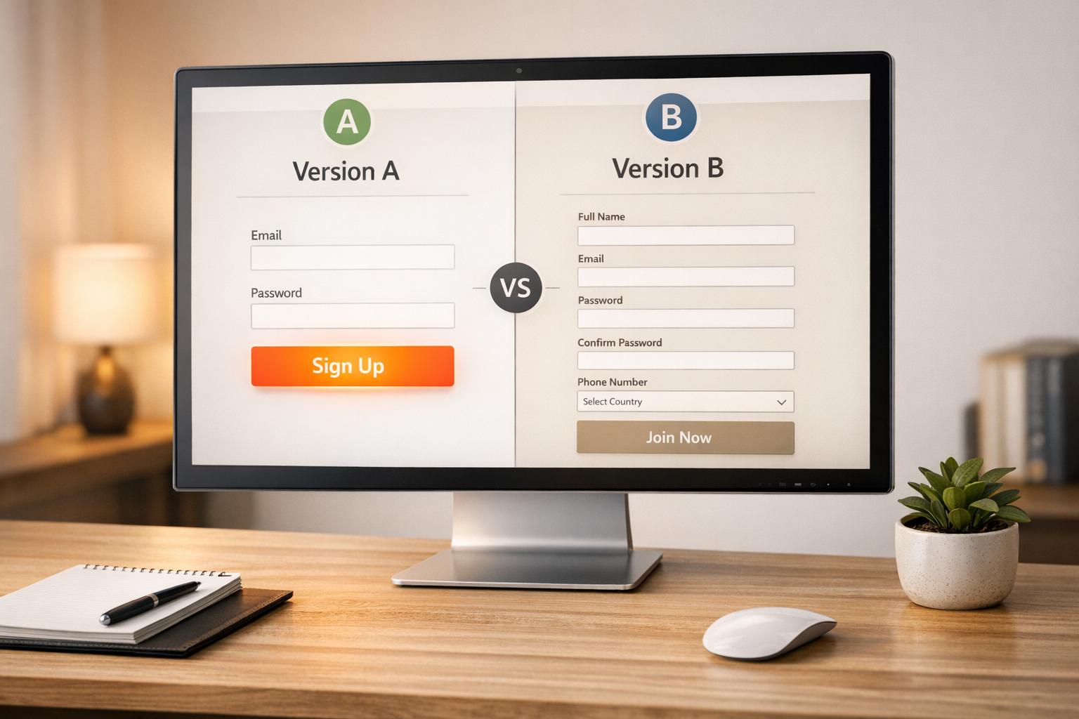
When you’re ready to test, create two versions of your form: the Control (original) and the Challenger (variation with one change). Test only one element at a time - whether it’s the headline, button color, or number of fields. This way, you can confidently attribute any performance differences to the specific change you made.
"The more specific the change (button color, microcopy, etc.), the more scientific we should be because the change is less likely to have a large and noticeable impact on conversion rate."
– Matt Rheault, Senior Software Engineer, HubSpot
Determine your sample size before starting the test. A general rule is to aim for at least 1,000 visitors per variant, though the exact number depends on your baseline conversion rate and the size of the effect you're measuring. Use an online calculator to ensure statistical significance - usually a 95% confidence level - so you can trust your results. Run your tests for 7–14 days to capture both weekday and weekend traffic patterns.
Resist the temptation to peek at early results or stop a test prematurely, even if one version seems to be winning. Doing so can lead to false positives and wasted effort. Always run both variations simultaneously to minimize the impact of external factors like seasonality or time-of-day differences.
Before launching a real test, consider running an A/A test - comparing two identical versions of your form. This helps ensure your testing tool is working correctly and not reporting false differences.
sbb-itb-8889418
What to Test in Your Signup Forms
Form Elements You Can Test
The design and content of your signup form can have a big impact on conversions. Start by testing headlines and subheadings. For instance, does a benefit-driven headline like "Download Your Free Checklist" perform better than a curiosity-driven one like "Are You Making These 7 Mistakes?"
Call-to-action (CTA) buttons are another key area to experiment with. Test the wording - comparing first-person phrasing like "Get My Free Guide" to second-person options like "Get Your Free Guide." You can also experiment with the button's size, placement, and color. Instead of trying to find one "perfect" color, focus on ensuring the button contrasts well with the rest of your page design.
Form fields are critical, too. Each additional field adds friction, so test reducing the number of fields. Try out single-step versus multi-step forms, explore different label alignments (e.g., top-aligned vs. side-aligned), and mark optional fields instead of marking required ones with asterisks.
Placement matters as well. Consider testing forms in different locations: above the fold, as exit-intent popups, within lightboxes, as slide-ins, or even as sticky ribbons. Each option grabs attention at different points in the user journey.
Lastly, don’t overlook trust signals. Adding elements like privacy statements, security badges, testimonials, or social proof (e.g., "Join 50,000 other marketers") can reduce hesitation and build credibility.
How Changes Affect Performance
Even small tweaks to your signup form can lead to noticeable improvements. For example, one study found that reducing the number of fields from four to three increased conversion rates by nearly 50%. Similarly, NeilPatel.com saw a 26% boost in signups simply by removing one field.
However, there’s a balance to strike between quantity and quality. Fewer fields often mean more leads, but adding fields can improve lead quality by filtering for high-intent users and providing better data for your sales team. For example, a "Request a Live Demo" form might justify extra fields, while a simple "Download a Resource" form benefits from keeping things minimal.
Visual design changes can also make a difference. One hotel booking site increased submissions by 52% by switching from a horizontal to a vertical form layout. Adding a progress bar to multi-step forms improved conversions by 28%.
The type of input fields you use can reduce friction as well. For five or fewer options, radio buttons allow quick, one-click selections. Dropdown menus work well for six to 15 options, conserving space while remaining user-friendly. For 16 or more options - like selecting a country - autofill or search functionality minimizes frustration and saves time.
Using Comparison Tables to Make Decisions
To streamline decision-making, use comparison tables to evaluate test outcomes and prioritize changes with the highest potential impact.
| Element to Test | Option A | Option B | Best For |
|---|---|---|---|
| Form Length | Email only | Name + Email + Company | High lead volume vs. high-quality leads |
| Layout | Single-step form | Multi-step form | Simple signups vs. detailed lead generation |
| CTA Copy | "Get Your Free Guide" | "I Want My Free Guide" | Testing voice (second-person vs. first-person) |
| Field Labels | Mark required with asterisks | Mark optional fields | Traditional approach vs. reducing effort perception |
You can also use tables to match field types to your form's specific needs:
| Number of Options | Field Type | Reason |
|---|---|---|
| 5 or fewer | Radio Buttons | Quick, one-click selection |
| 5 or fewer (multiple choices) | Checkboxes | Ideal for selecting multiple options |
| 6 to 15 | Dropdown Menu | Saves space while staying manageable |
| 16 or more | Autofill / Search | Prevents tedious scrolling through long lists |
These frameworks help you prioritize tests based on your goals - whether you’re aiming to increase lead volume, improve lead quality, or find the right balance between the two.
How to A/B test a pop-up in Klaviyo | Increase website popup conversion rate | Klaviyo tutorial
Advanced Signup Form Testing Strategies
Taking your signup form optimization to the next level requires more than just basic A/B testing. Advanced strategies allow you to refine your approach and scale your efforts effectively.
Testing by User Segment
After mastering the basics of A/B testing, segmentation enables you to fine-tune forms for specific visitor groups. Each segment has unique needs. For instance, new users often require more context and trust-building elements, while returning visitors may already be familiar with your brand. Research suggests targeting new users for specific tests helps establish a consistent baseline by minimizing noise from returning visitors who already have pre-formed opinions about your product. This is especially useful when testing major changes in messaging.
Traffic source also plays a key role. Visitors from Facebook ads, for example, behave differently from those arriving via organic search. Someone clicking an ad may have lower intent than someone who searched directly for your solution. A/B tests often deliver better results with low-to-medium intent traffic because there's a wider gap in interest to address compared to high-intent organic visitors. For ad traffic, you might test benefit-driven headlines, while organic visitors might respond better to clear, descriptive copy.
Device segmentation is equally important. Mobile users require streamlined designs and concise calls-to-action (CTAs), while desktop users can handle more detailed layouts. For example, test a CTA like "Download the full guide" for desktop users versus "Send me the quick checklist" for mobile visitors. Trigger timing is another variable worth testing - time-delay popups might work better on desktops, whereas scroll-based triggers could be more effective on mobile.
For B2B marketers using tools like Breaker, audience targeting can be even more precise. Segmenting by industry, company size, or job title allows for tailored forms. For instance, a CTO might need a form focused on technical features, while a marketing manager might prefer information about campaign benefits.
Once your segments are clearly defined, focus on testing strategies that balance lead quantity with lead quality.
Prioritizing Lead Quality Over Quantity
High signup numbers mean little if those leads don’t convert into paying customers. To identify which form variations deliver better results, track down-funnel metrics like Marketing Qualified Leads (MQLs), Sales Qualified Leads (SQLs), and revenue.
In some cases, this means intentionally adding friction to your forms. While shorter forms may increase the volume of signups, including mandatory fields can help filter out low-intent leads. The challenge is finding the right balance - test which fields improve lead quality without significantly impacting conversions. Hidden fields can also be used to pass data into your CRM, helping you track which form variations result in closed deals.
Multi-step forms are another effective tactic. By collecting basic details upfront and requesting more information later, you reduce initial resistance while ensuring that those who complete the form are genuinely interested. Compare this approach to single-step forms, but measure success based on lead quality rather than just completion rates.
For platforms like Breaker, which prioritize engaged and highly relevant subscribers, quality metrics are critical. Pay attention to how many signups open your first email, click through to resources, or request demos. A form that generates 100 engaged leads is far more valuable than one that produces 500 uninterested contacts.
With segmented testing and quality-focused strategies in place, the next step is scaling your testing program.
Scaling Your Testing Program
As your testing efforts expand, staying organized becomes essential. Keep a centralized test log to avoid redundant experiments and build on past insights.
Focus on testing meaningful changes rather than minor tweaks that may not yield significant results. As Julian Shapiro from Demand Curve explains:
"A/B testing is higher-leverage and cheaper than most other marketing initiatives. It's critical to build the team-wide discipline to do it".
Use frameworks like ICE (Impact, Confidence, Ease) to prioritize high-value experiments. This ensures your team focuses on changes that can deliver substantial improvements without wasting resources on low-impact ideas.
Real-time analytics are crucial for tracking multiple tests at once and aligning them with your overall goals. Platforms like Breaker integrate performance tracking with your CRM, allowing you to measure results throughout the funnel - not just at the signup stage.
Maintain statistical rigor by running tests until they reach 95% confidence and conducting multiple experiments simultaneously to account for external variables. Avoid making changes to a test while it’s running, as this can compromise your data entirely.
While around 60% of companies run A/B tests on landing pages, those that see consistent success treat testing as an ongoing process rather than a one-off project. By building the right infrastructure, documenting your findings, and continuously iterating, you can ensure long-term improvements in your signup form performance.
Analyzing Results and Using What You Learn
Running a test is just the beginning. The real impact lies in understanding the data and applying those lessons to make smarter decisions going forward. Jumping to conclusions too quickly can lead to wasted efforts, so take the time to analyze thoroughly.
How to Read Your Test Results
Start by ensuring your results are statistically significant - look for a 95% confidence level (p ≤ 0.05). This step confirms your findings aren't just due to random chance. Be cautious about ending tests too early, a mistake often referred to as "peeking." Doing so can lead to misleading results and false positives.
The size of your sample and the duration of your test are equally important. Aim for your test to include at least 20% of your monthly traffic and run it for 1–2 weeks to gather reliable data. For example, in 2021, Jae Jun from Old School Value tested two product images in an opt-in box. The modern image outperformed the traditional one, boosting conversions by 34.43% with a confidence level of 99.76%.
Dive deeper into your data by segmenting it. Break it down by device, geography, or traffic source. This can uncover trends, like a variant that performs poorly overall but excels with mobile users. Balance your primary metric, such as conversion rate, with secondary metrics like form abandonment or lead quality. A higher conversion rate is only beneficial if it attracts qualified leads.
As Josh Gallant, Founder of Backstage SEO, explains:
"A/B test analysis focuses on uncovering the lessons learned and other findings from your test... it's about asking why something occurred".
If you're working in B2B marketing with tools like Breaker, use these insights to refine your targeting. For instance, if mobile users respond better to shorter forms, you can create tailored experiences for those audiences to attract engaged, high-quality leads.
Once you've interpreted the data, the next step is to document your findings and put them into action.
Recording and Implementing Your Findings
Thorough documentation ensures your efforts lead to continuous improvement. Keep a centralized log of every experiment, even the ones that don’t succeed. Your log should include key details: the hypothesis, test variants, primary and secondary metrics, results, and actionable next steps. Using a standardized template can help streamline this process. For instance, Csek Creative tested a new homepage tagline to improve clarity. Their updated tagline, which better described their services, reached over 600 visitors and increased click-throughs by 8.2%.
When you identify a winning variant, implement it permanently and continue monitoring its performance. Make sure the observed improvement holds over time, as factors like seasonality or overlapping campaigns can sometimes skew initial results.
Interestingly, only 12% of design changes lead to positive outcomes. This means many tests will either be inconclusive or result in losing variants. But as Chipo from Thrive Themes points out:
"A variation that tanks is still a success - it just saved you from rolling out a bad idea".
Common Test Outcomes and What to Do Next
The results of your tests will guide your next steps. Here’s how to respond to different outcomes:
| Test Outcome | Effect on Metrics | Recommended Next Step |
|---|---|---|
| Clear Winner | Significant boost in primary metric; secondary metrics stable. | Implement the winning variant as the new control. |
| Inconclusive/Neutral | No significant difference between variants. | Revisit the hypothesis and test a bolder change. |
| Losing Variant | Drop in primary metric; increase in bounce or abandonment rates. | Revert to the original and analyze why the change didn’t work. |
| Mixed Results | Improvement in one segment (e.g., mobile) but decline in another (e.g., desktop). | Roll out changes selectively and run follow-up tests for specific segments. |
| False Positive Risk | High lift observed with low sample size or confidence level. | Continue the test until you reach the required sample size and statistical validity. |
If results are inconclusive, don’t see it as a failure. Instead, use the insights to refine your hypothesis and plan your next experiment. For example, if a headline change doesn’t move the needle, try testing a more dramatic shift in messaging or a complete overhaul of your value proposition.
External factors can also affect your results. Technical issues like slow page loading, broken links, or cookie deletion (which impacts about 10% of users within two weeks) can skew data. Additionally, consider seasonal trends, marketing campaigns, or other site-wide changes that may have influenced your test.
For platforms like Breaker, where lead quality is critical, pay close attention to downstream metrics. A form variant might increase signups by 20%, but if those leads are 50% less likely to request a demo, the test isn’t a true success. Tracking both primary and secondary metrics gives you a fuller picture of how changes impact your entire funnel.
Conclusion
A/B testing transforms guesswork into measurable growth, offering a structured way to refine your strategies. Chipo from Thrive Themes sums it up perfectly:
"Guessing gets you nowhere, but testing gets you conversions".
The impact of small changes can be massive. For example, tweaking form fields has been shown to boost conversion rates by as much as 300%. Even something as simple as eliminating an unnecessary field helped Expedia save $12 million annually.
The process itself is straightforward: test one variable at a time, and don’t settle for results until you hit a 95% confidence level. Documenting every test, even the ones that don’t work out, is essential - it prevents repeating mistakes and ensures every insight contributes to smarter decisions.
The true magic of A/B testing lies in its ability to compound results. Each winning test becomes your new baseline, setting the stage for the next round of improvements. Over time, these small, incremental gains build into a powerful competitive edge.
For B2B marketers, Breaker offers a great example of how this approach doesn’t just drive signups but also attracts better-quality leads. Focusing on engaged, high-value prospects rather than just raw conversion numbers ensures your funnel delivers meaningful results. By balancing key metrics like conversion rates with secondary ones - such as lead quality and form abandonment - you create a system that improves the entire customer journey.
As Unbounce wisely puts it:
"Optimization is a mindset. Never stop testing".
Audience preferences will always evolve. The key is to keep testing, learning, and adapting to stay ahead.
FAQs
What should I test first on my signup form to improve performance?
When optimizing for user decisions, start by testing elements that are both impactful and easy to tweak. Focus on areas like the headline, the text on your call-to-action (CTA) button, the number and type of form fields, the design (such as colors or layout), and the timing of when the form appears.
Begin with high-impact, low-effort changes. For instance, adjusting the CTA text or headline is quicker and simpler than overhauling the form's layout or changing when it pops up. Always test one variable at a time to pinpoint what’s driving improvements. For example, you could experiment with two CTA options: "Sign up now" versus "Get exclusive updates."
To ensure your results are reliable, let the test run long enough to gather enough data - aim for a few hundred sign-ups per variation. Tools like Breaker can help you monitor performance in real time and confirm when your findings are statistically valid.
What metrics should I focus on when A/B testing signup forms?
When you're A/B testing your signup forms, there are two key metrics you need to keep a close eye on: conversion rate and statistical significance.
- Conversion rate tells you the percentage of visitors who fill out and submit the form. It's a straightforward way to see which version is pulling in more users.
- Statistical significance helps you confirm that the performance differences between your variations aren't just random flukes. It gives you the confidence to trust the data and make solid decisions.
Focusing on these metrics allows you to fine-tune your forms and achieve better outcomes.
How can I make sure changes to my signup form improve lead quality instead of just increasing the number of signups?
To boost the quality of your leads, start by clearly defining what a high-quality lead looks like for your business. Is it someone who meets specific criteria, converts into a paying customer, or actively engages with your follow-up emails? Pinpointing these metrics will give you a solid foundation for your A/B testing. Focus on these quality indicators rather than just the total number of signups.
When running A/B tests, make sure to tweak only one element at a time. This approach ensures you can identify what’s driving the results. Let the experiment run long enough to gather enough data for statistically meaningful insights. You might also consider adding fields like "job title" or "company size" to your forms to better qualify leads. Just make sure the form remains simple and user-friendly - long, complicated forms can scare off potential prospects. Tools with real-time analytics can be incredibly helpful here, giving you insights into how changes affect metrics like engagement or conversion rates.
Don’t stop there - keep an eye on key indicators like bounce rates and what users do after they sign up. These behaviors can tell you if you’re attracting the right audience. Once you’ve identified a clear improvement in your lead quality metrics, you can confidently roll out the winning version of your form.