Best Practices for Optimizing Signup Forms
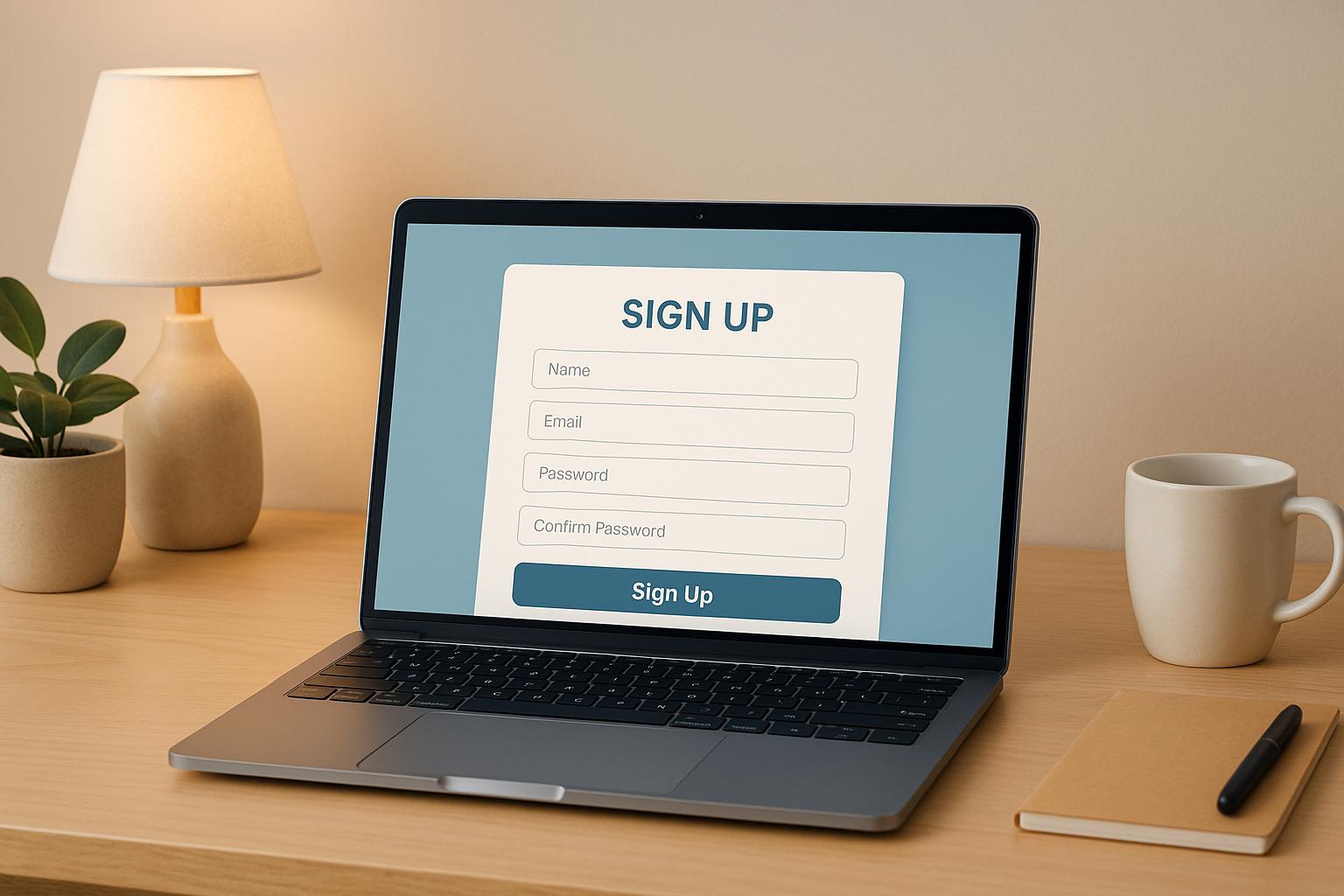
Your signup form is a critical gateway to growing your email list. A well-designed form can significantly boost conversions, while a poorly executed one can drive users away. Here’s what you need to know:
- Simplify your forms: Reducing fields from four to three can boost conversions by nearly 50%. Stick to essentials like email and name.
- Optimize for mobile: Over half of signups happen on mobile. Use responsive designs, proper input types, and single-column layouts to improve completion rates by up to 40%.
- Use clear CTAs: Replace generic buttons like "Submit" with action-driven phrases like "Start Your Free Trial."
- Provide value: Offer lead magnets like free trials, templates, or reports to incentivize signups.
- Build trust: Be transparent about email frequency, content type, and privacy policies.
- Test and improve: A/B test form elements, track metrics like conversion rates, and refine based on real-time data.
How To Make A High-Converting Pop Up & Grow Your Email List Fast!
Reduce Friction in Your Signup Process
Extra steps or unnecessary fields in your signup form can quickly discourage potential subscribers. The goal is simple: make the process so easy that users don’t even think twice about completing it. By removing barriers and simplifying the experience, you can significantly boost your conversion rates.
Keep Form Fields Simple
The number of fields in your signup form directly impacts whether users complete it. Research shows that reducing a form from four fields to three can increase conversion rates by nearly 50%.
The most effective signup forms stick to the basics - usually just an email address, or at most, a name and email. Adding more fields only creates resistance, giving users more reasons to abandon the form. A great example is ClickUp, which keeps its initial signup form simple by asking only for an email address. Details like team size, role, or billing information are only requested after users engage with the platform.
Think carefully about every field you include. Does it need to be part of the initial signup, or can it wait? Asking for things like phone numbers, job titles, or company names upfront often creates unnecessary friction. The rule is straightforward: the fewer fields you require, the easier it is for users to complete the form.
When multiple fields are necessary, use a single-column layout to stack them vertically. This layout isn’t just visually clean - it’s faster and more intuitive. In fact, single-column forms are completed 15.4 seconds faster than multi-column ones, as users can move naturally from top to bottom without horizontal navigation. The only exception might be date fields (e.g., day/month/year), which can work better when grouped horizontally.
If you need to collect more information, consider breaking the process into steps to keep things simple.
Use Multi-Step Forms or Progressive Profiling
For forms requiring more than basic details, splitting the process into multiple steps can reduce drop-offs. Multi-step forms on landing pages perform particularly well, achieving a 9.113% signup rate, much higher than lengthy single-page forms.
Breaking the form into smaller sections makes it feel less overwhelming. Progress indicators showing how far users have come can also help. Completing each step builds momentum, encouraging users to finish the process.
Progressive disclosure is another effective strategy. This involves revealing only the fields necessary for each step. For example, the first step might only ask for an email address. The next step could request a name and company, followed by preferences or interests. By reducing the cognitive load at each stage, you guide users through the form more smoothly.
Progressive profiling takes this a step further by collecting information gradually over time. Start with essential details during the signup process, then request additional information later, such as when users download a resource or attend a webinar. This approach helps you build detailed subscriber profiles for segmentation while keeping the initial signup friction-free.
Match Form Length to Your Offer's Value
The length of your form should match the perceived value of your offer. Users are more likely to complete longer forms if they feel the reward justifies the effort.
For a simple offer like a weekly newsletter, asking for more than an email address - or perhaps a name and email - is likely to hurt your conversions. However, if you’re offering something more substantial, like a detailed industry report, a free trial of premium software, or exclusive resources, users are typically willing to fill out a few more fields.
For low-value offers, keep the form as short as possible. For high-value offers, you can include additional fields - but only if they’re absolutely necessary. Even with premium offers, avoid asking for unnecessary details. Always consider if the information is critical, could be inferred, or collected later.
When offering something substantial, make sure users know what they’re getting. Lead magnets like discount codes, ebooks, or free trials should be displayed prominently near the form. Use clear, benefit-driven calls-to-action instead of generic buttons. For example, instead of "Submit", try something like "Sign Up Today and Save 15%!" or "Start Your Free 14-Day Trial". These CTAs reinforce the value users will receive, making the effort feel worthwhile.
In short: keep it simple for minimal offers, and be selective - even with high-value ones. Every unnecessary field adds friction, so only ask for what you truly need.
Offer Clear Value in Exchange for Signups
People need a solid reason to hand over their email address - spelling out exactly what they’ll get makes all the difference.
Show What Users Will Get
Be upfront about what subscribers can expect. Vague phrases like "stay updated" or "join our community" don’t cut it. Instead, focus on specific benefits.
Take Breaker, for example. Their message, "Get Perfect Subscribers, Automatically," is direct and leaves no room for confusion. They also map out the subscriber experience with a simple, step-by-step breakdown, making the benefits crystal clear.
Transparency about email frequency and content type can make or break your signup strategy. For instance, if users know they’ll get weekly insights instead of daily sales pitches, they’re more likely to stick around. This kind of honesty reduces unsubscribes and spam complaints, which can hurt your sender reputation. For B2B audiences, being upfront about whether your emails are educational, promotional, or a mix ensures you attract the right kind of subscribers.
Adding a short description near your signup button can help set expectations. For instance, something like "Get weekly B2B marketing insights delivered straight to your inbox" or "Join 50,000+ marketers receiving monthly industry reports" filters out those who aren’t interested while drawing in those who are.
Once you’ve nailed down the core value, amplify it with a strong lead magnet to entice signups further.
Use Lead Magnets and Special Offers
A clear promise is powerful, but combining it with a lead magnet makes it irresistible. Lead magnets - whether it’s a free resource, trial, or tool - give people an immediate reason to sign up. The key is to offer something your audience genuinely values.
For B2B audiences, educational tools often outperform generic discounts. Think webinars, industry reports, templates, or free trials. Breaker does this well by offering a 7-day free trial, allowing marketers to explore features like precision targeting and analytics before committing to a paid plan. This approach lowers the risk for potential users while showcasing the product’s value.
Delivering the lead magnet immediately is essential for building trust. Whether it’s an eBook, discount code, or trial access, instant delivery satisfies users and sets the tone for future engagement. For B2B audiences, who often expect efficiency, this immediacy is even more critical.
Interactive tools also work wonders. Breaker’s ROI calculator, for example, lets users see potential benefits in real time - an effective way to demonstrate value.
Personalization can take your lead magnets to the next level. If someone lands on your signup form after reading a blog post about email segmentation, tailor the form copy to reflect that, like: "Join 50,000+ marketers mastering email segmentation techniques." This small touch makes the offer feel directly relevant, which significantly boosts conversions.
It’s also worth noting that the format and placement of lead magnets matter. For instance, discount offers perform consistently well across popups (2.358% signup rate), flyouts (2.337%), and landing pages (2.073%), but drop sharply in embedded forms (0.194%). So, how you present your offer can be just as important as the offer itself.
With your lead magnets in place, the next step is crafting signup copy that reinforces the value you’re delivering.
Write Clear Signup Copy and CTAs
Your call-to-action (CTA) is where the value exchange happens, so it needs to be crystal clear. Generic CTAs like "Submit" or "Sign Up" waste opportunities. Instead, make the benefit obvious by using action-oriented language.
For example, instead of a vague "Sign Up", try something specific like "Sign Up Today and Get 15% Off!" or "Start Your Free 14-Day Trial." Breaker uses CTAs like "Activate My 7-Day Trial," which clearly communicates both the action and the reward.
For B2B audiences, focus on measurable outcomes. Instead of saying, "Get marketing tips," try something like, "Learn how to boost email conversion rates by 40% with insights from 10,000+ campaigns." This kind of specificity appeals to decision-makers who care about ROI and tangible results.
Keep your signup copy short and easy to skim. Users should grasp the value in seconds. Use concise sentences, bullet points if needed, and avoid overly technical language while maintaining a professional tone.
Pair your CTA with social proof to build trust. For instance, Breaker highlights testimonials like this one from Peter Lohmann, CEO of RL Property Management:
"We tripled our sponsor revenue and doubled our community memberships with Breaker. Well over a 10X ROI".
They also share performance stats, such as a 30% average open rate and a 40% click-through rate across active campaigns. These numbers back up their claims and make the decision to sign up much easier for potential subscribers.
Ultimately, every piece of your signup form - from the headline to the CTA - should clearly communicate the value users will gain. When the benefits are obvious and compelling, signing up feels like a no-brainer.
Place and Design Forms for Maximum Conversions
Even the most enticing offer won't convert if your signup form is hidden or poorly designed. Strategic placement and thoughtful design are key to grabbing attention and guiding visitors smoothly through the signup process.
Choose the Right Form Locations
Where you place your signup form can make or break its success. The best spots are those that naturally catch users' eyes when they're most open to your message.
Consider high-visibility areas like the end of blog posts, homepage headers, and checkout pages. Each serves a unique purpose. For example, blog post endings work well because readers are already engaged with your content and more likely to take the next step. Homepage headers ensure immediate visibility without requiring any scrolling. Checkout pages, on the other hand, target users who are already in a buying mindset and more inclined to engage further.
For mobile users, footer placements can be surprisingly effective. Urban Outfitters, for instance, places their subscription form at the very bottom of their mobile site. This strategy takes advantage of the natural scrolling behavior of mobile users, making the footer a logical stopping point.
The key is aligning form placement with user intent. Someone reading a detailed guide on email marketing is far more likely to sign up for related insights than someone casually browsing your homepage.
Multi-step signup forms perform exceptionally well on landing pages, with a 9.113% signup rate. Breaking the process into smaller steps makes it feel less overwhelming. Once users complete the first step, they're psychologically more likely to finish the rest.
Timing also matters. Use triggers like scroll depth, time spent on the page, or exit intent to display forms at the right moment. For instance, an exit-intent popup can capture users about to leave, turning potential drop-offs into signups. Just ensure these popups are helpful, not intrusive - nobody enjoys being bombarded with popups the moment they land on a page.
Once you've nailed the placement, the next step is ensuring your forms function seamlessly across all devices.
Make Forms Work on Mobile Devices
With over half of signups happening on mobile devices, optimizing for mobile is a must.
Mobile forms need to be responsive, easy to read, and require minimal scrolling. Tap targets should be large enough to avoid accidental clicks, with sufficient spacing for comfortable use.
Using HTML5 input types can boost mobile completion rates by 40%. By specifying input types like email, phone number, or date, you trigger context-specific keyboards on mobile devices. This small tweak makes a big difference. For example, an email input automatically brings up a keyboard with the @ symbol, while a phone number input displays a numeric keypad, reducing errors and frustration.
ClickUp provides a great example of mobile-friendly design. Their signup form starts with just an email field and a "Get Started" button. Once users engage, they collect additional details like team size and billing information. This approach prioritizes speed and simplicity, which mobile users value most.
Stick to single-column layouts for mobile forms. Horizontal space is limited, so stack fields vertically and keep them consistent in width.
Always test your forms on various devices and browsers - iPhones, Androids, tablets, and older smartphones. What looks great on your laptop might not translate well to a smaller screen. Pay attention to details like font size, button spacing, and how the form interacts with the mobile keyboard.
After functionality, focus on the visual design to ensure forms are both appealing and aligned with your brand.
Use Visual Elements and Consistent Branding
A well-placed and mobile-optimized form still needs strong design to guide users through the signup process effortlessly. Your form should reflect your brand’s style and instill trust.
Stick to brand-aligned colors, fonts, and imagery that enhance the form without overwhelming it. If your website uses specific colors or typography, carry those into the form to create a seamless experience. Consistency reassures users that the form is part of your site, not an unrelated third-party widget.
White space is crucial. It makes forms easier to read and reduces visual clutter. Spacing out fields and elements helps users process information more comfortably, avoiding the "overwhelmed" feeling that cramped designs can cause.
Your call-to-action (CTA) button should stand out. Use action-driven language like "Join Now", "Start Learning Today", or "Get My Discount" instead of generic terms like "Submit". Breaker, for instance, uses CTAs like "Activate My 7-Day Trial", which clearly communicates the benefit of signing up. Make the button visually prominent by using contrasting colors that naturally draw the eye.
Visual cues like arrows or icons can direct attention to key fields, but don’t overdo it. Every design element should serve a purpose - whether it’s guiding attention, clarifying instructions, or reinforcing your brand.
Logical grouping of form fields can reduce completion time by 20% and errors by 30%. Organize related fields into sections using whitespace or borders. For example, group contact information together and separate billing details into its own section. This reduces cognitive load and makes the form easier to navigate.
Small details also matter. Autofocus on the first field can reduce interaction time by 2.3 seconds and boost engagement by 15%. When users land on the form, the cursor should automatically appear in the first field, signaling that the form is ready for input. Just ensure the focus indicator is clear so users know where to start typing.
Autocomplete functionality is another game-changer, cutting completion time by 30% and increasing form completion rates by 25%. Adding autocomplete attributes for fields like name, email, and address allows browsers to fill in stored information automatically. This feature is especially helpful on mobile, where typing is more cumbersome - mobile completion rates improve by 40% with autocomplete.
The ultimate goal is to create a frictionless experience where users barely notice they’re filling out a form. Every design choice should simplify the process, clarify expectations, and highlight the value of signing up.
sbb-itb-8889418
Build Trust and Set Clear Expectations
Once you've nailed the design and placement of your signup form, the next priority is to establish trust and set clear expectations. After all, you're asking for something valuable - their email address. To earn that trust, you need to prove you're worth it. B2B audiences, in particular, are cautious about who gets access to their inbox. They’re not just evaluating your content; they’re also assessing you as a potential business partner. If anything feels unclear or questionable, they’ll leave without a second thought.
Trust is built on transparency, clarity, and respect for your subscribers' time and privacy. When people know exactly what they’re signing up for and feel confident their information is secure, they’re much more likely to hit “submit.”
Tell Users What to Expect from Your Emails
Nobody enjoys surprises in their inbox, especially busy professionals juggling hundreds of emails daily. Being upfront about email frequency and content type not only builds trust but also reduces the likelihood of unsubscribes.
Instead of a vague “Subscribe to our newsletter,” be specific. For example, say, “Get weekly B2B marketing insights delivered every Tuesday morning” or “Receive monthly case studies and best practices from industry leaders”. This level of detail shows respect for their time and sets clear expectations from the start.
Transparency is key. If you’re sending daily updates, say so. If it’s a bi-weekly digest, let them know. B2B decision-makers manage their inboxes strategically, and unexpected email frequency is a surefire way to lose them. A simple statement like “We’ll send you 2-3 emails per week” or “Monthly updates, no spam” near your signup button can work wonders for conversion rates. It removes uncertainty and reassures them they’re making an informed choice.
You can also go a step further by offering customization options. Let subscribers choose what they want to receive - whether that’s product updates, educational resources, or industry insights. Giving them control over their preferences shows you value their time and needs, not just your own agenda. These clear expectations naturally lead to addressing privacy concerns.
Add Privacy and Security Information
Data privacy is a top concern for B2B decision-makers, especially with regulations like GDPR and CCPA in place. Address these concerns directly within your signup form.
Make your privacy policy easy to find - don’t bury it in tiny text at the bottom of the page. Include a clear link near the signup button, paired with a reassuring statement like “We respect your privacy. Read our privacy policy” or “Your data is secure and GDPR compliant”. These small details can make a big difference in building trust.
For enterprise-focused forms, consider showcasing certifications or security badges such as SSL or SOC 2 compliance. These visual cues signal your commitment to data protection without requiring lengthy explanations. Enterprise clients often conduct vendor security assessments, so displaying these badges upfront shows you take security seriously.
Be explicit about how you’ll use their data. A straightforward statement like “We’ll use your email only to send you marketing insights and product updates” eliminates ambiguity. Avoid vague language that leaves room for doubt. The clearer you are, the more comfortable visitors will feel sharing their information.
If your audience spans multiple regions, mention compliance with relevant regulations. For U.S. audiences, include a note about adhering to CAN-SPAM laws. This transparency isn’t just legally required - it’s an opportunity to build trust. When paired with privacy assurances, these signals make your signup form even more credible.
Show Social Proof or Testimonials
Trust signals like social proof and testimonials can significantly boost form completions. People tend to follow the actions of others, especially in B2B settings where decisions often involve multiple stakeholders. Social proof taps into this psychology, enhancing credibility and perceived value.
One simple yet effective form of social proof is displaying subscriber numbers. A statement like “Join 50,000+ marketing professionals” instantly communicates that others find your content valuable. It reassures potential subscribers that they’re making a smart choice.
For B2B audiences, specific metrics and recognizable company logos are even more persuasive than generic testimonials. Featuring a short testimonial from a known industry leader or company near your call-to-action (CTA) reinforces your credibility. For instance, Jordan Ross, CEO of 8 Figure Agency, shared that their “newsletter is growing by 5,000 subscribers each month” with Breaker. Testimonials like this, which highlight tangible results, are far more convincing than generic praise.
Effective testimonials include real names, job titles, and companies to make them relatable and trustworthy. They should focus on measurable outcomes, not vague endorsements. When potential subscribers see that others in their field have benefited, they’re more likely to believe they will too.
Displaying logos of well-known companies that subscribe to your content is another powerful tactic. Logos act as visual shortcuts, communicating credibility without requiring visitors to read lengthy testimonials. Just make sure you have permission to use them.
An additional approach is showcasing satisfaction ratings. For example, Breaker boasts an average satisfaction score of 4.8/5 from B2B marketers. This quantifiable metric offers an at-a-glance indicator of value and builds confidence in your offering.
Place these trust signals strategically - near the CTA button, within the form, or just above it. The goal is to address the unspoken question: “Why should I trust you with my email address?” By answering this, you’ll encourage more visitors to take the leap and subscribe.
Test and Improve Your Forms Continuously
Getting your signup form live is just the start - what comes next is where the magic happens. The best B2B marketers know that improving forms is a never-ending process. Instead of relying on guesswork, they use data to guide their decisions. By testing different elements, tracking key metrics, and making data-driven changes, you can see measurable gains. Even a small boost in your conversion rate can translate into hundreds of additional subscribers without increasing traffic. The key is to systematically test and refine your forms to see what works best.
A/B Test Different Form Elements
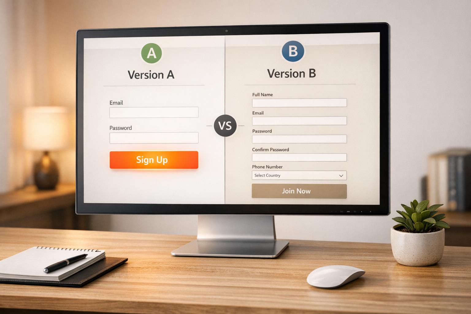
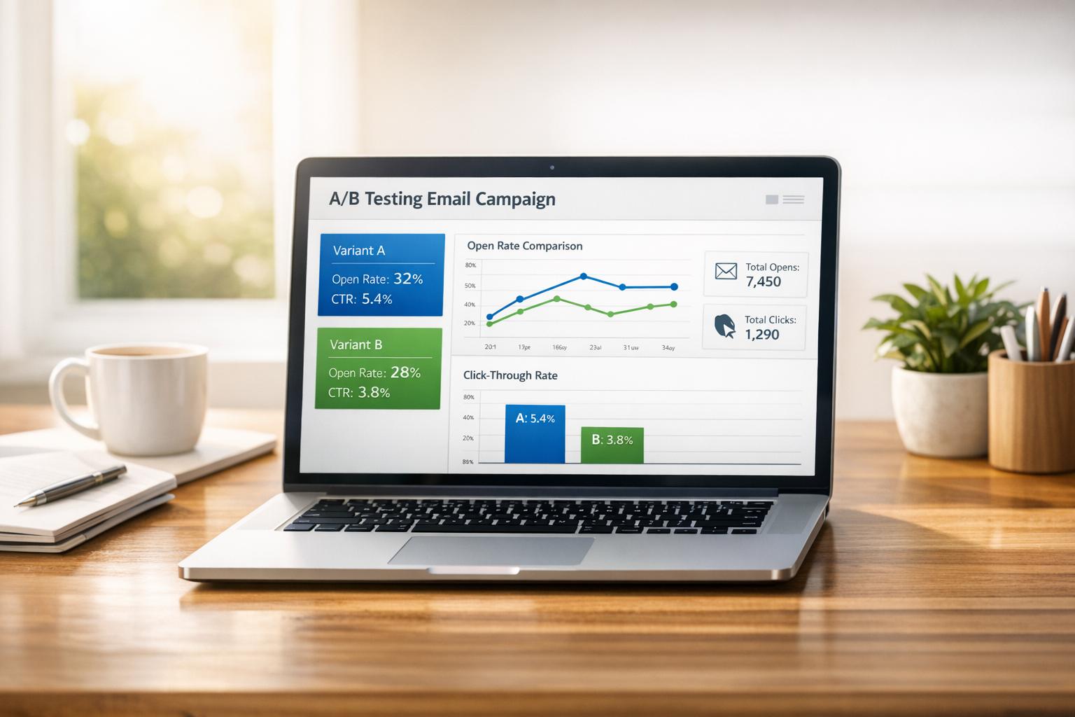
Once your form is live, the next step is fine-tuning its performance through A/B testing. The idea is straightforward: create two versions of your form, change one element, and split your audience to see which version performs better. By testing one variable at a time, you can pinpoint exactly what drives improvements.
Start with elements that have the most impact. For example, your call-to-action (CTA) button is a great place to begin. Action-oriented phrases like "Join Now", "Get My Discount", or "Start Learning Today" tend to outperform generic options like "Submit". Another key factor is the number of fields - reducing fields from four to three can increase conversions by nearly 50%. Each additional field adds friction, so stick to what’s absolutely necessary or consider progressive profiling for gathering more details over time.
The layout of your form also matters. Single-column designs, for instance, are completed 15.4 seconds faster than multi-column layouts. Placement is another area to experiment with - forms placed at the end of blog posts, in homepage headers, or on checkout pages often perform well.
To get reliable results, aim for 100–200 conversions per variation and keep detailed records of your findings.
Track Performance Metrics
Testing only works if you’re measuring the right metrics. Start with your conversion rate - the percentage of visitors who complete your form. For example, if 100 people see your form and 5 sign up, your conversion rate is 5%. Break this down further by traffic source, device type, and form location. A 5% overall rate might look different when you see mobile users converting at 2% compared to 8% on desktop.
Another helpful metric is the completion rate, which shows how many users finish the form once they start. If a specific field causes a big drop-off, it might be worth revising or moving it to a later stage. Similarly, the bounce rate (the percentage of visitors who leave without interacting) can highlight issues with your form’s design, placement, or even the perceived value of your offer.
If users are taking too long to complete the form, consider streamlining it. Features like autocomplete can cut completion time by 30%, while grouping related fields can save another 20%. Using the right input types - like dropdowns or checkboxes - can also improve mobile completion rates by 40% and reduce errors by 50%. Since more than half of B2B signups happen on mobile devices, keeping an eye on mobile-specific metrics is critical.
Once you’ve collected these insights, use them to guide updates and improvements.
Use Real-Time Data to Make Changes
Real-time data is a game-changer for optimizing your forms. It allows you to spot issues as they happen and make adjustments before losing more potential signups. Features like real-time validation - such as showing a checkmark for valid email addresses - can reduce errors by 50%. Similarly, input masks for phone numbers help users enter the correct format, cutting down on mistakes.
Tools like Breaker provide instant access to performance analytics, giving you a clear view of metrics like subscriber growth. Instead of juggling data from multiple platforms, you get actionable insights in one place. For instance, if you notice a sudden dip in conversions, you can quickly investigate and resolve the problem. Real-time data also helps you spot patterns, like lower completion rates on Friday afternoons, so you can test shorter forms or adjust your strategy during those times.
Heatmaps and session recordings add another layer of insight by showing where users hesitate or drop off. Use this information to create a cycle of continuous improvement: measure your baseline performance over a week, prioritize impactful tests, and implement the winning changes. High-performing teams often introduce new variations every one to two weeks, ensuring their forms are always evolving.
Use Form Data for Segmentation and Personalization
Signup forms do more than just collect email addresses - they provide valuable insights for crafting tailored campaigns. The key is finding the right balance between gathering useful data and keeping the process simple. Achieving this balance can lead to higher engagement, fewer unsubscribes, and better overall performance.
Collect Additional Data Without Overwhelming Users
Adding extra fields to forms increases the mental effort required to complete them, which can lower submission rates. To avoid this, focus on collecting only the information that will directly influence how you communicate with your audience. For B2B marketers, crucial details often include job role, industry, and company size - data that can shape more targeted messaging.
Using conditional logic in forms can help streamline the process. With progressive disclosure, users see only the fields relevant to their previous answers. For instance, if someone identifies as a "B2B marketer", the form might display questions specific to their industry, while other users see different options.
Another effective tactic is using multi-step forms. These forms guide users through a series of smaller, more manageable steps, which can improve completion rates. In fact, multi-step forms on landing pages have been shown to achieve a 9.113% signup rate. Start with basic contact details, then move on to segmentation data, and finish with preference settings.
Optimizing forms for mobile devices is also critical, as more than half of B2B signups happen on mobile. By simplifying the process and making it mobile-friendly, you can ensure a smoother experience for users.
The bottom line? Only ask for information that will help you create more personalized campaigns. This approach lays the groundwork for messages that truly resonate with your audience.
Create Targeted Campaigns for Better Results
Once you've gathered segmentation data, use it to craft campaigns that speak directly to your audience. Segmented email campaigns often outperform generic ones, generating 14–100% higher open rates and 100–300% higher click-through rates.
Your welcome sequence is a great place to start. With data like job role, industry, or interests collected during signup, you can deliver onboarding content tailored to each subscriber's needs. For example, a healthcare professional might receive case studies relevant to their field, while someone in finance gets content that addresses their unique challenges. This kind of personalization builds trust from the very first email and highlights the value of your communications.
Offering customized lead magnets and special offers can also boost engagement. Align your resources with each subscriber's segment - for example, enterprise-level guides for larger companies or startup-focused advice for smaller teams. Letting subscribers choose their preferred email frequency adds another layer of personalization, helping to maintain list health and reduce unsubscribes.
Just as simplifying forms can increase conversions, using that data to create personalized content strengthens engagement. Tools like Breaker can integrate signup data with automated lead generation and analytics, enabling precise segmentation and messaging.
Don’t stop at initial data collection - keep refining your segments based on subscriber behavior, such as clicks, downloads, and email opens. Start with broader categories and adjust them as you learn more about how subscribers interact with your content.
Finally, be upfront about how you use segmentation data. Let subscribers know during signup that their information will help deliver more relevant content. This transparency builds trust and encourages users to provide accurate details.
Conclusion
Optimizing your signup forms creates a smoother experience for users while delivering clear benefits. The numbers back it up - strategies like simplified designs, well-thought-out field placement, and mobile-friendly layouts can increase conversions by 50% or more and significantly cut down completion times.
Start with a basic form that asks for only the most critical information. As users engage more, you can gradually collect additional details. Use clear and specific calls-to-action, such as “Start Your Free Trial” or “Get My Discount,” instead of vague phrases. Since more than half of signups now happen on mobile devices, ensure your forms are fully optimized for mobile use. This approach not only builds trust but also sets a solid foundation for testing and improvement.
Trust is further strengthened by being transparent about privacy policies and clearly outlining what subscribers can expect to receive. Regularly test elements like button colors, CTA language, and the arrangement of fields. Pay close attention to metrics like completion rates, abandonment rates, and time-to-completion to identify and resolve friction points based on actual user behavior.
Incorporate progressive profiling to gather segmentation data gradually. This method avoids overwhelming users while enabling you to create personalized campaigns tailored to their interests and needs.
Platforms like Breaker can provide the tools you need to succeed. With features like automated lead generation, precise audience targeting, and real-time analytics, Breaker helps you identify which forms and placements yield the best results. Its intuitive newsletter builder ensures you deliver on your promises, while high deliverability rates make sure your messages actually reach your subscribers.
To drive sustainable growth, focus on simplifying your forms, clearly communicating value, optimizing for mobile users, testing consistently, and personalizing campaigns based on data. Each improvement transforms your signup form into a powerful tool for building and maintaining a thriving subscriber list.
FAQs
How can I identify the essential fields for my signup form without making it less effective?
When designing your signup form, the key is to focus on what you actually need to achieve your goals. Start by clarifying the main purpose of the form - whether it’s building an email list, collecting leads, or something else entirely - and only request the bare minimum of information needed to meet that objective.
For instance, if you’re creating a newsletter signup, asking for just an email address might be enough. If you need extra details, like a name or company, make sure those fields directly support your strategy. Keep in mind that too many fields can discourage users from completing the form, so simplicity is crucial. Experiment with different versions of the form to strike the right balance between gathering useful data and ensuring the process feels quick and easy for users.
How can I optimize my signup forms for mobile users?
To make your signup forms work well for mobile users, focus on creating a responsive design that adjusts smoothly to any screen size or orientation. This ensures the form looks and functions properly, no matter the device. Simplify the form by asking only for the most important details - fewer fields mean less hassle for users.
Design with usability in mind: include large, easy-to-tap buttons and ensure the text is clear and readable without needing to zoom in. Avoid crowding the layout - leave enough space between elements to prevent accidental taps. Finally, test your form on a variety of mobile devices and operating systems to confirm it delivers a seamless experience for everyone.
What are the best ways to use A/B testing to boost signup form conversions?
A/B testing is a smart way to fine-tune your signup form and figure out what clicks with your audience. Start by focusing on just one element at a time - like the headline, call-to-action (CTA) text, button color, or the overall length of the form. This approach makes it easier to pinpoint which specific change drives the most conversions.
Make sure you gather enough data during your tests to draw meaningful conclusions. A larger sample size means more dependable results. And don’t forget to regularly review your findings and put the winning variations into action. Even small adjustments can make a big difference in improving your form’s performance over time!


