Mastering the art of creating a heat map for actionable insights

A heat map does something a spreadsheet just can't: it turns raw numbers into a visual story. It translates data points—like clicks or timestamps—into a color-coded overlay where hot colors show high activity and cool colors reveal low engagement. It’s the fastest way to understand complex behavior at a glance.
Beyond Spreadsheets: The Real Power of Heat Maps

Before we get into the "how," let's talk about why heat maps are such a game-changer for modern marketing. They take you beyond simple metrics to show you where and when your audience is most engaged. This isn’t just a pretty chart; it’s a strategic weapon for finding hidden trends in your data.
From 19th-Century Paris to Modern Marketing
Believe it or not, the concept isn't new. Back in 1873, a French statistician named Toussaint Loua created one of the first heat maps to visualize social data across Paris. He used darker shades for higher population density, instantly revealing patterns that were buried in traditional tables.
That foundational idea is exactly what powers modern platforms like Breaker when analyzing subscriber engagement, cutting down what used to take hours into just a few minutes. The core principle remains the same.
A heat map's real value is the immediate context it provides. Instead of just knowing a link was clicked 1,000 times, you see precisely where on the page those clicks happened. That tells a much richer story about what your users actually want.
Visualizing Your Path to Growth
For anyone in marketing, a heat map is a direct line to making smarter decisions. It helps answer the critical questions that drive subscriber growth and improve campaign performance. The benefits are clear and immediate:
- Identify Engagement Hotspots: Pinpoint exactly which calls-to-action (CTAs), images, or links in your newsletter grab the most attention.
- Optimize Content Layout: Discover if your audience is missing key information because it’s stuck in a "cold" zone of your email or landing page.
- Refine Send Schedules: Build temporal heat maps to see the exact days and times your audience is most likely to open and engage with your content.
- Improve User Experience: Find points of friction where users might be clicking on non-interactive elements, which is often a sign of confusion.
To really get a feel for their power, it's helpful to understand the different types, including specialized tools like click maps that focus purely on user interactions. Ultimately, heat maps empower you to turn your marketing efforts into a precision-guided operation fueled by real user behavior.
Defining Your Objective and Gathering Clean Data

A powerful heat map always starts with a clear question, not with a mountain of data. Before you even think about visuals, you have to know exactly what you want to learn.
Are you trying to figure out which CTA in your last newsletter actually drove conversions? Or maybe you're trying to pinpoint the absolute best time of day to send your next campaign for maximum impact.
The question you ask dictates everything that follows—the type of heat map you build, the data you need, and the insights you'll get. Without a specific goal, your visualization is just a pretty picture with no real purpose.
Matching Your Business Goal to the Right Heat Map
To help connect the dots between your business objectives and the right visualization, think of it this way: your goal is the destination, and the heat map is the vehicle. Each type is designed for a different kind of journey. This table breaks down which heat map to use based on what you're trying to accomplish.
This simple breakdown ensures you're not just creating a heat map for the sake of it, but are actually building a tool to answer a specific, valuable business question. For most B2B marketers and newsletter creators, these three categories cover almost every use case.
The Foundation of a Great Heat Map
Once you've locked in your objective, the next critical step is gathering the right data. This is the behind-the-scenes work that prevents a "garbage in, garbage out" result.
The data points you need are tied directly to your goal. A click map, for example, requires X/Y coordinates for every single click on a static image of your newsletter. A temporal map needs precise timestamps for every email open. A geographic map, on the other hand, relies on subscriber data—which you can often supplement with location details using IP addresses.
If your own data is missing some of these pieces, you can learn more about how data enrichment services can help fill in the gaps.
Getting your data ready is a meticulous process. It needs to be clean, accurate, and structured correctly. Exploring advanced methods like AI data cleaning techniques can seriously streamline this crucial step, making sure your final visualization is trustworthy.
A clean, well-structured dataset is the most important ingredient in creating a heat map that you can actually trust. It’s worth spending 80% of your time on preparing the data to ensure the final 20%—the visualization—is accurate and insightful.
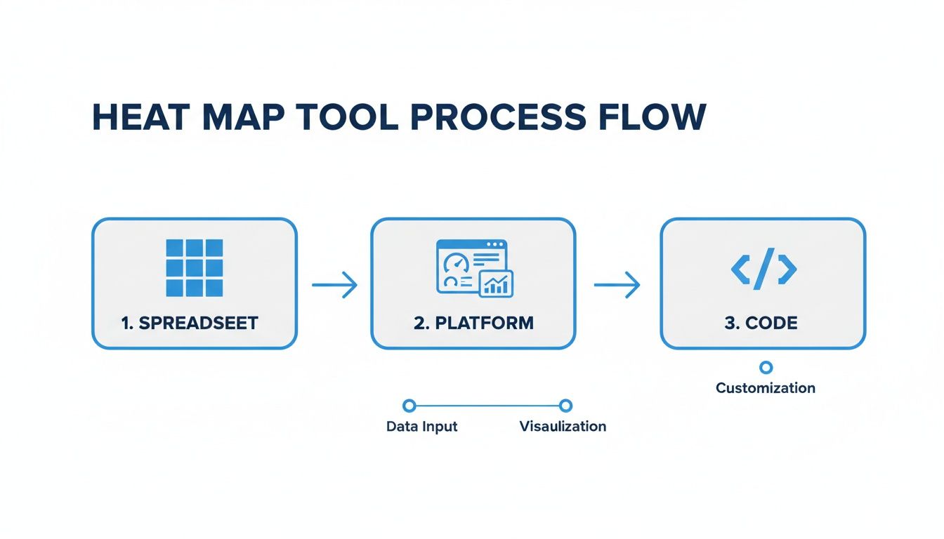
Choosing Your Heat Map Tools and Platforms
Once your data is clean and you know what you’re trying to achieve, it’s time to pick your tools. This part can feel a bit overwhelming, with options ranging from the spreadsheet software you already have to highly specialized platforms. The tool you choose will determine not just how your final heat map looks, but also how much time and effort you'll spend building it.
The good news? You don’t need a fancy or expensive tool to create something impactful. The best choice really comes down to what you need right now, your comfort level with technology, and the complexity of the story you want to tell.
The whole idea of digital heat maps really got its start back in 1993 when Cormac Kinney and his team created the first computer-generated versions. It wasn’t until 2006 that platforms like Crazy Egg brought this tech to the masses, famously showing that 70% of website interactions were happening in the top-folders. That discovery sparked a massive shift, and by 2010, over 500,000 websites were using heat map tools. You can read more about the fascinating history of heat maps on Capturly.com.
Simple and Accessible Spreadsheet Tools
For many temporal or geographic heat maps, you can get started with the tools you probably use every day. Software like Microsoft Excel and Google Sheets offer a simple, no-code way to build basic visualizations.
Using conditional formatting, you can create a grid that automatically colors cells based on their values. This is perfect for visualizing things like email open rates by day of the week and hour of the day.
- Pros: There’s no extra cost, the learning curve is low, and it’s great for quick, straightforward analysis.
- Cons: Customization is limited, the visuals aren't as polished, and it’s not built for complex datasets or click maps.
Dedicated Visualization Platforms
When you need more power and a professional finish, dedicated heat map platforms are the way to go. Tools like Hotjar, Mouseflow, or our own platform, Breaker, are purpose-built for analyzing user behavior and come with sophisticated features right out of the box.
These platforms often handle the data collection for you, especially for click and scroll maps, and give you interactive dashboards to dig deeper. They’re designed for marketers who need reliable insights without having to write a line of code.
Pro Tip: When you're looking at dedicated platforms, find one that doesn’t just create the heat map but also fits into your existing workflow. The goal is to make insights easy to find and act on, not to add another siloed tool to your tech stack.
These tools are ideal when you need to quickly generate and share professional-looking visuals. They also make it easier to connect different datasets, which is a huge advantage for anyone building a real-time email analytics dashboard that provides continuous insights.
Code-Based Libraries for Full Control
For those with a technical background or a need for total customization, programming libraries offer unmatched flexibility. Python is a popular choice for data scientists and analysts, with powerful libraries like Seaborn and Matplotlib.
This approach gives you complete control over every single aspect of your heat map, from the exact color palette to the statistical models running in the background. It’s the most powerful option, but it also comes with the steepest learning curve.
- Best for: Custom dashboards, embedding heat maps into your own software, and deep, multi-layered data analysis.
- Considerations: You'll need coding knowledge (Python or R) and be ready to invest more time in the initial setup.
Ultimately, the right tool is the one that fits your immediate needs and your long-term goals. Don't be afraid to start simple and move to more advanced solutions as your analysis gets more complex.
A Practical Guide to Building Your First Heat Map
Alright, your data is clean and you've picked your tool. Now for the fun part—turning all those raw numbers into a visual story. This is where we move from theory to actually creating a heat map that tells you something useful about your newsletter.
We're going to walk through building three different types of heat maps. Each one is designed to answer a specific, burning question you probably have about your audience.
The general workflow is pretty consistent, whether you're starting in a simple spreadsheet or using a specialized platform. You input the data, you visualize it, and you analyze it. As your needs get more complex, you can move to more powerful tools, but the core steps don't really change.
Let's dive into some real-world examples of how this plays out.
Creating a Newsletter Click Map
The goal here is simple: find out exactly what your subscribers are clicking on. Is it the big, flashy CTA button you spent hours designing? Or are they more interested in that subtle, in-text link buried in the third paragraph? A click map will show you, plain and simple.
Here’s how you get it done:
- Grab a base image. First, take a high-resolution screenshot of your entire email. This is going to be the canvas for your data.
- Plot your click data. You’ll need the X/Y coordinates for every single click. Most good email service providers log this for you, and it's usually available in an export.
- Overlay the data onto the image. This is where your tool comes in. You’ll feed it the coordinates, and it will overlay them onto your screenshot.
The tool aggregates all those individual clicks into colorful hotspots. Areas with a ton of clicks will glow red and orange, while the spots people ignore will stay a cool blue or green. The result is a dead-simple visual that instantly shows you what’s getting attention and what’s being overlooked. This kind of insight is gold for optimizing the layout of your next campaign.
Building a Temporal Heat Map for Send Times
As anyone in marketing knows, timing is everything. A temporal heat map is your secret weapon for finding the absolute best time to send your campaigns by showing you when your audience is most active. It’s just a simple grid, with days of the week on one axis and hours of the day on the other.
To build it, you’ll need your open-rate data.
- Start by organizing that data into a grid. You're looking to find the average open rate for each specific time slot—like, say, Tuesday at 9 AM.
- Then, apply a sequential color scale. Low open rates might be a light yellow, which gets progressively darker, ending in a deep red for your peak engagement times.
This kind of visualization makes spotting trends ridiculously easy. You might find out your audience is surprisingly active on Sunday evenings, giving you a huge leg up on everyone else who defaults to Tuesday morning sends.
A common mistake I see is people using a rainbow color palette. It looks vibrant, but it’s not intuitive. A single-color gradient that goes from light to dark is much easier for our brains to process quickly and accurately.
Visualizing Subscriber Engagement with a Geographic Map
A geographic heat map helps you figure out where your most engaged subscribers live. This is incredibly useful for planning regional events, running location-targeted ad campaigns, or even tailoring your content to specific areas.
The process is all about plotting subscriber locations onto a map. You can use city, state, or even country-level data. The visualization will then show you geographic hotspots where you have the highest density of subscribers.
Imagine a law firm discovers a surprising cluster of engaged readers in a city they hadn't considered before. That’s not just interesting data; it’s a signal of a potential new market for expansion. You’re turning a simple subscriber list into a strategic business asset.
Turning Heat Map Insights Into Actionable Strategies
Making a heat map is just the starting line. The real magic happens when you turn those colorful visuals into smart, decisive actions. A beautiful chart doesn't mean much if you don't act on what it's telling you. The data tells a story, and it's your job to read it—and then write the next chapter.
Think of yourself as a detective sifting through clues. Is there a bright red "hotspot" glowing over a specific call-to-action button? That's a huge hint about what grabs your audience's attention. On the flip side, are your weekend emails sitting in a cold, blue zone? That's a clear signal to rethink your send schedule.
From Observation to Optimization
The first thing to do is start grouping your findings. Look for undeniable patterns of high and low engagement. For example, a click map might show that 90% of your audience completely ignores the fancy navigation bar in your newsletter but eagerly clicks on links embedded within the text.
That’s more than just an interesting tidbit; it's a direct instruction from your users. This observation leads you straight to a testable hypothesis: "If we simplify our header and weave more contextual links into the body content, our overall click-through rate will jump."
From that single idea, you can spin out a whole set of concrete actions:
- A/B Test Your Layouts: Run your current email template against a new version that downplays the header and puts the focus on in-text links.
- Refine Your Content Strategy: Start prioritizing valuable, link-worthy content inside the email body instead of just hoping people use the main navigation.
- Update Future Templates: Once a new design proves itself, make it the standard for all upcoming campaigns to lock in those gains.
This cycle transforms a simple visual into a powerful feedback loop, driving continuous improvement.
The goal isn't just to find out what happened; it's to understand why it happened and use that knowledge to make your next campaign perform even better. Each heat map is a lesson in user psychology.
Making Data-Driven Business Decisions
Beyond tweaking individual campaigns, heat map insights can shape bigger strategic moves. Heat maps are becoming a cornerstone of modern business analytics, and their adoption has exploded over the last decade. One retail chain, for example, used geospatial heat maps to dig into its point-of-sale data. They uncovered revenue hotspots where 65% of its $500M in annual sales were concentrated. This insight directly guided the opening of 12 new stores and boosted regional sales volume by 22%—a perfect demonstration of data leading to profitable action. You can discover more about how businesses are using heat maps at Inforiver.com.
You can apply the exact same logic to growing your newsletter. A geographic heat map might reveal a surprising pocket of super-engaged subscribers in a specific city you hadn't considered. That single insight can guide your decisions on:
- Targeted Advertising: Why not run ad campaigns focused specifically on that high-engagement region?
- Content Personalization: You could create content that speaks to local interests or events happening in that area.
- Sales Outreach: If you're a B2B company, that geographic cluster might be a goldmine for your sales team.
These are the kinds of moves that connect your visualizations directly to subscriber growth and ROI. When you systematically turn findings into actions, you’re no longer just reporting on the past—you’re actively shaping the future. This process is a great complement to ad hoc reporting for quick business insights.
Common Questions About Creating Heat Maps
When you're first getting started with heat maps, a few practical questions almost always pop up. Getting these sorted out early can save you a ton of time and keep you from falling into common traps. Let's walk through some of the most frequent hurdles marketers run into.
One of the first things people ask is about data. How much do you actually need to create a visualization that’s actually useful?
How Much Data Do I Need for a Useful Heat Map?
There's no single magic number here—the right amount of data really boils down to your goal and the type of map you’re making. But there are some solid guidelines to get you started.
For a newsletter click map, you can start seeing meaningful patterns with just a few hundred clicks. But for temporal or geographic maps, you’ll want a much larger dataset. I’d aim for at least 1,000 data points, like unique subscriber opens, to get a reliable picture.
What if your list is on the smaller side? Don't worry. A great tactic is to aggregate the data from several similar campaigns. Combining the results from three or four of your newsletters can easily give you the sample size needed to spot statistically significant trends.
What Are the Most Common Mistakes to Avoid?
It’s surprisingly easy to make a few mistakes when you're new to heat maps. Just being aware of them upfront can make your analysis much more accurate and insightful.
From my experience, the biggest errors usually fall into a few categories:
- Using a poor color scheme. Rainbow palettes look flashy, but they're not intuitive at all. Stick to a simple, sequential color gradient (like light blue to dark blue). It's far easier for the human eye to interpret correctly.
- Failing to normalize your data. This is a huge one. If you're comparing engagement across campaigns with different send sizes, you have to use percentages or rates, not raw numbers. Otherwise, your larger campaigns will always look "hotter" and completely skew your results.
- Not having a clear question. A heat map without a guiding question is just a pretty picture. You need to start with a specific objective to make sure your analysis is focused and leads to an actionable insight.
- Over-interpreting small clusters. On a map with sparse data, a tiny, bright red spot might just be an anomaly, not a real trend. Always make sure your conclusions are backed by enough data to be reliable.
Can I Create a Heat Map for Other Data?
Absolutely. While we’ve focused on clicks and engagement, heat maps are incredibly versatile. Their whole purpose is to show the intensity of a value using color in a two-dimensional space.
You can apply this concept to almost any dataset you can organize into a grid or plot on a map. For instance, you could visualize survey responses to see satisfaction scores across different customer segments. You could track scroll depth on a landing page or even analyze correlations between marketing metrics in a matrix. If you can structure the data, you can map it.
Ready to turn your newsletter data into actionable insights? Breaker combines intuitive email campaign creation with real-time analytics to help you understand subscriber behavior and drive growth. Stop guessing and start visualizing what works. Explore how Breaker can grow your newsletter today.