Newsletter Landing Page Optimization for Higher Conversions
A high-performing newsletter landing page can make the difference between visitors leaving your site or becoming loyal subscribers. The right newsletter landing page optimization techniques help you simplify the sign-up process, highlight your value, and increase conversions with the right audience.
For consultants, agencies, and SaaS teams, small design and messaging changes can significantly improve subscriber growth. Breaker supports this process by automating list building. It ensures that every new subscriber is validated, engaged, and ready for your content.
In this article, you’ll learn the core elements of an effective landing page, common mistakes to avoid, and proven optimization tactics that boost conversion rates. Let’s dive in.
Understanding Newsletter Landing Pages
A strong newsletter landing page captures attention and converts visitors into subscribers. It must clearly explain the value you offer, highlight key features, and avoid common design and content mistakes. This approach helps you grow your list faster with the right audience.
What Is a Newsletter Landing Page
A newsletter landing page is a standalone web page designed to get visitors to sign up for your newsletter. Its only purpose is subscriber growth, so it focuses on clear messaging and a simple sign-up process. Unlike a homepage, it avoids distractions like multiple links or unrelated content.
Tell visitors right away why your newsletter matters and what benefits they will get, such as exclusive insights or industry updates. In B2B, be specific about topics and audience. For example, highlight that you deliver real leads and actionable insights, making your newsletter a valuable resource.
Key Elements of Effective Design
Your newsletter landing page should include these key elements:
- Compelling headline: A clear, benefit-driven headline explains what the newsletter offers.
- Concise description: Short paragraphs describing the value your newsletter provides.
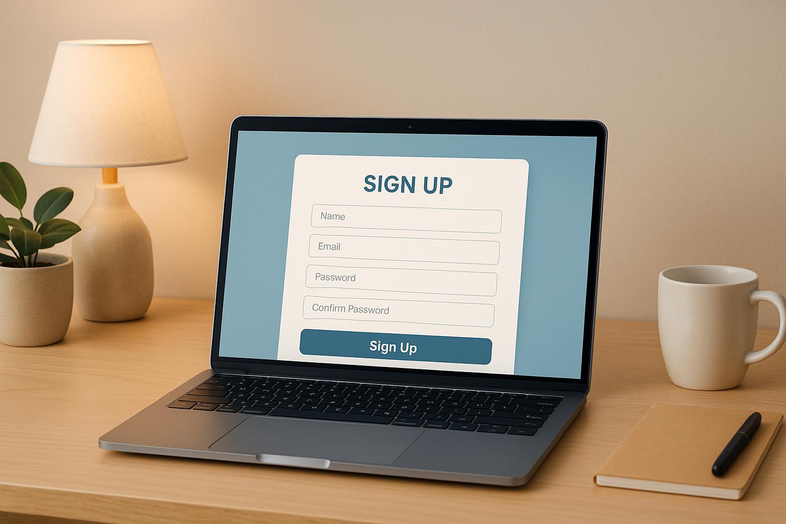
- Sign-up form: Simple, visible, and minimal fields—email only if possible.
- Call to action (CTA): Use action words like "Join Now" or "Get Insights."
- Social proof: Testimonials, subscriber counts, or logos to build trust.
- Mobile-friendly design: Ensure the page looks good on smartphones and tablets.
Good design helps visitors focus on signing up without confusion or extra steps.
Newsletter Landing Page Conversion Benchmarks
Here’s how top-performing newsletter landing pages stack up in 2025:
- Newsletter Subscription Pages: Average conversions of 10–20%, with top performers reaching 30–40%.
- Overall Landing Page Benchmark: General average hovers around 6%, while optimized pages often achieve over 10%.
- Segment Variability by Industry: SaaS pages tend to convert between 3.8% (median) and higher (e.g., Legal tops at 12.3%).
- Email-Driven Conversions: Pages driven by email traffic can see conversion rates as high as 10.3%, reflecting the value of engaging warmer audiences.
Why these numbers matter: These conversions provide context—if your page is converting below 10%, you may improve sign-up copy, CTA placement, or trust signals. Anything over 30% marks elite performance.
Common Mistakes to Avoid
Avoid these pitfalls on your newsletter landing page:
- Too much text: Overloading visitors with information decreases sign-ups.
- Complex forms: Asking for too many details can cause visitors to drop off.
- Weak CTAs: Generic CTAs like “Submit” don’t communicate value clearly.
- Busy layout: Clutter distracts visitors from the signup goal.
- Ignoring mobile users: Many visitors use mobile devices. A poor mobile experience lowers conversions.
Automation platforms help you avoid issues like poor deliverability and list targeting, making your landing page efforts more effective.
Designing for Conversion
To turn visitors into subscribers, your landing page must capture attention quickly and guide users toward signing up. Every element should make the process simple, clear, and persuasive. Focus on strong headlines, effective call-to-actions, and clear visual paths.
Crafting Compelling Headlines
Your headline is the first thing visitors see. It should clearly explain what your newsletter offers and why it matters to your audience.
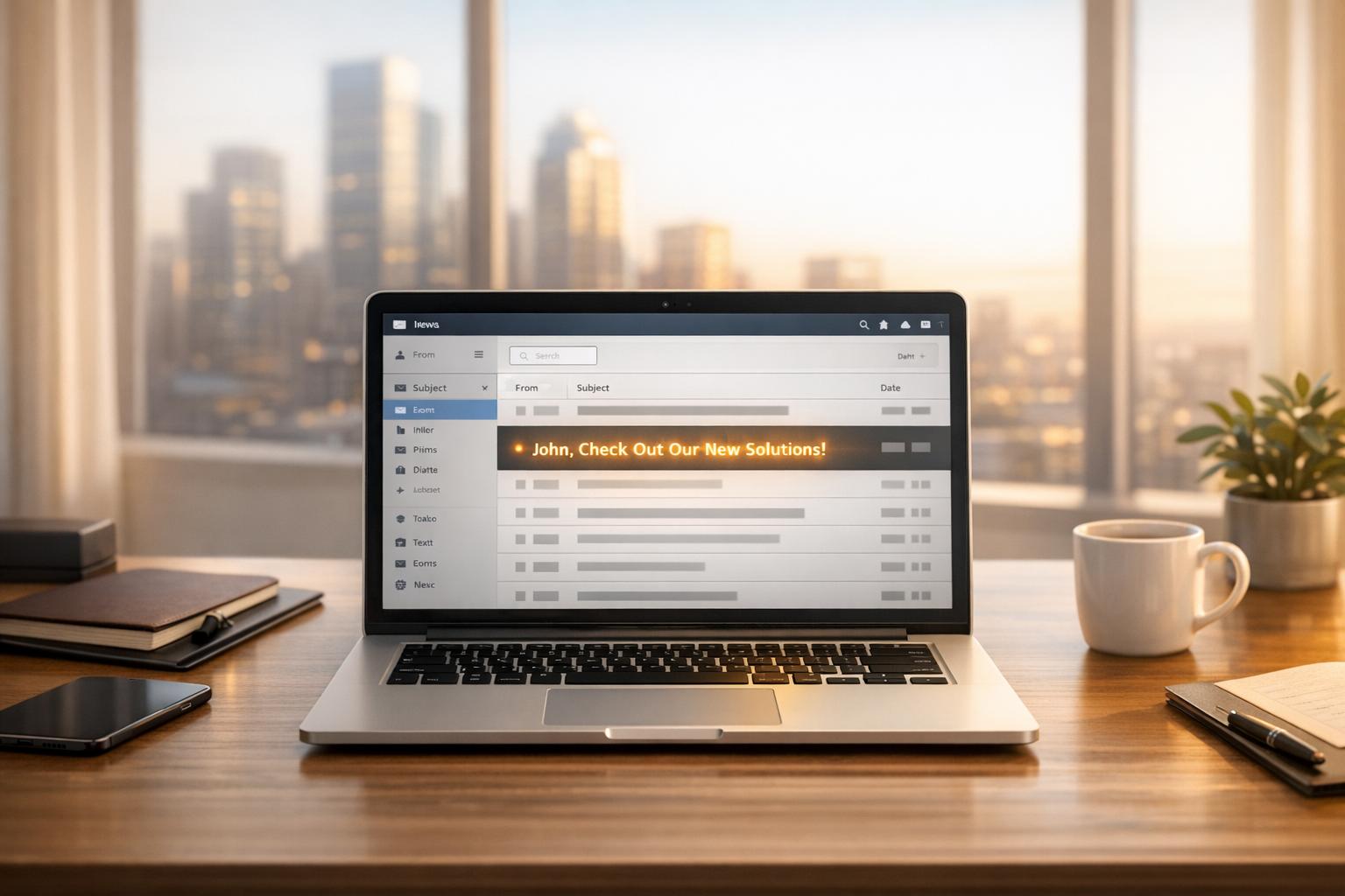
Use specific benefits like "Get B2B insights that grow your pipeline" or "Stay ahead with weekly marketing tips." Avoid vague statements. Keep headlines short—around 8 to 12 words—to hold attention.
Write 3-5 headline options, then test which drives the most sign-ups. Add a subheadline that expands on the main idea with details like frequency or the kind of content they’ll get.
Persuasive Call-to-Action Strategies
Your call-to-action (CTA) button guides people to subscribe. Use clear and action-driven language: phrases like "Join Free," "Get Instant Access," or "Start Growing Today" work well.
Pick contrasting colors that stand out on the page but fit your brand style. Make the button large enough to tap or click easily, especially on mobile.
Place CTAs above the fold and repeat once or twice down the page. Avoid multiple competing CTAs that confuse users. Test wording and button design regularly to find what works best.
Visual Hierarchy Best Practices
Visual hierarchy helps guide the eye so visitors focus on what matters most. Use size, color, and spacing to highlight key elements like your headline and CTA. Make headlines the largest text on the page. Use smaller, simpler subheaders and body text. Whitespace separates sections, keeping the page clean and easier to scan.
Limit the number of fonts and colors to 2-3 for a consistent, professional look. Use images that support your message, not distract from it.
Create a clear path: headline → benefit statement → CTA. This flow helps visitors quickly understand your offer and act. Following these design principles helps you grow your subscriber list with less guesswork.
Optimizing Forms for Maximum Sign-Ups
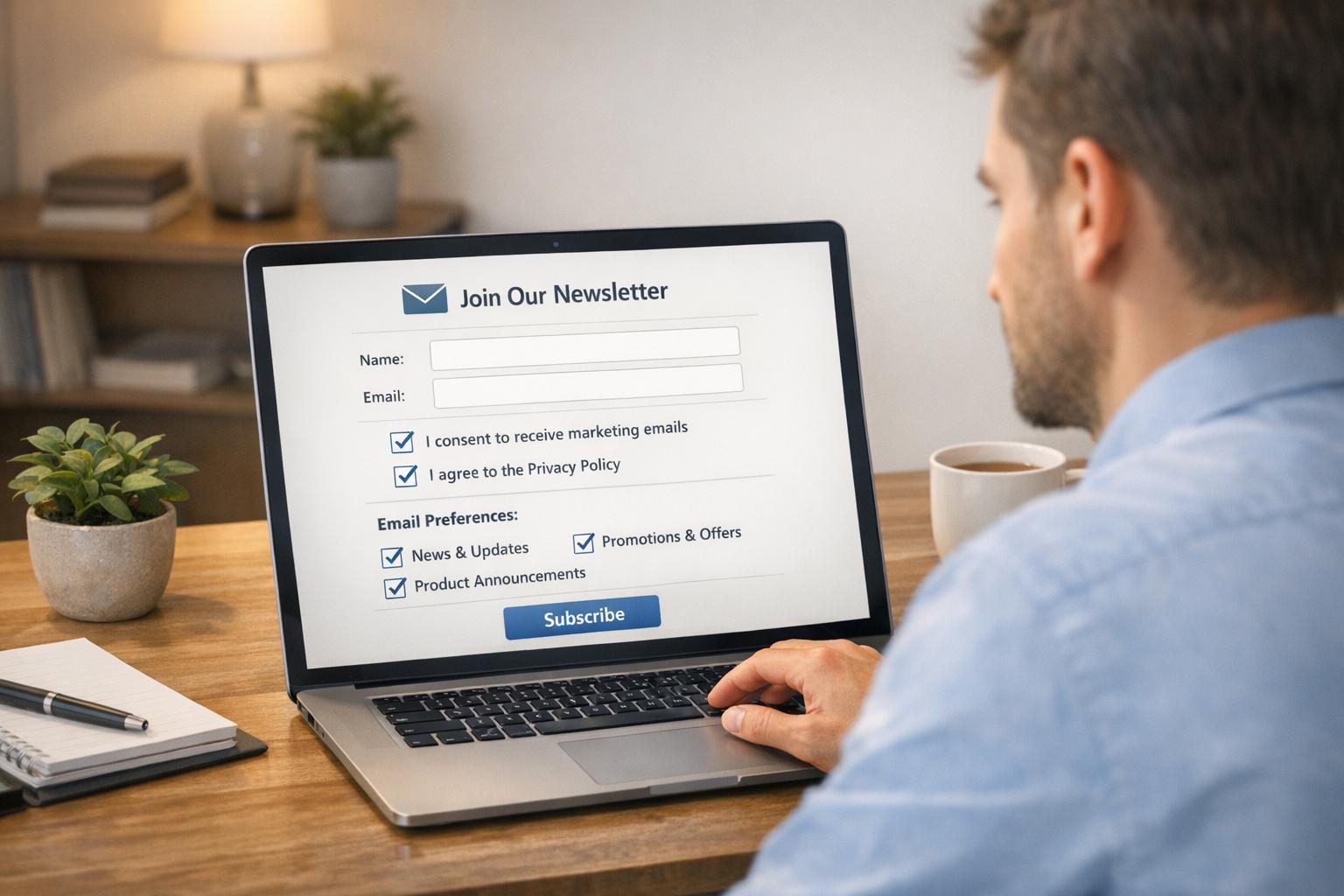
Your sign-up form is the gateway to growing your newsletter list. Simple, clear design and a focus on trust turn visitors into subscribers. Making the form easy to use on phones and minimizing fields can boost the number of people who complete it.
Minimizing Form Fields
Keep your form short and only ask for what you need. Each extra field can reduce sign-ups by up to 20%. For B2B newsletters, an email address and first name are usually enough. Don’t ask for phone numbers or detailed job titles at the start.
Collect more info later through follow-up emails. A shorter form loads faster and feels less intimidating. You’ll get more subscribers, and your data quality improves because people don’t rush through complex forms.
Ensuring Mobile Responsiveness
Most users sign up on mobile devices, so your form must work well on small screens. Use large buttons and inputs that are easy to tap. Avoid side-by-side fields that don’t fit well on narrow displays.
Test your form on different phones and tablets to check loading speed and readability. A mobile-friendly form increases completed sign-ups and reduces frustration. Teams often see better results after switching to responsive layouts.
Encouraging Trust and Security
Show visitors that their data is safe. Use clear language about privacy, like “We never share your email.” Add trust signals such as a simple lock icon or a link to your privacy policy to reassure subscribers.
Add a brief note about your email frequency, so people know what to expect. Trust increases the chance visitors won’t bounce after seeing the form. A message like “Join 5,000 marketers who get our newsletter weekly” adds social proof without sounding pushy.
Personalization and Segmentation Techniques
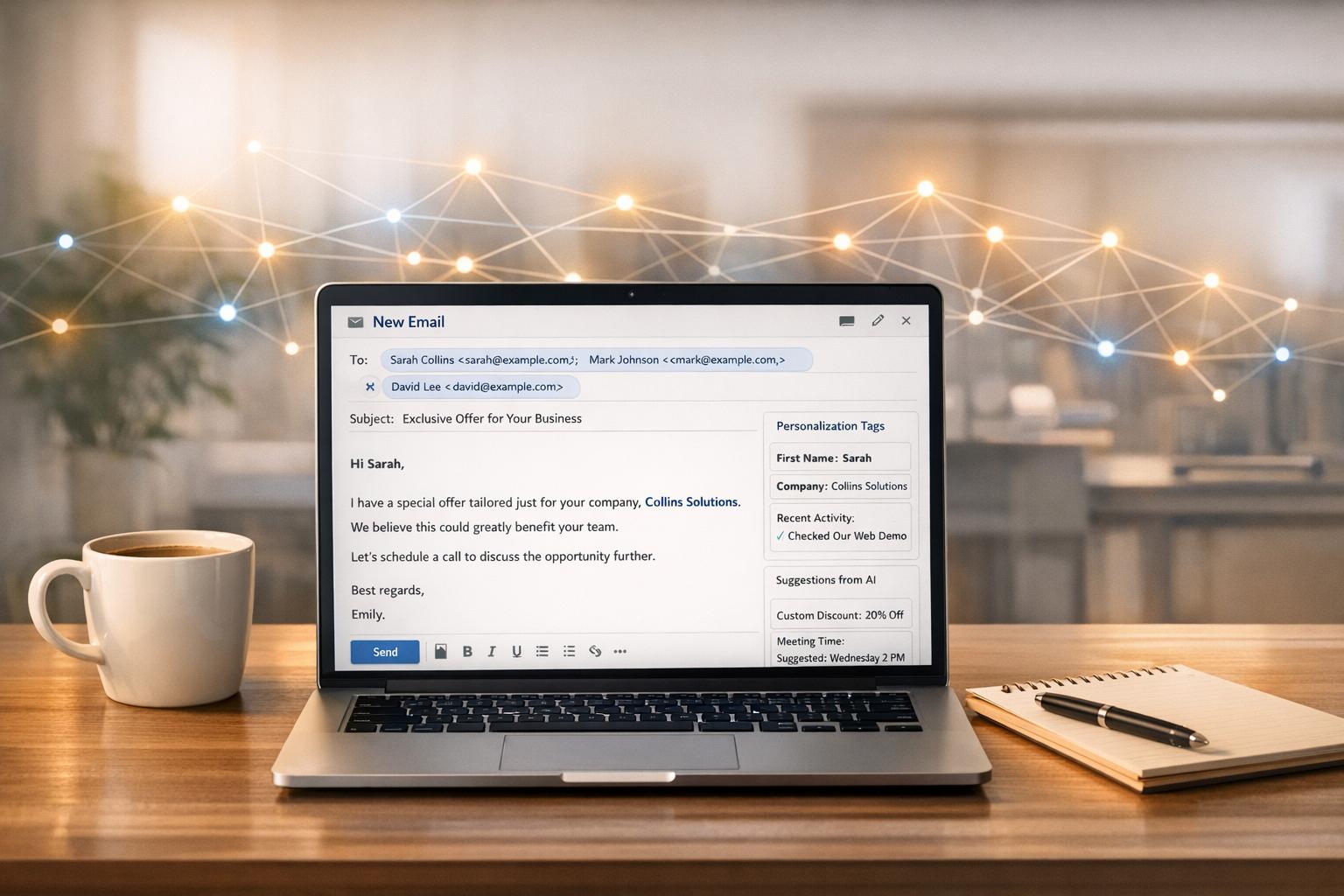
Personalization helps you connect with your readers by tailoring content to their interests. Segmentation divides your audience into groups based on specific traits. These tactics improve engagement and grow your subscriber base more effectively.
Using Dynamic Content
Dynamic content shows different messages to different subscribers on the same landing page. For example, display industry-specific case studies or offers based on the visitor’s job title or company size. This keeps your newsletter relevant and increases the chances someone will sign up.
Set up simple rules to change headlines or images depending on data collected in your signup form or previous interactions. This adjustment can boost conversions by making visitors feel like the content was made for them.
Automation tools can streamline this process so you can focus on improving your message while the system handles the details.
Targeting Audience Segments
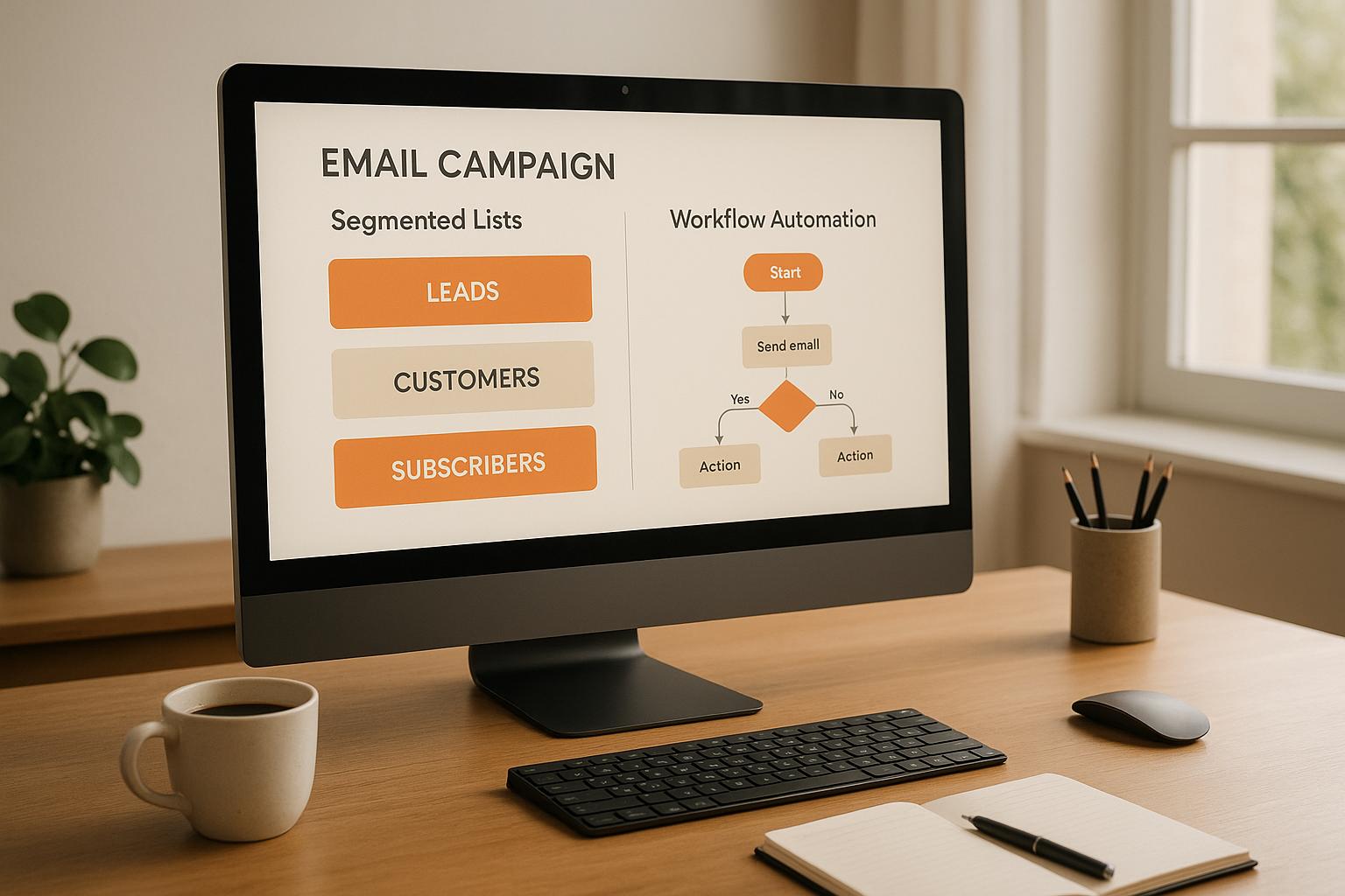
Segmenting means grouping your potential subscribers using criteria like sector, role, or behavior. Targeting these groups with tailored messaging makes your newsletter more appealing.
Collect basic info on your landing page, such as company type or job function. Then, create versions of your signup pitch for each segment. For instance, consultants might see how your newsletter helps generate leads, while SaaS teams get a focus on product growth insights.
Track segment-specific results to see which messages work best. This targeted approach saves time and marketing dollars by focusing on the leads that fit your ideal customer profile.
Some growth platforms support this by filtering and delivering B2B subscribers who match your segments efficiently.
Testing and Analytics for Ongoing Improvement
To keep your newsletter landing page performing well, test different ideas and track the right data. Paying attention to what works helps you make smart changes that grow your subscriber list faster.
A/B Testing Landing Page Elements
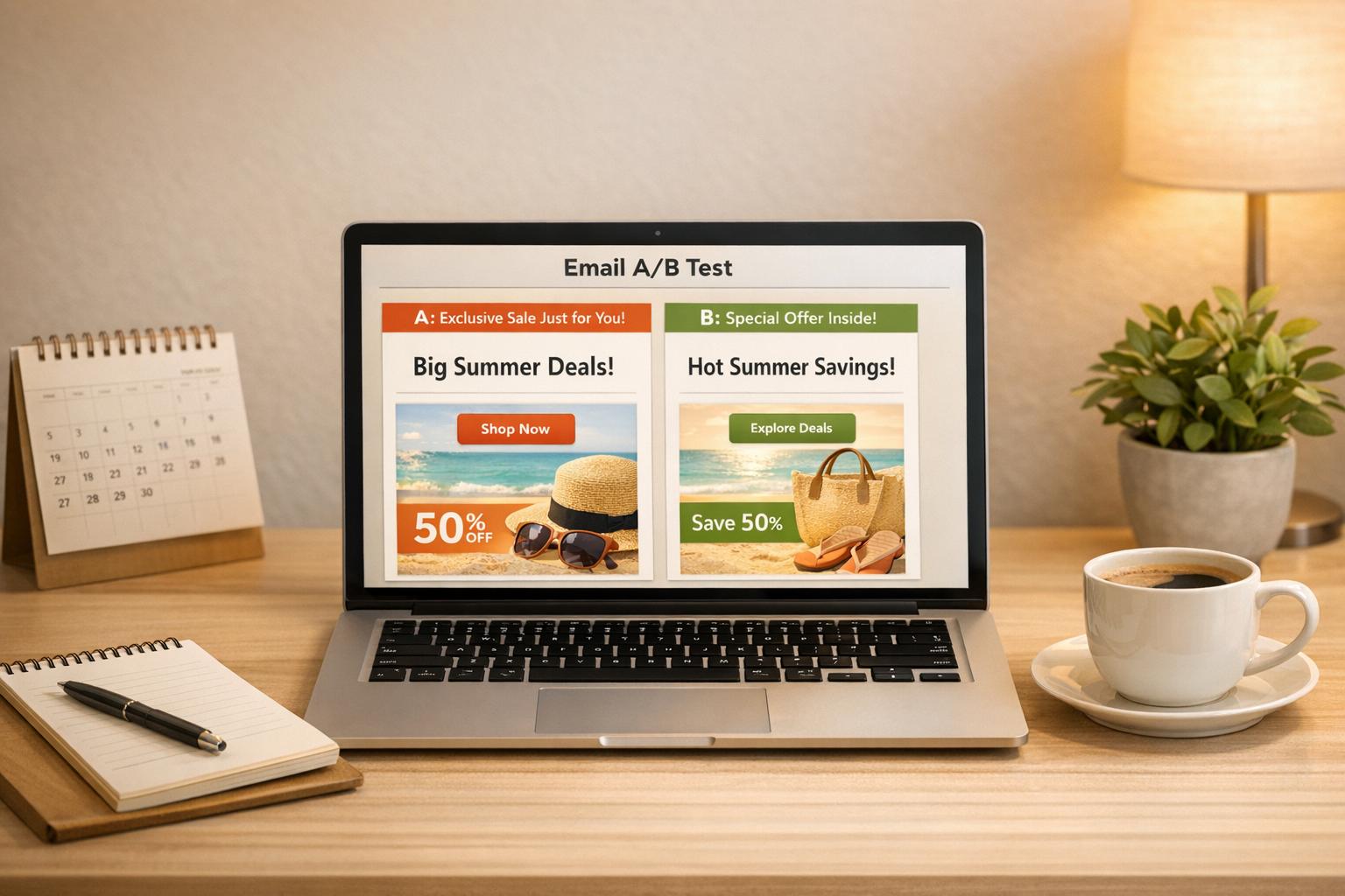
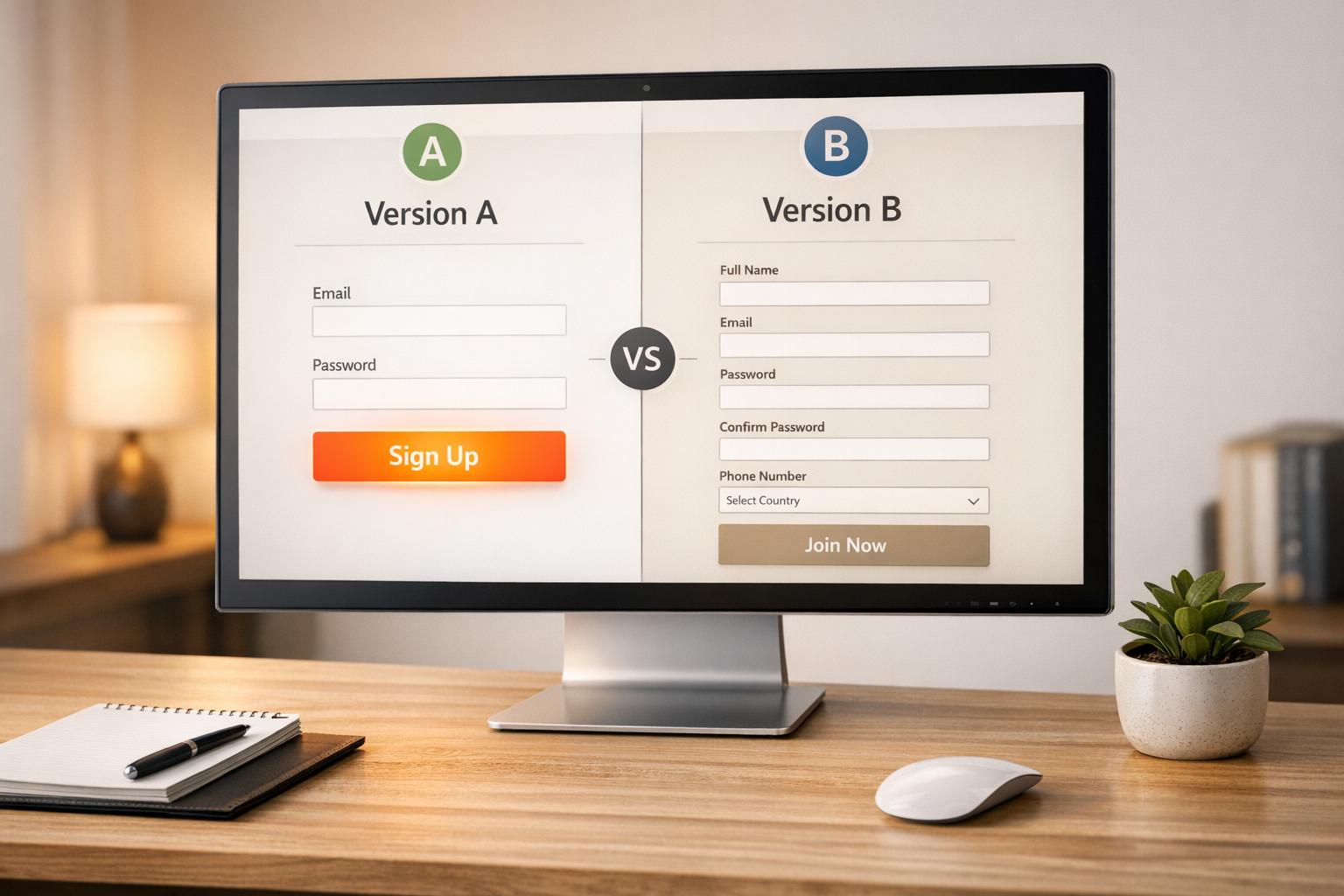
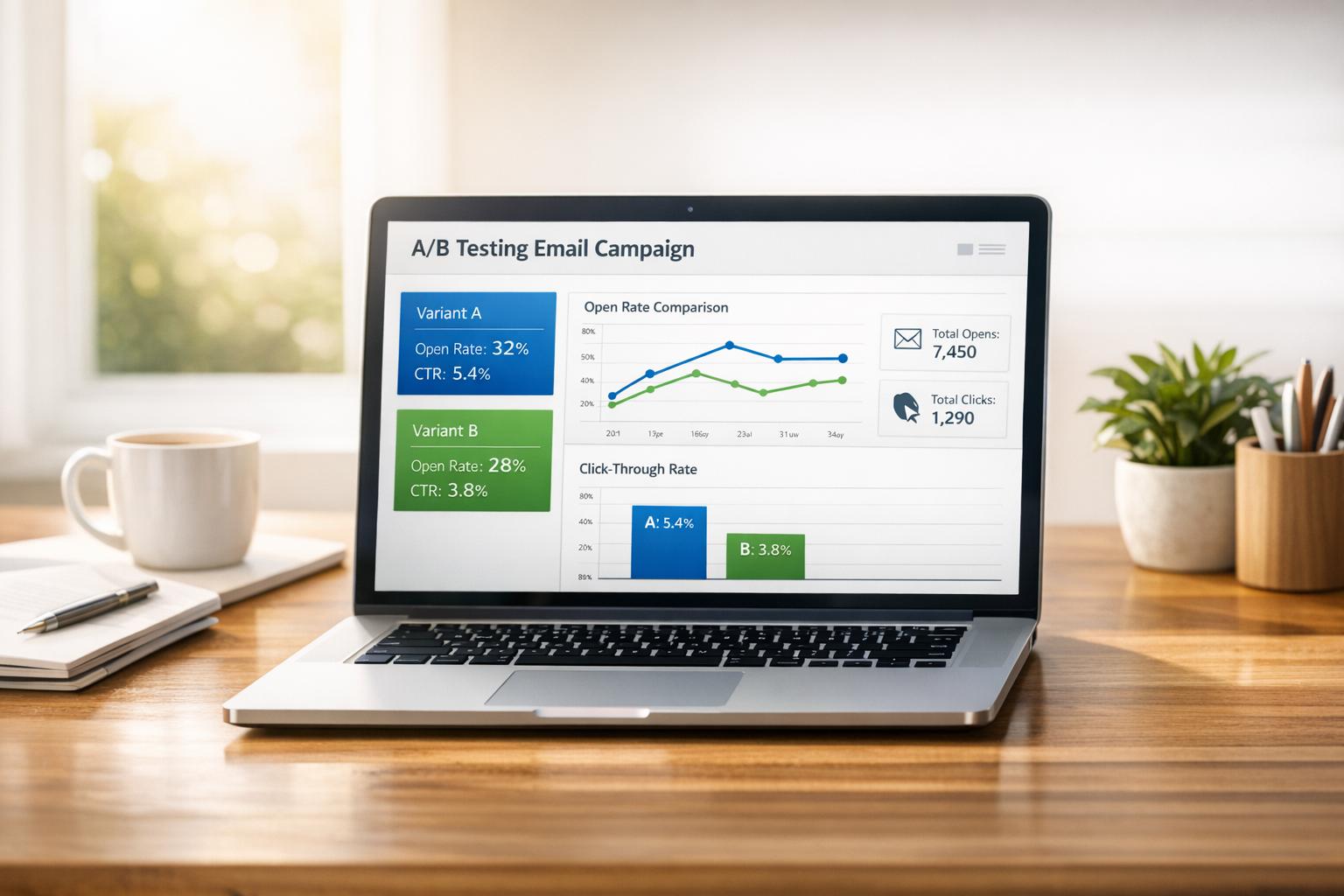
A/B testing means trying two versions of a landing page element to see which drives more subscriptions. Test headlines, call-to-action buttons, images, or even the form layout.
For example, test button colors or wording like “Subscribe Now” versus “Join Our Newsletter.” Small changes like this can improve your conversion rate by up to 20%. Run tests long enough to gather enough data—usually a couple of hundred visitors per variation.
Use tools that integrate with your platform to make testing easier and automated. Keep tests focused—test one element at a time to know exactly what changes impact subscriber behavior.
Monitoring Conversion Metrics
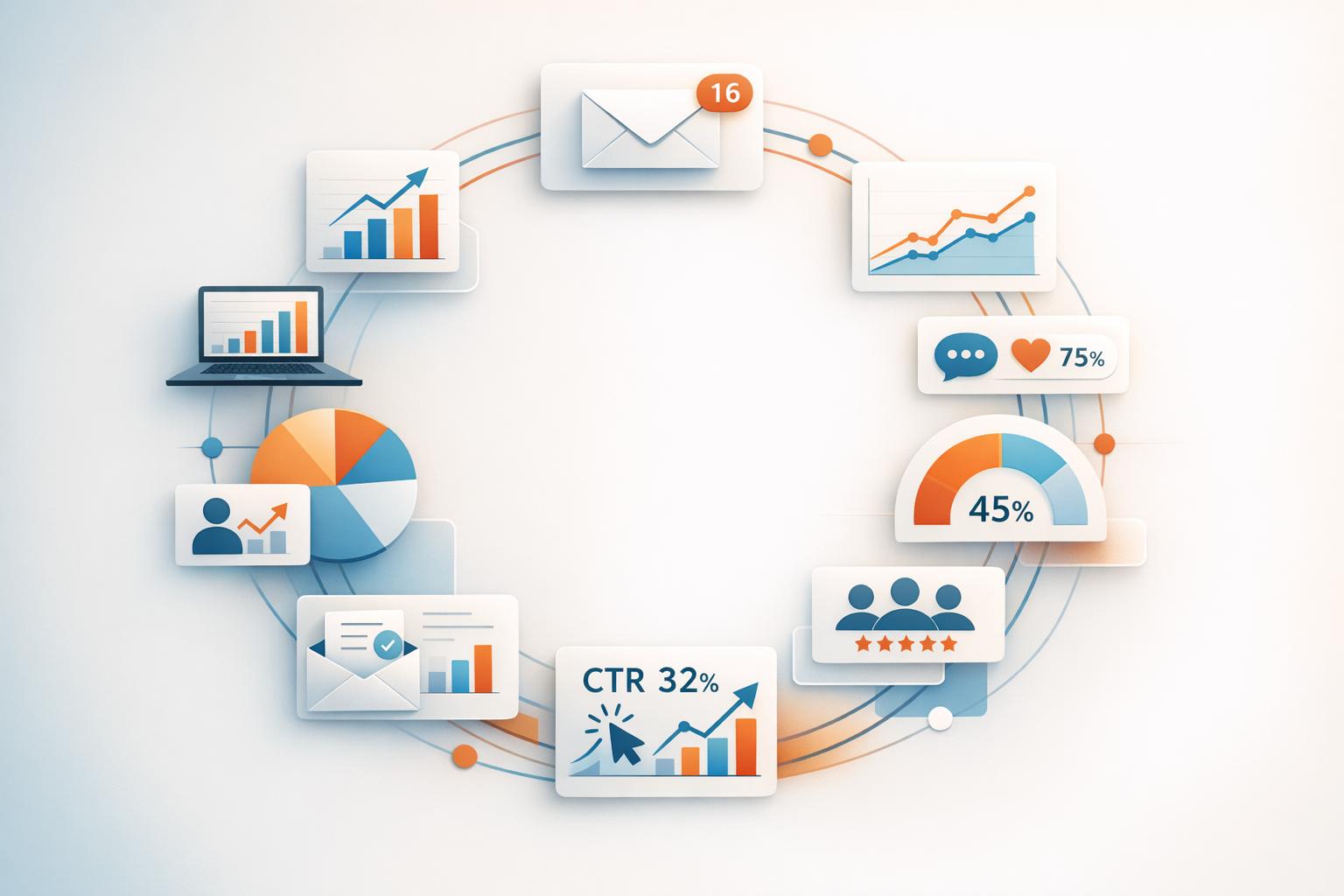
Track the key numbers that show how well your landing page turns visitors into subscribers. Focus on:
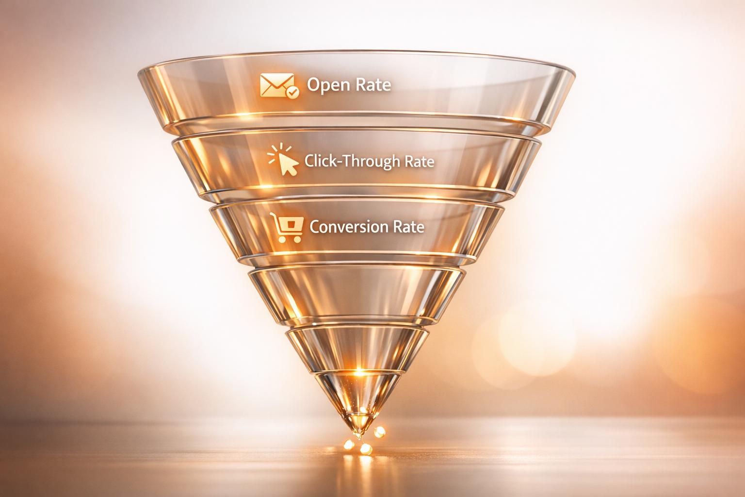
- Conversion Rate: The percentage of visitors who sign up.
- Bounce Rate: How many leave without interacting.
- Time on Page: Whether people spend enough time reading your offer.
- Click-Through Rate: If you have secondary links or CTAs.
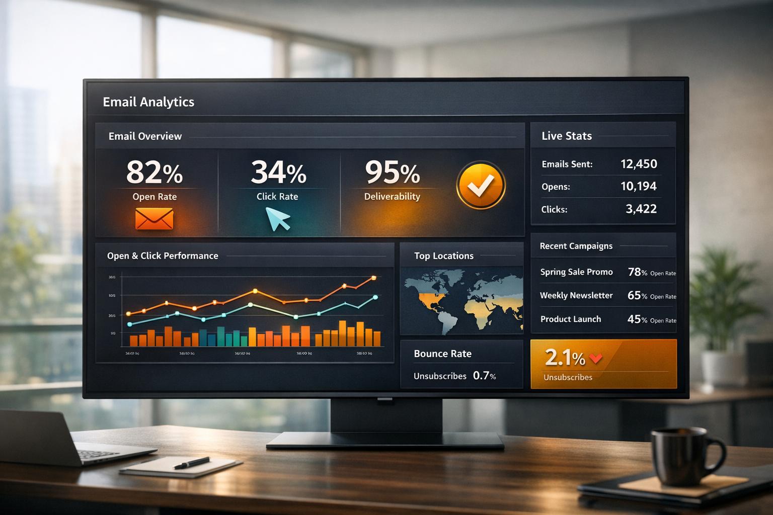
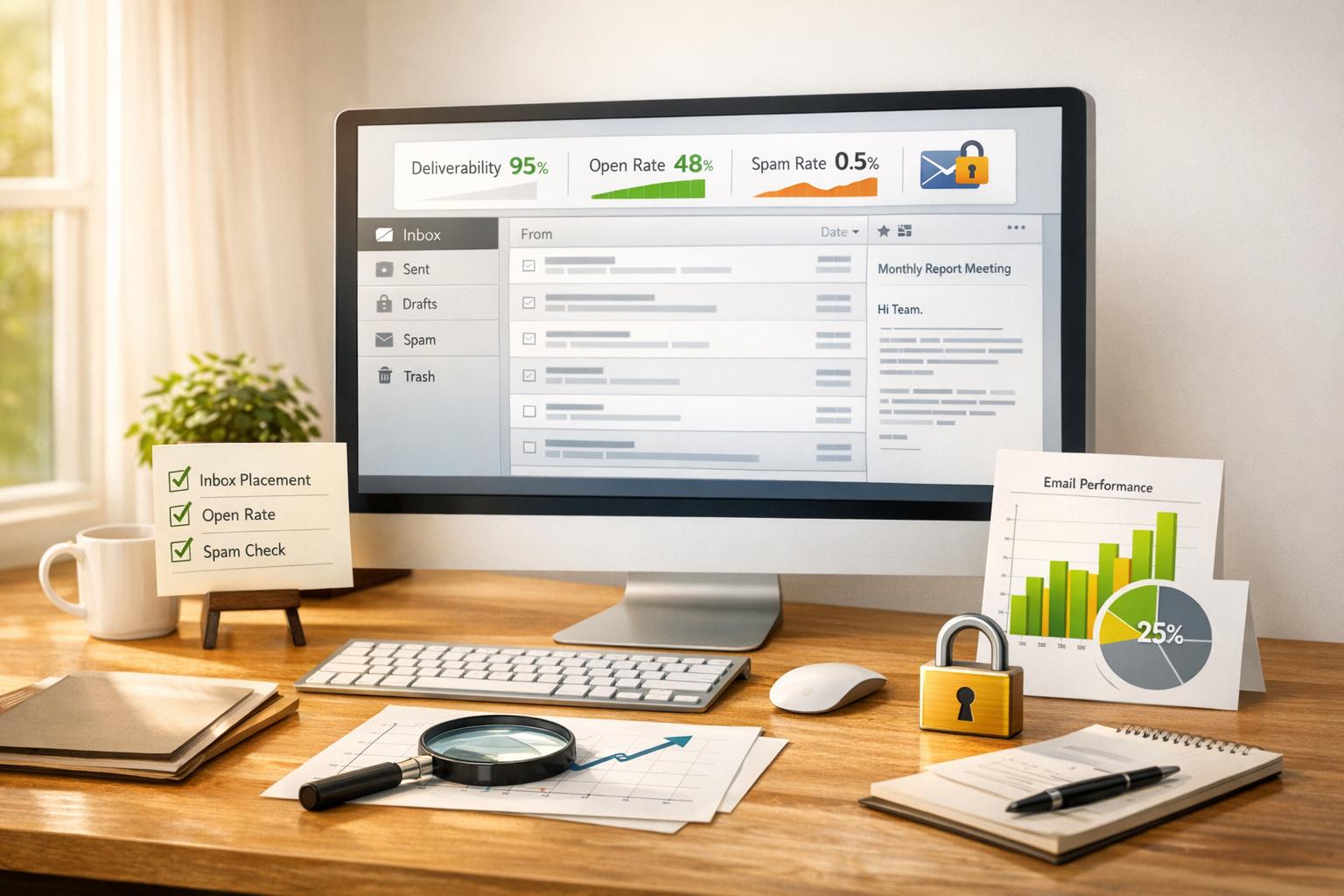
Use analytics tools to monitor these metrics daily or weekly. Look for patterns like which traffic sources convert best or where users drop off. For B2B growth, focus on attracting the right subscribers, not just higher numbers.
Some platforms automate list growth and track subscriber quality, so you don’t waste time on leads that don’t engage.
Iterative Optimization Strategies
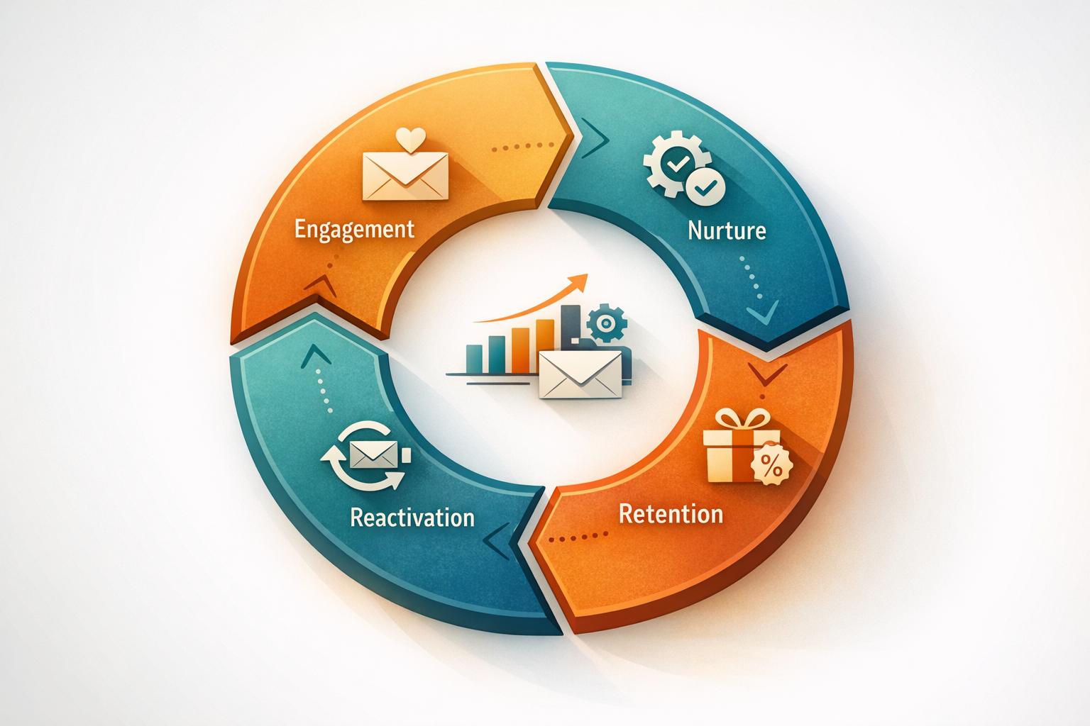
Optimization is an ongoing process. Use insights from your tests and metrics to make gradual improvements. Fix the biggest issues first, like low conversion or poor mobile experience.
Prioritize fix ideas, such as:
- Simplifying the signup form
- Changing headline copy for clarity
- Adding social proof or testimonials
Improve with small steps, test again, and repeat. This cycle helps you adapt to changes in your audience’s behavior or market trends.
Turn Your Landing Page Into a Subscriber Magnet
Optimizing your newsletter landing page is one of the highest-leverage moves you can make for subscriber growth. By applying proven design principles, testing variations, and tracking benchmarks, you’ll create a streamlined experience that converts visitors into loyal readers.
Every improvement—from a sharper headline to a simplified form—compounds over time, driving more qualified sign-ups with less effort. Breaker helps teams scale this process by automating list growth and ensuring every subscriber is validated and engaged.
Ready to boost your newsletter conversions? Explore how it supports high-performing landing pages and predictable list growth — schedule a demo today.
Frequently Asked Questions
Improving your newsletter landing page means focusing on clear design, strong calls to action, and easy sign-up processes. Tracking performance and testing changes helps you find what works best to boost subscriber numbers and engagement.
What are the best practices for designing a high-converting newsletter landing page?
Keep your page simple and focused. Use a clear headline that explains the value of your newsletter. Include a prominent sign-up form above the fold. Add trust signals like testimonials or subscriber counts. Make sure your call to action (CTA) stands out with contrasting colors.
Mobile-friendly design is essential. Fast loading times improve user experience and lower bounce rates. Use short, benefit-focused copy to explain why readers should subscribe.
How can I test and improve the performance of my newsletter sign-up page?
Analyze your current sign-up rates and user behavior using tools like heatmaps or session recordings. Look for points where users drop off.
Test different headlines, CTA text, button colors, and form lengths. Monitor changes in conversion rates to see what drives more sign-ups. Regularly update your content and design based on this data.
What are some effective techniques for A/B testing a newsletter landing page?
Split your traffic evenly between two versions of your page. Change one element at a time, such as the headline or sign-up form placement.
Measure which version gets more sign-ups or engagement. Continue testing small changes to keep improving. Use statistical significance to know when results are reliable.
Can you provide a checklist to ensure my newsletter landing page is optimized for user engagement?
- Clear and concise headline
- Strong, visible CTA button
- Simple sign-up form with minimal fields
- Mobile-responsive design
- Fast page load speed
- Social proof, like testimonials or subscriber numbers
- Privacy reassurance near the sign-up form
- Use of contrasting colors to highlight important elements
Which tools can help me analyze and enhance my newsletter landing page's effectiveness?
Use analytics platforms to track visitor behavior and conversion rates. Heatmaps show where users click and scroll. Session recordings let you observe user interactions. Breaker offers integrated solutions to manage your list growth and improve targeting without extra effort.
What are the key metrics to track when assessing the success of a newsletter landing page?
Track your conversion rate to see how many visitors become subscribers. Watch bounce rate and time on page to measure engagement. Check open rates and click rates after sign-up to gauge subscriber quality. Monitor growth in list size and cost per new subscriber for ROI.


