Newsletter Template for Gmail: A Step-by-Step Guide
You’ve probably been here before. You need to send a polished newsletter this week, not after a month of evaluating email platforms, migrating contacts, and rebuilding your workflow. Maybe you’re a consultant nurturing warm leads, a startup marketer shipping product updates, or a sales team trying to stay visible without sounding like a mass blast.
In that situation, Gmail is more useful than is often assumed.
A good newsletter template for gmail gives you a low-friction way to test ideas, send branded updates, and build a repeatable habit before you commit to a heavier system. The trick is knowing which Gmail methods are good enough, which workarounds are worth the effort, and where the cracks start to show.
Why Start Your Newsletter in Gmail
Monday morning, the update needs to go out by noon, and nobody has time to spend two weeks comparing email platforms. In that situation, Gmail is a practical starting point.
I have seen early B2B newsletter efforts stall for a simple reason. The team treats tool selection like a strategy project, then misses the actual send. Gmail lowers that barrier because the account, inbox, and daily workflow are already in place. You can get the first issue out, learn what people respond to, and decide later whether the program deserves more infrastructure.
Google made Gmail more usable for this job when Workspace added newsletter layouts and Multi-Send. Zapier’s walkthrough of Gmail newsletter layouts explains how those features let Workspace users build a more structured email inside Gmail and add basic personalization with fields like @firstname and @lastname. That changed the equation. Before that, sending a newsletter through Gmail usually meant settling for plain text or wrestling with clumsy formatting.
The appeal is not sophistication. It is speed, proximity, and proof.
Gmail works well at the stage where you are still testing message market fit:
- Low setup cost. No new platform to buy, configure, or train the team on.
- Replies stay visible. Newsletter responses land in the same inbox your team already monitors, which makes it easier to spot objections, questions, and buying signals.
- The format stays honest. If the newsletter only works when it has heavy design and automation behind it, the core idea may not be strong yet.
That last point gets missed in a lot of technical guides. A scrappy Gmail send is useful because it forces clarity. Can you write a subject line that earns the open? Can you deliver one idea worth reading? Can you turn replies into conversations? Those are the signals that matter before you spend time comparing email newsletter template examples for different goals or setting up a dedicated system.
There are limits, and they show up fast once the newsletter starts working. Gmail is fine for founder updates, small nurture lists, product notes, and early customer education. It gets awkward when you need deeper segmentation, reporting, approval workflows, A/B testing, or a sending setup built for consistent growth.
Use Gmail to prove the newsletter deserves a bigger home. Upgrade when the manual work starts costing more than the tool would.
Building Your First Gmail Newsletter Template
A first Gmail newsletter usually breaks in one of two ways. The copy is fine, but the format turns messy after one edit too many. Or the email looks polished, but it takes so much manual work that no one wants to send the next issue.
The fix is to choose the right starting format for the stage you are in, then keep the template simpler than you think it should be.
Use Gmail Templates for repeatable text-first sends
Start with Gmail’s saved templates if your newsletter is mostly insight, links, and one clear ask. This option is the most forgiving. It is fast to build, hard to break, and easy for another teammate to reuse without introducing weird spacing or image issues.
The workflow is simple:
- Open Compose and draft the email like a normal message.
- short intro
- one main insight
- two or three linked resources
- one CTA
- plain signature
- Save it through Gmail’s template menu.
- Reuse the template and replace the content for each send.
- Subject: Weekly product growth notes
- Opening: one short paragraph on what changed this week
- Middle: three bullets linking to a launch, customer lesson, or market observation
- CTA: read the post, book a demo, or reply with a question
- Logo: upload a clean brand mark
- Theme color: use one primary brand color
- Font: choose readability over style
- Footer details: add your business name and address
- Links: include the site and social links you want repeated
- Short headers
- One primary button
- Simple image blocks
- Two to four content modules
- Clear spacing
- too many colors
- oversized images
- dense multi-column sections
- long paragraphs inside boxed modules
- Header: logo plus newsletter title
- Intro block: one paragraph on the main theme
- Insight block: one takeaway with a “Read more” link
- Resource block: two links to posts, webinars, or product notes
- CTA block: one button
- Footer: contact details and unsubscribe language if your process supports it
- Headlines and subheads
- Standard fonts
- Inline images
- Simple tables
- Text links
- Basic button-style blocks made with tables
- Custom fonts
- Layered visuals
- Tight image alignment
- Decorative backgrounds
- Complex multi-column sections
- Start from one approved Docs template.
- Write short sections with clear hierarchy.
- Insert images inline, never floating.
- Stick to common fonts such as Arial or Helvetica.
- Keep the layout narrow.
- Paste into Gmail and check for spacing issues.
- Send tests to yourself on desktop and mobile.
- Review the subject line with a proven newsletter subject line framework before sending.
- Prospects from webinars
- Current customers
- Partners
- Newsletter-only subscribers
- Sales follow-up list
- greeting by first name
- referencing company or role if your workflow supports it
- tailoring the CTA by audience segment
- stuffing merge fields everywhere
- forcing fake familiarity
- adding variables you haven’t cleaned properly
- Build the template.
- Clean the contact source.
- Segment the list.
- Add only the merge fields you trust.
- Send a preview to yourself.
- Then send to the segment.
- Wrong links: placeholder links survive drafts more often than people think.
- Wrong audience: someone sends a customer newsletter to prospects.
- Untested mobile rendering: desktop looked fine, mobile looks broken.
- Subject line: state the topic in plain language.
- Opening line: support the subject with context or value, so the preview text earns the open.
- Primary CTA: give the email one main action.
- Body structure: use short sections, meaningful subheads, and links that explain where they go.
- desktop inbox
- Gmail mobile app
- dark mode if your audience uses it
- forwarded view, if the email is likely to be shared internally
- Manual list handling: segmentation and hygiene become repetitive and error-prone.
- Thin analytics: you can’t build a serious optimization loop without reliable performance data.
- Weak automation: recurring nurture, branching journeys, and testing stay clumsy.
- Scaling risk: the more you send, the more brittle the workflow becomes.
This format works because it behaves like a real email. That matters more than design early on. Text-first newsletters are easier to edit, easier to approve, and less likely to render differently when multiple people touch the draft.
A solid B2B version looks like this:
If replies are part of the goal, this is usually the better choice. It feels personal enough to start conversations, which is often more valuable than a prettier layout.
Use Gmail Layouts when presentation matters more
Gmail’s built-in layouts are useful when the email needs more structure. Product roundups, event invites, founder updates with images, and partner announcements all tend to benefit from clearer visual hierarchy.
Open Compose, then click Select a layout at the bottom of the draft window. Pick the layout that matches the amount of content you have, not the one that looks most impressive in the picker. Short announcements need very little structure. A weekly digest can support a few distinct blocks.
Then set the basics once:
Restraint matters here. Gmail layouts hold up best with light branding, short copy, and one obvious action.
What to change and what to leave alone
Inside the layout editor, Gmail gives you buttons, images, dividers, content blocks, and theme controls. Use those tools for hierarchy, not decoration.
What usually works well:
What usually causes trouble:
That trade-off is worth being honest about. Gmail can produce a respectable newsletter, but it does not give you much room for precision. If the template depends on exact spacing, layered design, or strict brand rules, editors will spend more time fixing layout drift than improving the message.
If you want ideas before building from scratch, review email newsletter templates built for different newsletter goals, then simplify what you like for Gmail’s limits.
A short visual walkthrough helps if you haven’t used the layout editor before:
A practical template you can reuse
For a weekly B2B newsletter, this structure is reliable:
Keep one primary action per send. If the email asks readers to read a post, book a demo, watch a webinar, and share feedback, response rates usually drop because the priority is unclear.
This is also the point where teams start to see the line between a scrappy system and a scalable one. Gmail templates are good at repeatability. They are less good at protecting brand consistency across editors, enforcing process, or keeping the format stable as the newsletter grows. That is fine for a first version. It becomes expensive once the newsletter turns into a real channel.
Advanced Styling with Google Docs and HTML Imports
A Gmail template usually looks fine until someone asks for tighter branding, cleaner spacing, or a layout that does more than stack text and links. That is where the simple copy and paste workflow starts to earn its keep.
Use Google Docs to get better formatting without leaving Gmail
Google Docs is the fastest upgrade path for teams that want more control but are not ready to buy and learn an email platform yet. I have used this method with lean B2B teams that needed a newsletter out this week, not after a tool rollout and approval cycle.
Open docs.google.com, go to the Template Gallery, and start with a newsletter template like Geometric, Lively, or Plum. Replace the placeholder content, add your logo, tighten the copy, then paste the finished layout into Gmail.
The trade-off is simple. Google Docs gives you better drafting and better visual control than Gmail, but Gmail still decides how the final email renders.
What usually survives the paste
The safest designs are plain on purpose. If the newsletter looks clean and restrained in Docs, it usually holds together in Gmail.
These elements tend to transfer well:
These elements are where problems start:
I treat Google Docs as a formatting tool, not a design system. That mindset prevents a lot of frustration.
A workflow that holds up under real use
Use one Docs file as your master template and protect it from random edits. Duplicate it for each send. That keeps spacing, link treatment, and section order consistent even when multiple people touch the newsletter.
A reliable process looks like this:
One practical rule helps here. If a block takes effort to keep aligned in Docs, it will probably be harder to keep stable in Gmail.
HTML imports can help, but they add fragility
Some teams push further and build the email in Stripo, Beefree, or another HTML editor, then try to move that design into Gmail. This can produce a sharper result, especially if brand guidelines matter, but it also creates more failure points.
Gmail strips or ignores a lot of modern HTML and CSS. Web-style layouts, fancy spacing rules, background treatments, and interactive elements often degrade fast. A design that looks polished in the builder can look uneven once it lands in the Gmail composer or in the recipient's inbox.
Here is the practical comparison:
| Approach | Good for | Main risk |
|---|---|---|
| Google Docs copy-paste | Faster branded sends | Minor styling drift |
| Third-party HTML builder | Tighter visual branding | Rendering inconsistencies |
| Direct custom HTML hacks | One-off experiments | Hard maintenance |
HTML imports make sense when the team has a clear brand requirement and someone who can test every send carefully. For an early newsletter program, that overhead is usually hard to justify.
Google Docs is the better middle ground. It gives you a more polished newsletter template for gmail, keeps the workflow lightweight, and makes the trade-off visible. Once preserving design, approvals, and rendering consistency starts taking more time than writing the newsletter itself, Gmail has done its job and it is time to move up to a dedicated platform.
Personalizing and Sending Your Gmail Newsletter
A clean template is only half the job. If every recipient gets the same generic blast, the email will feel disposable.
The simplest improvement is personalization. Gmail supports mail merge fields such as @firstname, @lastname, @fullname, and @email when you send through the right workflow. That gives you just enough flexibility to make a newsletter feel addressed to a real person, not sprayed at a list.
Set up segmentation before you write
Most Gmail newsletter problems start before the send. The contact list is messy, the labels are vague, and nobody knows which audience should get which message.
Use Google Contacts labels to separate groups before drafting anything. Keep the segments obvious and operational. Examples:
A good product update for customers usually makes a weak top-of-funnel newsletter for prospects.
Add personalization without overdoing it
If you’re using Gmail’s mail merge flow, insert merge tags naturally in the email body. A first line like “Hi @firstname,” is enough. You don’t need to personalize every sentence.
Good uses of personalization:
Bad uses:
A broken merge tag is worse than no personalization. Review the data before you send.
Use lightweight sending tools carefully
Many teams pair Gmail with lightweight tools such as YAMM or GMass for sending and tracking workflows. That can be useful when you need more control than native Gmail gives you, especially for recurring sends and basic mail merge operations.
The key is restraint. If your setup involves multiple add-ons, manual exports, copied HTML, and spreadsheet gymnastics every week, the process is already trying to tell you something.
A better pattern is:
For subject lines, keep them specific and readable. If you want ideas that fit newsletter sends rather than hype-heavy promos, this roundup of newsletter subject line approaches is useful for sharpening your send before it goes out.
Personalization should make an email feel relevant, not automated. If the data is messy, simplify the send instead of pretending the workflow is smarter than it is.
Avoid the easiest sending mistakes
Three mistakes show up constantly in Gmail newsletter sends:
The fix is boring but effective. Always send a preview. Always click every link. Always open the draft on your phone.
Optimizing for High Deliverability and Engagement
A Gmail newsletter usually wins or loses before anyone reads the second paragraph. The email has to land in the inbox, look credible at a glance, and make the next click obvious.
That is a different job than drafting good content in a doc.
Subject lines do more work in Gmail because you have fewer controls than you would in a dedicated email platform. No advanced send-time optimization. No elaborate testing loop. The subject line and opening line carry more of the load, so keep both concrete. For a B2B send, the strongest angle is usually one of these: a clear insight, an operational update, or a useful resource tied to a real problem.
Write for inbox behavior
Inbox readers skim first and decide fast. Gmail newsletters perform better when the copy respects that behavior.
Use this pre-send standard:
If inbox placement is already inconsistent, tighten the sending setup before you keep tweaking copy. These email deliverability best practices cover the domain, list, and authentication issues that Gmail alone does not solve well.
Keep the build simple enough to survive real inboxes
Gmail handles simple email structure better than clever design. That trade-off matters. A lighter build gives you fewer rendering problems, fewer spam signals from bloated code, and fewer surprises on mobile.
| Element | Better choice in Gmail |
|---|---|
| Images | compress them before upload and keep file sizes modest |
| Fonts | stick to standard email-safe options |
| Buttons | make them easy to tap and readable without zooming |
| Links | use descriptive anchor text and test every destination |
| Layout | use clean sections instead of dense multi-column designs |
Formatting can improve click behavior when it makes the message easier to scan, as noted earlier. The practical lesson is simple. Use structure to guide attention, not to show off design range Gmail was never built to support.
Engagement comes from relevance and friction control
A clean template helps, but engagement usually rises because the message feels timely and easy to act on. That means the offer matches the segment, the CTA matches the topic, and the email does not ask the reader to decode what matters.
I use a quick gut check here. If a recipient opens the email on a phone while walking into a meeting, can they understand the point in ten seconds and take the next step in one tap? If not, the draft needs editing.
For more tactical ideas on improving opens, clicks, and response quality, this guide on email marketing tips for engagement and sales is a useful companion.
Test like the sender, not the writer
The draft in Gmail composer is not the final product. The received email is.
Send yourself a live copy and review it in the places your audience will see it:
Check spacing, image load, link styling, and CTA visibility. Then read it once without editing anything. That final pass catches the problems that hurt Gmail newsletters most often: cluttered openings, weak hierarchy, and calls to action buried too low.
When Gmail Is Not Enough The Case for a Growth Platform
Gmail is a good launchpad. It’s a weak operating system for a serious newsletter program.
The difference matters once your newsletter stops being a side project and starts carrying pipeline, brand, or customer education goals. At that point, the friction isn’t just annoying. It becomes expensive in time, consistency, and missed opportunities.
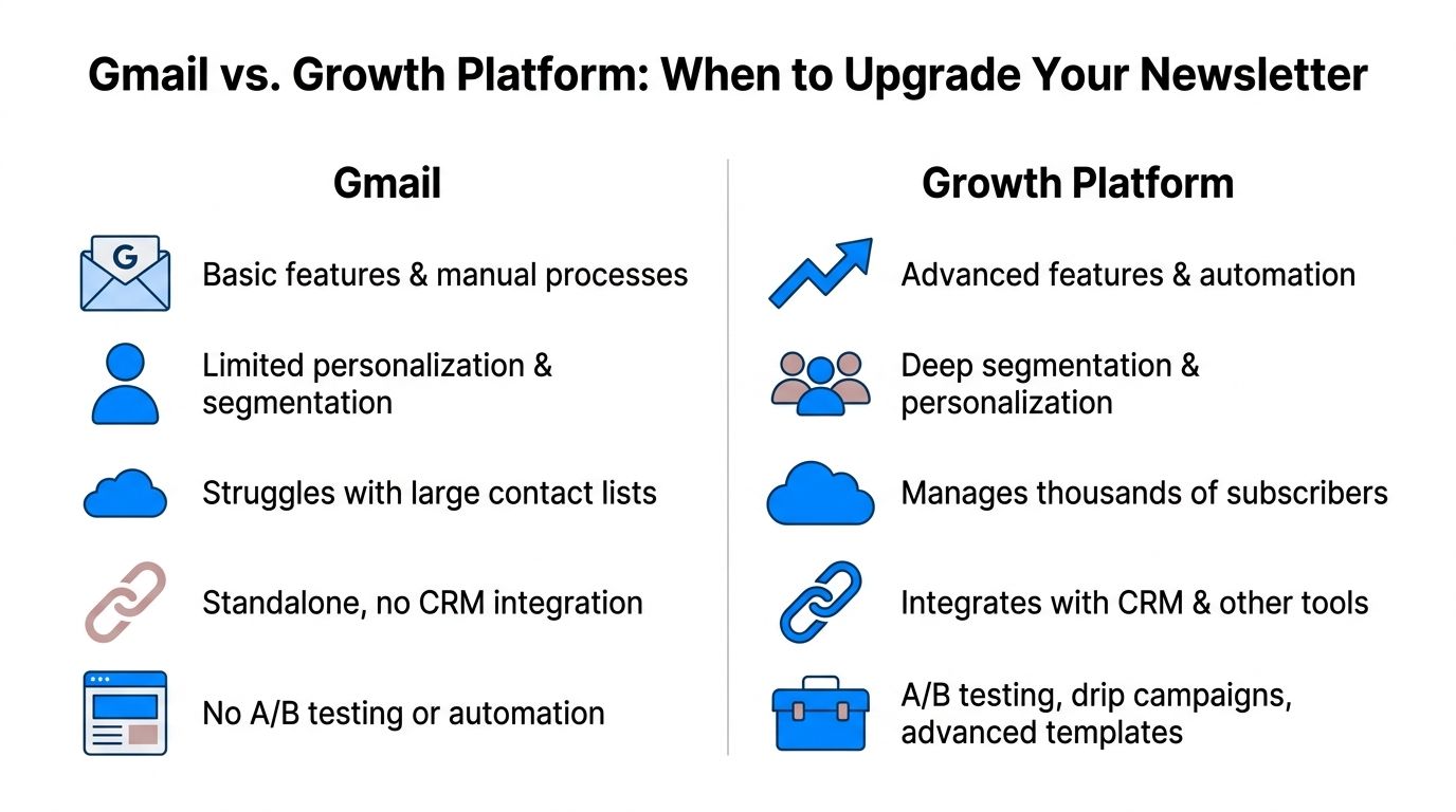
The limits show up in operations first
The earliest warning sign isn’t usually design. It’s process.
One person owns the list in Google Contacts. Another person edits the Doc. Someone else sends from Gmail. Tracking lives in spreadsheets or in an add-on dashboard. Nobody has a clean view of what worked, which segment responded, or how the list is growing.
That creates four structural problems:
Accessibility is the quiet risk most teams miss
A bigger issue sits underneath design quality. Accessibility.
A critical gap in Gmail templates is that they often fail WCAG expectations for structure and alt text handling. That matters because 25% of email opens use screen readers, according to E-shot’s accessibility analysis of newsletter templates. The same source frames this as a growing legal and operational risk, especially as accessibility enforcement tightens.
That’s not a niche concern for enterprise or regulated teams. If your newsletter is part of your customer communication, accessibility isn’t optional.
If your send process can't reliably support structure, compliance, and testing, the problem isn't your template. It's the platform choice.
A simple comparison of the trade-off
| Feature | Gmail with add-ons | Breaker Platform |
|---|---|---|
| Template creation | workable, but constrained and manual | purpose-built builder for repeatable campaigns |
| Audience segmentation | basic labels and external workarounds | deeper targeting built for B2B audiences |
| Analytics | limited and fragmented | real-time performance visibility |
| List growth | mostly manual | supports ongoing acquisition workflows |
| Deliverability management | depends on your process and tools | managed as part of the platform |
| Compliance and hygiene | easy to overlook | more operational support for scale |
If you’re evaluating what “good” looks like in the broader channel, this outside resource on email marketing tips for engagement and sales is worth reading alongside your platform decision. It complements the operational question well: sending better emails matters, but the system behind them matters just as much.
The moment to upgrade is usually obvious in hindsight. The team is copy-pasting too much, fixing the same formatting bugs every send, and making strategic decisions without clean data. That’s when Gmail stops being scrappy and starts being a bottleneck.
From Gmail Template to Growth Engine Your Next Move
Gmail is a smart place to start. It lets you ship fast, test your message, and build an early newsletter habit without adding software bloat. For many consultants, founders, and lean B2B teams, that’s exactly the right first move.
But the tool that helps you begin usually won’t be the tool that helps you scale.
Once your newsletter needs reliable analytics, cleaner segmentation, better compliance, stronger deliverability controls, and a less fragile production workflow, a patchwork Gmail setup starts costing more than it saves. That’s the transition point. Not when Gmail becomes impossible, but when it becomes inefficient.
A useful way to think about the journey is simple. Use Gmail to prove the newsletter deserves investment. Then move to a platform built to turn that newsletter into a repeatable growth channel.
If your team has outgrown manual Gmail sends and wants a newsletter system built for B2B growth, audience expansion, analytics, and deliverability, take a look at Breaker.