
Masthead for Newsletter
Master the perfect masthead for newsletter success in 2026. Learn branding, design steps, deliverability, and key metrics to boost engagement and conversions.
You've written the issue. The subject line is solid. The offer is relevant. Then you open your email builder and hit the same dead stop many encounter: the top of the newsletter is empty, and whatever you put there is going to shape how the whole send feels.
That top block matters more than is often realized. A sloppy header makes the message look disposable. A clear, disciplined masthead makes the email feel like a real publication from a real sender. In B2B, that difference affects trust fast.
A strong masthead for newsletter performance does three jobs at once. It tells readers who sent this, what kind of communication this is, and whether it looks consistent with what they signed up for. That sounds simple. Operationally, it's one of the most important pieces of your recurring email system.
What Is a Newsletter Masthead
A newsletter masthead is the branded identification block at the top of the email. It usually includes the newsletter name, logo, and supporting context such as a short descriptor, date, or issue details. It is not just a decorative banner.
In practice, the masthead is the first repeated trust signal in every issue. Readers see it before they read your lead story, before they click, and often before they decide whether the email feels legitimate. If your subject line gets the open, the masthead has to confirm they made the right choice.
A lot of teams confuse the masthead with a generic email header. They're related, but not identical. If you want the basic distinction between the two, this guide to an email header is useful context. The masthead is the publication identity layer inside that space.
Three functions matter most:
- Branding: It creates recognition across repeated sends.
- Trust: It reassures subscribers that this is the same newsletter they opted into.
- Deliverability support: It reinforces sender consistency through stable naming, structure, and presentation.
A newsletter that looks the same every time is easier for a reader to trust and easier for a team to maintain.
When marketers ask what belongs at the top of the email, the right answer isn't “something visual.” The right answer is “a repeatable identity block that makes every issue immediately recognizable.”
Why Your Masthead Is a Growth Lever
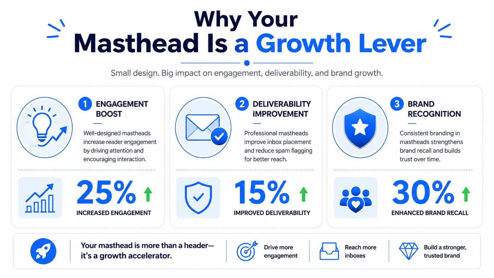
A subscriber opens your email, glances at the top, and hesitates for half a second. That pause matters. If the masthead feels unfamiliar, overly promotional, or disconnected from the sender name, the reader has to verify whether this email is legitimate before they read a word. In email, that hesitation shows up as lower engagement, faster deletes, and more complaints.
The masthead affects performance because it helps confirm identity fast. Subject lines and from-names get the open, but the masthead has to reinforce that the email matches the expectation set in the inbox. Teams that treat it as a repeatable trust signal usually get a cleaner reading experience and fewer avoidable negative reactions.
Recognition lowers friction
Recognition reduces cognitive load. If the masthead matches the sender name, visual identity, and editorial tone from prior issues, the subscriber can move straight into the content. If those signals conflict, the reader starts checking for clues.
That check is expensive. People do not always mark a confusing email as spam, but they often delete it, ignore it, or stop trusting future sends. Over time, those weak signals hurt list quality and make it harder to maintain strong engagement metrics.
This is one reason masthead decisions belong in the same conversation as strategic email marketing benefits. A stable identity system helps turn a newsletter into a habit, not a one-off send.
Consistency supports deliverability
A masthead does not control inbox placement by itself. SPF, DKIM, DMARC, sender reputation, complaint rate, and engagement history still do the heavy lifting. But the masthead supports those technical inputs by reducing confusion after the open.
Mailbox providers pay attention to how recipients interact with messages. If subscribers repeatedly open, read, click, reply, move to a folder, or save the email, those are healthy signals. If they delete without reading or report spam because the message looks off-brand, the problem is no longer just creative. It becomes a deliverability problem.
In practice, the masthead helps keep the message coherent across four layers:
- Inbox identity: from-name, subject line, and preheader set the expectation
- In-email identity: logo, publication name, and descriptor confirm it
- Editorial consistency: layout and tone signal that this issue belongs to the same series
- Operational consistency: the team can reproduce the same top block without template drift
That last point gets overlooked. When the masthead is loosely defined, different marketers rebuild it in different ways. File sizes change, alt text gets skipped, dark mode breaks the logo, and mobile spacing becomes inconsistent. Those are production issues, but they create trust issues for readers.
Weak mastheads create avoidable risk
The failure patterns are usually easy to spot.
- Brand mismatch: the masthead looks unrelated to the sender name
- Campaign styling: the top of the email feels like an ad creative instead of a publication
- Issue-to-issue drift: colors, title treatment, or spacing keep changing
- Naming conflict: the subject line promises one thing, while the masthead labels the email something else
I see this most often in B2B newsletters that borrow a corporate promo template. The email may be technically delivered, but the opening experience feels salesy and generic. That lowers trust before the first story, which is a bad trade if the goal is repeat readership.
A strong masthead does quieter work. It reduces doubt, supports recognition, and helps protect engagement signals that feed long-term deliverability. That is why it belongs in growth planning, not just design review.
Anatomy of a High-Performing Masthead
A subscriber opens your newsletter in a crowded inbox, gives it a quick scan, and decides within seconds whether it looks like a publication they trust or another campaign blast. The masthead shapes that decision fast. It sets identity, context, and publishing discipline at the top of the email, which helps protect the engagement signals inbox providers watch over time.
Core elements
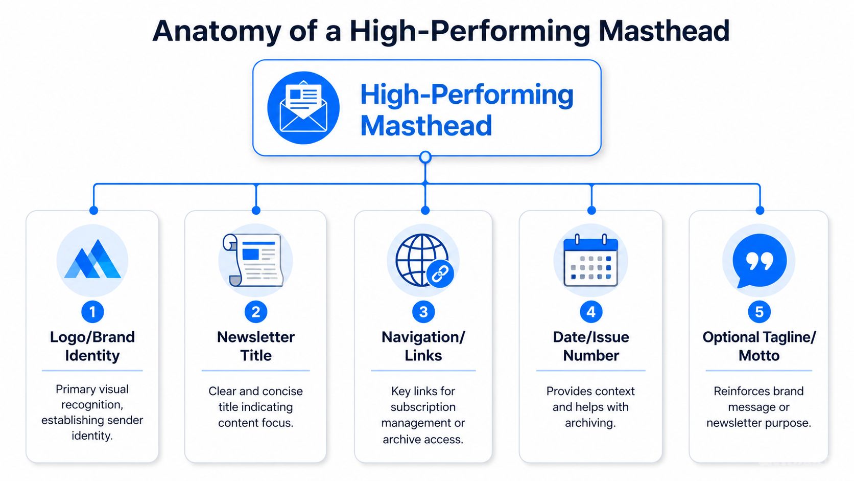
Start with three parts that should appear in every issue.
Element
What it does
What works
Logo or wordmark
Confirms sender identity
Use a clean, legible asset that still reads well on mobile
Newsletter title
Names the publication
Keep it short, specific, and easy to recognize in a forwarded email
Short descriptor
Gives context fast
State the topic, audience, or promise in a few words
These pieces need to work together. A company logo alone does not create a masthead. I see this problem often in B2B newsletters built from promo templates. The sender is clear, but the publication is not. That weakens recognition and makes the email feel disposable.
The title should carry its own weight. If the email gets forwarded to a colleague, the masthead should still explain what the publication is without relying on the subject line.
The descriptor earns its place when the title is brand-led or abstract. One short line can remove ambiguity and reduce the chance that a reader mistakes the newsletter for a one-off campaign.
Practical rule: In a two-second scan, a subscriber should be able to identify who sent the email and what kind of content follows.
The credibility layer
Once the identity is clear, add metadata that supports consistency and trust. With this, the masthead starts acting like a publishing asset instead of a decorative header.
Useful options include:
- Date: Helps with timeliness and archive scanning.
- Volume and issue number: Useful for newsletters published on a fixed editorial cadence.
- Archive or website link: Helps readers who revisit or share issues.
- Account or preference link: Supports subscriber control without crowding the body content.
Volume and issue numbers can work well for editorial newsletters, investor communications, and recurring executive briefings. Traditional newsletter guidance describes the convention as starting a new publication at Vol. 1, No. 1 and incrementing issues over time, with volume numbering tied to the publication cycle, as noted in guidance on volume and issue numbers in newsletter mastheads.
That convention is optional. The trade-off is clarity versus complexity. For a weekly analyst digest, issue numbering can strengthen continuity and make archived sends easier to reference. For a simple founder update, a date may be enough.
What to leave out
High-performing mastheads stay disciplined. Every extra element competes with the opening headline and first story.
Skip items that pull attention away from orientation:
- Too many social icons: They interrupt the reading path.
- Long slogans: They take space without adding much clarity.
- Multiple CTAs: They make the masthead feel transactional.
- Complex artwork: It often renders poorly across email clients.
The strongest mastheads usually look simple because the team made careful cuts. That restraint matters. A cleaner top block is easier to scan, easier to reproduce accurately, and less likely to create friction that hurts trust at the very start of the email.
Designing and Building Your Masthead
A masthead often looks finished in the design file and still fails in the inbox. The logo scales badly on mobile. Dark mode inverts colors in a way that weakens contrast. Outlook adds spacing you did not plan for. Subscribers may not notice the technical cause, but they do notice the result. If the top of the email feels off, trust drops before the first line of copy is read.
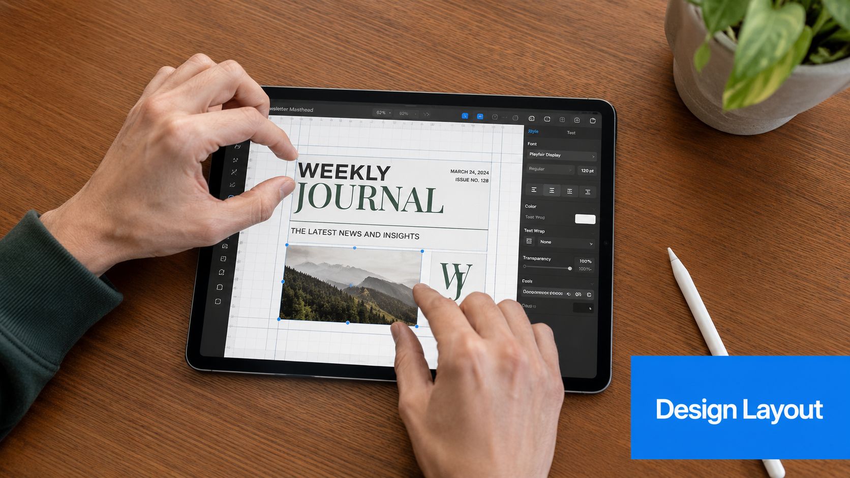
Treat the masthead as a production component, not a one-off graphic. In practice, that means building it once in your ESP, documenting the parts that can change, and testing it under the same constraints as the rest of the email. Teams that do this well get more than visual consistency. They reduce rendering errors, keep sender identity stable, and make each issue faster to ship.
Build one module, then control the variables
Rebuilding the masthead every send creates avoidable risk. A swapped logo file, a broken mobile stack, or a missing alt attribute can turn a familiar header into something that looks unverified or careless.
Set it up as a locked or semi-locked module with clear rules:
- Fixed brand elements such as logo, title treatment, alignment, and background treatment.
- Variable fields such as date, edition label, or issue number.
- Mobile behavior for stacking, resizing, and spacing.
- Fallback content so the masthead still communicates the sender if images are blocked.
That structure matters operationally. If multiple people touch the newsletter, a fixed module protects the top of the email from inconsistent edits. It also helps maintain recognition over time, which supports trust and can reduce the chance that subscribers mistake the message for a forwarded template or a spoofed send.
If you want examples of how different teams handle repeatable top-of-email branding, these B2B newsletter examples show the range well. The common pattern is not visual style. It is consistency.
If you use Mailchimp, HubSpot, or Beehiiv, save the masthead as a reusable block. If you manage a B2B newsletter operation in a platform like Breaker, the same rule applies. Keep one structured top module and update only the issue-specific fields.
Design for recognition first
The masthead has one job before anything else. It should confirm who sent the email.
Lead with the newsletter or brand name in live text when possible. Place supporting details under it or beside it, not in a competing visual treatment. A decorative header image can work, but only if the sender identity still reads clearly when images are off.
A reliable hierarchy usually includes:
- One dominant element: the newsletter name or brand lockup
- One secondary line: a descriptor, date, or edition label
- Clear spacing: enough separation from the first headline or intro block
- Limited styling changes: no extra type treatments unless they serve a clear purpose
The trade-off here is simple. A more expressive masthead can feel editorial and polished, but every added layer increases the chance of rendering problems. For many B2B newsletters, cleaner wins because it loads faster, survives more inbox environments, and keeps the sender immediately recognizable.
Build for email clients, not mockups
Use live text instead of one flattened image whenever you can. That improves readability, helps with accessibility, and gives the masthead a better chance of holding up when images are blocked or dark mode shifts the presentation.
If you do need an image-based logo or lockup, keep the file lightweight, add descriptive alt text, and check how it behaves in Gmail, Apple Mail, and Outlook. Test the top block on mobile first. A masthead that looks balanced on desktop but pushes the headline too far down on a phone costs you attention where most opens happen.
A few practical checks catch the problems that hurt performance:
- Confirm the brand name appears without relying on image loading
- Verify color contrast in both light mode and dark mode
- Check spacing above and below the masthead on mobile
- Make sure the preheader and from-name still work with the masthead, not against it
- Review the first screen of the email as a subscriber sees it, not as a designer sees it
This build walkthrough is worth watching before you finalize your template:
A strong masthead does more than look on-brand. It helps the email feel legitimate at a glance, supports recognition in crowded inboxes, and removes avoidable friction at the top of every send.
Examples of Effective Newsletter Mastheads
The best examples aren't all trying to look the same. Different newsletter goals call for different masthead styles.
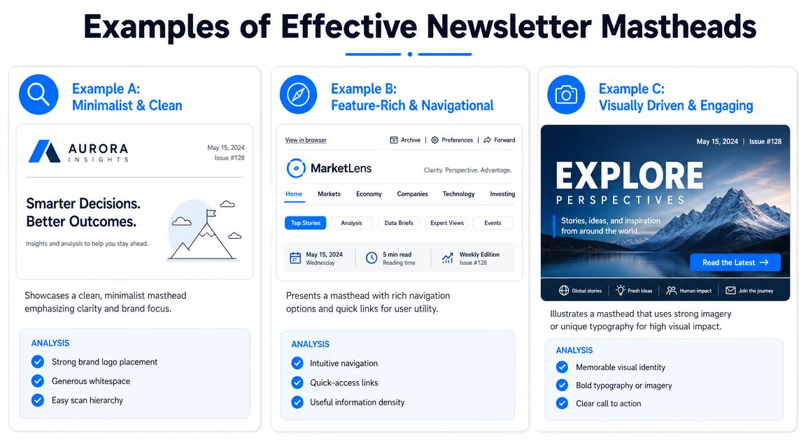
Minimalist and clean
This style uses a wordmark or simple logo, a short newsletter title, and little else. It works well for founder-led newsletters, executive briefings, and product updates where the content itself should carry the weight.
Why it works:
- The sender identity is immediate.
- The top of the email loads fast and stays readable.
- There's very little to break across devices.
This is often the strongest choice for B2B operators. If the audience already knows the brand, extra decoration doesn't help much. Precision does.
Editorial and publication-like
This approach borrows from magazine and print newsletter traditions. It often includes a formal title treatment, issue date, and sometimes volume or issue numbering. It's effective when you want the email to feel like a recurring publication with continuity.
That style is useful for analyst commentary, market briefings, and thought leadership newsletters where the publication itself is part of the value. A formal masthead can make the issue feel collectible and archive-worthy.
What to watch carefully is rendering. A publication-style top block only works if the typography still holds together on small screens.
Visually driven and branded
Some newsletters use stronger color blocking, illustration, or expressive typography to stand out. That can work, especially in media-heavy or creative sectors, but it comes with a real operational constraint: the masthead still has to communicate clearly when email clients simplify or strip styling.
Creative guidance often shows bold mastheads with texture, color, and custom type, but the harder question is how they hold up in dark mode, on mobile, or in clients that limit advanced styling. That trade-off is the key point in this discussion of masthead design across constrained environments, where practical rendering realities matter as much as visual ambition.
The strongest creative mastheads still work when the fancy parts disappear.
A quick comparison
Style
Best for
Risk
Minimalist
B2B digests, product newsletters, founder updates
Can feel plain if the brand system is weak
Editorial
Premium recurring publications, analysis newsletters
Can become dense on mobile
Visually driven
Brand-led media, design-conscious audiences
More likely to break in constrained clients
A good masthead for newsletter growth is the one that matches the audience and survives the inbox. Not the one that gets the most compliments in design review.
How to Test and Measure Masthead Performance
Many organizations never test the masthead directly. They tweak subject lines forever and leave the top of the email untouched for years. That's a mistake.
A masthead influences trust, orientation, and early click behavior. You can't isolate every inbox outcome to the masthead alone, but you can test whether changes improve clarity and reader response.
What to test
Start with one change at a time. Don't redesign everything and hope for insight.
Good test ideas include:
- Title clarity: Compare a branded title against a more descriptive one.
- Logo placement: Test centered versus left-aligned if your template allows it.
- Descriptor line: Add or remove a short subhead that explains the newsletter.
- Metadata presence: Test whether date or issue details help recurring readers.
- Link behavior: Evaluate whether archive or preference links in the masthead get used.
For each test, hold the rest of the issue as steady as possible. If you change the masthead, the subject line, and the lead story all at once, you won't know what moved performance.
What to measure
Open rates matter, but don't stop there. Look at the metrics that show whether readers understood and trusted the email enough to engage with it.
Track:
- Open rate trends: Use them directionally, not in isolation.
- Clicks on masthead links: Helpful if you include archives, homepage, or account actions.
- Scroll depth or downstream clicks: Useful for seeing whether the top section supports reading.
- Complaint and unsubscribe patterns: Important if a redesign creates confusion.
- Device-level behavior: Watch for signs that mobile users struggle with the new layout.
If you need a practical framework for deciding what to watch every send, this overview of email campaign performance metrics is a good reference point.
Accessibility is part of performance
Accessibility is not a separate “nice to have” review. It affects whether people can recognize and use the masthead at all.
Journalism guidance around disability coverage highlights a broader point that applies here too: audience-facing content needs to be readable and usable for people with disabilities. In masthead terms, that means readability, contrast, alternate text, and clear presentation affect recognition and comprehension, as discussed in this piece from the Columbia Journalism Review on accessibility and audience needs.
Use this checklist before shipping:
- Contrast: Make sure text remains legible against the background.
- Alt text: If the masthead contains images, describe them briefly and clearly.
- Text sizing: Avoid tiny metadata that disappears on phones.
- Plain-language naming: Don't make readers decode clever branding.
- Screen reader sanity check: Confirm the top of the email reads in a logical order.
If a subscriber can't identify your publication quickly, the masthead isn't doing its job.
A masthead should earn its place through repeat performance. Test it like any other part of the email system.
If you're building a B2B newsletter and want the design, targeting, analytics, and deliverability layer in one place, Breaker gives teams a way to create recurring newsletter campaigns while tracking engagement, subscriber growth, and inbox performance without rebuilding the process around separate tools.
Keep reading
All articlesHow to Grow Newsletter Subscribers with Qualified Leads in 2026
Discover 8 channels to grow engaged newsletter subscribers in 2026, with real cost-per-engaged-subscriber data to focus your list-building strategy.
B2B Lead Generation via Newsletter: What Actually Works
Cold outbound is losing steam. See 7 proven newsletter tactics for B2B lead generation, from gated content to sponsorship swaps, that beat cold outreach.
How to Write a Newsletter with AI: Step-by-Step Guide 2026
Learn how to write a newsletter with AI the right way: a 7-step process to train, calibrate, and edit AI drafts that still sound like you.