Your Guide to a High-Converting Landing Page for Webinar
You’ve got the webinar topic. The speaker is solid. The promo emails are queued, paid traffic is live, and the dashboard still looks flat. That usually isn’t a traffic problem. It’s a landing page problem.
A landing page for webinar registration has one job. Turn interest into a committed hand-raise. When that page misses, the whole campaign looks weak, even when the webinar itself is exactly what your market wants.
Many judge success too narrowly. They ask whether the page generated registrations. The better question is whether it attracted the right people, captured them with low friction, and set up a clean path into your newsletter and nurture motion after the event. That’s where webinar ROI becomes defensible.
Why Your Webinar Landing Page Isn't Converting
A familiar pattern shows up in webinar campaigns. Paid clicks come in, email traffic lands, partner shares generate visits, and the registration rate still stays weak. In that situation, the bottleneck is usually the page itself, not the topic or the channel.
The page is asking visitors to make a fast decision. Register or leave. If the promise is vague, the form feels heavy, or the page reads like a general website instead of a focused conversion asset, people bounce before they commit. Good best landing page practices matter here because webinar traffic is often high-intent traffic. Wasting it gets expensive quickly.
Common reasons pages stall
In our experience, underperforming webinar pages often share a few traits.
- They explain the subject, not the outcome. "Join our webinar on lifecycle marketing" is informational. "Learn how to increase activation without adding more paid spend" gives the visitor a reason to care.
- They bury the value proposition. Visitors should understand who the webinar is for, what problem it addresses, and what they will leave with almost immediately.
- They add friction before trust is earned. Long forms, vague CTA copy, and extra page elements create hesitation at the exact moment you need clarity.
- They split attention. Navigation links, unrelated resources, social icons, and competing CTAs give people exits instead of a next step.
- They attract the wrong registrant. Broad copy can increase raw sign-ups while lowering attendance, newsletter engagement, and pipeline quality later.
That last point gets missed often.
A webinar page can look healthy on paper because registration volume is up, while the downstream numbers tell a different story. Low attendance. Weak email engagement. Few qualified conversations. Poor subscriber retention. If your copy overpromises or speaks to everyone, you may get more names into the form and less value out of the campaign.
A practical rule helps here. If a visitor has to think too hard, scroll too far, or piece together why this session matters, the page is carrying too much weight.
Registrations are only the first conversion
A webinar registration is not just an event signup. It is also the first permission-based step into your email ecosystem.
That changes how strong teams judge page performance. The goal is not to get the highest possible number of form fills. The goal is to bring in people who are likely to attend, engage after the event, and keep reading. For marketers using Breaker, that distinction matters because webinar leads should not disappear into a one-off campaign list. They should flow into a newsletter growth motion you can track over time, segment cleanly, and tie back to source.
Here is the difference in how that plays out:
| Focus | Weak approach | Better approach |
|---|---|---|
| Goal | Maximize raw sign-ups | Maximize qualified sign-ups and engaged subscribers |
| Copy | Broad, topic-level messaging | Audience-specific promise tied to a clear business problem |
| Form | Collect every field upfront | Ask for the minimum, enrich and qualify later |
| Success metric | Registration count | Registration quality, attendance, subscriber engagement, and influenced pipeline |
This is why some webinar pages "convert" and still fail. They produce names, not momentum. The better page earns the registration and sets up what happens after it. That is where webinar ROI becomes easier to prove.
The Strategic Blueprint for Your Webinar Page
Before you write the headline or open a page builder, make three decisions. Who is this for, what exact problem are they trying to solve, and why should they trust this webinar enough to register now.
That sounds obvious, but most pages skip this work. They jump straight to layout. Then the page ends up full of accurate information and weak persuasion.
Start with the attendee, not the event
A webinar page performs best when it feels written for one buyer, not for everyone in your CRM.
For a product-led growth team, that might be a lifecycle marketer trying to increase activation. For a consultant, it might be a founder who knows pipeline has stalled but doesn’t know where the leak is. For enterprise sales, it could be a revops leader trying to clean up handoff friction between marketing and SDRs.
Write down:
- Role: who is this person at work
- Pain: what problem is frustrating them right now
- Desired outcome: what they want to fix, improve, or avoid
- Trigger: why this matters now, not next quarter
If you can’t do that in plain language, the page won’t either.
Pick a topic with built-in intent
The best webinar topics sit in the middle of relevance and urgency. They’re specific enough to feel useful, but broad enough to draw the right volume.
The Goldcast guidance flags a common failure here. Overly generic topics can produce 40 to 50% lower registrations, and featuring a prominent thought leader in the hero section can lift click-through performance by 25 to 30%, according to Goldcast’s webinar landing page examples.
That tracks with what works in practice. “Marketing trends for next year” sounds broad and safe. It also sounds skippable. “How B2B teams fix webinar drop-off between registration and attendance” feels operational and urgent.
A strong topic usually does one of these:
- solves a costly problem
- explains a change buyers need to react to
- gives a repeatable framework
- shows how peers approach the same challenge
Remove every escape hatch
One of the most important rules in webinar landing page design is still the oldest one. Remove navigation.
Historically, taking site navigation off the page has been the most significant optimization, and pages without those distractions can push conversion rates beyond 20%. The same BeaconLive source also notes that personalized CTAs outperform generic ones by 202%, that value should be clear within 3 to 5 seconds, and that 52.5% of web traffic is mobile, based on BeaconLive’s webinar page conversion guide.
That changes how you plan the page.
Instead of asking, “What should we include?”, ask, “What can we remove without hurting a decision?”
A webinar page isn’t a miniature homepage. It’s a focused argument for one action.
If you want a useful reference for simplifying structure and reducing distraction, these best landing page practices are worth reviewing before you build.
Build the offer before the copy
Don’t start with wording. Start with the offer itself.
A webinar offer has four parts:
| Element | Good | Weak |
|---|---|---|
| Promise | A clear practical outcome | A vague educational topic |
| Audience | Explicitly named | Implied or broad |
| Authority | Speaker relevance tied to topic | Generic title and logo soup |
| Reason to act | Timely event, limited window, useful next step | “Join us” |
Here’s a planning template that works:
- For lifecycle marketers at B2B SaaS companies
- Who need to improve trial-to-paid conversion without rebuilding onboarding
- This webinar shows the messaging, email, and activation fixes to test first
- Led by an operator who’s done that work in live environments
- So attendees can leave with actions they can implement immediately
That gives the page its spine. Once that’s clear, the headline, bullets, CTA, and speaker section get much easier.
Anatomy of a High-Converting Page Layout and Copy
A strong webinar page guides a visitor from interest to confidence in a few quick scrolls. Each block should answer one practical question: What is this, why should I care, why should I trust it, and what happens if I sign up?
That sequence matters because webinar conversion is not only about filling the room. The page also sets the quality of the audience you attract. If the message is vague, you may get registrations, but you will not get the kind of subscriber who opens follow-up emails, joins your newsletter, and gives you a clean line of ROI attribution later. Teams using Breaker feel this quickly. A webinar that adds engaged readers to your list is far more valuable than one that pads sign-up counts with low-intent contacts.
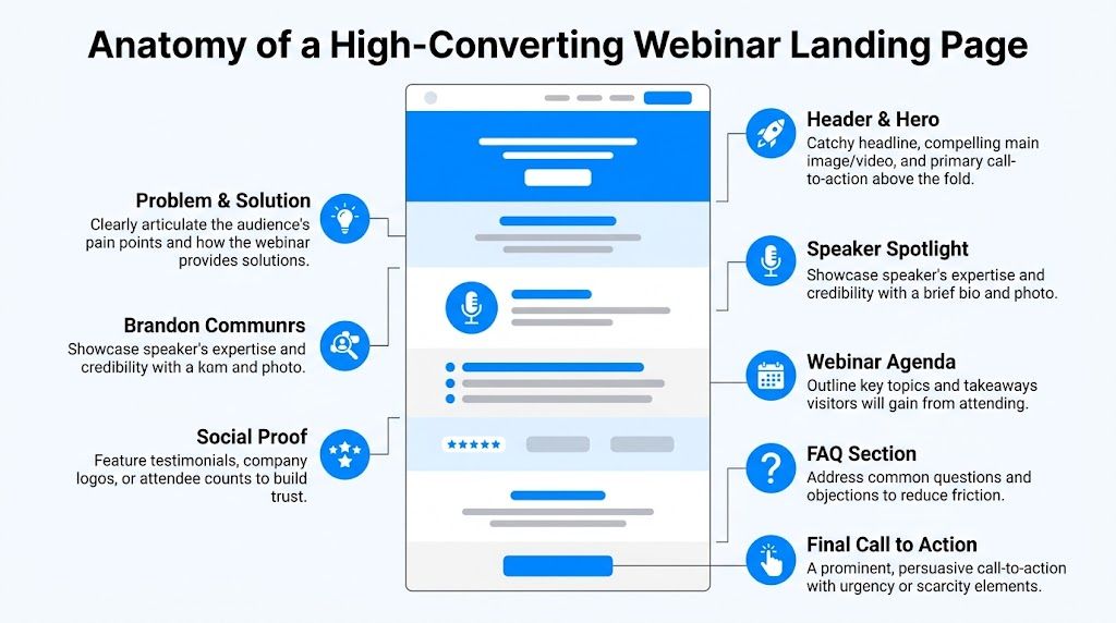
The hero section needs to answer the decision fast
The top of the page carries the page.
A visitor should be able to scan the hero and know the outcome, the audience, the speaker, and the next action without hunting. A practical layout is simple: headline, short subhead, 3 to 5 takeaways, speaker proof, and the registration action.
Good headline:
How B2B SaaS teams turn webinar sign-ups into engaged newsletter subscribers
Weak headline:
Join our upcoming webinar on demand generation
The first promises a business result and names the audience. The second only names the format.
The subhead should explain how the result happens. For example:
- Learn how to structure your registration page, follow-up flow, and post-event nurture so the webinar drives more than attendance.
That line works because it gives the mechanism, not just the topic.
Write takeaways as decisions and outcomes
Many webinar pages make the mistake of writing bullets that read like meeting notes. That weakens conversion because buyers are not registering for your agenda. They are registering for a useful change in how they work.
Use bullets that show what someone will be able to do after the session:
- Find conversion leaks: Spot where your webinar page loses qualified visitors before they register.
- Reduce friction: Simplify page structure and messaging so more of the right people complete the form.
- Prove value after the event: Connect webinar registrations to newsletter engagement and downstream pipeline signals.
Those bullets also attract better-fit registrants. That matters if your webinar feeds a long-term owned audience program. In Breaker, for example, the difference between a generic registrant and an interested subscriber shows up fast in open behavior, click behavior, and list health. Better page copy improves top-of-funnel conversion and downstream subscriber quality at the same time.
Put the speaker proof near the claim
A speaker bio is a trust device, not filler.
If the session depends on the presenter’s credibility, show that proof close to the hero. If the topic itself is the draw, the speaker still needs to appear early enough to answer the silent question every experienced marketer asks: “Does this person do this work?”
Use a short bio with four parts:
| Bio element | What to include |
|---|---|
| Role | Current position or operating context |
| Relevance | Why this person can teach this exact topic |
| Specific proof | Experience, known companies, or accurate outcomes |
| Tone | Short and plainspoken |
Bad bio:
“Jordan is a passionate growth leader who loves helping businesses scale.”
Better bio:
“Jordan runs lifecycle and demand generation programs for B2B software companies and has built webinar funnels tied to email engagement, subscriber growth, and pipeline reporting.”
That version gives a buyer something to trust. It also reinforces the business case behind the webinar.
If you are refining the broader structure around the page, this guide to B2B landing pages that generate leads is a useful companion.
A quick visual walkthrough helps if you're reviewing page hierarchy with a team:
Use proof that reduces risk
Social proof works best when it answers a specific concern. Will this session be practical? Will it waste my time? Is this aimed at someone like me?
That means one strong proof point often does more than a long strip of vague logos. Good proof can include:
- feedback from a past attendee that mentions a concrete takeaway
- logos from companies the speaker has worked with, if they are relevant
- a short line on who the webinar is built for
- evidence that the team can connect attendance to meaningful follow-up outcomes
That last point is often missed. If your webinar supports newsletter growth, say so. If registrants get added to an ongoing content stream, and you can track who stays engaged over time, that lowers perceived risk for both the visitor and your internal stakeholders. It shows the webinar is part of a measurable funnel, not a one-off event.
Use FAQs to handle objections, not to dump extra information
An FAQ section earns its place when it removes hesitation near the bottom of the page. It does not need to answer every possible company question.
Useful FAQ prompts include:
- Is this live or will there be a replay?
- Who is this session best for?
- How tactical will the session be?
- Will attendees get follow-up resources?
Weak FAQ prompts usually belong somewhere else, especially if they shift attention back to your company instead of the webinar.
Close with a CTA that restates the payoff
The final CTA block should remind people what they get by registering.
Weak final block:
“Ready to register?”
Better final block:
“Register if you want a webinar funnel that brings in the right attendees, grows your subscriber base, and gives your team a cleaner way to attribute ROI after the event.”
Then repeat the same button language you used above. Consistency helps people commit. It also keeps the page focused on one action from top to bottom.
Optimizing Your Form and Call to Action for Maximum Sign-Ups
A webinar page usually loses people at the moment you ask them to commit.
The visitor is interested. The topic is relevant. The speaker feels credible. Then the form asks for first name, last name, company, job title, team size, website, country, phone number, and anything else the sales team wanted. That is where conversion rate drops.
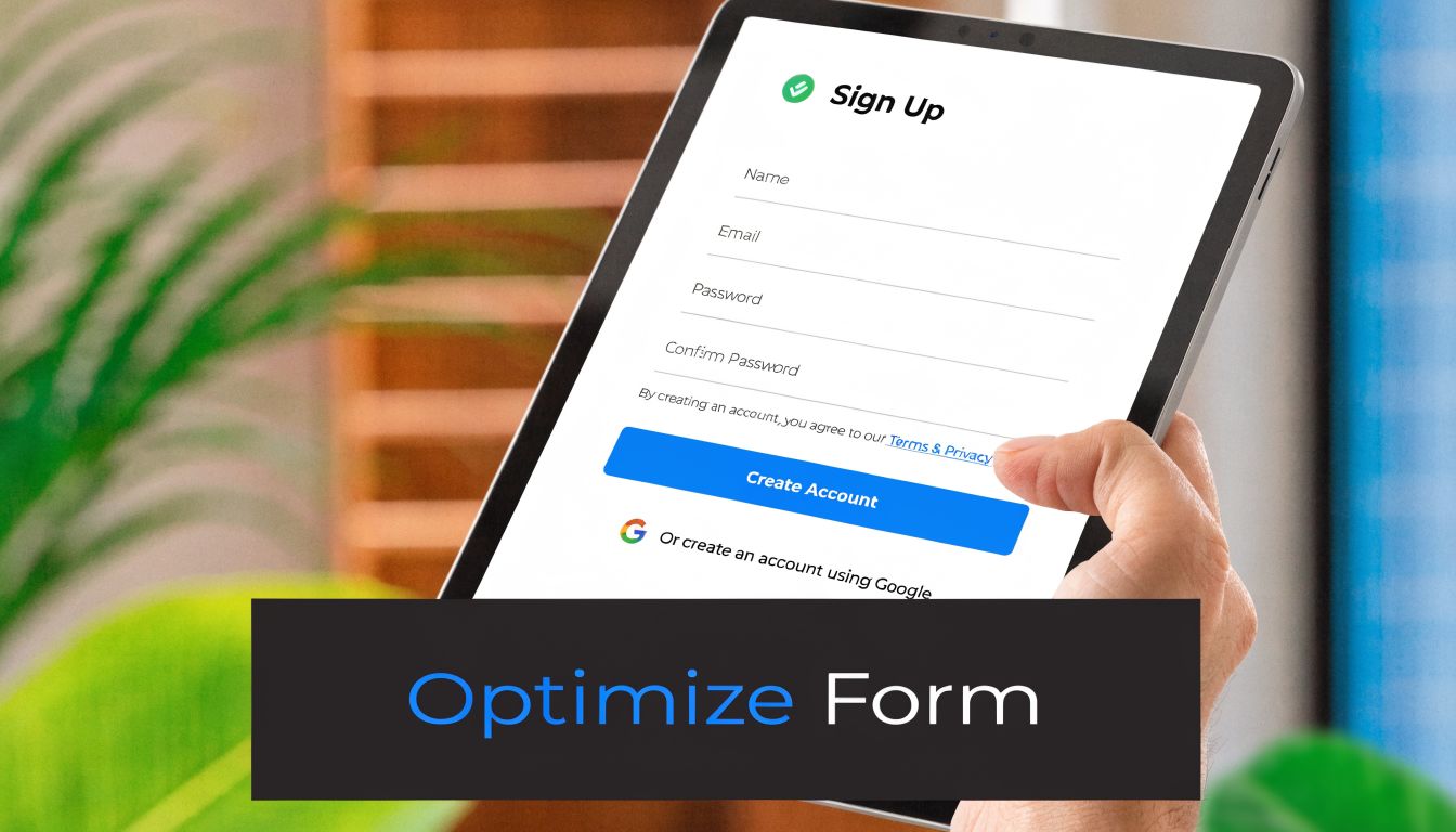
Keep the form aligned with the commitment level
Registering for a webinar is a light-intent action. Your form should reflect that.
For most B2B webinar pages, the default setup is simple:
- first name
- work email
- one optional business field if it changes what happens next
That last part matters. Every extra field should have a job. If you are routing enterprise prospects to a sales-assisted follow-up, company name can make sense. If you plan to segment the post-webinar newsletter by role, job title may be worth testing. Phone number rarely earns its place on a registration form.
I use a simple rule here. If the field does not change routing, messaging, or attribution, cut it.
Capture the hand-raise first, qualify later
Teams often stretch the form because they want better leads. I get the instinct. Sales wants context, operations wants cleaner records, and marketing wants segmentation before the first email goes out.
But the webinar page is not the right place to solve every downstream need.
Its job is to convert qualified interest into a registration. Qualification can happen after the form fill through email clicks, attendance behavior, CRM enrichment, and progressive profiling. That sequence usually produces better data because it comes from behavior, not from a visitor trying to get through your form as fast as possible.
Here is the framework I use:
| If your goal is | Ask on the form |
|---|---|
| Drive the highest registration rate | Name and email |
| Route larger accounts differently | Name, email, company |
| Segment follow-up content | Add one field only if it changes the email path |
| Build a full lead score | Do it after registration |
If you want practical examples of how to tighten this step, these opt-in form examples and tactics are worth reviewing against your current page.
There is also a bigger upside here. A shorter form does not only improve registrations. It usually improves newsletter growth after the webinar because more of the right-fit visitors make it into your email ecosystem in the first place. With Breaker, that matters. You can track which webinar registrants become engaged subscribers, not just which campaigns drove raw sign-ups. That gives the form a second job. It feeds a measurable list growth engine.
Write CTA copy that reflects the outcome
“Submit” is weak CTA copy for a webinar page. It sounds like paperwork.
The button should reflect what the visitor is getting or doing next:
- Reserve My Spot
- Save My Seat
- Get Webinar Access
- Join the Session
- Send Me the Invite
The strongest webinar CTAs usually do one of two things. They create a sense of ownership, or they promise a clear next step.
A few rules keep this tight:
- Match the page promise. If the webinar offers tactical instruction, the button should sound useful, not administrative.
- Use one primary CTA. A webinar page should not ask visitors to register, book a demo, and browse product pages at the same time.
- Make the button easy to find. High contrast helps. So does repeating the same CTA language throughout the page.
If a button could sit on any generic contact form on your site, rewrite it.
Remove friction around the form itself
Placement matters, but clarity matters more. On a short page, putting the form in the hero often works well. On a longer page, a top CTA that jumps to the form can keep the experience cleaner, especially on mobile.
The supporting copy under the form should answer one question: what happens after I click?
Good microcopy is brief:
- We’ll email your confirmation and webinar details right away.
- Can’t attend live? We’ll send the replay.
That kind of reassurance reduces hesitation without turning the form area into a legal disclaimer.
One operational point is easy to miss. Track what happens around the form before you launch. If you test field count, CTA copy, or form placement, your measurement needs to be clean enough to show what changed. This guide to Google Analytics event tracking is useful if you need to set up CTA clicks, form starts, and completed registrations properly.
That tracking becomes more valuable after the event. You are not only measuring who registered. You are measuring which form setup brought in subscribers who kept opening, clicking, and staying engaged. That is the ROI story leadership cares about.
Measuring Performance and Optimizing Your Funnel
Often, teams launch a webinar page, check registrations, and call it analysis. That leaves too much hidden.
A landing page for webinar campaigns should be measured like any other acquisition asset. You need source clarity, event-level tracking, and a way to connect registrations to what happens after the form fill. Otherwise you’re optimizing for a number that may not predict any useful business outcome.
Track the funnel before traffic arrives
Set the basics before launch. Don’t wait until the campaign is live.
At minimum, define:
- traffic source with UTM parameters
- registration event as the core conversion
- CTA click event if the form sits below the fold
- thank-you page visit as confirmation that the submission completed
- post-registration engagement in your email or CRM stack
If your analytics setup is messy, this walkthrough on Google Analytics event tracking is useful for mapping actions cleanly.
The key is consistency. If paid social uses one naming pattern, partner campaigns use another, and lifecycle email uses no tags at all, you won’t know what’s driving the best registrants.
Watch for the failure points that matter
A page can underperform for different reasons. Look at the behavior, not just the end result.
Here’s a practical diagnostic table:
| Signal | Likely issue | What to check |
|---|---|---|
| High click-through, low registration | Form friction | Field count, CTA clarity, mobile usability |
| Low time on page | Weak headline or poor traffic match | Ad-to-page message alignment |
| Heavy mobile drop-off | Layout or below-fold details | Hero compression, form placement |
| Strong registration, weak follow-up engagement | Wrong audience or weak nurture | Topic fit, email sequence, segmentation |
Many teams discover the core problem isn’t conversion rate alone. It’s conversion quality.
Run simple tests with clean hypotheses
You don’t need a massive experimentation program to improve a webinar page. You need discipline.
The Unbounce-aligned benchmark data highlights a few high-impact areas. Pages without speaker bios can underperform by 30 to 40%. Using action verbs in the CTA can provide an 18% uplift. A/B testing simple elements like button color can yield 12 to 15% gains, according to Unbounce’s webinar landing page examples.
That gives you a good testing order:
Headline match
Test a problem-first headline against an outcome-first headline.Speaker credibility
Add or reposition the speaker bio and headshot if the current page buries trust signals.CTA language
Compare a generic button with an action-based one.Button treatment
Try contrast changes only after message issues are addressed.Page length and order
Move agenda, logistics, or proof higher if users hesitate before reaching them.
Don’t test three big changes at once. If the result improves, you won’t know what caused it.
Measure beyond registration
Here, webinar teams usually leave value on the table.
Registration is the first conversion. It isn’t the final one. The stronger question is whether registrants become engaged contacts afterward. Do they open follow-up email. Do they click replay links. Do they engage with related newsletter content. Do they fit the audience segment you want to keep nurturing.
That matters because two webinar pages can generate the same number of sign-ups and produce very different business value. One attracts broad curiosity. The other attracts people who keep engaging.
A useful operating model is to review the page in two layers:
Front-end performance
visits, clicks, registrationsBack-end performance
confirmation email engagement, attendance behavior, replay engagement, newsletter interaction
If your page converts but the follow-up audience goes cold immediately, the offer or audience targeting likely needs work. If the page converts fewer people but they stay engaged, you may have a stronger funnel than the raw registration number suggests.
That’s the measurement shift more B2B teams need. A webinar page shouldn’t only answer “Did it sign people up?” It should answer “Did it bring the right people into an ongoing relationship?”
Your Post-Registration Playbook for Nurturing Leads
The registration page did its job when the visitor converted. Your funnel hasn’t done its job yet.
A lot of webinar programs break at this point. The confirmation page is generic. The follow-up email is purely logistical. The replay goes out once, and then the contact drops into a broad nurture stream with no relation to the topic they signed up for.
That wastes the intent they just showed.
Turn the thank-you page into a next step
The thank-you page should reduce no-shows and prepare the next interaction.
A practical thank-you page includes:
- a confirmation headline
- calendar invite links
- the webinar date and time
- a short expectation set for what they’ll receive by email
- one relevant next action
That next action can be simple. Share the webinar with a teammate. Read a related article. Reply with a question you want answered live. The point is to keep momentum while intent is fresh.
Build the email sequence around the topic they chose
Your registrant already told you what they care about by signing up.
Use that signal. Don’t dump them into a generic newsletter flow with no context. Segment them by webinar topic, pain point, or audience type and send follow-up that extends the promise of the page.
A simple nurture path looks like this:
| Purpose | |
|---|---|
| Confirmation | Deliver logistics and reinforce the value of attending |
| Reminder | Bring the problem back into focus before the event |
| Replay or recap | Recover no-shows and extend access |
| Follow-up resource | Deepen the topic with one practical next step |
| Newsletter transition | Explain why staying subscribed will keep helping on this exact problem |
If you need a framework for that handoff, these lead nurturing best practices are a strong starting point.
Connect webinar success to subscriber value
This is the blind spot in most webinar advice. It optimizes the registration page, then stops measuring.
The bigger opportunity is to treat the webinar as the front end of a list-growth and relationship-building system. That gap is called out directly in Swipe Pages’ discussion of webinar landing page blind spots. Pages are usually built for registration, not for subscriber ROI, which makes it harder for B2B teams to justify webinar investment through downstream engagement.
That changes how you think about success.
A useful webinar page doesn’t just fill seats. It brings in people who are likely to keep reading, clicking, and responding after the event. When you can tie the page to engaged newsletter growth, your webinar program stops looking like a one-off campaign and starts looking like a repeatable acquisition channel.
The best webinar marketers build pages that convert, thank-you pages that continue momentum, and email flows that make the relationship worth keeping.
If you want that entire chain to be easier to run and easier to prove, Breaker helps B2B teams turn webinar traffic into engaged subscriber growth with email sending, list expansion, targeting, enrichment, and analytics in one platform. It’s built for marketers who need more than registrations. They need a clean path from sign-up to sustained audience value.