High-Converting B2B Opt In Forms That Actually Work
Opt-in forms are your digital handshake. They represent that crucial moment when you ask a potential customer for their email in exchange for something valuable. But this isn't just about data collection—it's the very start of a relationship and the foundation of your entire B2B lead generation strategy.
Rethinking The B2B Opt In Form

The old days of throwing up aggressive, multi-field forms and just hoping for sign-ups are over. Today’s B2B buyers are smart, protective of their inboxes, and completely overwhelmed by digital noise. They simply won't fill out a form asking for their name, company, job title, and phone number just to get a newsletter.
This is exactly why a minimalist, high-intent approach has become the gold standard. The core idea is to reframe the opt-in as the beginning of a valuable relationship, not a one-sided transaction. Your form has to make one thing crystal clear: this is a compelling value exchange.
The Value Exchange Mindset
Before you even think about asking for an email, you have to answer the visitor's silent question: "What's in it for me?" The value you're offering has to feel greater than the cost of them handing over their contact info.
This means moving past generic calls-to-action like "Subscribe." Instead, you need to offer something tangible and genuinely useful that speaks directly to their professional goals.
- Exclusive Reports: Give them data-driven insights they can't get anywhere else.
- Actionable Checklists: Offer a tool that helps them solve a real, specific problem right now.
- Expert Analysis: Deliver a newsletter so good it makes them better at their job.
When you focus on a clear, high-value offer, you naturally attract higher-quality subscribers—people who are actually interested in what you have to say. This first interaction sets a positive tone for every email that follows. To really level up your forms, it's worth exploring all the capabilities of modern advanced form features.
The opt-in moment is the first real handshake. If your form feels like an interrogation, you’ve already lost their trust. Make it feel like a fair trade of value, and you'll build a healthier, more engaged subscriber base from day one.
This relational mindset fundamentally changes how you see your forms. An email address isn't just another data point; it's a permission slip from a potential customer who trusts you to deliver on your promise. Honoring that trust starts with a respectful, minimalist, and value-driven opt-in experience.
This shift in thinking is critical for modern B2B lead generation. Here’s a quick breakdown of how the old approach stacks up against a modern, high-intent strategy.
The Shift from Transactional to Relational Opt In Forms
| Principle | Outdated Approach | Modern High-Intent Approach |
|---|---|---|
| Goal | Collect as much data as possible | Build a high-quality relationship |
| Form Design | Long, multi-field, and complex | Minimalist, single-field (email only) |
| Value Prop | Vague ("Subscribe to our newsletter") | Specific ("Get the weekly B2B growth analysis") |
| Psychology | Transactional: "Give us your data" | Relational: "Let's start a conversation" |
Embracing this modern approach isn't just about getting more sign-ups; it's about getting the right sign-ups and starting those relationships on the best possible footing.
Designing Forms That Convert On Contact
A great strategy is your blueprint, but design is what makes your opt-in forms work. The user experience (UX) and user interface (UI) are what separate a form that gets ignored from a true conversion machine. This is where we stop talking theory and start making practical design choices that get people to act.
When a B2B professional sees your form, they make a split-second decision: is filling this out worth what I’m getting in return? Your design needs to make that a quick and easy "yes." It all starts with reducing cognitive load—the mental effort it takes to complete a task.
The best way to do that? Be ruthless about how many fields you ask for.
The Power of Simplicity and Single Fields
For most top-of-funnel offers, like a newsletter subscription, your form should have exactly one field: email. Anything more just adds friction and gives someone a reason to second-guess signing up. A single field projects confidence. It tells the user you’re so sure of the value you provide that you’re making it effortless to get it.
This minimalist approach does more than just lift conversion rates. It builds trust right from the first interaction by showing you respect their time and privacy. You can always ask for more information later on through progressive profiling once you've started to build a relationship. For more advanced tips on this, you might be interested in our guide on optimizing signup forms for better results.
This clean, simple design philosophy is especially vital when you consider generational differences. Recent research on opt-in trust signals found that 43% of Gen Z feel more comfortable filling out a form if it has a clean and simple design. It’s a clear sign that minimalist aesthetics are crucial for building trust with younger professional audiences.
Crafting Copy That Connects
The words on your form are just as critical as its design. B2B professionals respond to clear, benefit-focused language, not generic button copy. Vague CTAs like "Submit" or "Subscribe" are conversion killers because they talk about what the user has to do, not what they get.
Instead, you need to reframe your button copy to highlight the value they’re about to receive.
- Instead of "Download," try "Get the 2024 Report"
- Instead of "Sign Up," use "Send Me the Checklist"
- Instead of "Submit," write "Join 5,000+ Marketers"
This simple change in perspective makes the action feel like a win for the user, not just another entry in your database. To really level up your forms, you can even use tools for AI that suggests better CTAs based on user data.
Your button copy should complete the sentence, "I want to..." This ensures your call-to-action is always user-centric and focused on the benefit they will receive.
This principle applies to your headline and any descriptive text, too. Use active, compelling language that spells out the "what" and "why" of your offer, leaving no room for confusion.
Choosing the Right Form Type for the Context
Finally, the type of form you use should match the user's intent and where they are on your site. There’s no single "best" format; the right choice depends entirely on the situation.
| Form Type | Best Use Case | Why It Works |
|---|---|---|
| Inline Form | Placed at the end of a high-value blog post or within a relevant product page. | Catches users at their moment of peak engagement, feeling like a natural next step instead of an interruption. |
| Pop-Up Form | Triggered by exit-intent or after a user scrolls through 70% of a page. | Grabs attention without ruining the initial reading experience. It’s the perfect last-ditch effort to convert a visitor who is leaving. |
| Slide-In Form | Appears in a bottom corner after someone has been on the page for a set amount of time. | A less intrusive alternative to a full-screen pop-up. It provides a persistent but gentle reminder of your offer. |
By carefully matching the form type, placement, and design to the user’s journey, you create a seamless experience. This thoughtful approach to designing your opt in forms not only maximizes conversions but also starts every new subscriber relationship on a foundation of trust and value.
Placing Your Opt In Forms For Maximum Impact
You can have the best-looking form in the world, but if it’s buried on your site, it won’t do you any good. Where and when your opt in forms appear is just as critical as the copy you write for them. It's all about catching your Ideal Customer Profile (ICP) at the right moment.
Think about it from their perspective. A visitor who just finished a 2,000-word breakdown of a problem they’re facing has a completely different mindset than someone who just landed on your homepage. Your job is to make signing up feel like the natural next step, not a jarring interruption.
Capitalizing On High-Intent Moments
Some pages on your website are just natural hotspots for conversions. These are the moments when a visitor has gotten real value from your content and is thinking, "What's next?" Focusing your forms on these touchpoints will always outperform a generic, site-wide approach.
- At the End of a Blog Post: This is a classic for a reason. If someone stuck around to read your entire article, they're clearly invested in your expertise. An inline form here is a perfect, low-friction way to offer them more.
- On a Solutions or Product Page: When a visitor is actively researching how you solve their pain points, they're a seriously warm lead. This is the ideal place for an opt-in that offers a relevant case study or a product-focused guide.
- During a Webinar Registration: The sign-up process for a webinar is a golden opportunity. You can easily include a secondary opt-in for your newsletter, turning a one-time event registration into a long-term subscriber.
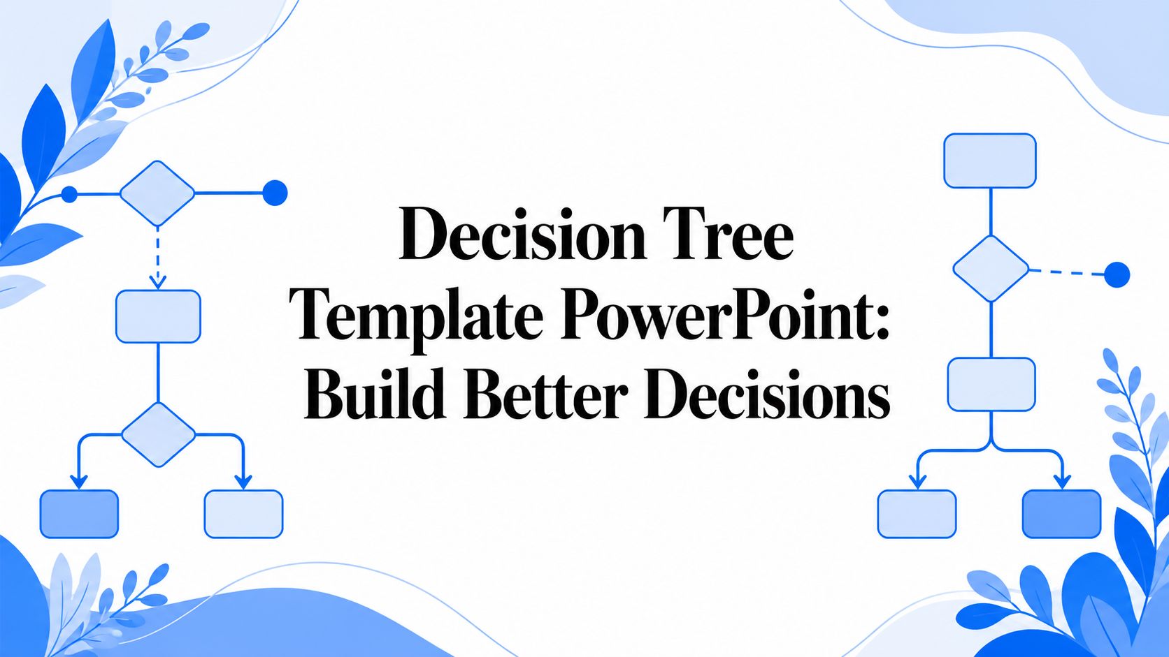
This simple decision tree can help you match the form type to the user’s intent on the page.
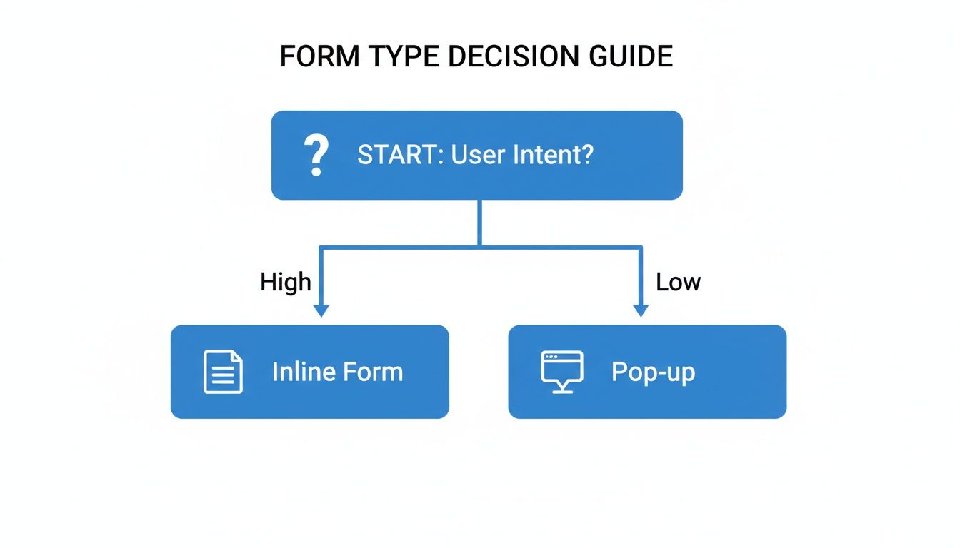
As you can see, when a user's intent is high, an inline form feels much more natural. Pop-ups are better suited for grabbing attention when that intent isn't quite as focused.
Using Intelligent Targeting Rules
Static forms that show up for everyone at the same time are a relic of the past. Modern tools like Breaker let you set up smart targeting rules that show your opt in forms to the right people at the right time. This makes your forms more relevant and way less annoying.
Case Study: A B2B SaaS company selling project management software added an exit-intent pop-up to their pricing page. The form didn't just ask for an email; it offered a free "ROI Calculator" spreadsheet. This single, highly targeted form increased their qualified subscriber list by 27% in one quarter. Why? It intercepted users with high commercial intent and gave them something incredibly useful.
This is where you can get really granular with how you engage your audience.
- Exit-Intent: This trigger shows a form the second a user’s cursor heads for the back button or to close the tab. It’s a powerful, last-ditch effort to convert a visitor without ever disrupting their on-page experience.
- Scroll-Depth: You can set a form to appear only after someone has scrolled through a specific amount of the page, like 75% of a blog post. This ensures you're only asking for an email from people who have shown real interest.
- Time-on-Page: Triggering a slide-in form after a visitor has been on a page for a set amount of time (say, 60 seconds) is a great way to engage users who are clearly invested and taking their time to explore.
Personalizing The Offer to The Content
The most effective strategy, by far, is to tailor your opt-in offer to the specific content someone is viewing. A generic "subscribe to our newsletter" CTA simply can't compete with a hyper-relevant lead magnet.
For example, on a blog post about SEO, you could offer a "Content Marketing Cheatsheet." On an article about financial modeling, a pre-built spreadsheet template would be a no-brainer. This level of personalization shows you understand what the user needs right now, and it dramatically boosts conversion rates. For a deeper look at creating these targeted entry points, check out our guide on newsletter landing page optimization.
When you combine smart placement with intelligent targeting and personalized offers, your opt-in forms stop being passive data collectors and become active growth engines for your business.
Building User Trust With Every Interaction

In B2B marketing, trust is everything. It’s not just a nice-to-have; it's the currency that drives conversions. Every time a potential subscriber lands on one of your opt in forms, they’re making a split-second decision: "Is this worth it? Can I trust them with my email?"
Building that trust isn't about one big, flashy move. It's about a series of small, thoughtful interactions that show you respect their inbox and their time.
This all starts with how you approach privacy and consent. Think of regulations like GDPR and CCPA less as legal hoops to jump through and more as a guide to building respectful relationships. The problem is, walls of legal text and scary-looking consent boxes can scare people away. Your goal is transparency, not intimidation.
Instead of leading with intimidating legal language, focus on clarity. Your privacy policy should be easy to find, but it shouldn't be the star of the show. A simple, reassuring line of copy right below the email field can make all the difference.
Crafting Reassuring Consent Language
Think of your consent copy as a quiet handshake, not a legal contract. It needs to be friendly, clear, and reassuring.
- Weak Language: "By clicking 'Subscribe', you agree to our Terms and Privacy Policy."
- Strong Language: "We respect your inbox and privacy. You can unsubscribe at any time."
That small shift in tone changes the entire dynamic. It moves the focus from a legal obligation to a genuine promise, which is a powerful signal of trust. This is especially important when you remember that inbox fatigue is at an all-time high.
The average person gets somewhere between 50 to 120 emails every single day. In fact, 51% of subscribers say getting too many emails is the main reason they unsubscribe. By using minimalist opt in forms and clear, respectful language, you’re not just boosting conversions—you’re signaling that you won’t become another source of inbox noise. You can find more data on how email frequency impacts subscribers on backstroke.com.
Trust isn't built in a single moment. It's the result of a consistent pattern of respectful behavior. Your opt-in form is the very first test of that pattern. Keep it clear, simple, and user-focused to pass with flying colors.
Demonstrating Trust Through Frictionless Design
Beyond the words you use, the design of your form itself speaks volumes about how much you respect your user's time. A clunky, multi-field form screams, "My data needs are more important than your experience." A sleek, single-field form says the exact opposite.
This is exactly why single-field email captures and one-tap social logins are so effective. They strip away nearly all the friction from the sign-up process, showing you have confidence in the value you're offering. You're basically saying, "The content you're about to get is so good, we're making it as easy as humanly possible to access."
Here are a few design choices that build subconscious trust:
- Single-Field Simplicity: At the top of the funnel, asking only for an email address is the ultimate sign of respect for a user's time and privacy.
- Clear Unsubscribe Promises: Explicitly stating that unsubscribing is easy and hassle-free removes the fear of being trapped on a list they can't leave.
- Double Opt-In Transparency: If you use a double opt-in, just say so. A simple "Check your email to confirm your subscription!" sets clear expectations. For a complete guide, you can learn more about the strategic use of double opt-in here.
By cutting down on friction and being upfront, you transform your opt in forms from a basic data collection tool into a powerful trust-building asset. This approach doesn't just boost your sign-ups today—it lays the foundation for a healthier, more engaged, and more profitable relationship with your subscribers for the long haul. It shows them you're not just trying to get their email; you're trying to earn their attention.
Measuring What Matters In Form Performance
If you can’t measure your opt in forms, you can't improve them. It’s that simple. The real trick is to stop chasing vanity metrics and start focusing on the numbers that actually signal a healthy, growing lead generation engine. Sure, raw subscriber counts look nice on a report, but they don't tell you the whole story.
For years, we all obsessed over email open rates. But with privacy updates like Apple's Mail Privacy Protection, that metric has become a ghost—it looks like it's there, but you can't really trust it. It’s time to look past the open and focus on what truly matters: the actions people take after they sign up.
Moving Beyond Vanity Metrics
The most dangerous metrics are the ones that make you feel good without actually moving the needle. A massive email list packed with unengaged contacts isn't an asset; it's a liability that drives up your costs and tanks your deliverability.
Instead, let's zero in on the data that reflects genuine interest and provides real value. These are the numbers that should guide every single optimization you make.
- Click-Through Rate (CTR): This is your first real test. It tells you if your content is compelling enough to make someone stop scrolling and actually do something.
- Subscriber-to-Customer Conversion Rate: Here’s the ultimate KPI. How many people who join your list eventually pull out their credit card? This ties your form's performance directly to revenue.
- Revenue Per Email (RPE): By tracking sales from your email campaigns, you can put a dollar value on every message you send. Now you're talking business impact.
With the traditional open rate becoming so unreliable, smart marketers are pivoting hard toward these engagement metrics. Brands that have adopted AI-driven email campaigns are already seeing around a 13% increase in click-through rates and up to a 41% lift in revenue, proving that a focus on real engagement pays off. You can get more details on how marketers are adapting to these email trends on verticalresponse.com.
A Practical Framework For A/B Testing
Data tells you what is happening, but A/B testing is how you figure out why. A disciplined testing process lets you make small, incremental improvements that compound into massive gains over time. The key is to test only one thing at a time so you know exactly what caused the change.
Start with a clear hypothesis. For example: "I believe changing our button copy from 'Subscribe' to 'Get the Weekly Analysis' will lift conversions because it’s more specific about the value." Then, you let the data decide who wins.
The goal of A/B testing isn't to be right; it's to get it right. Every test, whether it wins or loses, provides a valuable insight that makes your marketing smarter.
So, where should you start? Here are a few high-impact elements to test on your opt in forms.
What to Test on Your Opt In Forms
| Element to Test | Why It Matters | Example A/B Test |
|---|---|---|
| Headline | This is your first and best chance to grab attention and communicate your value proposition. | "Join Our Newsletter" vs. "Get Actionable B2B Growth Tips" |
| CTA Button Copy | The button copy should feel like the rewarding conclusion to the user's action, not a chore. | "Submit" vs. "Send Me the Guide" |
| The Offer Itself | The perceived value of your lead magnet is often the single biggest driver of conversions. | "Free Ebook" vs. "Exclusive Cheatsheet" |
| Form Design | Visual elements like the number of fields and the layout directly impact user friction. | Single email field vs. Email + Name fields |
Once your test wraps up and you have a clear winner, implement the change and move on to the next hypothesis. By continuously measuring what matters and testing your assumptions, you create a powerful feedback loop. This data-driven process ensures your opt in forms aren't just collecting emails, but are actively building a list of engaged future customers who contribute to your bottom line.
Your Top Opt-In Form Questions, Answered
Even the best-laid plans can hit a snag when it's time to actually build your opt-in forms. Certain questions tend to pop up again and again, often causing teams to get stuck in debate.
Let’s cut through the noise. The answers are usually simpler than you think, especially when you remember the two main goals: make it easy for people to sign up and build their trust from day one.
How Many Fields Should My B2B Opt-In Form Have?
For top-of-the-funnel content like a newsletter or a simple checklist, less is always more. You should start with a single field for the email address. Period.
This approach minimizes friction to almost zero and will give you the highest possible conversion rate. Every extra field is another reason for a potential subscriber to click away.
When you’re offering something with higher value, like a demo request or a detailed industry report, you can ask for a bit more. A name and company name are reasonable at this stage. This is the core idea of progressive profiling—you only ask for what you absolutely need at each step.
It’s a great way to build trust over time. You can always use data enrichment tools on the backend to fill in the gaps without ever bothering the user with more fields.
Should I Use a Single or Double Opt-In?
This is the classic tug-of-war between growing your list quickly and ensuring its quality. A single opt-in creates a seamless experience, maximizing the sheer number of subscribers you capture. The risk? You might attract lower-quality leads or get hit by spam bots.
A double opt-in, which forces users to confirm their subscription through an email link, builds a highly engaged list and protects your email deliverability. But you have to accept that you'll lose some legitimate subscribers who just don't take that extra step.
For most B2B marketers, a single opt-in combined with a regular, disciplined list cleaning process is the winning formula. It strikes the perfect balance between aggressive list growth and long-term list health, letting you capture maximum interest while weeding out unengaged contacts later on.
This hybrid strategy lets you grow fast without letting your list quality tank.
How Can I Use Pop-Up Forms Without Annoying Visitors?
The secret to pop-ups that people don’t hate is all about timing and relevance. Whatever you do, never show a pop-up the second someone lands on your site. It’s the digital equivalent of a pushy salesperson blocking the door.
Instead, lean on smart triggers that catch visitors at moments of high intent.
- Exit-Intent Pop-Up: This is easily one of the most effective and least annoying options. The form only shows up when the user’s cursor moves toward the exit, giving you one last shot to make a valuable offer.
- Scroll-Depth Trigger: Set your form to appear only after someone has scrolled through a good chunk of the page, like 75% of a blog post. This targets people who are clearly engaged with what you have to say.
- Time-on-Page Trigger: Showing a pop-up after a visitor has spent 60 seconds or more on a page is another solid way to engage interested readers without being disruptive.
Most importantly, make the offer hyper-relevant. A generic "sign up for our newsletter" is easy to ignore. But a pop-up offering a "Financial Modeling Template" on an article about P&L statements? That’s going to convert because it directly solves the reader’s immediate problem.
What’s the Best Way to Integrate Forms with My CRM?
A smooth integration isn’t just a nice-to-have; it's fundamental to an efficient marketing engine. Your opt-in forms need to automatically pipe new leads into your CRM and kick off your nurture sequences without anyone lifting a finger.
Modern marketing platforms offer native, one-click integrations with major CRMs like Salesforce and HubSpot. This is the dream scenario. It makes mapping fields straightforward, ensuring data flows from your form directly into the right contact record every time.
If a native connection isn't available, look for platforms that support webhooks or have a Zapier integration. These tools act as a bridge, connecting your form builder to just about any other app you can think of. The setup typically involves just authenticating your accounts and matching up the fields to automate your lead management from the moment someone signs up.
Ready to stop worrying about manual integrations and start building a high-intent subscriber list? With Breaker, you can design high-converting forms and automatically get engaged, exact-match subscribers delivered to your list. See how Breaker can grow your newsletter audience today.