Email Preview Text: A Guide to Boosting Open Rates in 2026
You send the campaign. The copy is solid, the audience is right, and the offer matters. Then you check performance and the open rate lands in the middle of the pack. Not terrible. Not good enough.
That’s the moment a lot of teams start rewriting subject lines, changing send times, or blaming list quality. Often, the missing lever sits right beside the subject line: email preview text.
Most inboxes show the sender, the subject line, and a short snippet of supporting copy. That snippet decides whether the subject line gets context or gets wasted. When the preview text reinforces the promise, sharpens the relevance, or adds urgency, the email earns a second chance in a crowded inbox. When it repeats the subject line or defaults to “View in browser,” you’ve spent valuable inbox real estate on nothing.
Treat preview text like part of the headline system, not an afterthought. If you're revisiting subject line strategy too, this roundup of best cold email subject lines is useful for studying how good hooks create curiosity and clarity without sounding forced. For newsletter and lifecycle sends, the same principle applies: your preview has to complete the thought, not echo it.
If open rates have flattened, preview text is one of the fastest places to improve execution. Break down the inbox view, tighten the message, and test the full envelope. If you want a broader view of envelope performance before changing templates, this guide on how to increase email open rates gives the larger context.
The Hidden Lever for Higher Email Open Rates
Email senders often underuse preview text because it feels small. It isn’t. It’s the line that either gives your subject line momentum or leaves it unsupported.
Preview text matters most when the subject line can’t do every job at once. A short subject might create curiosity but lack specificity. A direct subject might explain the topic but feel flat. The preview line handles the missing piece. It can add the benefit, the timing, the audience cue, or the next step.
Why marketers keep missing it
Preview text usually gets ignored for three reasons:
- The ESP auto-fills something passable: Teams assume whatever appears by default is good enough.
- Writers focus only on the subject line: They spend all their creative energy on one line and leave the second line blank.
- Reviews happen in the builder, not the inbox: The email body looks polished, but nobody checks how the message renders in Gmail, Outlook, or Apple Mail.
That creates a familiar failure mode. The subject says one thing, the preview says nothing useful, and the inbox impression feels incomplete.
Practical rule: If the preview text could be deleted without changing the inbox decision, it’s not doing enough.
What strong preview text actually does
The best preview text usually plays one of four roles:
- It clarifies a vague subject line.
- It adds value the subject line couldn’t fit.
- It creates tension with urgency or curiosity.
- It filters for fit so the right reader opens.
That’s why this lever affects more than vanity metrics. Better opens create more chances for clicks, replies, demos, and downstream engagement. For B2B newsletters, especially, the inbox view is where growth starts.
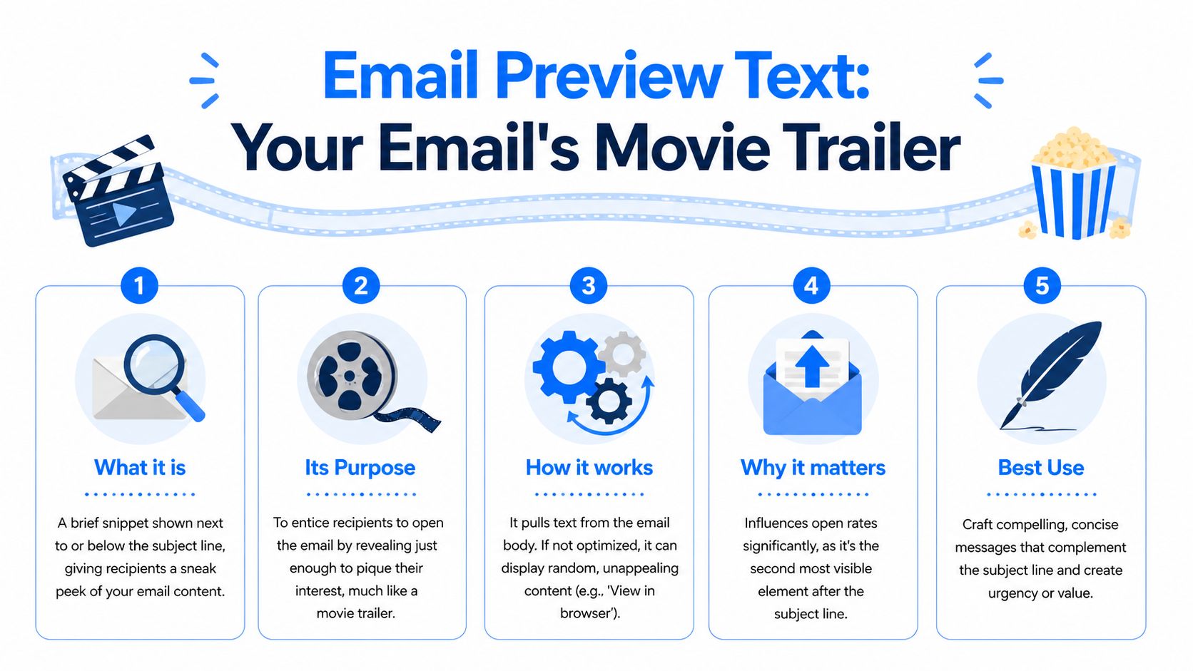
What Email Preview Text Is and How It Really Works
Email preview text is the short snippet shown beside or beneath the subject line in the inbox. It’s commonly called preheader text, though practitioners often use the terms interchangeably. In practical terms, it’s your email’s trailer. The subject line gets attention. The preview text tells the reader whether the email is worth opening.
A good movie trailer doesn’t retell the whole plot. It gives just enough signal to make the audience care. Preview text works the same way. It should sharpen the subject line, not summarize the whole email and not repeat what the subject already said.
Where preview text comes from
This is the part many marketers never get shown. Email clients don’t magically know your preferred preview. They extract it from the first plain text content in an email’s multi-part MIME structure. If you don’t set that content intentionally, the inbox often grabs whatever appears first in the code or visible content.
That’s why bad previews happen so often:
- “View this email in your browser”
- “Unsubscribe”
- Navigation labels
- Logo alt text
- Random opening copy that makes no sense in the inbox
According to DailyStory’s summary of Litmus benchmark findings, customized preview text can boost open rates by 10 to 20% in B2B campaigns, and action-oriented envelope copy showed 15% higher engagement in their benchmark framing of the sender name, subject line, and preview working together as one unit (how email preheaders improve open rates).
Why hidden preheader text exists
Most modern ESPs handle this with a dedicated preview or preheader field. Behind the scenes, they typically inject hidden HTML near the top of the email body so inboxes find that text first, while readers don’t see it when they open the email.
That matters because the inbox reads code order, not visual importance. Your hero section may sit at the top of the design, but if the source starts with utility text or boilerplate, that’s what some clients may use.
Set preview text deliberately every time. “Auto” is fine for internal alerts. It’s weak for revenue emails.
What works and what fails
The fastest way to tell whether preview text is helping is to compare the subject and preview side by side.
| Subject line | Preview text | Outcome |
|---|---|---|
| New guide for RevOps teams | New guide for RevOps teams | Repetition. Wasted space. |
| New guide for RevOps teams | Fix routing gaps before QBR season | Stronger. Adds relevance. |
| Q4 pipeline planning | Three changes top teams are making now | Stronger. Adds context and curiosity. |
A useful rule is simple: the preview should answer the question the subject line creates.
If the subject says, “Webinar replay inside,” the preview can say who it’s for or what they’ll learn.
If the subject says, “Your newsletter growth plan,” the preview can add the specific outcome.
If the subject says, “Last chance,” the preview should explain what expires.
That’s the essential job. Not filler. Not duplicate copy. A second line that earns the open.
Why Preview Text Is Critical for Growth and Deliverability
Preview text affects more than opens. It shapes the first impression of your brand, influences whether subscribers keep engaging, and helps determine whether your emails feel relevant or disposable.

The benchmark spread is the clearest reason to take it seriously. Pushwoosh reports 40.08% average open rates for newsletters, with 35% to 50% described as an excellent range for engaged B2B audiences, and notes that preview text acts as a critical extension of the subject line across major inboxes (2026 email open rate benchmarks). If you’re operating below that range, the envelope is one of the first places to look.
Opens are an upstream metric
Open rates don’t close deals on their own, but they gate everything else. If the inbox presentation is weak, fewer people see the email body. That means fewer clicks, fewer sessions, fewer replies, and fewer chances to move a subscriber toward pipeline.
The effect compounds over time:
- More opens create more opportunities for clicks
- More relevant opens can improve list engagement quality
- Stronger inbox alignment reduces wasted sends to indifferent readers
This is why preview text shouldn’t be left to a junior production step. It belongs in campaign strategy.
Preview text also supports deliverability signals
Inbox providers care about engagement patterns. They look for signs that recipients value what you send. Preview text doesn’t control placement on its own, but it helps create the interaction patterns that support a healthier sending reputation.
That’s especially important for B2B teams sending recurring newsletters, product updates, and educational campaigns. The message has to look relevant before the contact opens it. If it consistently earns attention from the right readers, your future sends have a better chance of continuing to land in the inbox instead of being ignored.
One operational mistake I see often is teams treating deliverability as purely technical and copy as purely creative. In practice, the inbox doesn’t separate them that cleanly.
Better preview text won’t rescue a bad list. But even a strong list underperforms when the envelope looks generic.
For teams restructuring workflow around campaign performance, this piece on how to optimize your marketing team is worth reading because preview text quality usually improves when ownership between strategy, production, and QA is clearer.
A short walkthrough can help you think about the business impact in more practical terms:
Personalization raises the stakes
Pushwoosh also notes that preview personalization can raise rapport, while the broader verified dataset references 37.04% open rates in behavior-based contexts from MoEngage. The point isn’t that every campaign should force a merge field. It’s that inbox relevance matters.
When the preview shows the right benefit to the right segment, the email feels intentional. When it feels mass-produced, even a decent subject line can’t carry the whole impression.
A lot of teams obsess over body copy after the open. Growth teams should obsess over the inbox before it.
Email Client Character Limits You Must Know in 2026
Generic advice like “keep it short” doesn’t help much when different inboxes show very different amounts of text. Character limits vary by client, device, and orientation. If you write one universal preview without knowing where it gets cut, you’re guessing.
TheMarketer’s summary of rendering differences shows why this matters. Apple Mail on iPhone shows 81 characters vertically, while Outlook on Windows shows 35. The same source says over 70% of B2B opens happen on mobile, and that previews longer than 90 characters can lead to a 12% drop in opens because the message gets truncated before the value lands (email preview text length guidance).
Email preview text character limits by client in 2026
| Email Client | Device/OS | Approx. Character Limit |
|---|---|---|
| Apple Mail | iPhone vertical | 81 |
| Apple Mail | iPhone horizontal | 137 |
| Apple Mail | iPad | 87 |
| Gmail | iOS | 90 |
| Gmail | Browser | 97 |
| Outlook | iOS | 55 |
| Outlook | Windows | 35 |
That spread explains why one-size-fits-all advice breaks down. A preview that looks complete in Gmail browser may lose its most important phrase in Outlook Windows. A longer preview can work on Apple Mail horizontal but still fail in the context that matters most for your list.
The safe zone most teams should use
If you want one practical default, use 40 to 70 characters. That’s the safest cross-client range from the verified guidance, especially for mobile-first B2B sends.
This range does three things well:
- Fits tighter clients better: It reduces the chance Outlook and smaller mobile layouts cut off the key phrase.
- Forces better writing: It pushes you to front-load value instead of stacking qualifiers.
- Improves scanability: Short preview text is easier to process when subscribers triage inboxes quickly.
What to put first
The beginning of the preview matters more than the ending. Put the strongest value cue in the first words, not the last.
Compare these two options:
| Weak front-load | Strong front-load |
|---|---|
| In today’s issue, we cover how RevOps leaders can improve routing | Fix lead routing gaps before next quarter |
| We’re sharing a few ideas on newsletter monetization today | Sponsorship ideas for B2B newsletter growth |
| This email includes a breakdown of onboarding friction | Reduce onboarding friction in three steps |
The second versions work because the benefit appears early. If truncation happens, the key promise still survives.
Outlook on Windows is the discipline builder. If your preview still works there, it usually works everywhere else.
When to go shorter or longer
Use the lower end of the range when:
- Your audience skews toward Outlook-heavy corporate environments
- Your subject line is already fairly long
- Your preview relies on a specific phrase that can’t be cut
Use the upper end when:
- Your audience opens mostly on Apple Mail or Gmail mobile
- Your subject line is very short and needs more context
- The value proposition needs one extra clause to be clear
What doesn’t work is writing to the maximum every time. Teams see available space in one client and fill it. That often creates previews that read like body copy, not inbox copy.
A simple client-by-client testing habit
Use your campaign analytics to identify the clients and devices your audience uses. Then review previews in those views before every major send. If your list is Gmail-heavy, optimize for Gmail first. If you serve enterprise buyers, check Outlook carefully. If mobile dominates, assume the first phrase does almost all the work.
The point of a client-by-client breakdown isn’t to make the process fussy. It’s to stop treating rendering differences like edge cases. They’re normal. Strong email marketers plan around them.
Actionable Best Practices for Compelling Preview Text
Once you know the space is limited, the writing gets sharper. The job of preview text is simple: add the missing reason to open. The best versions are concise, specific, and clearly connected to the subject line.
MailerLite’s verified benchmark data reports a 43.46% median open rate and notes that marketers improve results by avoiding subject line repetition and using concrete numbers. The same verified dataset includes MoEngage’s finding that personalization can reach 37.04% in behavior-based emails (compare email performance benchmarks).

Complement the subject line instead of repeating it
This is the most common miss. Repetition feels safe because it stays on message. In reality, it wastes the second line.
| Subject line | Good | Better | Best |
|---|---|---|---|
| New playbook for consultants | Download the new playbook | Templates included | Templates for proposals, follow-up, and scope control |
| Product update for admins | See what changed | Faster setup and cleaner permissions | Faster setup, cleaner permissions, fewer support tickets |
| B2B newsletter strategy | Read our latest strategy | What top operators prioritize | What to fix first if opens have stalled |
The “best” version doesn’t just restate. It adds a reason.
Use specificity over cleverness
A clever preview can work, but specificity usually wins in B2B. Buyers open when they understand the benefit fast.
Strong patterns include:
- A concrete outcome: “Reduce demo no-shows with a tighter reminder flow”
- A clear audience cue: “For PLG teams struggling with activation drop-off”
- A defined asset: “Includes templates, examples, and send notes”
- A useful number: “Three edits that improve inbox clarity”
Numbers work when they clarify. They fail when they look bolted on for effect.
Personalize carefully
Personalization can help, but only when the inserted detail is relevant and reliable. First name isn’t automatically useful. Behavior, segment, role, or account context is often stronger.
Examples:
- Weak personalization: “John, don’t miss this update”
- Better personalization: “For RevOps teams cleaning up handoff friction”
- Best personalization: “Your onboarding drop-off points are probably in these three steps”
That last example feels personal without requiring a token. It reflects a problem the segment actually has.
Write for recognition, not just merge fields. Good personalization makes readers think, “This is for me.”
If your team needs a stronger baseline for tone and clarity in inbox copy, this guide to mastering email communication is a useful companion because preview text quality often improves when the broader writing discipline improves too.
Create urgency without sounding cheap
Urgency works when it describes a real deadline or decision window. It fails when every campaign acts like a countdown.
Try these distinctions:
- Spammy urgency: “Hurry before it’s gone”
- Credible urgency: “Registration closes Friday”
- B2B urgency: “Use this before next quarter planning starts”
The strongest version ties urgency to the reader’s workflow, not your desire for an open.
Ask a question only if the answer matters
Questions can pull a reader in, but many are too broad to earn attention.
Compare these:
- “Want better growth?”
- “Are your lifecycle emails losing momentum after signup?”
- “Are prospects dropping off because your handoff emails feel generic?”
The second and third questions work because a real operator can answer them immediately.
Build a simple writing checklist
Before approving preview text, run this checklist:
- Does it add new information: If it repeats the subject, rewrite it.
- Is the value front-loaded: Put the payoff in the first words.
- Would the first half still work if cut off: Assume some clients truncate.
- Is personalization safe: Broken tokens damage trust quickly.
- Does it sound like a human wrote it: Mechanical copy underperforms even when the structure is right.
For more examples of how the subject and preview should work together, this set of email subject line best practices is worth reviewing alongside your next campaign QA.
Advanced Optimization and Technical Considerations
Once the basics are in place, the next gains come from testing method, template control, and adaptation to changing inbox behavior.
The biggest recent shift is AI-generated inbox summaries. Litmus notes that Gmail and Apple Mail have introduced AI summaries that can override custom preview text, and while there’s no firm data on the open-rate impact yet, the change makes subject line primacy more important and increases the value of real-time monitoring (preview text support and AI summary changes).
Test envelopes, not isolated lines
A/B testing preview text works best when you test the whole inbox impression:
- subject plus benefit-led preview
- subject plus urgency-led preview
- subject plus audience-specific preview
- subject plus curiosity-led preview
Don’t run random copy experiments. Start with a hypothesis. For example, if the audience already knows the topic, urgency may outperform explanation. If the topic is new, clarity may beat curiosity.
One useful discipline is to keep one variable stable. If the subject line stays fixed and the preview changes, you can learn what the preview contributed.
Build fallback logic for personalization
Advanced teams often use dynamic content in the preview. That’s powerful, but it creates failure points.
A broken token in the inbox looks worse than a generic line. So every personalized preview should have a fallback version that still reads naturally if data is missing. Review test sends with empty fields, unusual names, and edge-case segments before launch.
Common pitfalls include:
- Incomplete first-name tokens
- Segment labels that sound internal
- Account names that make the copy awkward
- Dynamic snippets that push important words beyond truncation
Watch encoding and rendering details
Special characters, separators, and emojis can help scanning, but they also introduce inconsistency. Some teams use symbols as a crutch for weak writing. A vertical bar can improve readability. An emoji can work for the right brand. Neither fixes a vague message.
More important is ensuring the preview doesn’t pull in hidden utility copy or compliance text. Technical QA matters here. Marketers should review the actual inbox output in major clients before every key send, not just the email body.
The best technical setup is invisible. Subscribers should never notice the hidden work behind a clean preview.
Adapt to AI summaries without overreacting
AI-generated summaries change the rules, but they don’t make preview text irrelevant. They do mean you should stop assuming your crafted preheader will always appear exactly as intended.
A practical response looks like this:
- Put more message weight into the subject line.
- Keep the preview useful when shown, but don’t rely on it alone.
- Monitor envelope performance over time for anomalies.
- Test major campaigns in clients likely to summarize content.
- Keep deliverability and rendering QA aligned with message strategy.
That last part matters. If inbox behavior becomes less predictable, platform visibility becomes more valuable. Teams need to connect rendering checks with performance trends and with broader email deliverability best practices, especially when unexplained drops appear after client-side changes.
How Breaker Optimizes Your Preview Text Strategy
Most preview text problems aren’t conceptual. Teams know the line matters. The hard part is executing consistently across every send, every segment, and every client without turning QA into a bottleneck.
That’s where workflow matters. Breaker is built for operators who want to treat the inbox view like a measurable growth surface, not a final production detail.
It makes preview text easier to set on every campaign
A lot of email teams fail on consistency. One campaign has a strong preview. The next one reuses a template and forgets to update it. Another falls back to generic text because the field was skipped.
Breaker’s builder makes that workflow easier to control. Marketers can create, revise, and schedule campaigns quickly without burying the preview setup in a technical process. That reduces the odds that important inbox copy gets left to defaults.
It supports relevance at the audience level
Preview text works best when it reflects the problem the reader cares about. Breaker’s targeting engine helps define your ICP and reach engaged exact-match subscribers, which makes sharper preview writing possible in the first place. Better audience alignment gives subject lines and previews more room to be specific.
That matters for B2B newsletters because generic inbox copy usually signals generic targeting. When the list is cleaner and the segmentation is tighter, the preview can speak to a real job, pain point, or buying context.
It gives teams the feedback loop they need
Testing preview text is only useful if the reporting loop is fast enough to support decisions. Breaker surfaces real-time analytics around opens, clicks, subscriber growth, and ROI, so teams don’t have to dig through exports to figure out whether a different envelope is working.
That’s especially useful for:
- A/B testing benefit-led versus urgency-led previews
- Comparing segment-specific previews across ICPs
- Spotting when a rendering or deliverability issue may be suppressing opens
- Measuring whether inbox changes affect not just opens, but downstream engagement
It connects preview text to newsletter growth
The bigger advantage is that Breaker doesn’t treat email as a siloed sending tool. It combines campaign execution with automatic list expansion for B2B audiences. That means inbox optimization connects directly to subscriber growth and lead generation, instead of living as an isolated tactic.
Preview text won’t carry a newsletter strategy by itself. But in a growth program where acquisition, deliverability, targeting, and analytics all connect, it becomes much more valuable. It’s one of the smallest parts of the email and one of the first things subscribers judge.
Teams that win with newsletters usually respect that reality. They don’t let the inbox snippet happen by accident.
If you want a platform that helps you design stronger campaigns, reach the right B2B audience, monitor performance in real time, and turn newsletter sends into reliable pipeline, take a look at Breaker.