Create High-Converting Landing Pages With Video

Video can lift landing page conversion rates sharply, but the lift only shows up when the video is built for the conversion event on that page. For B2B teams trying to grow a high-quality subscriber list, that distinction matters. A polished brand video can still underperform if it delays the page, buries the form, or attracts the wrong signups.
B2B marketing teams still publish landing pages that read like compressed product docs. The result is familiar. Paid clicks bounce, high-intent visitors skim, and newsletter subscribers come in broad but low quality. Video fixes part of that problem because it can explain the offer, qualify the audience, and build trust faster than static copy alone. It can also make performance worse if the embed is heavy, the script is vague, or the CTA asks for an email before the visitor understands the payoff.
The job of a video landing page is simple. Get the right visitor to subscribe with enough context that they are likely to stay engaged after signup.
That is the standard I use for every decision on the page. Script length, speaker choice, thumbnail frame, hosting setup, lazy-loading, captioning, and form placement should all support list growth quality, not just top-line conversion rate. On platforms like Breaker, where subscriber quality matters as much as raw volume, the best pages filter out poor-fit traffic while making the value of subscribing obvious to the right audience. The form and the video should work together, not compete for attention. If you need to tighten that handoff, study high-converting opt-in form patterns for subscriber growth.
A lot of teams try to stop your landing pages from leaking money with surface-level design changes. The bigger win usually comes from matching message, media, and capture flow. A landing page video should do a specific conversion job. Everything else is production trivia.
Why Your Landing Page Needs Video Right Now
Visitors make a decision fast. They either understand the value of subscribing in a few seconds, or they leave. On a B2B landing page, video shortens that gap between first impression and informed action better than static copy alone.
A good video does more than explain the offer. It qualifies the audience. That matters if the goal is not just more email addresses, but a stronger subscriber list with people who are likely to read, return, and convert later. For teams using channels like Breaker, that distinction is the whole point. Raw signup volume can hide a quality problem for months.
Many B2B landing pages still force visitors to scan dense copy, decode the offer, and trust the brand before they have enough context. Video handles that work faster. A clear 30 to 90 second asset can show the problem, frame the payoff, and set expectations for what the subscriber gets. If the fit is weak, the visitor opts out earlier. If the fit is strong, the form feels justified instead of premature.
A lot of teams don't need a full redesign. They need to stop your landing pages from leaking money by fixing the mismatch between how buyers evaluate offers and how the page delivers information.
What video changes on the page
Video improves the parts of the page that usually decide whether a visitor subscribes:
- Message clarity: It compresses a complex offer into a format that is easier to absorb than several paragraphs of positioning copy.
- Trust transfer: A founder, product marketer, or credible customer on camera can reduce skepticism faster than polished text.
- Action momentum: Once the value is clear, the form CTA feels like a logical next step, not an unnecessary ask.
The best landing page videos reduce hesitation first.
For subscriber growth, that has a direct payoff. The video can answer the questions that would otherwise create low-intent signups, such as who the content is for, what kind of insight the subscriber will get, and how often you will show up in their inbox. Then the form closes the loop. If you want that handoff to perform, study proven opt-in form patterns for subscriber growth alongside the video itself.
The impact on subscriber quality
High-converting video landing pages do not just increase form fills. They improve list composition.
A weak page collects curiosity clicks from people who will never become engaged subscribers. A strong video makes the value proposition specific enough that poor-fit visitors leave before signup. That is a win. In B2B, a smaller list of relevant subscribers usually outperforms a larger list built on vague interest, especially if your downstream goal is pipeline, retention, or qualified audience growth rather than vanity metrics.
This is a strong case for video on a landing page. It helps the right people understand the offer fast, and it screens out the rest before they dilute the list.
Planning Your High-Impact Conversion Video
Good production can't rescue a confused offer. Before you record anything, decide what the video needs to do in the funnel and who it needs to persuade.

A landing page video has one job. It should move one audience toward one action. If you try to speak to buyers, champions, practitioners, and curious competitors in the same cut, you'll end up with a polished video that converts poorly.
Match the video type to the page goal
Not every landing page needs the same kind of video. The format should follow the conversion objective.
A practical way to choose:
| Video type | Best use case | What it should do |
|---|---|---|
| Explainer | New category, unfamiliar product, top-of-funnel traffic | Clarify the problem, show the solution, make the next step feel simple |
| Testimonial | Skeptical buyers, higher-friction signup, proof-heavy offers | Borrow trust from a credible customer and reduce perceived risk |
| Product demo | Bottom-funnel traffic, feature-aware audience, webinar or trial signup | Show how the product works and answer "what do I actually get?" |
If you're building a page for event or education signup, the video should usually act like a focused invitation, not a full product overview. A tight registration page often benefits more from a promise-led structure similar to a strong landing page for webinar conversion flow than from a broad corporate intro.
Script for the ICP, not for your brand deck
Most bad scripts sound internally approved. They open with category clichés, list features in company language, and close with a CTA that feels detached from the rest of the message.
A stronger script usually follows this sequence:
- Call out the problem in the buyer's language. Use the phrasing your prospects use in sales calls, onboarding notes, or support tickets.
- Frame the cost of staying stuck. Not with invented numbers. With tangible friction like wasted time, unclear reporting, or low-quality leads.
- Show the specific mechanism. Buyers need to understand how your offer works, not just that it exists.
- Handle the obvious objection. Complexity, implementation effort, trust, data quality, or team adoption.
- Close on one clear next step. Subscribe, register, request access, or book a call. Not all four.
Practical rule: if the CTA asks for an email address, the video should answer "why this is worth hearing from us again."
Personalization is no longer optional for segmented traffic
Many teams leave conversion on the table by creating one generic hero video and sending every audience to the same page.
That approach is weak for B2B because your paid visitor, organic visitor, partner referral, and existing brand-aware audience don't need the same argument. Personalized video elements have been shown to boost engagement by 35% in B2B campaigns, and for B2B mobile users, static above-the-fold videos underperform personalized ones by 28% in time-on-page.
That doesn't always require producing entirely separate videos. Often you can personalize lighter elements around the core asset:
- Opening line: Swap the first few seconds to match the audience segment.
- Thumbnail text: Reflect the use case or pain point that drove the click.
- Adjacent CTA copy: Change the offer language by traffic source.
- Page headline: Match the ad, keyword, or referral context exactly.
Keep the brief tight
The best pre-production document is short and ruthless. It should include:
- Audience definition: who this page is for, and who it isn't
- Primary conversion event: the one action that matters
- Promise: what the visitor gets if they convert
- Proof angle: customer result, product clarity, or founder credibility
- Objection to neutralize: the main reason someone won't sign up
- Distribution context: paid traffic, organic search, email, or outbound
If you can't fill that out clearly, don't record yet. The problem isn't your camera setup. It's your strategy.
Video Production and Hosting for Marketers
You don't need a studio-grade setup to build effective landing pages with video. You need clean audio, clear structure, and a host that won't sabotage performance or analytics.
Production quality matters, but not in the way generally assumed. Buyers forgive modest visuals faster than they forgive rambling, weak positioning, or a page that loads like it's carrying a full media library.
What to care about in production
For most B2B pages, the production stack can stay simple:
- Camera: a modern phone or mirrorless camera is usually enough if framing and lighting are handled well.
- Audio: this matters more than the camera. Use a decent USB mic, lav mic, or shotgun mic.
- Lighting: natural window light or a small key light is often enough to avoid the flat webinar look.
- Editing: Cut aggressively. Remove filler phrases, dead starts, and any intro that doesn't earn its place.
A polished but overproduced video can backfire if the page is meant to feel direct and credible. For a newsletter signup page, a clear founder-led explanation or a concise expert walkthrough often beats a glossy brand reel.
The hosting decision that affects conversion
Where you host the video changes what you can measure, how the embed behaves, and what distractions show up around the player.
Here's the practical comparison marketers usually care about:
| Hosting option | Strengths | Weaknesses | Best fit |
|---|---|---|---|
| YouTube | Easy, familiar, free, broad compatibility | Competing suggestions, weaker control over player experience, less focused conversion environment | Awareness content, lower-stakes pages |
| Vimeo | Cleaner presentation, better branding control, solid embed options | Less marketing-specific lead capture workflow than some dedicated tools | Brand-forward pages that need a polished player |
| Wistia | Strong analytics, marketer-friendly embeds, CTA and lead capture options | Paid tool, more setup overhead | Conversion pages where watch behavior matters |
| Vidyard | Good for sales and personalized video use cases, useful viewer insights | Can be more than some teams need for a simple page | Sales-assisted funnels and account-based workflows |
| Self-hosting | Full file control | Usually poor choice for speed, bandwidth, analytics, and maintenance | Almost never the right answer for landing pages |
Self-hosting is where teams get into trouble. They upload a large file to their own server, add a custom player, and then spend weeks chasing page speed problems, playback inconsistencies, and incomplete reporting. Unless you have a strong technical reason and the engineering support to maintain it, don't do it.
If the page is meant to convert cold traffic, don't give the video delivery job to infrastructure that wasn't built for video delivery.
Pick for measurement, not just appearance
A lot of marketers choose a host based on how the player looks. That's backward. Start with the reporting and control you need.
Questions that matter more:
- Can you see play rate and watch behavior clearly?
- Can you control branding inside the player?
- Can you avoid sending visitors into unrelated video recommendations?
- Can you add CTAs or turnstile-style email capture when it fits the funnel?
- Can your team implement the embed without slowing the page down?
If the landing page is tightly tied to lead capture, professional hosting usually wins over a basic YouTube embed because it supports cleaner measurement and fewer distractions. The exact platform matters less than the principle. Your video host should support conversion. It shouldn't compete with it.
Embedding Video Without Sacrificing Page Speed
Pages slow down for boring reasons. A heavy iframe, extra player scripts, oversized thumbnails, and third-party requests can wipe out the conversion lift the video was supposed to create.
On a B2B subscriber page, that cost is higher than it looks. If the page stalls before the headline, proof, or signup form appears, fewer qualified visitors stay long enough to watch. Fewer watchers become subscribers. For a brand trying to build a list of the right people, speed is part of the conversion path, not a technical cleanup task.
Treat the embed like a conversion component
Page builders make video embeds look harmless. They are not. A default embed often pulls in the player, analytics libraries, thumbnail assets, fonts, and tracking requests before the visitor does anything.
That is a bad trade if your goal is newsletter growth.
The visitor needs to see the promise first. Headline, supporting copy, social proof, and the first signup opportunity should render before the full player loads. If you use Breaker or any workflow-driven subscriber system, this matters even more because fast page loads protect the top of the funnel that later feeds segmentation, scoring, and automated follow-up. Teams building that handoff should also map the signup flow into an automated subscriber workflow before they start adding scripts to the page.
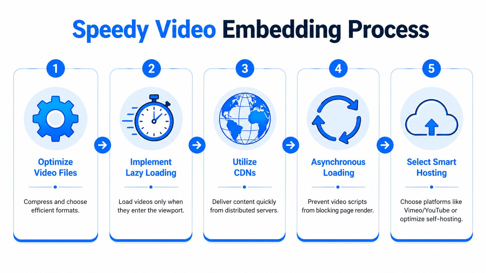
Use this setup:
- Start with a smaller source file. Hosting platforms transcode, but they do not rescue a sloppy upload every time.
- Load a poster image first. Defer the full player until the click.
- Lazy-load any video that sits below the fold. The browser should not fetch player resources for content the visitor has not reached.
- Keep autoplay muted if you insist on using it. In many B2B cases, click-to-play converts better because it reflects real intent.
- Test on a throttled mobile connection. Desktop office Wi-Fi hides problems that hurt paid traffic and email clicks.
A simple rule works well here. If the embed delays the headline, CTA, or form, it is too heavy.
A practical embed pattern
For iframe-based players, the cleanest pattern is a facade. Show a thumbnail and play button first. Swap in the iframe only after the click.
<div class="video-facade" data-video-id="YOUR_VIDEO_ID"><button class="video-play" aria-label="Play video"><img src="thumbnail.jpg" alt="Preview of the landing page video"></button></div>That approach reduces initial requests and keeps Core Web Vitals in better shape. It also gives you tighter control over the first impression. On subscriber pages, I prefer a thumbnail that looks like a continuation of the page message, not a generic video still. The job of the preview is to earn the click without distracting from the form.
If you use YouTube, avoid the default iframe unless you accept the weight and branding trade-offs. If you use Wistia, Vimeo, or Vidyard, check whether they offer lighter embed options and whether you can limit what loads on page render.
Mobile fallbacks decide whether the page still converts
Background video causes a lot of preventable damage. It can look polished on a large screen and perform poorly on mobile, low-power devices, or weak connections.
Set hard rules:
- Use a static poster image when bandwidth or device conditions are weak
- Do not rely on motion to explain the offer
- Keep the headline, value proposition, and form readable without playback
- Make sure the page still converts if the video never starts
That last point matters. B2B landing pages often get traffic from LinkedIn, newsletters, shared Slack threads, and mobile email opens during the workday. In those contexts, video is support. The signup path still has to work without it.
Add accessibility and search signals without bloating the page
Captions help conversion because many people watch at work with the sound off. Transcripts help scanning, clarify your message, and give search engines more context about the asset.
A solid implementation includes:
- Closed captions or burned-in captions
- A transcript for videos with real explanatory content
- Descriptive alt text on the preview image
- VideoObject schema so search engines can interpret the video
<script type="application/ld+json">{"@context": "https://schema.org","@type": "VideoObject","name": "Product explainer","description": "Short video explaining the product and signup offer","thumbnailUrl": "https://example.com/thumbnail.jpg","embedUrl": "https://example.com/embed/video"}</script>Keep the first visible experience light. Visitors should understand the offer before the player starts asking the browser for more work.
What usually goes wrong
The failure pattern is predictable. A team makes a strong video, then hurts the page with a poor embed.
Common mistakes include:
- Uploading oversized files and assuming the host will fix performance
- Turning on autoplay with sound
- Embedding multiple videos on one signup page
- Forgetting captions and losing silent viewers
- Using a thumbnail that does not reinforce the value proposition
- Letting the player load before the form, headline, or proof elements
Good implementation is boring by design. The video should feel fast, intentional, and tightly connected to the signup goal. If it looks impressive but slows the page, it is working against list growth.
Connecting Your Video to a Newsletter Growth Engine
A video landing page earns attention. Subscriber growth comes from what happens in the next 30 seconds.

On B2B pages, the usual failure is easy to spot. The video is specific, the visitor is interested, and then the signup experience gets vague. The form asks for an email with no clear reason to subscribe, and the follow-up sequence treats every lead the same. That breaks the momentum the video just created.
For a platform like Breaker, that mistake shows up fast in list quality. You may get more form fills, but lower-intent contacts drag down engagement, distort campaign reporting, and waste sales or lifecycle follow-up.
Match the CTA to the promise of the video
The CTA should feel like a continuation of the video, not a separate ask.
If the video explains a painful operating problem, offer an ongoing briefing that helps the subscriber solve that problem. If the video demonstrates expertise, promise more analysis, workflows, or examples from the same angle. If the video relies on customer proof, the opt-in should extend that proof with case-led emails, not generic product news.
That alignment matters more than squeezing in extra urgency language.
A good B2B subscriber CTA does three things at once. It tells the right person what they will get, shows why the content is worth repeated attention, and naturally filters out people who only wanted a quick look. That filtering is healthy. A smaller list of relevant operators, buyers, or practitioners usually outperforms a larger list full of weak-fit contacts.
Route subscribers based on what they watched
The page should pass context into your email system the moment someone converts. Source, page intent, and video angle should determine the first messages a new subscriber receives.
A good marketing workflow setup for subscriber routing helps you tag signups by page theme, campaign source, or CTA variant so the first email matches the reason they opted in. That is how a landing page turns into a newsletter growth engine instead of a disconnected lead capture form.
Use a simple routing model:
| Video angle | Subscriber intent signal | Best follow-up |
|---|---|---|
| Product explainer | Wants clarity on the offer | Educational onboarding sequence |
| Customer testimonial | Needs proof and confidence | Case-led nurture and objection handling |
| Founder or expert POV | Interested in insight and perspective | Thought leadership newsletter sequence |
This is also where testing matters. If you want a practical benchmark for form, CTA, and page-level experiments, this guide to A/B testing for UK SMEs is a useful reference.
Qualify before the form submit
A lot of B2B teams optimize for raw conversion rate and call it a win. That is incomplete math. If the video broadens the audience too far, the page can grow the list while hurting subscriber quality.
Use the video to make audience fit obvious before the form appears. Name the role the newsletter is for. Speak to the specific problem it covers. Show the kind of insight, operating advice, or market analysis subscribers will receive. Avoid vague promises like "stay updated" or "get the latest news."
The right video increases signups and reduces bad signups.
Treat the thank-you page and first email as part of the conversion path
The handoff does not end at form submission. The thank-you page should confirm what the subscriber signed up for and suggest one next action, such as reading a related issue, bookmarking a resource, or replying with their biggest challenge. The first email should arrive quickly and continue the same thread as the page and the video.
That continuity is what turns a single visit into an engaged subscriber relationship. It is also what makes video worth the production effort in the first place.
How to Measure and A/B Test Video Performance
A video that gets watched but does not grow your subscriber list is a production cost, not a growth asset. On a B2B landing page, measurement has one job: show whether the video increases qualified email signups from the right audience.

Start with a simple question set. Did visitors press play? How long did they stay? Did people who watched convert into better subscribers at a higher rate than people who skipped the video?
Views alone are not enough. A high play count can hide a weak page if the video attracts attention but fails to qualify the visitor. For newsletter growth, especially in B2B categories like Breaker-style insight products, the win is not more emails in the database. The win is more subscribers who match the role, problem, and level of intent the newsletter is built for.
The metrics that matter
Track these first:
Play rate
This shows whether the thumbnail, player treatment, and nearby copy are strong enough to earn attention.Watch behavior
Check where viewers drop. Sharp exits in the first few seconds usually point to a weak opening, a mismatch between ad promise and page message, or a video that starts too slowly.Conversion rate by viewer status
Split visitors into non-viewers, partial viewers, and high-intent viewers if your stack allows it. That breakdown is usually more useful than average watch time.Subscriber quality after signup
Measure what happens after the form submit. Do video viewers confirm their email, open the first message, and keep reading over the next few sends? If not, the page may be converting curiosity instead of fit.
That last metric gets ignored too often.
A page can show a higher conversion rate and still damage list quality. I have seen videos increase form fills while reducing downstream engagement because the message was broad, polished, and vague. It pulled in people who liked the content but were never a real fit for the newsletter.
A/B tests worth running
Run tests that answer one conversion question at a time. If you change the headline, thumbnail, CTA, and player position in one round, you will get a result but not a usable lesson.
The highest-value tests are usually these:
Video versus no video
Establish the baseline first. Some traffic sources need the extra persuasion. Some do not.Thumbnail treatment
Test a speaker close-up, a product or newsletter preview, and a frame with supporting text. Thumbnail choice changes play rate fast.Video placement
Compare a hero placement against a lower position after proof and copy. For skeptical B2B traffic, forcing the video too early can hurt momentum.Opening 10 seconds
Test a version that states audience fit immediately against one that opens with brand context. Early clarity often improves both watch depth and lead quality.CTA relationship to the video
Try the form beside the player, below the player, or after a short proof block. The best setup depends on whether the video creates demand or merely resolves objections.Video type
Test founder explainer versus customer proof. Explainers often help cold traffic. Testimonials often help visitors who already understand the offer.
How to read the result without fooling yourself
A high play rate with flat subscriber growth usually means the packaging is working better than the message. People are interested enough to click, but not convinced enough to subscribe.
A low play rate does not automatically mean failure. If page conversion improves and post-signup engagement holds, the video may be doing its job as passive reassurance. Some visitors just need to see that a real person, customer, or product explanation exists.
Segment by source before you make a call. Paid social traffic, branded search traffic, partner referrals, and direct visitors often behave differently enough that one average hides the actual pattern. A testimonial video may help warm referral traffic and hurt cold paid traffic. An explainer may do the opposite.
For teams that want a cleaner process, this guide to A/B testing for UK SMEs is a useful reference because it focuses on test hygiene, controlled variables, and sample discipline.
A practical review rhythm
Use a weekly review in the first month after launch, then shift to a monthly check once the page stabilizes.
| Review area | What to inspect | What it may signal |
|---|---|---|
| Play rate | Are visitors starting the video at a healthy rate for this traffic source? | Weak thumbnail, poor placement, or low message relevance |
| First 10 to 15 seconds | Where do viewers leave? | Slow setup, unclear audience fit, or weak opening line |
| Viewer versus non-viewer conversion | Who actually subscribes more often? | Whether the video persuades or just attracts clicks |
| Post-signup quality | Do viewers become engaged subscribers? | Whether the video is filtering for fit or widening too far |
| Source-level performance | Does one channel respond better to video than another? | Need for segmented landing pages or channel-specific variants |
Stay disciplined. Measure the full path from play to subscriber quality, keep tests focused, and treat every video change as a conversion decision, not a creative one.
Frequently Asked Questions About Landing Page Videos
Teams usually ask the same thing after launch. Not whether video belongs on the page, but whether each choice helps or hurts conversion quality. That is the right question, especially on a B2B subscriber page where a play does not matter unless it leads to qualified signups.
Should landing page videos autoplay
Usually, no.
Autoplay works in a narrow case: muted background motion that adds context without carrying the core message. It performs poorly when the visitor needs the video to understand the offer, trust the brand, or decide whether to subscribe. It also creates practical problems across mobile devices, browser settings, and low-bandwidth sessions.
Use this framework:
| Scenario | Recommendation | Reasoning |
|---|---|---|
| Hero explainer with substantive message | Don't autoplay | Visitors should choose to engage with the message |
| Silent background loop supporting brand feel | Use carefully, muted only | The page still needs to stand on its own |
| Mobile-first B2B signup page | Avoid autoplay | It adds friction and increases performance risk |
| Testimonial video beside a form | Don't autoplay | Proof works better when the visitor opts in |
If the answer is not obvious, use click-to-play.
How long should the video be
Keep it as short as the buyer journey allows.
For B2B landing pages, most explainers work best when they reach the point fast, and most testimonial clips work best when they stay tightly edited. A subscriber acquisition page is not the place for a brand film. The job is to establish relevance, show why the offer is worth an email address, and point clearly to the CTA.
If the video takes too long to answer "Why should I sign up?", it is working against the page.
Should the video sit above the fold
Put it high on the page when the video does real conversion work.
If the headline and supporting copy already make the value clear, the video can sit just below the first screen and act as reinforcement. If the page depends on the video to explain the offer, reduce skepticism, or show product value, place it where visitors can see it immediately. Hiding your main persuasion asset lower on the page usually costs you both plays and signups.
A simple rule helps here. Put the video above the fold when it drives understanding. Move it lower when it mainly adds proof.
Are background videos worth using on B2B pages
Sometimes. Often they are decoration dressed up as strategy.
Background video can help on pages where the product has a visual workflow, a physical environment, or a motion-based interface that is hard to communicate in one static image. For a newsletter or subscriber capture page, though, the bar should be high. If the motion does not increase clarity or trust, it is just adding weight, accessibility issues, and implementation work.
Use background video only if all four conditions hold:
- The value proposition is still clear without playback
- The CTA remains readable and prominent
- The fallback image can carry the section on its own
- Mobile load and interaction stay clean
If one of those breaks, use a static hero and a standard player.
Is YouTube good enough for a landing page
It can be. It is rarely my first choice for high-intent conversion pages.
YouTube is fast to ship and fine for awareness traffic. It is weaker when the goal is list growth from buyers who are deciding whether your newsletter, demo, or content is worth ongoing attention. On those pages, cleaner player control, fewer distractions, and better viewing data matter more than convenience.
The trade-off is simple. YouTube lowers setup time. Dedicated hosting usually gives you a better conversion environment.
Should I use captions if the speaker is easy to hear
Yes.
Captions improve comprehension, help viewers who are watching without sound, and make the message easier to scan. They also expose weak scripting. If a sentence looks vague in captions, it usually sounds vague in the video too.
Can one video serve every traffic source
It can. It usually leaves conversion on the table.
Paid social traffic often needs a faster setup and stronger qualification. Branded search traffic may already understand the category and need proof or specificity instead. Referral traffic may respond better to credibility cues because the initial trust is already there. One generic cut tends to smooth over those differences, which is exactly what a high-converting subscriber page should not do.
If producing multiple videos is too expensive, customize the lighter layers first:
- Change the headline
- Swap the thumbnail
- Adjust the CTA
- Rewrite the first line or opening scene
Those edits are cheaper than a full reshoot and often enough to make the page feel built for the traffic source. For newsletter growth engines, that matters because better message match usually improves not just signup rate, but subscriber fit after signup.
What's the biggest mistake teams make with landing pages with video
They optimize for finishing the video instead of earning the subscription.
That mistake shows up everywhere. The script explains too much and qualifies too little. The page design gives the player more visual weight than the form. The CTA appears after the persuasive moment instead of beside it. Reporting stops at views and watch time, so the team never learns whether viewers become engaged subscribers.
A landing page video has one job. Help the right visitor decide to join. Platforms like Breaker become more useful when that upstream work is done properly, because better page intent creates a healthier list, cleaner segmentation, and stronger downstream email performance.