10 Landing Page Best Practice Tips for B2B Growth

You pay to get the right B2B visitor to the page. They arrive with context, scan for a few seconds, and leave without subscribing. In newsletter acquisition, that usually points to page-message fit, not just a traffic problem.
A B2B newsletter signup asks for more than a form fill. It asks for permission to keep showing up in a buyer's inbox. That changes the standard for what a landing page needs to do. The page has to attract the right subscribers, set clear expectations, and filter out low-intent signups that inflate top-line conversion rates but never turn into engagement or pipeline.
That trade-off matters. A page can post a healthy conversion rate and still perform poorly if the list it builds does not open, click, or match your ICP. For newsletter growth, volume without fit creates reporting noise, weakens downstream email performance, and gives the team the wrong read on what is working. Strong pages do the opposite. They qualify interest early and earn subscriptions from people who want the content.
Scale matters too. Involve.me's landing page benchmark research found that companies with more landing pages tend to generate more leads. For B2B newsletters, the practical takeaway is straightforward. One generic signup page rarely matches the performance of focused pages built for specific audiences, offers, or acquisition channels.
That is especially clear for teams already creating campaign-specific pages, such as a webinar landing page for B2B registration and follow-up, then trying to convert that same audience into newsletter subscribers later. Intent changes by channel and offer. The page should reflect that.
The sections below focus on landing page best practices for B2B newsletter acquisition specifically. The goal is not to get more email addresses at any cost. It is to build a subscriber base that stays engaged and creates long-term value.
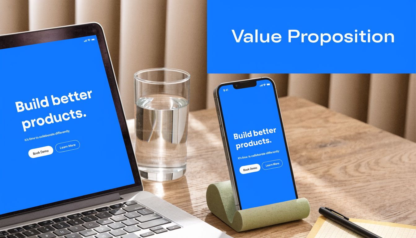
1. Clear Value Proposition Above the Fold
A prospect clicks from LinkedIn, lands on your signup page, and sees “Join our newsletter.” That is usually where the session dies. In B2B, the first screen has to answer a sharper question: why should this person give your team recurring access to their inbox?
The answer cannot be “because more subscribers is good.” For newsletter acquisition, the job of the hero section is to attract the right readers and filter out weak-fit signups early. A clear value proposition improves conversion quality, not just form completion rate. That matters more than adding another batch of low-intent contacts who never open.
Write for immediate clarity
Visitors should understand three things before they scroll: what they will get, who it is for, and why it is worth subscribing. If any of those points are fuzzy, the page creates hesitation. Hesitation is expensive on traffic you already paid for or worked to earn.
A strong above-the-fold section usually includes:
- Headline: Lead with the outcome or insight category. “Get weekly B2B growth ideas you can apply” is clearer than “Insights for modern teams.”
- Subhead: Define the audience and content scope. Say whether the newsletter is built for SaaS marketers, demand gen leaders, founders, or revenue teams.
- CTA: Keep the action tied to the offer. “Subscribe for weekly growth ideas” sets a better expectation than “Submit.”
- Support line or microcopy: Add one line on format, frequency, or editorial angle if it sharpens fit.
Here is the test I use. Remove the brand name from the page. If the headline could still fit ten other B2B companies, the message is too generic.
Specificity gets better subscribers
Broad copy can lift raw signup volume, especially with cold traffic. It also tends to pull in people with weak intent. For a B2B newsletter, that trade-off often hurts downstream performance. Open rates fall, clicks soften, and the list looks larger than it really is.
Specific copy does the opposite. It narrows the audience a bit, but the subscribers you gain are more likely to recognize themselves in the promise and stay engaged over time. That is usually the better growth decision.
For example, “Weekly email marketing advice” is serviceable. “Weekly breakdowns of B2B email, landing page, and conversion tests for SaaS growth teams” does more qualifying work up front.
If you want a good companion framework, these B2B newsletter opt-in form examples and tactics pair well with a sharper hero message.
Match the promise to the traffic source
Above-the-fold copy should also reflect why the visitor clicked in the first place. A paid campaign aimed at demand gen leaders should not reuse the same hero message built for founder-led organic traffic. The offer may be the same newsletter, but the angle should match the intent behind the visit.
If you're building campaign-specific pages, study focused signup flows like a landing page for webinar conversion path. The principle carries over cleanly to newsletter acquisition. Message match reduces confusion fast and improves the odds that the subscriber actually wants the content after signup.
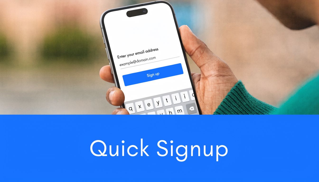
2. Single-Step Signup Form with Progressive Profiling
A demand gen leader clicks through to your newsletter page, sees six fields, a phone number request, and two dropdowns, then leaves. That visit did not fail because the offer was weak. The form asked for qualification before it earned trust.
For B2B newsletter acquisition, the first conversion should be light. In many cases, email alone is enough. Name or company can make sense if there is a clear use for it right away. Job title, team size, budget, and phone number usually reduce completion rate without improving subscriber quality enough to justify the loss.
Reduce friction first, enrich later
Analysts and practitioners have reported for years that shorter forms convert better. The practical takeaway matters more than the exact benchmark. Each extra field adds hesitation, especially on a page whose goal is newsletter signup, not demo qualification.
That does not mean giving up on segmentation. It means changing when and where you collect it.
A better B2B workflow usually looks like this:
- Signup step: Ask for email, and add one extra field only if it directly improves routing or personalization.
- Thank-you page: Collect role, company, or topic preference after the subscriber has already converted.
- Welcome sequence: Ask one simple profiling question in the first or second email.
- Backend enrichment: Use your CRM and enrichment tools to append firmographic data without making the subscriber do the work.
This approach protects conversion rate and still gives the team enough data to separate students from operators, vendors from buyers, and low-fit subscribers from the audience you want.
Keep qualification logic behind the scenes
B2B marketing teams often add fields because downstream teams want cleaner lists. The trade-off is straightforward. If the form cuts signups by asking too much up front, the extra data has no value.
Progressive profiling solves that problem. Capture the signup first. Then segment by post-submit questions, email behavior, referral source, or enrichment. A subscriber who opens three issues and clicks content about pricing strategy is often more valuable than someone who filled out a detailed form and never engaged.
If you want examples of low-friction capture flows built for qualification over time, review these opt-in forms for B2B acquisition.
The goal is not the biggest list. It is a list full of people who will keep reading.
3. Social Proof and Trust Signals Strategically Placed
B2B visitors don't trust you because you say your newsletter is useful. They trust you when the page shows proof that credible people already pay attention to it.
That doesn't mean dumping a huge testimonial wall under the hero. It means placing the right proof at the moment the reader starts to question whether the subscription is worth it.
Lead with relevant proof, not generic praise
For newsletter pages, the best trust signals usually include recognizable company logos, subscriber role relevance, sample content quality, and a short privacy reassurance near the form. If the audience is niche, role-specific proof beats broad popularity every time.
A page targeting RevOps leaders might perform better with logos from known B2B SaaS brands and a testimonial from a revenue leader than with generic “great newsletter” blurbs from founders outside the segment.
Use a simple order:
- Top of page: customer or reader logos
- Mid page: one or two short testimonials tied to business outcomes
- Near form: privacy, compliance, or unsubscribe reassurance
Generic social proof often underperforms when the audience is highly targeted. Relevance matters more than volume.
Show the kind of audience you attract
For newsletter acquisition, trust isn't only about your brand. It's also about the peer group the subscriber joins. Smart pages make that visible. If the newsletter is read by product marketers, sales operators, or PLG teams, say so clearly.
One trap I see often is using a vanity number without context. A large subscriber count may sound impressive, but a B2B buyer usually cares more about whether the audience is their peer set. For this kind of page, “read by growth leads at B2B SaaS companies” is often stronger than a broad popularity signal.
4. Benefit-Focused Copy with Outcome Clarity
A newsletter landing page is not a content archive. It's a promise.
Visitors don't subscribe because you publish “insights.” They subscribe because they believe your emails will help them do something better, faster, or with less waste. That's why feature-heavy copy underperforms on newsletter pages. People care less about your publishing cadence or content format than they do about the practical outcome.
Write the after-state
Strong newsletter copy answers one question: what gets better if I subscribe?
Instead of writing:
“We send weekly articles about email growth, acquisition, and campaign strategy.”
Write:
“Get weekly ideas to attract better-fit subscribers, improve engagement, and make your newsletter a stronger revenue channel.”
That second version gives the reader an after-state. It connects the email to work they already need to do.
A useful structure is before and after:
- Before: paying for traffic that doesn't convert
- After: acquiring subscribers who engage
- Before: guessing which campaigns work
- After: making decisions from clear performance signals
Be specific about the promise
Good pages define content type, audience, and practical payoff. They don't rely on hype.
Substack succeeds with simple product messaging. Lenny's Newsletter works because the value is clear and role-specific. B2B newsletter pages should do the same. If your content is for SaaS marketers, say that. If it helps teams grow engaged email audiences, say that too.
I've found that pages improve when copy shifts from “what we publish” to “what you'll learn, avoid, or improve.” That sounds small, but it changes how the offer lands.
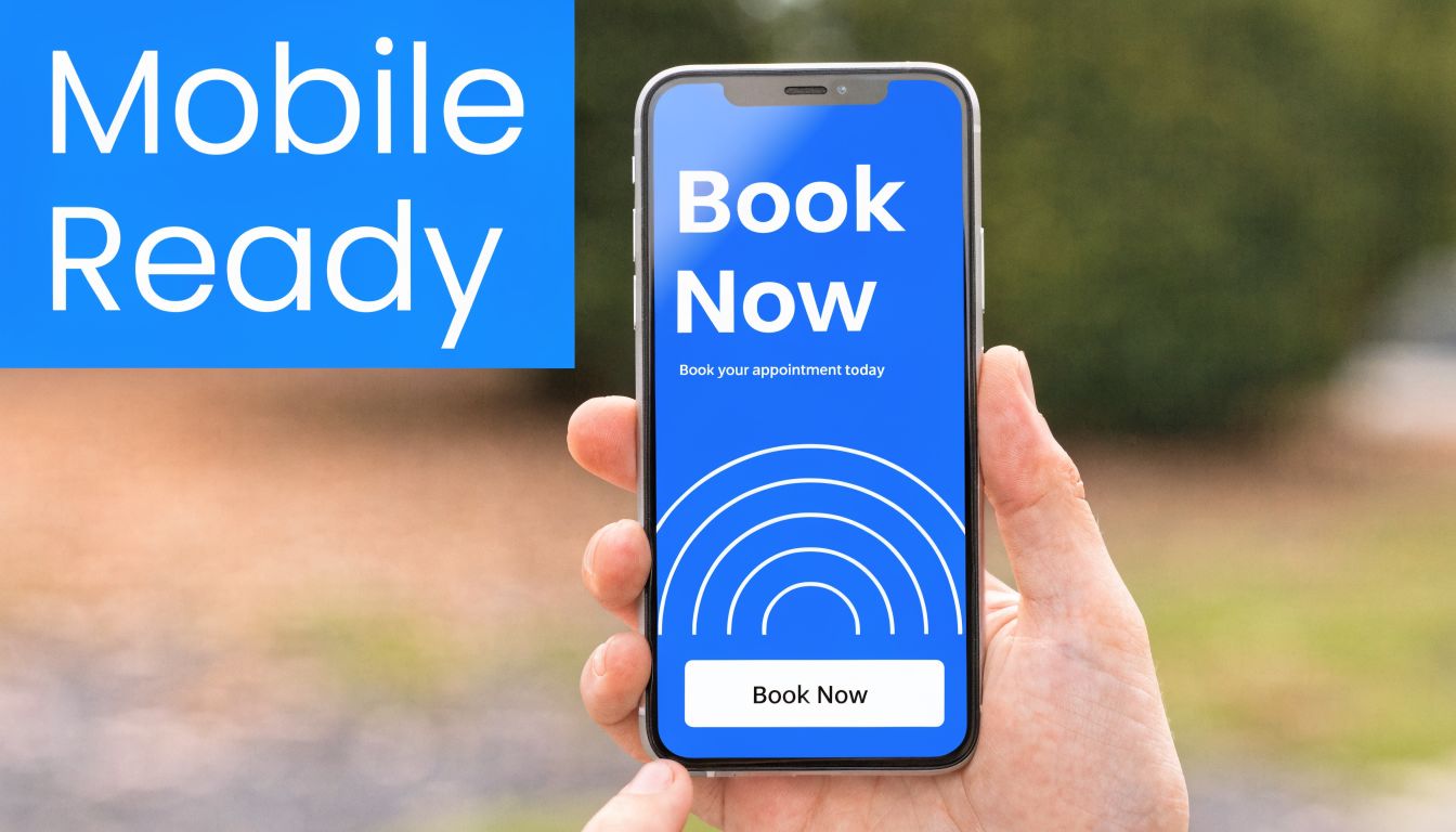
5. Mobile-Optimized Design with Touch-Friendly CTAs
A paid LinkedIn click lands on your newsletter page during a commute. The prospect is interested, but the email field sits below a tall hero image, the button is cramped, and the form jitters as the page loads. That visitor may still care about your content. They just are not going to fight the page to subscribe.
For B2B newsletter acquisition, mobile design affects more than raw conversion rate. It shapes who completes the form. If the experience is clumsy on a phone, you often lose high-intent readers who discovered you from social, communities, forwarded emails, or a saved link they opened between meetings.
Design for real mobile behavior
Desktop reviews miss common mobile problems. Long intros bury the form. Multi-line buttons become harder to scan. Input fields look acceptable in a mockup, then feel too small on an actual device.
Three choices usually matter most:
- Get to the signup action fast: the email field and CTA should appear quickly without excessive scrolling
- Use tap-friendly spacing: buttons need enough height and surrounding space to prevent mis-taps
- Keep copy tight on small screens: short paragraphs and clear subheads help readers qualify the offer quickly
- Reduce visual weight: oversized images, sticky bars, and chat widgets often crowd the form on mobile
Minimal pages often perform better here because they ask the visitor to do less. That does not mean every page should be stripped down. It means every mobile element needs to earn its space.
Mobile friction changes subscriber mix
This matters for list quality. A hard-to-use mobile page does not just suppress signups. It can skew your acquisition toward lower-value traffic that converts later on desktop, while filtering out busy operators who were ready to subscribe in the moment.
I have seen this trade-off firsthand. Teams focus on desktop polish because that is where stakeholders review pages, then wonder why newsletter growth comes from lower-engagement segments. Often the issue is simple. The mobile page makes quick intent hard to act on.
Test the full signup flow on a phone
Open the page on iPhone and Android. Use cellular, not just office Wi-Fi. Submit the form, watch the keyboard behavior, and check the thank-you state.
Look for practical failures:
- the CTA drops below the keyboard
- autofill covers labels or breaks spacing
- the submit button shifts after a validation error
- the confirmation state loads slowly or feels disconnected from the signup action
A mobile page is doing its job when a qualified visitor can understand the value, enter an email, and finish the action with one hand in a few seconds.
6. Strategic CTA Button Design and Placement
A visitor reads the headline, likes the promise, and decides to subscribe. Then the button is vague, buried, or surrounded by competing links. That is how qualified newsletter intent gets lost.
For B2B newsletter acquisition, CTA design is not just a conversion detail. It shapes who joins the list. Clear buttons and disciplined placement help high-intent visitors act fast. Cluttered pages and soft CTA language pull in lower-quality clicks or create hesitation that costs strong subscribers.
One CTA goal per page
Dedicated signup pages work best when one action clearly dominates. As noted earlier, pages with fewer competing actions tend to convert better. More importantly for newsletter growth, they produce cleaner intent. A visitor should not have to choose between subscribing, booking a demo, reading the blog, and browsing the homepage.
Keep the page focused with a few practical rules:
- Use specific CTA copy: “Subscribe to weekly B2B growth insights” sets a clear expectation. “Submit” and “Get started” do not.
- Match the CTA to the offer: if the newsletter is tactical, say so. If it is curated for senior operators, say that.
- Give the button strong contrast: the CTA should be the most visually obvious action on the page.
- Cut weak exits: extra navigation, footer link stacks, and unrelated buttons dilute intent.
This is one of the easiest places to improve subscriber quality. Specific CTA language filters casual clicks and attracts readers who want the content being promised.
Place CTAs where confidence increases
CTA placement should follow the visitor's decision process. On a short page, one strong hero CTA and one repeat lower on the page is often enough. On a longer page, repeat the CTA after the moments that reduce friction: proof, sample topics, or a short explanation of who the newsletter is for.
The best pages do not scatter buttons everywhere. They place them after the visitor has enough information to say yes.
A useful standard is simple. If a section answers a real objection, the next element should let the reader act. If the page explains what they will get, who it is for, and why it is worth their inbox space, the CTA should be right there.
Avoid clever button copy that hides the action. Consumer brands can sometimes get away with “Let me in” or “Join the movement.” B2B newsletter pages usually perform better with plain language because the user is making a small but real professional commitment. “Subscribe” or “Get weekly insights” works because it is clear.
Good CTA strategy reduces friction. Great CTA strategy also improves list quality by making the commitment explicit before the click.
7. Segmented Landing Pages by Audience or Channel
If you're sending every visitor to the same newsletter signup page, you're asking the page to do too many jobs.
A consultant, a product-led growth lead, and an enterprise sales operator don't want the same message, even if they may all benefit from the same newsletter. Their pain points are different. Their language is different. Their threshold for relevance is different.
Relevance beats breadth
The payoff of scale becomes apparent. As noted earlier, more landing pages often mean more leads. For B2B newsletter growth, that usually happens because segmented pages increase message match.
A few practical segmentation patterns work especially well:
- By role: growth marketer, sales leader, agency operator
- By industry: SaaS, services, fintech, healthcare
- By channel: paid social, partner traffic, email referral, webinar follow-up
- By awareness level: cold traffic needs proof, warm traffic can move faster
Breaker-style targeting logic makes this particularly useful because traffic quality improves when the landing page reflects the same ICP logic used in acquisition.
Keep the page structure stable, change the message
You don't need a full redesign for every audience. You can often keep one proven template and swap:
- headline
- subhead
- social proof
- sample newsletter topics
- CTA wording
That's the practical version of landing page best practice. Build once, personalize many times.
A page for agencies might emphasize white-label growth and client reporting. A page for in-house SaaS marketers might emphasize subscriber quality and measurable engagement. Same offer category. Different buying context.
8. Analytics, Funnel Transparency, and A/B Testing
A newsletter landing page can look healthy at a glance and still be leaking high-intent subscribers every day. The problem is usually not dramatic. It is one unclear form label, one weak mobile state, one proof block placed too low, or one extra click between intent and signup.
Here's a useful walkthrough on testing and iteration before you set up your own process:
Track the steps that explain subscriber quality
Pageviews and total conversions are too shallow for B2B newsletter acquisition. They tell you volume. They do not tell you whether the page attracts the right subscribers, where qualified visitors hesitate, or why one traffic source produces engaged readers while another produces low-quality opt-ins.
Track the full path:
- Field starts: who begins the form
- Field abandonment: where intent drops off
- CTA clicks: which message earns action
- Submission attempts: where validation or UX issues block completion
- Successful signups: what reaches your ESP or CRM
- Post-signup quality signals: welcome email opens, early clicks, and source-level engagement by segment
That last layer matters. For a B2B newsletter, the best page is not always the one with the highest conversion rate. It is the one that consistently brings in subscribers who read, click, and stay.
If your reporting still stops at form submission, add a system that gives you detailed performance insights across the full acquisition path. Then connect that reporting to broader marketing campaign optimization workflows so landing page performance is evaluated alongside channel quality, not in isolation.
Make the funnel visible before you start testing
A surprising number of A/B tests fail because the team cannot see what caused the behavior change. If Variant B lifts conversions, you need to know whether it increased form starts, reduced abandonment, improved mobile completion, or only attracted lower-intent clicks.
That visibility changes the decisions you make. A shorter form may increase submissions but lower subscriber quality if it removes a useful qualification field. A more aggressive headline may improve opt-in rate while hurting welcome email engagement because it overpromises. Those are trade-offs worth seeing clearly.
Test the elements that change intent first
Start with the parts of the page that shape perceived relevance and friction:
- Headline and subhead
- Form length and field labels
- Navigation presence or removal
- CTA copy and placement
- Proof placement near decision points
- Mobile input states and layout
Navigation is a good example. In many cases, removing it improves focus because fewer visitors wander off before subscribing. But test it against your traffic mix. Branded visitors from search or partner referrals sometimes use navigation as a trust check before they convert.
Run fewer tests, but make them count.
Test changes that improve fit, clarity, and completion quality. Not just raw signup volume.
9. Clear Expectation-Setting on Email Frequency and Content
A lot of newsletter pages work hard to earn the signup, then get vague right before the form. That's backward. The visitor is most skeptical at the point of commitment.
Expectation-setting increases the quality of the opt-in because it filters in the right subscribers and filters out the ones who would disengage quickly anyway.
Tell people what they're signing up for
The strongest newsletter pages usually state some version of:
- how often the email arrives
- what topics it covers
- how long it takes to read
- what the tone feels like
- what it won't include
That last part matters. “No spam” is empty. “No generic roundup content. No daily sends. No sales pitches in every issue” is more believable because it's concrete.
You can also link to a sample issue or archive, which is often more persuasive than another paragraph of copy. For B2B buyers, examples reduce uncertainty fast.
Better expectations usually mean better engagement
This point matters more for newsletter growth than for standard lead capture. A signup page should not maximize raw form fills at the expense of long-term audience quality.
When readers know they're getting a weekly B2B growth digest, a short tactical email for sales teams, or a curated SaaS operator brief, they self-select more accurately. That improves downstream engagement and makes campaign performance easier to interpret.
If you want to measure whether this promise matches reality, pair page testing with detailed performance insights so you can compare acquisition source against open and click behavior later.
10. Retargeting and Multi-Touch Attribution for Landing Page Visitors
Most B2B newsletter subscriptions don't happen in a perfectly linear session. Someone clicks a LinkedIn ad, leaves, sees a founder post later, visits again from direct traffic, then converts after a retargeting ad or referral mention.
If you only credit the final click, you'll misread what drove the signup.
Retarget visitors based on intent, not just pageview
Retargeting works best when the creative reflects the page the person already saw. If the original landing page promised weekly demand gen ideas, the retargeting message should continue that thread. Don't switch to a generic brand ad.
Useful audience groups often include:
- visitors who reached the page but didn't start the form
- visitors who started but didn't submit
- visitors who spent meaningful time on page
- visitors who viewed a sample issue or proof section
That structure keeps retargeting relevant and avoids wasting budget on low-intent traffic.
Use attribution to judge page quality, not just ad efficiency
A landing page can look good on surface conversion rate and still attract weak subscribers. That's why attribution should connect ad source, landing page version, and downstream engagement.
For newsletter growth teams, the essential question isn't only “which page got the signup?” It's also “which page produced the subscriber who opens, clicks, and stays?”
The best operators use retargeting to recover warm visitors and attribution to identify which page-message combinations produce higher-quality audience growth over time. That's the difference between a page that captures email addresses and one that builds a valuable newsletter base.
Top 10 Landing Page Best Practices Comparison
| Item | 🔄 Implementation Complexity | 💡 Resource Requirements | 📊 Expected Outcomes | ⚡ Ideal Use Cases | ⭐ Key Advantages |
|---|---|---|---|---|---|
| Clear Value Proposition Above the Fold | Low–Medium: copy + design and ongoing A/B testing | Copywriter, designer, A/B tools, basic analytics | ↑ conversions (≈20–30%), ↓ bounce; faster clarity for visitors | B2B newsletter landing pages and first-touch pages | Quick clarity that drives immediate signups and relevance |
| Single-Step Signup Form with Progressive Profiling | Medium: simple form + backend for progressive enrichment | Dev integration, CRM/enrichment tools, email flows | ↑ conversions (≈40–60%), staged data collection for segmentation | Top-of-funnel capture where follow-up enrichment is possible | Low friction signup with scalable targeting over time |
| Social Proof and Trust Signals Strategically Placed | Low–Medium: asset curation and strategic placement | Customer testimonials/logos, legal approvals, design updates | ↑ conversions (≈25–35%), reduced perceived risk and higher trust | Enterprise or risk-averse audiences and CTA-adjacent placement | Builds credibility and reduces anxiety at point of conversion |
| Benefit-Focused Copy with Outcome Clarity | Medium–High: requires research, skilled copywriting, testing | Customer interviews, senior copywriter, A/B testing | ↑ conversions (≈30–50%), better engagement and lower churn | When ROI must be explicit for decision-makers/personas | Communicates clear outcomes and reduces signup remorse |
| Mobile-Optimized Design with Touch-Friendly CTAs | Medium: responsive design, performance tuning, device testing | Designers, devs, real-device testing tools, performance tools | ↑ mobile conversions (≈35–50%), ↓ bounce, improved SEO | Mobile-first audiences and email-driven traffic with high mobile share | Better UX, accessibility, and faster mobile performance |
| Strategic CTA Button Design and Placement | Low: design changes and iterative A/B testing | Designer, CRO tools, minor dev time | ↑ conversions (10–50% depending on tests); clearer click paths | Any page needing quick, high-ROI improvements | Fast, measurable wins with minimal development cost |
| Segmented Landing Pages by Audience or Channel | High: multiple pages, personalization logic, tracking | Content creators, designers, landing page tools, analytics | ↑ conversions (≈35–70%), improved post-signup engagement | Multiple distinct buyer personas or channel-specific traffic | Highly relevant messaging that increases long-term value |
| Analytics, Funnel Transparency, and A/B Testing | High: instrumentation, integrations, statistical rigor | Analytics stack, CRO specialist, dev time, testing tools | Actionable insights; identify bottlenecks; sustained conversion lift | Teams with sufficient traffic and a data-driven culture | Removes guesswork and validates optimizations with data |
| Clear Expectation-Setting on Email Frequency and Content | Low: copy updates and placement; optional preference center | Copywriter, sample emails, email template/settings | ↓ unsubscribes (≈25–40%), ↑ open rates (≈15–20%), better deliverability | Newsletters focused on retention and deliverability | Builds trust, reduces complaints, aligns subscriber expectations |
| Retargeting and Multi-Touch Attribution for Landing Page Visitors | High: cross-platform pixels, attribution modeling, consent | Ad platforms, creative, ad ops, analytics & CRM integration | Recapture ~95% non-converters; ↓ CPA (≈20–40%); clearer channel ROI | Long B2B buying cycles and low first-visit conversion rates | Re-engages visitors and clarifies multi-channel contribution to conversions |
Turn Best Practices into Consistent Growth
A strong landing page doesn't need gimmicks. It needs relevance, clarity, and less friction than the alternatives sitting in the visitor's inbox and browser tabs.
For B2B newsletter acquisition, that means tightening the basics first. Start with the value proposition. If the first screen doesn't explain who the newsletter is for, what the subscriber gets, and why it matters, fix that before anything else. Then reduce form friction. The initial signup should feel easy, especially on mobile. After that, make trust visible with audience-relevant proof, not generic praise.
The next layer is message fit. Broad pages can work, but segmented pages usually work better because they speak to a specific role, use case, or channel. That matters even more if your acquisition strategy already uses ICP targeting. The closer the landing page matches the promise of the campaign, the easier the conversion becomes.
You also need to judge success correctly. A page that produces more signups isn't automatically better. For newsletters, the page has to attract the right subscribers. That's why expectation-setting belongs near the CTA. Be clear about frequency, content, and tone. Let people opt in with full context. You'll usually get a cleaner audience because of it.
Testing should stay disciplined. Don't redesign the whole page every time performance dips. Change one meaningful variable, watch behavior, and keep a record of what moved. In most cases, headline quality, form simplicity, mobile usability, and proof placement have more impact than cosmetic tweaks.
Many B2B teams find themselves stuck. They treat the landing page as a one-time deliverable instead of an operating asset. The teams that win keep tuning it. They create more page variants, remove friction faster, and connect landing page data to subscriber quality downstream.
That's also why platforms built for newsletter growth matter. A good landing page converts the click. The right platform helps make sure that conversion becomes an engaged subscriber, not just a bigger list with weaker performance. Breaker fits that model well because it combines acquisition, targeting, enrichment, deliverability, and measurement in one system, which is exactly what B2B marketers need when they care about quality as much as quantity.
Start with the page you already have. Tighten the promise. Cut the form. Improve the mobile flow. Then build segmented versions for your best audiences. That's the practical landing page best practice that compounds over time.
Breaker gives B2B marketers more than a place to send newsletters. It helps you grow the list with better-fit subscribers in the first place. If you want a platform that combines email sending, ICP-based audience targeting, list expansion, enrichment, deliverability, and clear performance reporting, take a look at Breaker. It's built for teams that care about subscriber quality, not just signup volume.