Email Banner Examples: Elevate Your B2B Campaigns
Your newsletter is probably doing one of two things right now. It's either carrying a banner that looks polished but doesn't pull clicks, or it's shipping a generic header that gets the job done without shaping the reader's next move. That gap matters more than many acknowledge.
The banner is the first visual decision point in the email. Consumers often decide whether to read or delete within the first 2 to 3 seconds, and banner quality strongly affects that moment of judgment, according to the verified data provided above. Mobile pressure makes the margin for error even smaller. About 74% of emails are opened on mobile devices, which is why banner sizing and responsive layout need to be engineered instead of improvised. Mobile-optimized banners also lift click-through rates by an average of 22% compared with non-responsive designs, based on the verified data.
Most roundups of email banner examples stop at aesthetics. That's not enough for B2B teams trying to move trials, demos, webinars, product updates, or case study traffic. You need to know why a banner works, what campaign goal it supports, and how to turn an example into a repeatable pattern inside your workflow. This guide does that, with practical tool comparisons and implementation notes grounded in campaign performance. For adjacent conversion strategy thinking, Amax Marketing insights are worth reviewing.
1. Really Good Emails (RGE Studio + Gallery)
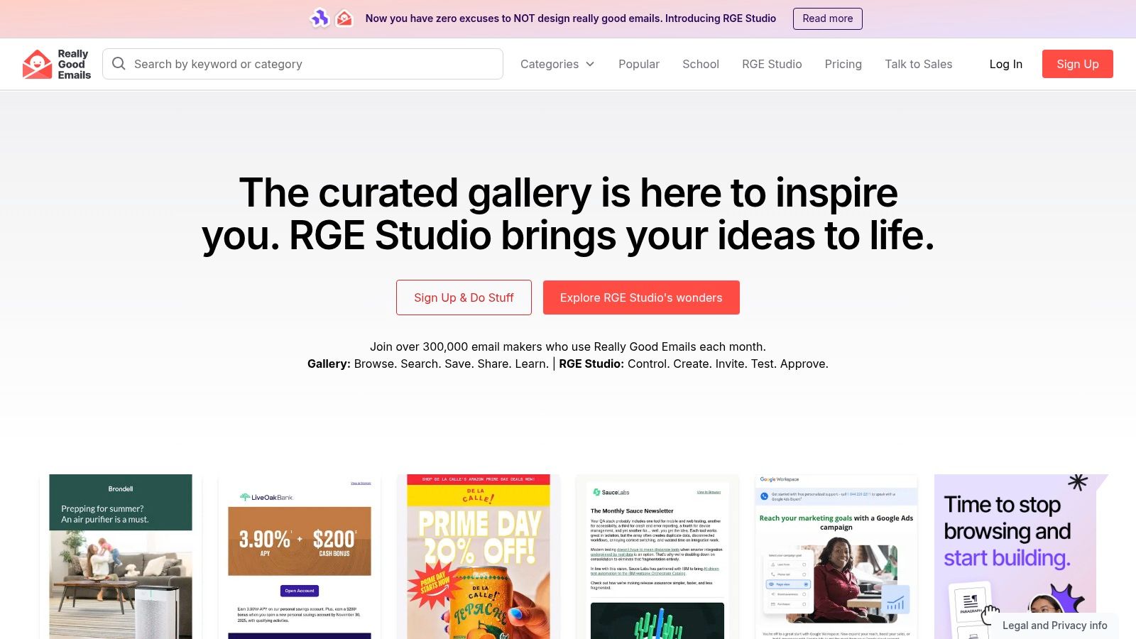
Really Good Emails is the fastest place to study real banner decisions in context. That matters because a banner rarely succeeds on its own. It succeeds because it matches the email's purpose, the copy hierarchy below it, and the CTA path that follows.
For B2B marketers, the advantage is the taxonomy. You can search for SaaS launches, webinar promos, event emails, product announcements, and lifecycle sends without scraping random inspiration boards. That makes it easier to compare how strong teams structure the first screen: headline length, visual density, logo treatment, CTA placement, and whether the hero image is carrying too much of the message.
Where it's strongest
RGE is best when you're diagnosing patterns, not just collecting pretty screenshots. If your team is debating whether the banner should be image-led, text-led, or split layout, this gallery gives enough breadth to spot repeatable structures quickly.
A few practical uses stand out:
- Banner hierarchy review: Compare event, product, and case-study sends side by side to see how leading brands prioritize one message above all else.
- Enhancement research: Filter for visual treatments like GIFs or timers when you want banner examples that create urgency without redesigning the whole template.
- Build workflow: Move from inspiration to production inside RGE Studio if your team wants reusable blocks and approval steps in one place.
Practical rule: Don't copy a banner composition until you've identified the campaign job. A webinar banner and a product adoption banner shouldn't share the same visual hierarchy.
The trade-off is that not every example is current enough to reflect today's rendering constraints or dark-mode expectations. Some older emails are still useful for structure, but they can nudge teams toward dated visual habits if you don't filter aggressively.
RGE Studio becomes more valuable when your team already knows what “good” looks like and needs a reusable system. It's less compelling if you only want a free swipe file.
Typography is where many banner concepts break down in execution. If your banner mockups look strong in review and weak in the inbox, it's usually a font, spacing, or contrast problem, not a creativity problem. This short guide to professional email font choices is a useful companion when you're adapting banner examples into production-safe modules.
2. Email Love
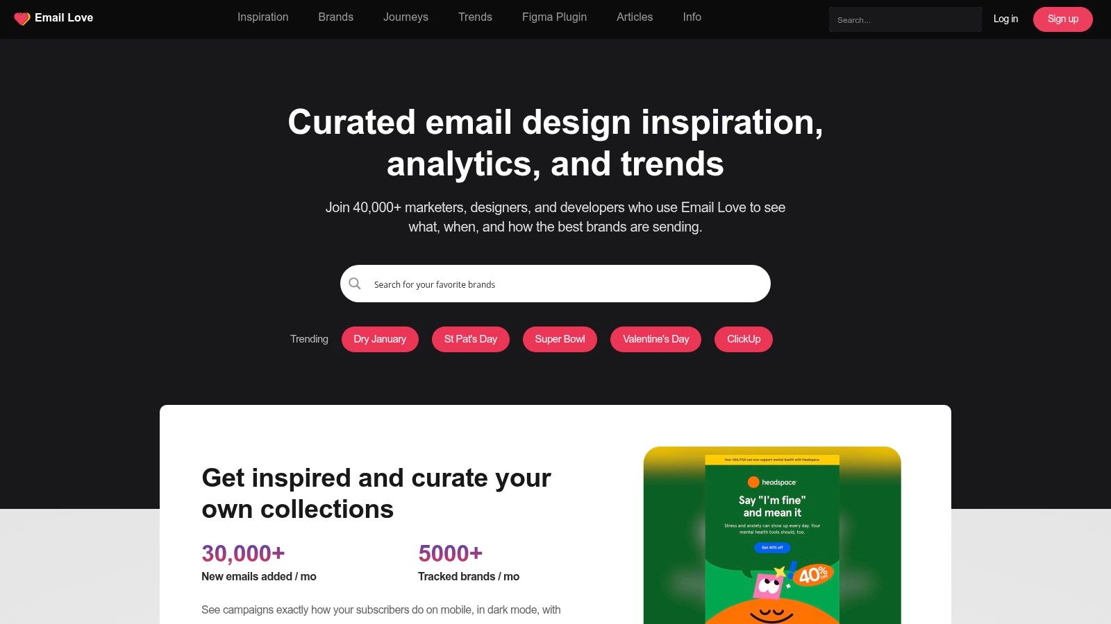
Email Love is the tool I'd pick when the primary bottleneck isn't inspiration. It's handoff. A lot of banner work dies between Figma and HTML, especially when teams design banners with text overlays that don't survive responsiveness, accessibility, or client quirks.
That's where Email Love separates itself. The gallery is solid for modern SaaS and B2B patterns, but the bigger operational advantage is the Figma plugin and export path into responsive HTML and MJML. If your designers and email developers are tired of rebuilding banners from static comps, this workflow saves friction.
Best fit for implementation-minded teams
Email Love works well when your team needs complete journey awareness, not just one hero section. Banner decisions are easier when you can review welcome emails, promotional sends, transactional flows, and follow-up messages from the same brand.
Use it when you need to answer questions like these:
- Does the banner support the campaign stage? Top-of-funnel banners should frame the offer fast. Mid-funnel banners can lean harder on proof or use-case specificity.
- Can the text remain live? That's often the difference between a banner that looks good and one that remains accessible across clients.
- Will the design survive export? The plugin matters because many “great examples” fall apart during code conversion.
Dynamic design is another reason to keep Email Love in the mix. Verified data shows dynamic email banners average a 4% CTR versus 2.5% for standard static banners, a 60% performance improvement, and banners personalized from previous purchases have shown a 30% higher conversion rate than generic promotions, according to the verified data provided above. Those aren't just creative wins. They're workflow wins, because personalization only matters if the production process can support variants without breaking.
Good banner systems reduce rework. Great banner systems reduce rework and preserve intent.
The downside is that some of the deeper plugin features sit behind paid access, and the archive can feel lighter than larger galleries if you're hunting older examples from legacy categories. But for teams serious about building responsive banner modules instead of collecting screenshots, Email Love is one of the most practical tools on this list.
3. Milled
Milled is the volume play. When you need a large set of email banner examples fast, few tools surface as many full-email screenshots as quickly.
That scale changes the kind of work you can do. Instead of hunting for one ideal banner, you can review dozens of versions of the same campaign type and pull patterns from the market. For B2B teams, that's useful when you're pressure-testing your own creative assumptions against what adjacent industries are shipping.
When volume beats curation
Milled's archive is strongest for broad comparative research. If you're building a mood board for a product launch, collecting competitive references for an event series, or presenting visual options to stakeholders, the full-length screenshot format is a practical advantage.
It's especially helpful for these use cases:
- Message-market scanning: Review how brands frame urgency, launches, or seasonal offers at the top of the email.
- Presentation prep: Downloadable full-email captures make it easier to build internal reviews without endless screenshot stitching.
- Geographic filtering: Country scoping helps if you want to study norms from a specific market.
The weakness is obvious. You do more sorting yourself. Milled doesn't give the same level of editorial framing as a curated gallery, so you need a stronger eye for separating useful banner structure from noise.
For B2B-only research, the archive is thinner than the retail side. Still, I wouldn't dismiss it. B2B marketers can learn a lot from high-tempo retail creative, especially around urgency, hierarchy, and reducing clutter above the fold.
One caution matters here. Verified data notes that image-heavy headers above 150KB have a 22% higher probability of being flagged as spam by modern AI-driven filters like Gmail, and banners over 100KB on 5G networks can increase initial load time by 1.4 seconds with a corresponding 15% drop in open rates, based on the verified data provided above. Milled can tempt teams into chasing visually dense banners that look strong in screenshots but perform poorly in the inbox if you recreate them without compression discipline.
4. Litmus Email Gallery
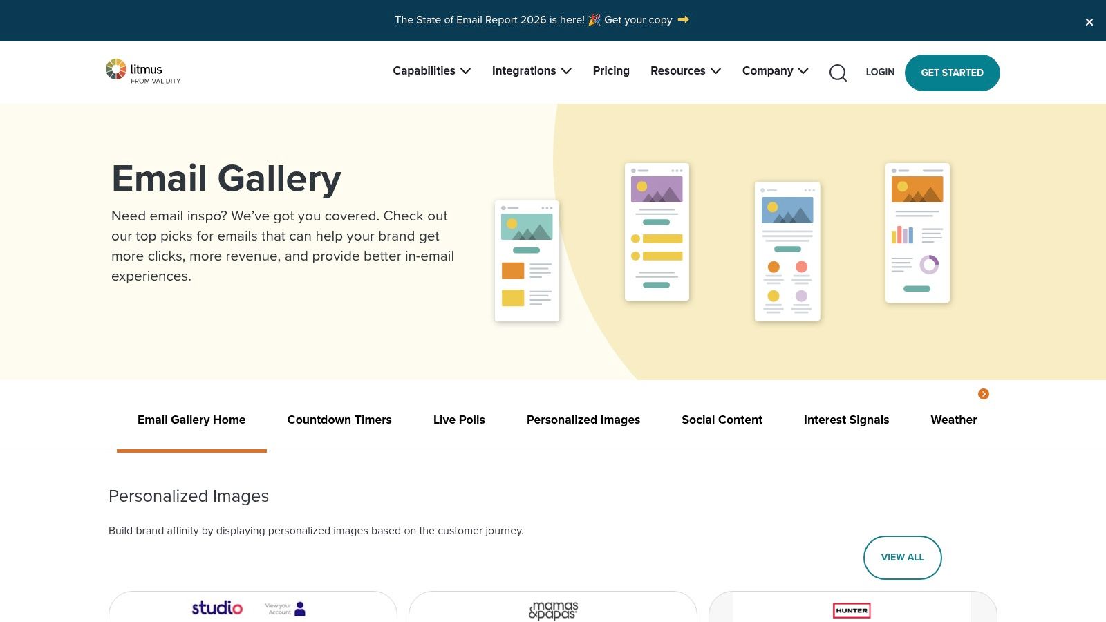
Litmus Email Gallery is where strategy people should spend more time. The gallery isn't the biggest, but it's one of the more useful if you need to justify a banner decision to stakeholders who care about testing, deliverability, and rendering risk.
That context matters in B2B. Banner choices often get approved in design review and then fail later because the team didn't ask whether Outlook would break the layout, whether dark mode would invert key elements, or whether the CTA remains visible when images are blocked.
Why the commentary matters
Litmus is useful because it connects examples to tactics. Countdown treatments, personalized hero images, social proof elements, and interactive ideas aren't shown as decoration. They're framed as strategic choices with implementation implications.
That's especially relevant when you're evaluating more advanced banners. Verified data shows banners with countdown timers or exclusive offers have demonstrated a 35% higher conversion rate than static images, and high-quality banners with vibrant colors, clear typography, and a single focal point can boost engagement rates by up to 40%, based on the verified data provided above. Those gains only matter if the team can implement the tactic cleanly.
What works: one focal point, one primary CTA, one obvious reading path.
What fails: layered messages, weak contrast, and banners that ask the image to do all the communication.
Litmus also helps with a discipline many teams skip. Banner QA. A banner should be reviewed not just as creative, but as a functional element across clients, themes, and image states.
The trade-off is breadth. If you need a giant swipe file, you'll outgrow the gallery quickly. But if your approval process depends on explaining why a banner pattern deserves testing, Litmus gives you better strategic language than most pure inspiration sites.
5. Campaign Monitor – Best Email Marketing Campaigns + Free Templates
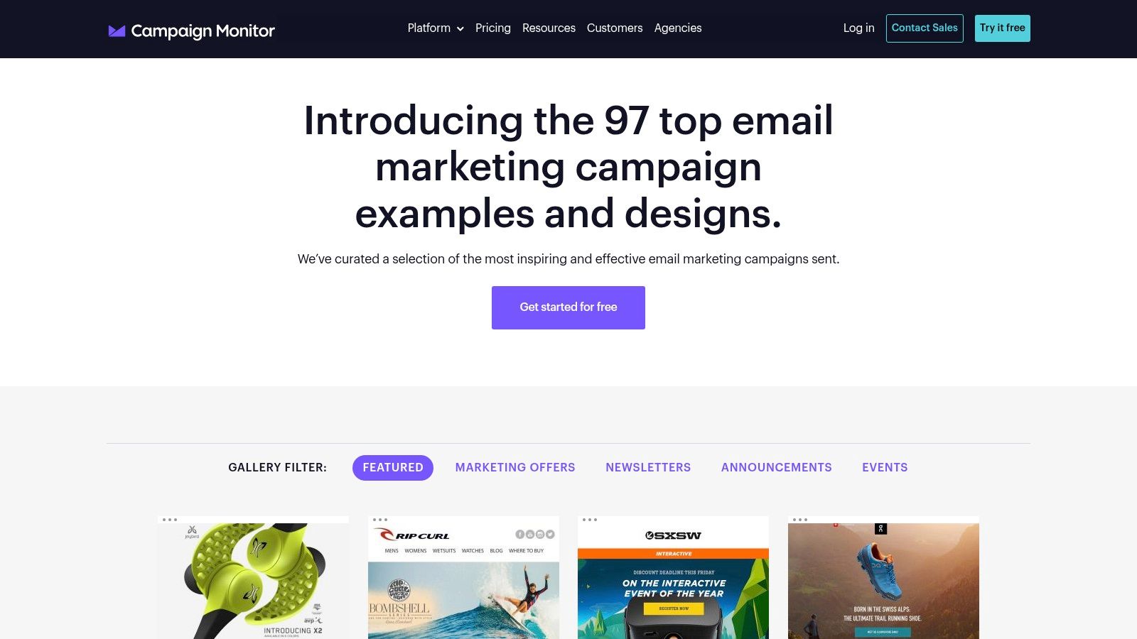
Campaign Monitor's campaign gallery and template library is the pragmatic option. It's less about trend scouting and more about getting a workable banner structure into production without overcomplicating things.
That's valuable for lean B2B teams. Not every send needs a custom hero concept. Sometimes you need a proven header layout for a newsletter, event announcement, or product update that can be adapted quickly and still look competent across devices.
Strong for template-first execution
The best use of Campaign Monitor is starting with a stable skeleton. Banner, preheader relationship, headline area, CTA spacing, and supporting copy blocks are already organized in ways that reduce design indecision.
Here's where it tends to help:
- Newsletter standardization: Good for teams that need repeatable top-of-email patterns across recurring sends.
- Text-heavy B2B adaptation: Easier to convert image-heavy hero ideas into layouts where live text carries the message.
- Accessibility discipline: The design guidance helps rein in common mistakes like weak contrast or oversized hero graphics with no textual fallback.
Banner design and mobile reading behavior are inextricably linked. Verified data says approximately 74% of emails are opened on mobile devices, with banner dimensions in the 600 to 700 pixel width range and 70 to 200 pixel height range helping prevent truncation, based on the verified data provided above. Campaign Monitor's practical templates are useful precisely because they push teams toward cleaner, simpler structures that are easier to keep responsive.
The limitation is depth. You won't get the same competitive intelligence you'd get from larger archives, and the examples often lean toward the Campaign Monitor ecosystem's own style bias. Still, if your team needs working banner layouts more than inspiration theater, it's a sensible pick.
6. Beefree (formerly BEE) – Free HTML Email Templates
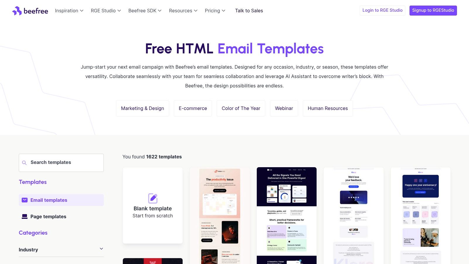
Beefree's template library is the fastest route from idea to export if your team wants a banner pattern it can customize this afternoon. The library has broad category coverage, including SaaS, technology, webinars, and internal communications, which makes it easier to find structures that don't feel imported from a retail brand.
The practical value is speed with enough control. Instead of staring at a blank canvas, you start with a template that already solves basic spacing, section order, and responsiveness.
Best for teams that need production-ready modules
Beefree is strong when your internal process favors modular design. You can pull a hero block, adapt the supporting CTA area, and preserve the rest of your email system without rebuilding each send from scratch.
That helps with campaign consistency in a few ways:
- Reusable header systems: Build a banner module once, then swap messaging for webinars, launches, or customer stories.
- Cross-team collaboration: Designers, marketers, and stakeholders can work from the same baseline instead of revisiting structural arguments every send.
- ESP handoff: Export paths reduce the friction of moving from approved banner concept to deployment.
Verified data notes that by 2024, approximately 25% of companies began using email signature software to standardize and optimize banners, and 18.8% reported using banners primarily for lead generation while 15.86% used them for social media promotion, based on the verified data provided above. Beefree fits that standardization trend well because it encourages teams to treat banners as repeatable growth assets, not one-off artwork.
Some templates do feel generic out of the box. This is the significant cost. If your brand already has a distinct visual system, expect to re-style aggressively rather than publish with minor edits.
If you're also rebuilding the full newsletter framework around the banner, these email newsletter template ideas pair well with Beefree's modular approach.
7. Stripo – Templates + Banner Builder
Stripo is the most directly useful option here if your specific problem is banner iteration. Not gallery browsing. Not template scavenging. Iteration.
Its built-in banner builder is what makes it different. You can test layered visual concepts, change overlaid messaging quickly, and generate variants without restarting the entire email design. For B2B campaigns where copy angles shift late, that flexibility is useful.
Where Stripo earns its place
Stripo works best when the banner is doing real persuasion work. That includes webinar registration, case-study promotion, feature release announcements, and segmented offers where the value proposition needs to change while the overall template stays stable.
A few scenarios fit especially well:
- Variant testing: Swap headlines, subheads, and CTA wording while keeping the same core visual composition.
- Live-text preference: Preserve readability and accessibility instead of baking every message into a static image.
- Export flexibility: Push the final banner into your ESP without locking yourself into one sending platform.
There's also a strategic upside if your team is moving toward personalization. Verified data states that 68% of B2B marketers now use AI to dynamically swap banner CTAs and images based on the recipient's ICP in real time, and dynamic banners generate 3.5x higher click-through rates than static banners in a 2025 Enterprise Marketing Association report, based on the verified data provided above. Stripo doesn't solve the entire personalization stack on its own, but it's a practical environment for creating the banner variants that a dynamic system needs.
“A strong B2B banner doesn't need more design elements. It needs tighter message control.”
The main caution is rendering complexity. If your team leans too hard into image-based composition, you can create banner designs that look polished in preview and fragile in Outlook or dark mode. That's why it helps to decide early whether the message belongs in live HTML text or inside the graphic.
If your team is still debating whether a given send should even use a visual banner, this comparison of plain text versus HTML emails is a useful gut check before you overdesign the top of the message.
7-Source Email Banner Examples Comparison
| Title | Implementation Complexity 🔄 | Resource Requirements ⚡ | Expected Outcomes 📊 | Ideal Use Cases | Key Advantages ⭐ | Tips 💡 |
|---|---|---|---|---|---|---|
| Really Good Emails (RGE Studio + Gallery) | 🔄 Moderate, curated gallery plus built‑in editor and approval workflows | ⚡ Low–Medium, free browsing; Studio features require subscription | 📊 High, on‑trend, production‑ready hero patterns and reusable blocks | Study hero/banner composition and move directly from inspiration to build | ⭐ Curated, current examples combined with a production editor | 💡 Use taxonomy filters and teardowns; consider Studio for full workflow |
| Email Love | 🔄 Moderate, gallery with Figma plugin workflow | ⚡ Medium, plugin (advanced features behind paid tiers) | 📊 High, responsive HTML/MJML exports shorten design‑to‑code handoffs | Turn banner designs into working HTML and benchmark competitor journeys | ⭐ Figma→code export and strong journey coverage | 💡 Use the plugin for component libraries; verify paid plugin limits |
| Milled | 🔄 Low, search‑centric archive requiring manual sifting | ⚡ Low, mostly free access; fast surfacing of examples | 📊 Moderate, large volume of current B2C banners for inspiration | Rapidly gather many banner variants, mood boards, and market scans | ⭐ Sheer volume and speed for US‑market banners | 💡 Rely on filters and saved collections to reduce noise |
| Litmus Email Gallery | 🔄 Low–Moderate, curated collections with tactical commentary | ⚡ Medium, Litmus account needed to access testing/QA links | 📊 High, strategy‑oriented examples tied to testing and deliverability | Justifying banner choices and linking designs to QA/delivery practices | ⭐ Strategy + testing/deliverability context from a trusted source | 💡 Use commentary to support design decisions and follow testing guides |
| Campaign Monitor – Best Campaigns + Templates | 🔄 Low, curated gallery with ready templates | ⚡ Low, free responsive templates available to customize | 📊 Moderate, production‑ready templates that speed deployment | Quickly grab hero/header structures and re‑skin templates for campaigns | ⭐ Easy access to working templates and accessibility guidance | 💡 Adapt templates to brand; be aware of ecosystem/B2C bias |
| Beefree (formerly BEE) | 🔄 Low, large template library with editor and export | ⚡ Low–Medium, many free templates; paid plans for collaboration | 📊 High, fast path to exportable hero/banner modules and clean HTML | Extract hero modules for ESP import; SaaS/technology templates for B2B | ⭐ Massive template catalog with clean HTML export and ESP mappings | 💡 Re‑style generic templates for brand fit; use ESP template pages |
| Stripo – Templates + Banner Builder | 🔄 Moderate, template catalog plus built‑in banner generator | ⚡ Medium, image assets and QA effort for cross‑client support | 📊 High, multiple banner variants with accessible live text and exports | Build layered hero images and messaging variations quickly | ⭐ Dedicated banner tools and easy HTML export for ESPs | 💡 Test image‑heavy banners for Outlook and dark mode issues |
Your Blueprint for a Better B2B Email Banner
A good banner gets attention. A strong B2B banner directs attention. That's the distinction often missed when browsing email banner examples and copying layouts without understanding the campaign mechanics underneath.
The examples and tools above are useful for different reasons. Really Good Emails is excellent for pattern recognition. Email Love is better when production handoff is the primary constraint. Milled helps when you need volume and competitive scanning. Litmus gives you strategic justification and testing context. Campaign Monitor offers stable, practical structures. Beefree is ideal for fast modular production. Stripo is strong when you need rapid banner variation and message control.
The bigger lesson is that banner performance comes from alignment, not decoration. Campaign goal, design hierarchy, accessibility, and delivery constraints need to point in the same direction. If the banner promotes a webinar, the top area should make the topic, audience, and CTA obvious immediately. If the banner pushes a case study, lead with the outcome and make the click path specific. If the banner supports product adoption, reduce visual complexity and let the message do the work.
A few principles hold up across almost every B2B send:
- Match the banner to one job: Don't ask the hero area to announce a feature, promote an event, and push social proof at the same time.
- Keep text readable without relying on the image: This protects accessibility and gives you more resilience across clients.
- Design for mobile first: Your first screen has less room than your desktop mockup suggests.
- Control file weight: A beautiful banner that loads slowly or triggers filtering is underperforming before the reader sees it.
- Build variants intentionally: Different industries, funnel stages, or offers often need different top-of-email framing.
The best workflow is simple. Start with a gallery or template source that matches your current need. Deconstruct the banner instead of admiring it. Identify the message hierarchy, CTA logic, spacing, and fallback behavior. Then rebuild the pattern inside your own system and test it against actual engagement data.
That's how email banner examples become useful. They stop being inspiration assets and start becoming operating models for better B2B campaigns.
Breaker gives B2B teams the missing layer after banner design: targeted distribution, deliverability management, and analytics that show what happened after the click. If you want to build banners inside a newsletter program that also grows the right audience, tracks opens and clicks in real time, and supports lead generation at scale, start with Breaker.