
How to Change Email Font Across Every Major Client
Learn how to change email font in Gmail, Outlook, Apple Mail, and marketing platforms. Includes fallback stacks, accessibility tips, and testing workflows.
You've got the email drafted, the type looks clean in your editor, and then someone replies with a screenshot showing a completely different font. That gap between what you changed and what recipients see is the part most guides skip, and it's the part that causes the most frustration when you're trying to figure out how to change email font without breaking the message.
The fix starts with one uncomfortable truth. Email typography is split between what you set in the compose window and what each client renders, which is why a font can look perfect in Outlook, Gmail, or Apple Mail on your screen and still land differently elsewhere. Microsoft's support docs show that Outlook treats fonts as configurable defaults for new messages and replies, while Gmail exposes a persistent Default text style setting, so font choice is clearly more than a one-time click in a draft Microsoft Outlook font settings. For a deeper look at how message formatting and plain-text mode change what survives the send, Breaker's guide on plain text versus HTML is a useful companion. A good benchmark is to think about whether you're changing a personal preference, or solving a rendering problem that shows up after the email leaves your inbox. Narrareach's 30-day text formatting experiment is a useful reminder that typography changes often need repeated observation, not just a one-time setup.
Why Your Email Font Changes Don't Always Stick
You can change the font in a draft and still send something that looks different in the inbox. That usually means you changed the compose view, but the recipient's client rendered the message with its own rules.
Email clients split typography into two separate layers. One layer controls what you see while writing, the other controls what survives after send, and those layers do not always match. Microsoft's Outlook guidance shows this split clearly through separate controls for message formatting and compose defaults across Outlook versions, while Gmail keeps a Default text style setting for future messages. Even then, the final appearance can shift once the message moves through a different client or a reply chain Microsoft Outlook formatting controls Microsoft Outlook compose and reply controls.
The real split between composing and rendering
Compose-side formatting is what you set in the editor. Render-side display is what the inbox shows, and that is where fallback stacks, client stripping, and plain-text preferences start to affect the result. A draft can look polished on your screen and still arrive in a muted system font if the recipient's client decides to replace part of the formatting.
Practical rule: if the email needs to look right in every inbox, treat font choice as a compatibility decision, not a personal preference.
That difference is why a simple search for how to change email font often misses the issue. The better question is whether the font survives across Outlook, Gmail, Apple Mail, and mobile clients without turning the message into a visual mismatch. A useful companion is Breaker's plain text versus HTML, since the format you choose affects how much typography survives after delivery.
A small test can save a lot of guesswork. The 30-day text formatting experiment at Narrareach is a reminder that font changes usually need repeated checking, not a one-time setup.
Changing Fonts in Gmail, Outlook, and Apple Mail
A font change only matters if you know whether you changed the draft or the account default. The compose toolbar affects the message you are editing right now, while default settings set the starting point for future mail. That distinction is where a lot of font confusion starts.
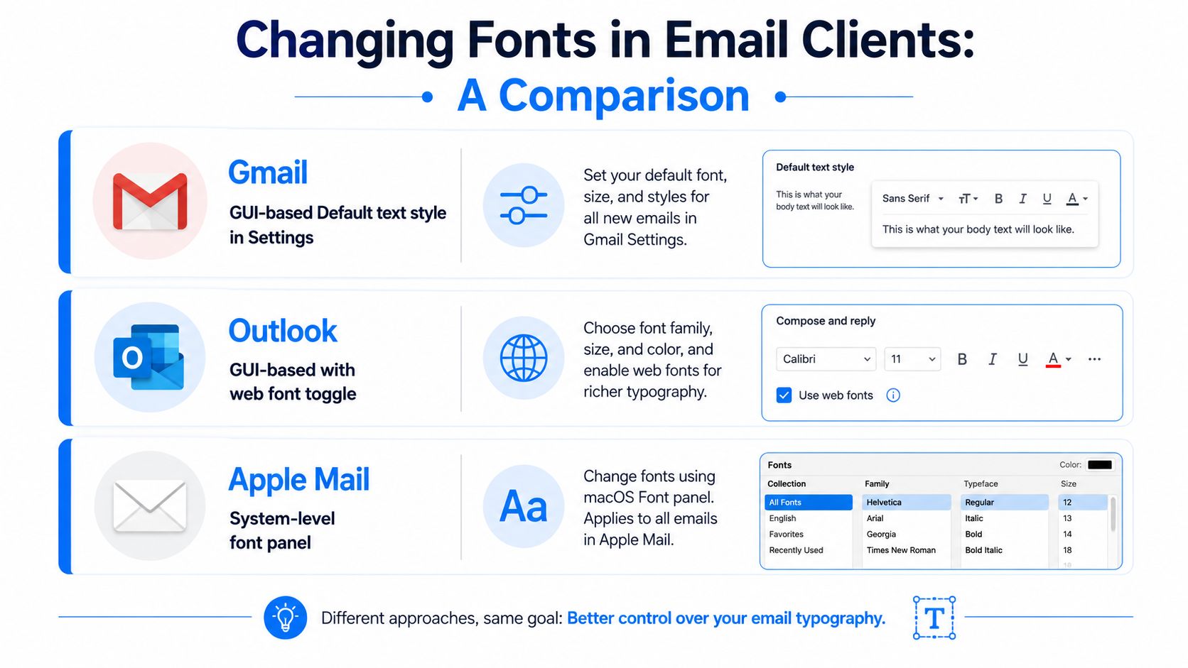
Gmail and Outlook paths that actually stick
In Gmail, open Settings, find Default text style, and set your baseline font there. That setting gives future messages a consistent starting point, but the compose toolbar still controls any text you format inside a specific draft. Outlook follows the same basic split, even though the path changes by version. Classic Outlook uses File > Options > Mail > Stationery and Fonts, new Outlook uses View > View settings > Mail > Compose and reply > Message format, and Outlook for Mac has its own Fonts setting for default composing fonts Microsoft Outlook default font settings.
Outlook.com separates the formatting toolbar in the compose window from the settings that control defaults Outlook.com font size and appearance. A common mistake is expecting a default change to rewrite a draft that is already open. It does not.
Apple Mail and message-level edits
Apple Mail keeps font and color controls in the app's settings, while the message editor still lets you format selected text directly. That split helps when you want one account-level baseline but need to override it for a single message. For a practical workflow around composing in Apple's ecosystem, AIDictation for Apple Mail is worth reviewing alongside the built-in typography controls.
For quick reference, keep the separation clear. Default font settings shape future mail, and the editor toolbar shapes the message you are writing right now. If you are adjusting a reply chain, forwarding a thread, or preserving mixed formatting, the per-message control is usually the one that matters most Microsoft Outlook font editing workflow.
A reliable setup is boring. Pick the account default once, then use message-level formatting only when the draft really needs it.
For teams that document email operations, Breaker's newsletter template for Gmail works well with this approach because it keeps the font decision inside a repeatable template instead of leaving every sender to improvise.
Implementing Custom Fonts in Email Marketing Platforms
Personal email settings stop at the edge of your inbox. Once you move into newsletters or lifecycle campaigns, font control shifts into HTML and CSS, and that's where many brands discover how fragile typography can be in email. A typeface that looks elegant in a browser can disappear in a client that strips the rule entirely.
The safe starting point is a fallback stack. You declare your preferred font first, then a web-safe alternative, then a generic family. In practice, that means something like this:
font-family: "Your Brand Font", Arial, Helvetica, sans-serif;
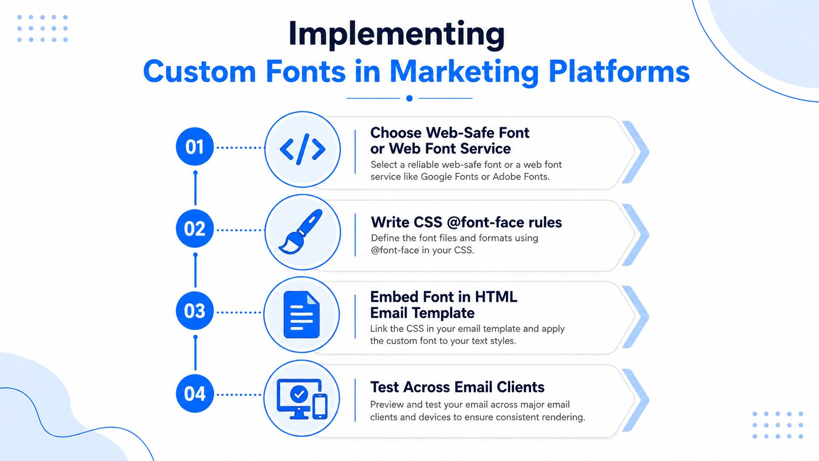
If you need to load a custom face, the usual pattern is an @font-face declaration in the email's head, followed by inline or template-level styling. A typical structure looks like this:
@font-face {
font-family: "Your Brand Font";
src: url("https://example.com/your-font.woff2") format("woff2");
}
Then:
<td style="font-family: 'Your Brand Font', Arial, Helvetica, sans-serif;">
The catch is that many email clients ignore or strip custom font loading. That's why fallback order matters more than the custom font itself. If the first choice doesn't load, the next one should preserve similar proportions and spacing so the email still reads like your brand instead of a broken layout.
What works in platforms and what needs testing
Some email service providers let you add custom CSS in the head, while others expect inline styles for safety. That's not a nuisance, it's the normal shape of email development. If your platform is built around campaign speed rather than code flexibility, Breaker sits in the broader category of newsletter tools that help teams publish campaigns quickly, but typography still needs the same fallback discipline as any other platform.
For a practical publishing workflow, start an online magazine blog can help content teams think about recurring layout standards, but email still needs its own rules because inbox rendering is less forgiving than a web page.
The best implementation habits are simple. Use the branded font where support is real, inline the fallback stack everywhere, and design the layout so a fallback font doesn't collapse line breaks or bury the CTA. That way, custom typography reads as an enhancement, not a dependency.
Choosing Fonts That Render Consistently Across Clients
The safest email fonts are the ones clients already know how to display. Arial, Helvetica, Times New Roman, Georgia, and Verdana remain the baseline because they render predictably across broad client sets. System fonts like -apple-system and Segoe UI can also be strong options when your audience is heavily concentrated in Apple or Microsoft environments.
That doesn't mean you should pick blindly. A font stack should match the job the email needs to do. If you need compact UI-like labeling, a system font may preserve hierarchy better. If you want editorial warmth, a serif fallback like Georgia can keep the tone intact when the preferred font fails.
A compatibility-first decision framework
Start with the audience, not the type specimen. If most of your readers are in Gmail, Outlook, and mobile inboxes, choose a stack that survives those environments before you worry about visual originality. Breaker's professional email font is a helpful reference if you're building a reusable brand stack and want the practical side of fallback selection.
Font Name
Gmail
Outlook
Apple Mail
Mobile Clients
Fallback Recommendation
Arial
Reliable
Reliable
Reliable
Reliable
Use as the first fallback for sans-serif copy
Helvetica
Often solid
Can vary
Reliable
Usually solid
Good secondary choice for Apple-heavy audiences
Times New Roman
Reliable
Reliable
Reliable
Reliable
Use when serif readability matters
Georgia
Reliable
Reliable
Reliable
Reliable
Best serif fallback for editorial tone
Verdana
Reliable
Reliable
Reliable
Reliable
Good for dense body copy and small text
-apple-system
Limited outside Apple
Limited
Strong
Strong on Apple devices
Use only when Apple users dominate
Segoe UI
Limited outside Microsoft
Strong in Microsoft environments
Limited
Mixed
Use when Windows readership is high
The table isn't a promise, it's a planning tool. If your preferred font doesn't render, the next font in the stack should still feel deliberate. That's the difference between a fallback and a layout failure.
Practical rule: never choose a font just because it looks good in a design mockup. Choose it because the fallback path still looks like your brand when the mockup is gone.
If you want to avoid guesswork, test support before you commit. The earlier section's rendering problem shows up most when teams pick fonts for style alone and ignore client behavior. That's why compatibility-first font stacks are a design decision, not a technical afterthought.
Accessibility Requirements for Email Typography
Readable email fonts aren't a nice-to-have. They're the difference between a campaign someone can scan in five seconds and a campaign they give up on halfway through the first paragraph. The easiest rule to remember is that body text should stay large enough to read without pinching or zooming, and the spacing around it should support that readability.
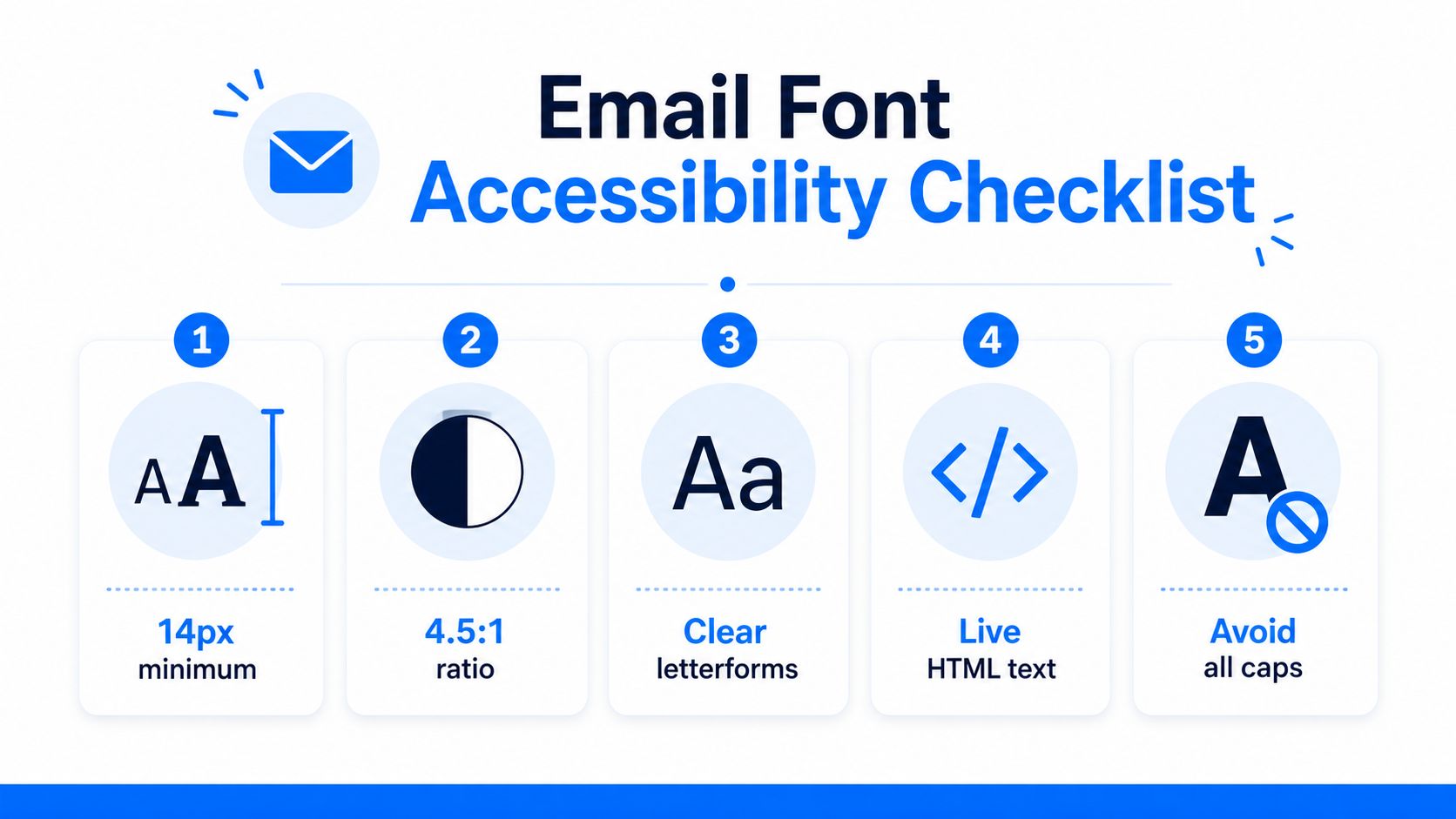
The practical baseline is 16px for body text, 1.5 line-height for body copy, and strong enough contrast that the text doesn't disappear into the background. Those are the numbers teams use when they want typography that works for people with visual impairments, cognitive load concerns, or a small screen and poor lighting. Color-only cues don't solve accessibility either, especially when a reader can't distinguish the hue or is using assistive technology.
What readable typography looks like in email
Sans-serif fonts generally stay easier to parse in dense email layouts because their letterforms are more open. That said, the font family alone doesn't make a message accessible. A clean sans-serif still fails if the weight is too light, the tracking is too tight, or the text is forced into all caps for long passages.
The safest pattern is straightforward:
- Body copy: keep it at a readable size, and don't cram lines together.
- Contrast: avoid pale gray text on white backgrounds.
- Case: reserve all caps for short labels, not paragraphs.
- HTML text: keep the text live, not flattened into images.
- Mobile scaling: make sure the font still works when the screen narrows.
For teams that manage templates, accessibility should be part of the theme, not a last-minute patch. HubSpot's theme settings documentation shows how font and body styles can be handled centrally in a system that governs fonts, colors, and text settings across content, which is a useful reminder that consistency usually starts at the template level rather than in isolated drafts HubSpot theme font and body settings. That principle carries over to email, even though the rendering environment is stricter.
If the text becomes unreadable when the client or device changes, the font choice is wrong for the audience. Accessibility isn't separate from brand typography, it's the constraint that keeps the brand legible.
Testing Your Email Fonts Before Hitting Send
Font testing is where polished ideas meet inbox reality. A draft can look balanced in your editor and still break in Outlook 2019 on Windows, shift spacing in Gmail on Android, or fall back awkwardly in Apple Mail on iOS. Those are the combinations worth checking first because they tend to reveal the biggest rendering differences fastest.
A practical workflow starts with a test send to accounts you control on different platforms. That gives you a direct read on whether the font family survives, whether the line breaks hold, and whether the hierarchy still makes sense when a client swaps in a fallback. If you have access to preview tools like Litmus, Email on Acid, or Parcel, use them to widen the sample before final approval.
What to look for in the preview
Minor spacing variation is usually acceptable. Broken hierarchy is not. If the headline shrinks too much, the CTA starts wrapping badly, or the body text reverts to a default that makes the message feel off-brand, that's a fixable problem, not an acceptable quirk.
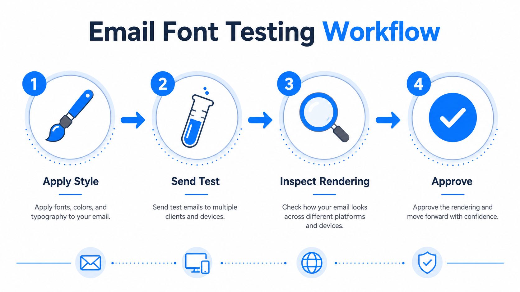
A quick testing routine usually looks like this:
- Apply the font stack in the template or compose window.
- Send a test message to Gmail, Outlook, and Apple Mail accounts.
- Inspect the render on desktop and mobile.
- Approve only after the fallback still reads cleanly.
If you don't have a testing budget, the fallback is still workable. Use the accounts you already own, open the message in browser and native apps, and check whether the typography still supports the message instead of fighting it. The point isn't to eliminate every difference, it's to catch the differences that make the email harder to read or weaker to trust.
That habit saves more than time. It keeps the send button from becoming a guess.
If you're building newsletters where typography, rendering, and deliverability all have to work together, Breaker gives you a place to manage the send without losing sight of the subscriber experience. You can build campaigns, target the right audience, and monitor how each send performs, then visit Breaker to see how it fits your workflow for email that still looks right when it reaches the inbox.
Keep reading
All articlesWhat Is a B2B Content Engine
Learn what a B2B content engine is, how it differs from a content calendar or strategy, and why it's essential for AI-driven search in 2026.
8 Best Email Tracking Software Tools in 2026
Compare 8 top email tracking tools for 2026, how tracking pixels work, and why Apple's privacy rules make open rates unreliable. See our top pick.
6 Best Email Trackers for Newsletter Senders in 2026
Open rates lie. Learn how email trackers really work, why Apple and Gmail skew the data, and which tools newsletter senders should actually use in 2026.