Professional Email Font: Enhance Readability in 2026
You wrote the campaign. The copy is sharp. The CTA is clear. Then you send a test to Gmail, Outlook, and your phone, and the email suddenly looks like three different people designed it.
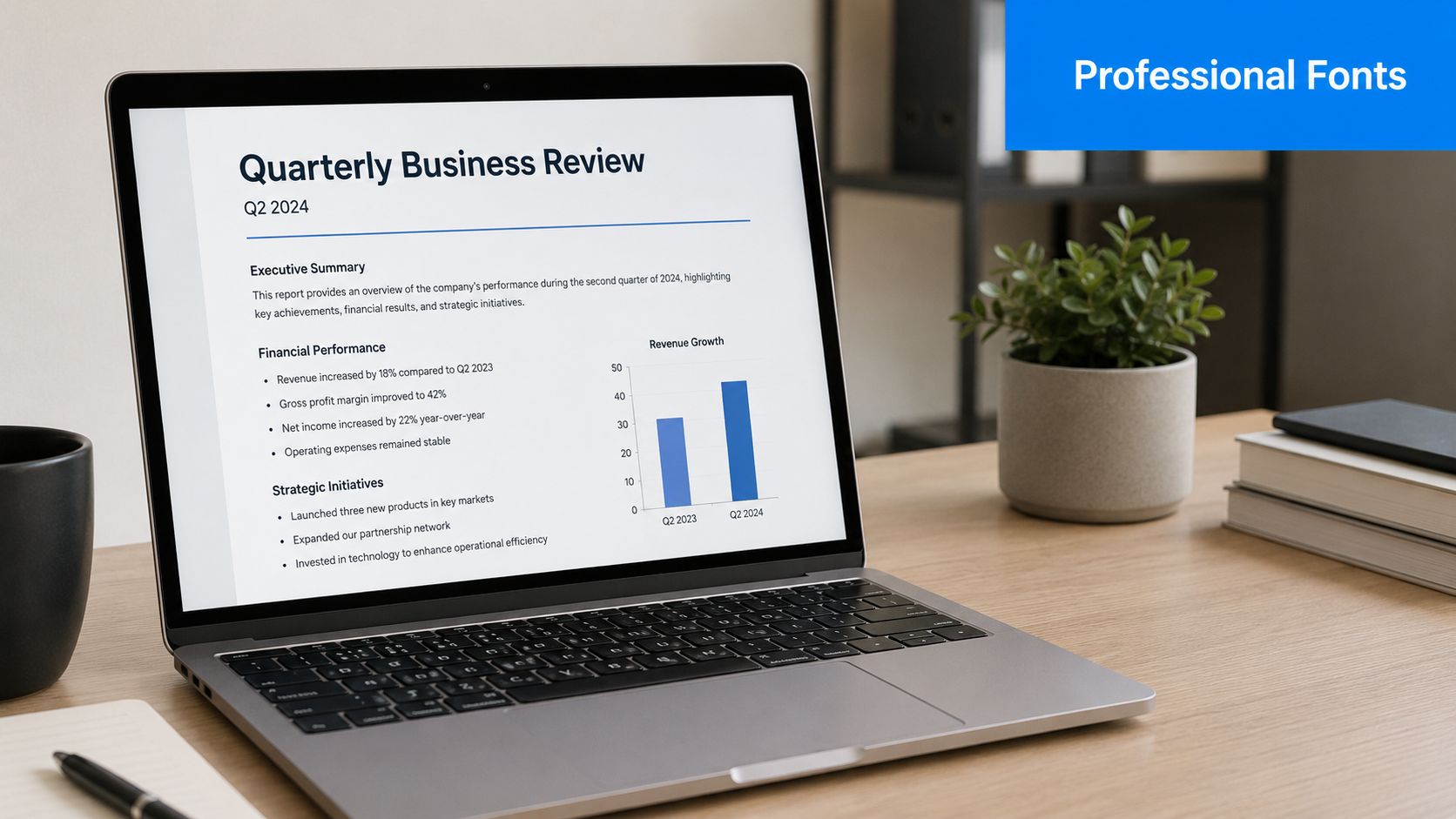
That's the moment marketers often realize font choice isn't cosmetic. A professional email font affects whether your message looks credible, whether people can scan it quickly, and whether your layout survives the trip through different email clients. In B2B, that matters more than many teams acknowledge. Buyers judge competence fast, and typography is one of the first signals they process.
A good font won't rescue weak messaging. But the wrong one can make strong messaging feel amateur, cluttered, or hard to trust.
Why Your Email Font Is More Than Just a Design Choice
B2B marketers usually treat fonts as a final polish step. That's backwards. In email, font choice sits much closer to infrastructure than branding. It influences how the email renders, how easy it is to read on mobile, and how professional your company appears in a crowded inbox.
The practical problem is simple. Email clients don't behave like modern web browsers. Gmail, Outlook, and Apple Mail each handle typography differently. That means a font decision can change line breaks, spacing, hierarchy, and even whether your message feels stable or sloppy.
Font choice affects perception before copy gets a chance
Most recipients don't consciously think, “This typeface signals authority.” They just feel it. If the email looks cramped, oddly formal, too playful, or inconsistent from header to body, confidence drops.
That's especially dangerous in B2B. You're often asking someone to trust a claim, book a demo, forward a note internally, or reply to a sales email. A professional email font supports that moment by making the message feel deliberate and easy to process.
A messy font stack is like showing up to a board meeting in a good suit with untied shoes. The substance may be there, but the presentation creates doubt.
Font choice also affects accessibility and inbox experience
Some teams separate accessibility from performance. In email, they're tied together. If text is too small, too decorative, or too tightly spaced, people stop reading. If a fallback font expands unexpectedly, the layout can break. If your hierarchy collapses on mobile, key points get buried.
A professional email font does three jobs at once:
- Preserves readability: It stays clear on small screens and dense inbox views.
- Supports authority: It matches the tone your audience expects from a serious business sender.
- Reduces rendering risk: It gives email clients less room to distort the message.
That's why the right question isn't “Which font looks nicest?” It's “Which font helps this email land clearly, reliably, and credibly in the environments my audience uses?”
What Actually Makes an Email Font Professional
A font becomes professional in email when it holds up under pressure. Not design-pressure. Inbox-pressure. It needs to read well on phones, match the tone of your brand, and survive client quirks without turning your template into a patchwork.
Readability comes first
If a recipient has to work to read your email, you've already lost ground. In practice, professional fonts are usually the ones that stay clean at common email sizes, especially on mobile. Sans-serif faces dominate here because they render more cleanly on small digital screens, and common email-safe options like Arial, Helvetica, and Verdana remain dependable choices.
Readability also means restraint. The more “personality” a font has, the more likely it is to distract from the message. Decorative fonts can work in a hero image or event graphic. They rarely belong in live email text.
A good rule is simple:
- Body copy should disappear into the reading experience
- Headings should guide, not perform
- Buttons and CTAs should look unmistakably functional
Tone matters more in B2B than many guides admit
Most email advice pushes marketers toward safe sans-serif fonts and stops there. That's useful, but incomplete. In B2B, typography also shapes perceived authority.
Data from the 2025 Edelman Trust Survey shows B2B decision-makers prioritize “authority and clarity” 23% higher than B2C consumers, and a 2025 Gartner study found that 68% of executives associate serif fonts with “formal credibility”. That nuance is often missing from mainstream email font advice, even though it has obvious implications for board-facing, enterprise, legal, financial, and consulting communication. See the reference in Gartner's newsroom archive.
That doesn't mean every B2B email should switch to Georgia or Times New Roman. It means a professional email font should fit the job:
- Sans-serif usually feels modern, efficient, and digital-first
- Serif can signal tradition, seriousness, and editorial authority
- Mixed systems can work well when a serif heading supports a sans-serif body
Practical rule: If your brand sells speed, product clarity, or modern workflow improvement, a sans-serif default usually fits. If your email is trying to reassure a cautious executive audience, a restrained serif can strengthen the message.
Reliability is the hidden test
A font isn't professional if it only looks good in your design tool. It has to render consistently in inboxes. That's why the best email fonts aren't always the most distinctive ones. They're the ones that hold their shape when the client ignores your preferences.
Three questions usually settle it:
- Will this font display predictably across major email clients?
- Will the fallback look close enough if the preferred font fails?
- Does the font support the tone without compromising readability?
If the answer to any of those is no, it isn't the right choice for email, no matter how polished it looks in Figma.
System Fonts vs Web Fonts The Reliability Tradeoff
System fonts and web fonts solve different problems. One protects consistency. The other expands brand expression. In email, you rarely get both without compromise.
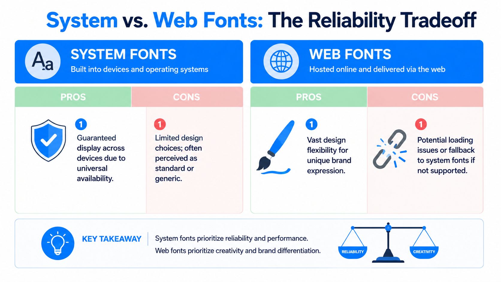
System fonts are the common language
Think of system fonts as a language every device already speaks. Arial, Helvetica, Georgia, Verdana, and Times New Roman are familiar because they're already installed or widely recognized by email clients. When you use them, you're reducing negotiation between your code and the inbox.
That reliability matters in production email. If your team sends newsletters, sales sequences, onboarding emails, or account updates at scale, stable rendering beats typographic originality most of the time.
System fonts are a strong choice when:
- You need broad compatibility: Especially across Gmail, Outlook, and mobile apps
- Your templates are modular: Reusable blocks break less often with predictable fonts
- You care about speed and maintainability: Fewer moving parts means fewer surprises
Teams working on UX consistency often apply the same thinking across email and site experience. Resources like Netco Design LLC's user experience optimization guide are useful because they frame visual choices around user behavior, not just aesthetics.
Web fonts are the local dialect
Web fonts let brands sound more distinctive. But in email, that comes with conditions. Some clients support them, some ignore them, and some replace them bluntly. When support fails, your fallback becomes the font your reader sees.
That's why a web font without a fallback plan is like printing a brochure in a language your audience may not speak and hoping someone translates it correctly on arrival.
The option exists because email typography evolved beyond fixed safe choices. The W3C Web Open Font Format specification marks the shift that made broader web font use possible. The widespread adoption of web fonts in 2011, following the creation of WOFF in 2009, changed digital typography and created the modern tension between branding freedom and inbox reliability.
How to decide which side to favor
For most B2B programs, the question isn't “system or web fonts?” It's “where should I spend risk?”
Use system fonts when the email is operational, high-frequency, or heavily templated. Use web fonts when brand expression is central and you're prepared to test aggressively.
A simple decision framework:
- Choose system fonts for lifecycle emails, sales outreach, newsletters with multiple modules, and executive communications where stability matters most.
- Choose web fonts for brand campaigns, product launches, or editorial emails where visual identity carries more weight.
- Always design the fallback first. If the fallback looks wrong, the stack is wrong.
If you're weighing typography against broader email format decisions, this breakdown of plain text versus HTML email helps clarify when visual polish helps and when it just adds complexity.
Top Professional Fonts for B2B Email Campaigns
No single font wins every B2B use case. The right choice depends on what you send, who reads it, and how much rendering risk your template can tolerate. The best approach is to choose a small set of dependable options, then assign each one a job.
Recommended Professional Email Fonts & Fallbacks
| Font Name | Type | Best For | Recommended CSS Fallback Stack |
|---|---|---|---|
| Arial | Sans-serif system font | Body copy, sales emails, newsletters | Arial, Helvetica, sans-serif |
| Helvetica | Sans-serif system font | Headlines, concise product emails, Apple-heavy audiences | Helvetica, Arial, sans-serif |
| Verdana | Sans-serif system font | Accessibility-focused body text, mobile-heavy lists | Verdana, Arial, sans-serif |
| Calibri | Sans-serif system font | Internal-style business communication, simple templates | Calibri, Arial, sans-serif |
| Georgia | Serif system font | Executive updates, thought leadership, formal B2B notes | Georgia, Times New Roman, serif |
| Times New Roman | Serif system font | Conservative industries, legal or finance communication | "Times New Roman", Georgia, serif |
| Open Sans | Web font | Modern branded newsletters, readable long-form sections | "Open Sans", Arial, sans-serif |
| Roboto | Web font | Product-led updates, tech brands, clean UI-style emails | Roboto, Arial, sans-serif |
The safest choices for everyday sending
If you want the least drama, start with Arial, Helvetica, or Verdana. These are the workhorses. They don't try to impress anyone, which is exactly why they work. In most B2B campaigns, boring in the code layer is a feature.
Verdana deserves special mention because it tends to hold up well when space gets tight. Its wider letterforms can help readers scan dense paragraphs, disclaimers, and multi-link sections more comfortably than narrower faces.
If your email gets read on phones during commutes, between meetings, or in a preview pane, simple sans-serif fonts usually outperform more expressive choices.
When serif fonts earn their place
Serif fonts get dismissed too quickly in email. That's a mistake for some B2B brands. If you're writing to senior buyers, procurement stakeholders, legal teams, or investors, Georgia can add a more formal tone without feeling outdated. It's the serif I'd trust first in live email because it typically retains dignity even when the client environment is less cooperative.
Times New Roman is harder to use well. It carries strong associations with default documents and old office workflows. That can work in conservative sectors, but it can also make a modern company feel behind. Use it deliberately, not accidentally.
For teams refining the broader program around content, timing, and structure, Gorilla's guide to email marketing is worth reviewing because it shows how message presentation supports trust in professional service contexts.
A practical way to choose your stack
Don't choose five fonts. Choose two, max.
Try this setup:
- Primary font for body: A readable sans-serif such as Arial or Verdana
- Secondary font for headings: Either the same family in a heavier weight, or a restrained serif like Georgia if authority is part of the message
- Fallbacks that match tone: A fallback shouldn't feel like a different brand
The goal isn't typographic flair. It's consistency. Your emails should look like they came from the same company, even when the inbox doesn't fully cooperate.
Essential Rules for Font Sizing and Accessibility
Most email font mistakes aren't dramatic. They're subtle. Text is a little too small. Line spacing is a little too tight. A heading is too close to the body size to create hierarchy. The result isn't a broken email. It's an email that feels harder to read than it should.
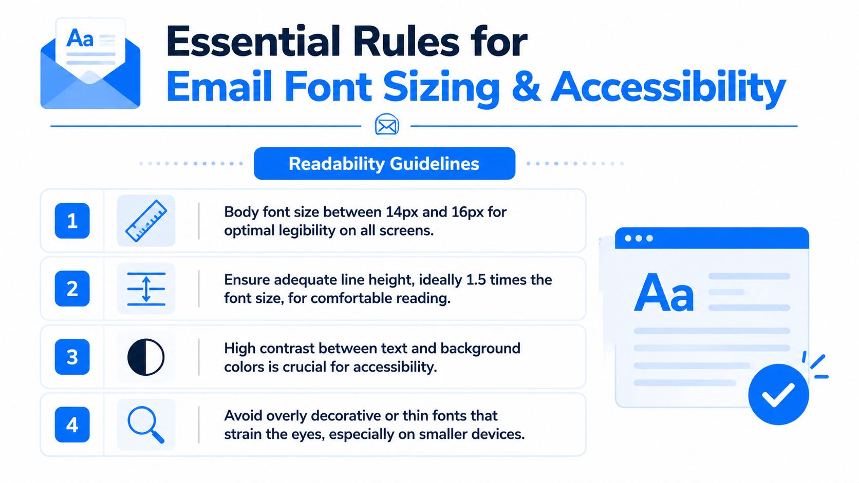
The non-negotiable sizing rules
For professional email font settings, keep body text in the 14px to 16px range. That's the practical standard for legibility across devices. For headings, use a clear jump above body size so the hierarchy is visible at a glance. A noticeable size gap works better than tiny increments no one can feel.
Line height matters just as much. Set body copy to 1.5 or 150% where possible. That extra breathing room helps in Outlook, improves scanability, and reduces the cramped look that turns long emails into effort.
Use these rules consistently:
- Body copy: 14px to 16px
- Headings: Larger than body by a clear visual step
- Line height: 1.5 or 150%
- Alignment: Left-aligned text for easy scanning
For a broader framework on structure, spacing, and content layout, these email best practices complement the typography rules well.
A short walkthrough can help if your team builds templates collaboratively:
Accessibility is not a side note
Research from the UK's Dyslexia Association shows that Verdana and Open Sans with 1.5x letter spacing can reduce reading errors by 31% for dyslexic readers, and the 2025 World Health Organization report indicates 18% of global professionals have some form of neurodivergence. That means font choice affects a meaningful share of any B2B audience, not a niche edge case. The underlying accessibility reference is available through the British Dyslexia Association.
This has direct implications for email design:
- Choose clear letterforms: Verdana and Arial are safer than thin or highly stylized fonts
- Add breathing room where needed: Letter spacing and line height help readers parse text more accurately
- Avoid center alignment for paragraphs: It slows scanning and creates uneven starting points
- Skip all-caps blocks: They're harder to read and look aggressive in professional email
Good accessibility work rarely looks flashy. It looks calm, stable, and easy to read.
If your audience includes technical buyers, operations leaders, or executives reading quickly between meetings, accessible typography is also efficient typography. The same choices that help neurodivergent readers usually help everyone else move through the email faster.
How to Implement and Test Your Email Fonts
A professional email font strategy lives or dies in the code. You can make a smart font choice and still create a bad inbox experience if the stack is brittle, the sizing is inconsistent, or the fallback wrecks your spacing.

Build the stack like a contingency plan
Your font-family line should read like a sequence of backups, not a wishlist. Start with the font you want. Then add the nearest acceptable alternative. End with a generic family.
Example:
- Sans-serif stack:
font-family: Arial, Helvetica, sans-serif; - Serif stack:
font-family: Georgia, "Times New Roman", serif; - Web font stack:
font-family: "Open Sans", Arial, sans-serif;
The logic is simple. If the first font doesn't load, the email client moves to the next one. Like a connecting flight, every handoff introduces risk. Your job is to make sure the next stop still gets the passenger where they need to go.
Technical analysis covered by Litmus notes that email clients use different default font stacks, including Arial for Gmail and Times New Roman for Outlook, which is why email-safe fallbacks matter so much. The same analysis also supports a minimum body font size of 14px, with sans-serif fonts like Arial and Verdana showing the strongest character recognition at that size in email contexts. See Litmus's guide to email typography.
Pre-flight checklist before every send
Don't trust the builder preview alone. Test the live email like a suspicious operator, not an optimistic designer.
- Check major clients: Review Gmail, Outlook, and Apple Mail before launch.
- Check mobile and desktop: A font that behaves on desktop can wrap badly on a phone.
- Inspect the fallback: Force the preferred font to fail and see whether the backup still looks on-brand.
- Review spacing under load: Look for collapsed line-height, awkward heading wraps, or oversized bullet indents.
- Read with images off: If the email still feels coherent, the typography is doing its job.
- Watch button labels and nav links: Fallback shifts often show up first in tight UI elements.
- Compare platform previews carefully: If you're still selecting tools, this roundup to compare email marketing software is useful because rendering and testing workflows vary a lot between platforms.
- Validate in your actual template system: A modular build may behave differently than a one-off test. This matters especially if you work from a reusable newsletter template for Gmail.
The test isn't whether your chosen font looks perfect. The test is whether the email still works when perfection fails.
That mindset keeps teams out of trouble. Reliable email design is less about forcing every inbox to obey you and more about planning for the ones that won't.
If you want a newsletter platform built for B2B growth, Breaker gives teams a faster way to design, send, grow, and protect high-performing email programs. It combines campaign creation with list expansion, audience targeting, analytics, and deliverability support so you can focus on sending emails that get read by the right people.