Decision Tree Template PowerPoint: Build Better Decisions
You're probably building a slide for a meeting where the answer isn't obvious. Should you shift spend from paid search to partner marketing? Should sales qualify this segment differently? Should product launch the feature now or wait for customer proof?
A normal comparison slide won't carry that argument. A pros and cons list flattens the issue. A spreadsheet may be analytically correct, but it rarely persuades a room. A decision tree template in PowerPoint works better because it shows how each choice leads to different outcomes, and it gives your audience a path they can follow without getting lost.
The mistake I see most often is treating the tree like clip art. If the slide only looks organized, but the logic is weak, people will challenge the recommendation. If the logic is strong, a template helps you present it fast and clean.
Why Use a Decision Tree in Your Next Presentation
You use a decision tree when the audience needs to see your reasoning, not just your conclusion. That usually happens in B2B marketing, sales planning, pricing discussions, campaign strategy, hiring decisions, and product prioritization. In those moments, the slide has to do two jobs at once. It has to analyze the choice and sell the recommendation.
Why a tree works better than a list
A list tells people what the options are. A tree shows what happens next.
That difference matters when you're presenting choices with uncertainty attached. A tree lets you start at the main decision, branch into likely scenarios, and show where each route ends. For strategy work, that's far more persuasive than saying one option “feels lower risk” or “seems more scalable.”
Decision-tree PowerPoint templates became widely standardized in the late 2010s as presentation vendors began packaging reusable decision-flow layouts. By 2018–2020, libraries like HubSpot and SlideModel had dedicated categories, moving decision trees from custom-built diagrams to common presentation assets, as noted in HubSpot's decision tree template library.
Why a template is the practical move
Many organizations don't need to invent this slide from scratch. They need a reliable structure they can adapt quickly.
A template gives you that structure. It keeps spacing, branch alignment, and node formatting under control, so you can focus on the core work: defining the choice, pressure-testing the assumptions, and making the business case. If you're already building larger planning materials, this fits naturally alongside a broader B2B marketing plan.
Practical rule: If your audience is likely to ask “what happens if this fails?” a decision tree is usually the right slide.
Used well, the tree makes your recommendation feel less like opinion and more like disciplined judgment.
Finding and Choosing the Right PowerPoint Template
Not all templates are useful. Some look polished in the preview and fall apart the moment you edit them. Others are technically editable but so crowded that any real business logic turns them into a mess.
Pick the template based on the decision you need to explain, not based on which one has the flashiest gradients.
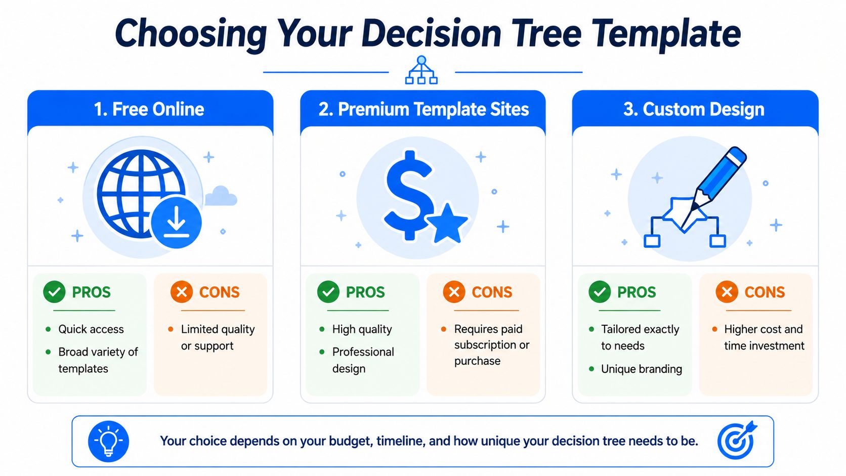
Where to get one
You usually have three options.
| Template source | Best for | Main trade-off |
|---|---|---|
| Free online templates | Fast starts and simple internal decks | Quality and editability vary |
| Premium template libraries | Client-facing slides and polished exec decks | Paid access |
| Custom-built slides | Very specific logic or brand-heavy presentations | More time to build |
If you need a quick working file, start with an editable PowerPoint template from a known presentation library. If you're building a broader strategic deck, a reusable planning asset like an account planning template can also help you frame where the decision tree belongs in the overall story.
What a good template must include
HubSpot's free template documentation describes the standard anatomy clearly: root node, decision nodes, leaf nodes, and branches. That matters because if the template doesn't make those parts obvious, your audience won't know how to read the slide.
When I review templates, I check for these things first:
- Editable shapes: You should be able to ungroup, relabel, resize, and duplicate without breaking alignment.
- Clean branch spacing: The paths need enough room for labels, not just decorative lines.
- Consistent node styling: Decision points and end states should look deliberate, not improvised.
- Enough white space: If the preview already feels tight, your real content will overwhelm it.
- A logical reading path: The slide should guide the eye from the root outward without confusion.
What to avoid
A few template types usually create more work than they save:
- Over-designed infographic slides: They look good in marketplaces and perform badly in meetings.
- Templates with tiny text placeholders: They force you into unreadable labels.
- Rigid SmartArt-style layouts: They can be useful for simple trees, but they often become awkward once you need uneven branches or richer annotations.
- Decorative icons everywhere: They add noise unless each icon signals meaning.
A strong decision tree template in PowerPoint should behave like a working framework, not a finished poster.
The best template is the one you can edit quickly while keeping the logic obvious.
Building Your Decision Tree from Draft to Diagram
The fastest build starts away from PowerPoint. If you open a slide first, you'll spend too much time nudging boxes before you've decided what the branches should mean.
A practical workflow is to first draft the logic on paper, then build the slide from the main node outward, ungrouping template elements as needed, duplicating boxes, and connecting nodes with lines to preserve readable flow. That build pattern is described in this PowerPoint decision tree tutorial from Tuts+.
Start with the logic on paper
Before you touch shapes, write down three things:
- The decision itself.
- The realistic alternatives.
- The outcomes you need the audience to compare.
That rough draft prevents a common mistake. Teams often build a tree around slide aesthetics rather than decision logic. The result looks organized but says very little. If you sketch first, you'll catch weak branches, duplicated outcomes, and missing assumptions early.
For operations-heavy teams, this discipline also fits naturally with process design work such as creating a workflow. The difference is that a workflow shows how work moves, while a decision tree shows how choices split.
Build from the root outward
Once the logic is solid, move into PowerPoint.
Create the root node first. This should be the question the room is trying to answer, not a vague topic label. “Channel strategy” is weak. “Shift budget toward partner-led demand generation?” is much stronger because it sets up a real decision.
Then add the first layer of branches. Keep these as the main alternatives, not every possible sub-scenario. If you cram every edge case into the first branch level, the slide becomes unreadable.
Use this working sequence:
- Place the root node first: Anchor the whole slide around the core decision.
- Add primary alternatives next: These become the major branches.
- Duplicate, don't redraw: Copying nodes keeps the formatting stable and speeds up revisions.
- Connect with straight lines or connectors: That preserves the reading flow and prevents drifting branches.
- Label as you build: Don't leave placeholder text for later. Unlabeled structures hide logic gaps.
Here's a helpful visual walkthrough if you want to see the build process in action:
Add business meaning, not just shapes
Many slides stop too early. A finished decision tree isn't just connected boxes. It's a decision model.
Your branch labels should describe what changes at each point. Your end nodes should make the business outcome clear. If a branch says “Option A” and the leaf says “Result,” the audience has to interpret too much on their own. That weakens the slide.
Use direct wording:
- Decision node: “Increase spend on intent-driven paid campaigns?”
- Branch label: “Yes, reallocate budget”
- Outcome node: “Higher short-term lead volume, higher cost sensitivity”
That language gives the tree persuasive force because the audience can read the logic without your narration carrying all of it.
Sketch first, then build. PowerPoint should document the thinking, not replace it.
Keep the first draft ugly and the second draft clean
The first digital version only needs to prove that the logic fits on one slide. Don't worry yet about color, alignment perfection, or presentation polish.
Once the structure works, tighten spacing, standardize text lengths, and reduce branch clutter. That's when the template starts paying off. You're no longer drawing from zero. You're refining a model that already makes sense.
Design Tips for a Clear and Persuasive Decision Tree
A decision tree can be analytically sound and still fail in the room if people can't read it quickly. For dense trees, layout clarity is the key performance constraint. SlideModel's guidance recommends clear decision attributes such as yes/no or numeric criteria, limiting the tree to a single root-to-leaf structure, and formatting nodes consistently so final states remain unambiguous, as described in its decision tree template guidance.
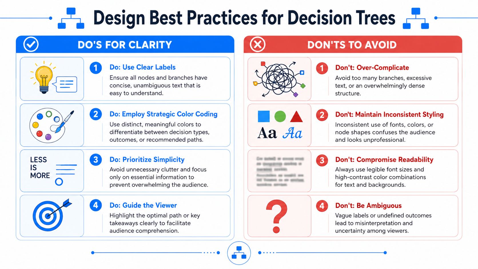
Use visual hierarchy on purpose
Your audience should know where to start, where to look next, and what matters most.
That means the root node usually gets the strongest visual emphasis. Main branches come next. Supporting annotations should stay secondary. If everything is bold, colored, and enlarged, nothing stands out.
A simple hierarchy works best:
- Root node: Largest shape or strongest fill
- Primary branches: Clear labels with consistent spacing
- Secondary notes: Smaller text, lighter weight
- Recommended path: One accent color, used sparingly
Keep labels short and specific
The best tree labels sound like decisions people make in meetings.
Use plain phrases such as “Yes,” “No,” “Delay launch,” “Run pilot,” or “Requires legal review.” Avoid abstract labels like “Scenario B” unless the audience already knows the coding system. Decision trees fail when viewers have to decode the language before they can judge the logic.
If a branch label needs a verbal explanation to make sense, rewrite the label.
Design choices that usually work
Here are the moves I rely on most:
- Color with restraint: Use color to distinguish categories or highlight the recommended path, not to decorate every node.
- Consistent shapes: The same kind of node should always look the same.
- Balanced spacing: Uneven gaps make the tree feel less trustworthy, even if the logic is correct.
- Readable fonts: If someone at the back of the room can't read a label, the slide isn't finished.
And here are the moves I avoid:
- Too many branch levels on one slide
- Long sentence labels inside small boxes
- Heavy shadows, gradients, and effects
- Crossing lines whenever the layout gets tight
A persuasive slide doesn't need visual drama. It needs instant comprehension.
Practical Examples for B2B Marketers and Teams
A decision tree becomes useful when you apply it to a real business call. Most decisions only have 2–4 meaningful alternatives, which is a good constraint for slide design as well as analysis. The same guidance also notes that expected value is calculated by multiplying each outcome's value by its probability, and that a 50/50 split is a reasonable starting point when uncertainty is high, according to Deckary's decision tree template guidance.
Budget allocation for channel strategy
A B2B marketing team often needs to choose between a few competing bets, not a dozen. A tree can start with a root decision such as where to place the next incremental budget tranche. The first branches might be SEO, paid acquisition, or partner marketing.
From there, each branch can split into likely outcomes such as slower compounding return, faster lead capture, or dependency on outside channels. You don't need perfect certainty to make the slide useful. You need a transparent model that shows how the recommendation was reached.
Lead qualification for sales and marketing handoff
This is one of the best use cases because it forces clarity. A lead either fits the route to sales now, needs nurture, or should be disqualified.
When teams struggle to define handoff rules, mapping the decision logic visually often reveals where the process is vague. If you're refining routing criteria, this guide to effective sales process mapping is a useful companion because it helps connect the tree to the downstream sales workflow.
Feature prioritization in product and growth teams
A product team can use a tree to compare whether to build Feature A, improve onboarding, or postpone both in favor of customer research. This works especially well when the room includes product, marketing, and sales, because the slide forces everyone to evaluate the same branches and endpoints.
The key is not to pretend the model is more precise than it is. Keep the alternatives limited, make the outcomes concrete, and let the tree show the logic behind the trade-off.
Presenting Your Decision Tree for Maximum Impact
A good tree still needs a good walkthrough. If you show the full diagram all at once and start talking at branch level three, people will stop following.
Start at the root node. State the decision in one sentence. Then reveal the first branch layer and explain why those are the only realistic alternatives on the slide. After that, move one path at a time. Simple appear animations can help if they're used to control sequence, not to impress anyone.
A few presentation habits work well:
- Reveal progressively: Show one branch set at a time so the audience doesn't scan ahead.
- Narrate trade-offs clearly: Say what each branch gains and what it gives up.
- Pause at end states: Let people absorb the outcomes before jumping to your recommendation.
- Export smartly: Save as PDF for handouts and as an image when the tree needs to live inside a memo or email.
Accessibility matters too. Use high-contrast text, avoid color-only meaning, and make sure labels stand on their own. If someone prints the deck in grayscale or reads it quickly on a laptop, the decision path should still make sense.
The best presentation outcome is simple. Your audience should feel that they've seen the available choices, understood the trade-offs, and arrived at the recommendation with you.
If you're turning strategic decisions into newsletter campaigns, Breaker is worth a look. It gives B2B teams one place to build emails, grow the right audience, track performance, and keep deliverability under control, so your distribution is as disciplined as the decision-making behind it.