The B2B Welcome Email Format to Convert Subscribers in 2026
68.6% average open rates, with reported highs of 83.63% and top-performing cases reaching 91.43%, put welcome emails in a different category than standard campaigns, especially when the typical email open rate across industries sits at 42.35% according to Mailmend's welcome email performance roundup. That gap changes how you should treat the format.
Welcome emails are still often written like an etiquette note. Thanks for subscribing. Here's who we are. See you next week. That approach wastes the strongest intent signal you'll ever get from a subscriber.
A better welcome email format does two jobs at once. It converts attention into a first action, and it builds trust early enough that the next email feels expected instead of intrusive. In B2B, that often matters more than clever copy. A new subscriber wants confirmation, relevance, and a clear next step. If they came from a webinar, they want the webinar follow-up. If they downloaded a guide, they want the guide plus the logical next move. If they joined a newsletter, they want to know what they'll get and how often.
That's the playbook here. Not a generic template. A practical welcome email format that adapts to signup context, stays short, and earns trust from the first send.
Why Your Welcome Email Is Your Most Important Message
A welcome email gets opened when attention is freshest. That's the whole advantage.
The reason this format has mattered since the early days of email marketing is simple. The subscriber just raised their hand. They've taken an action, they expect a response, and your message lands before indifference sets in. That's why the welcome email isn't a courtesy touch. It's your first conversion asset.
Teams that treat the welcome message like a branded hello usually miss the moment. The inbox doesn't reward long introductions. It rewards relevance. A strong welcome email format confirms what happened, explains what comes next, and gives the reader one useful action to take while intent is still high.
What the first message actually needs to do
In B2B, I want a welcome email to answer four questions fast:
- Why am I getting this? Confirm the exact signup event.
- What value will I receive? State the benefit in plain language.
- What should I do next? Give one primary CTA.
- Can I trust this sender? Set expectations and reduce ambiguity.
If you skip any of those, the relationship starts weaker than it should. The best-performing lifecycle programs don't separate onboarding from email thinking. They connect them. If you need a broader framework for that handoff, Moonb's guide on strategies for better onboarding is useful because it frames early user experience as a trust-building system, not a single touchpoint.
Practical rule: Your welcome email should feel like the direct continuation of the form, page, ad, or event that created the signup.
That's also where most generic templates fail. They flatten every subscriber into the same storyline. But a newsletter reader, a demo registrant, and a free-trial user didn't join with the same intent. Your format has to leave room for that context without turning into a wall of copy.
The Anatomy of a High-Converting B2B Welcome Email
A good welcome email is compact by design. Practitioner guidance recommends keeping it short, with no more than three brief paragraphs in some cases, using only the most pertinent information, and including an obvious unsubscribe link and contact information to build trust, as noted in Indeed's welcome email guidance.
That advice holds up in B2B because every extra sentence competes with the click you want.
Here's the structure I use most often.
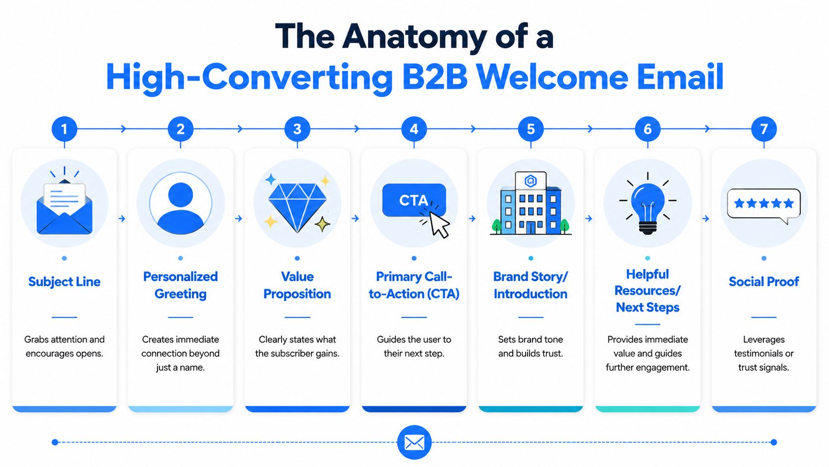
The core layout
Branded header
The top of the email should confirm the sender at a glance. Usually that means logo, brand name, and enough white space that the email feels intentional. If your team is still inconsistent here, this walkthrough from mailX on adding logos to emails is a practical reference for cleaning up brand presentation across clients.Subscription confirmation
Open with the exact reason they're receiving the message.
Good: “You're in. Your B2B newsletter subscription is confirmed.”
Bad: “Welcome to our community of innovators and leaders.”Value reminder
Remind them what they signed up for in one or two lines.
Good: “You'll get weekly breakdowns on lifecycle email, deliverability, and newsletter growth.”
Bad: “We're passionate about helping businesses achieve success.”One primary CTA
This is the conversion engine. Pick one action and make it obvious.
Good: “Read the starter guide” or “Set your preferences.”
Bad: three buttons competing for attention.
What belongs lower in the email
The middle and footer are where trust gets built without cluttering the main message.
| Email element | What works | What fails |
|---|---|---|
| Brand intro | One short sentence on who you help | A full company history |
| Helpful links | One or two support resources | A navigation bar stuffed with options |
| Footer | Unsubscribe, support contact, preference access | Tiny compliance text buried below images |
When teams get this wrong, they usually over-explain. They try to introduce the brand, pitch the product, share resources, ask for a follow, and showcase proof in one send. The reader sees work, not clarity.
A cleaner format looks like this:
- Top section confirms the action.
- Middle section states the immediate benefit.
- Action block points to one next step.
- Footer handles trust, support, and compliance.
Later in the sequence, you can expand. The first message should stay lean.
To see how strong welcome structures are built visually, this video gives a useful reference point before you draft your own layout:
Keep the body scannable enough that a busy buyer can understand it without scrolling back up.
That's the standard. If the email needs effort to decode, the format is doing too much.
Writing Subject Lines and Preheaders That Get Opened
The subject line should finish a thought the subscriber already has in their head. That's why welcome emails often outperform regular sends. The recipient expects them.
The easiest way to improve this part of your welcome email format is to stop writing subject lines as headlines and start writing them as confirmations.
Four formulas that work in B2B
Confirmation plus benefit
This is the safest default for most onboarding and lead capture flows.
Example subject line: “You're in. Your demand gen playbook is inside”
Preheader: “Start with the framework often missed in the first week.”
Asset delivered plus next step
Best for lead magnets, webinar replays, and resource signups.
Example subject line: “Your webinar replay is ready”
Preheader: “Watch the key segment first, then use the checklist.”
Expectation-setting
Useful for newsletters and creator-led B2B brands.
Example subject line: “Welcome. Here's what you'll get from us”
Preheader: “Practical email growth lessons, sent on a predictable schedule.”
Light curiosity with relevance
Works when the signup source suggests a clear pain point.
Example subject line: “Still working on activation?”
Preheader: “These are the first emails I'd fix.”
How the preheader should behave
The preheader should add information, not repeat the subject line. If your subject says “Welcome to the newsletter,” the preheader shouldn't say “Thanks for joining our newsletter.” That's wasted real estate.
A better pairing creates a one-two punch:
- Subject line confirms the event.
- Preheader explains the value or next action.
Here's a simple comparison:
| Subject line style | Weak preheader | Better preheader |
|---|---|---|
| You're in. Your guide is inside | Thanks for subscribing | Download the guide and use the quick-start checklist |
| Welcome to the PLG Brief | We're glad you joined | Expect concise growth analysis and one tactic per issue |
| Your trial starts now | Get started today | Connect your workspace and complete setup in minutes |
If your team needs a broader framework for inbox copy, these email subject line best practices are worth reviewing before you start testing.
A subject line gets the open. The preheader resolves hesitation.
In B2B, that hesitation is often practical. Is this the email I expected? Is there something useful in it? Is this worth opening now? A good subject and preheader pair answers yes without sounding inflated.
Personalization That Actually Drives Engagement
Most welcome email advice still treats personalization like token insertion. Add a first name. Maybe mention the company. Hope it feels customized. That's weak personalization, and it rarely changes the actual usefulness of the message.
Braze argues that personalization should rely on context such as acquisition channel or declared preferences, and Klaviyo notes that first-name personalization won't do much for open rates while channel-based tailoring may perform better, as summarized in Braze's welcome campaign guidance. That matches what works in practice. Relevance beats familiarity.

Context beats first-name tokens
If someone signed up from a webinar page, the email should sound like webinar follow-up. If they downloaded a compliance checklist, the welcome should continue that thread. If they selected a content preference, the CTA should respect it.
A contextual welcome email format usually adapts these three components:
- Opening line tied to signup source
- Value proposition matched to stated interest
- CTA aligned with the next logical action
That's a better use of personalization than “Hi Sarah” at the top of a generic email.
Two versions of the same welcome email
Here's what this looks like in practice.
Version A for a webinar subscriber
Subject line: You're in. Your webinar replay is ready
Preheader: Start with the segment on onboarding friction.
Body:
Thanks for registering for our onboarding webinar. Your replay is ready, along with the slides.
Because you joined through that session, we're starting you with resources focused on activation, onboarding emails, and early user education.
[Watch the replay]
Footer:
Questions? Reply to this email or contact support. You can unsubscribe any time.
Version B for a newsletter subscriber from a lead magnet
Subject line: Your onboarding checklist is inside
Preheader: Plus what you'll receive as a subscriber.
Body:
Thanks for requesting the onboarding checklist. You can access it below.
You've also been added to our newsletter, where we share practical lessons on lifecycle email, onboarding, and conversion-focused messaging. Expect concise ideas you can use without rebuilding your entire program.
[Get the checklist]
Footer:
Need help or want different topics? Update your preferences or unsubscribe.
The structure is similar. The relevance is not.
If you work across multiple audience types, it helps to think in segments, not names. That's one reason broader personalization strategy matters beyond email. This e-commerce personalization complete guide is useful as a mindset piece because it shows how behavior and context create better customized experiences than superficial tokens.
For a B2B-specific angle, these B2B email personalization examples are a solid reference when you're building segmented flows.
Field note: The best welcome emails feel like direct follow-up from the exact page, asset, or event the subscriber just touched.
That's the standard to aim for. Short, specific, and obviously connected to intent.
A/B Testing Your Welcome Email for Peak Performance
A welcome email should be built to improve over time. Customer.io's guidance recommends A/B testing subject lines, content, design, and CTAs because performance is highly audience-dependent, which is why optimization belongs in the format from the start in their welcome email template resource.
That doesn't mean testing everything at once. It means choosing one variable, watching the right behavior, and making clean decisions.
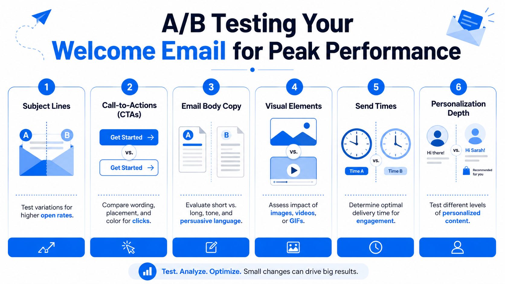
What to test first
Start with the parts closest to the main conversion point.
Subject line angle
Test confirmation language against benefit-led language.
Watch for opens, but also check whether the click quality holds up after the open.CTA wording
“Get started” is usually weaker than a CTA tied to the promised value.
Compare “Access the guide” versus “Start the checklist.”Value proposition placement
Some audiences respond better when the value reminder appears before the CTA. Others want the action button earlier.
Watch clicks and downstream action, not just email engagement.Trust elements
Test whether support contact, preference controls, or brief expectation-setting near the top reduces confusion and improves reply quality.
A simple testing rule
Don't redesign the whole email and call it a test. That gives you noise, not insight.
Use this sequence instead:
- Choose one variable that can plausibly affect behavior.
- Keep the audience comparable so the result means something.
- Define the winning metric before launch.
- Roll the winner forward and test the next highest-impact variable.
If you want a deeper testing framework for campaign analysis, this guide on A/B testing email campaigns gives a good process for isolating variables and reading outcomes correctly.
One more practical point. Test the adaptive parts too. A context-aware welcome email format only helps if the contextual changes are useful. Sometimes a shorter contextual intro wins. Sometimes a more explicit CTA wins. Let the audience tell you which version creates the better next step.
Three B2B Welcome Email Templates You Can Use Today
Welcome emails aren't just high-open messages. They also drive meaningful follow-through. Campaign Monitor reports a 26.9% click-through rate for welcome emails and a 196% lift in unique click rate, while other benchmark summaries report welcome sequences generating 4x more opens and 5x more clicks than regular email campaigns, according to Invesp's roundup on welcome emails. That's why each template below is built around one clear CTA.
Here's a quick chooser before the full examples.
| Use Case | Subject Line Suggestion | Template Focus & CTA |
|---|---|---|
| Lead magnet delivery | Your guide is inside | Deliver asset fast, reinforce value, CTA to access the resource |
| SaaS trial welcome | Your trial starts now | Reduce setup friction, CTA to complete first activation step |
| Newsletter signup | Welcome. Here's what you'll get | Set expectations and trust, CTA to read a starter resource or set preferences |
Template one for lead magnet delivery
This one is for a checklist, playbook, report, or webinar asset.
Subject line
Your onboarding checklist is inside
Preheader
Download it now, then use the quick-start step that's often overlooked.
Body copy
Hi [First name],
Thanks for requesting the onboarding checklist. You can access it below.
We created this resource for teams that want a cleaner handoff from signup to activation without adding more noise to the funnel. It's concise, practical, and built to help you spot friction fast.
[Download the checklist]
You're also subscribed to our email list. We'll send practical ideas on lifecycle messaging, onboarding, and conversion-focused email strategy. If that isn't a fit, you can unsubscribe any time.
Questions? Reply to this email and we'll point you in the right direction.
Why this format works
The asset comes first. That matters because the subscriber's intent is immediate and specific. The second paragraph expands on the value without turning into a brand monologue. The final lines set expectations and reduce the “why am I getting this?” reaction that leads to distrust.
Template two for SaaS trial welcome
This is for product-led B2B teams that need a first meaningful action, not just a login confirmation.
Subject line
Your trial starts now
Preheader
Complete your first setup step to get value faster.
Body copy
Hi [First name],
Welcome to [Product name]. Your trial is active.
The fastest way to get value is to complete your initial setup so the product can start working with real data and real workflows. We recommend starting there before exploring the rest of the account.
[Complete setup]
If you'd rather learn first, reply to this email and our team can point you to the best starting resources for your use case.
Support: [support email]
Manage preferences or unsubscribe below.
Why this one converts better than a generic product intro
A lot of SaaS welcome emails say too much and guide too little. They describe the platform, list features, and add multiple links to docs, webinars, and case studies. That sounds helpful, but it often dilutes the first action.
A stronger welcome email format for trials does three things:
- Confirms account status so the user knows the action succeeded.
- Explains the first activation step in plain language.
- Offers help without competing with the main CTA.
The best trial welcome emails don't introduce the whole product. They remove uncertainty around the next step.
Template three for newsletter subscribers
This template works for consultants, operators, creators, and B2B media brands.
Subject line
Welcome. Here's what you'll get
Preheader
Practical insights, a clear sending rhythm, and no bloated intros.
Body copy
Hi [First name],
You're subscribed.
We send practical analysis on B2B email, onboarding, and subscriber growth. Expect concise issues built for marketers and operators who want ideas they can apply quickly.
If you're new here, start with the guide below. It'll give you the context behind how we think about segmentation, lifecycle timing, and conversion-focused email strategy.
[Read the starter guide]
If you ever want fewer emails, different topics, or no emails at all, use the links in the footer to update your settings.
Why this template earns trust
Newsletter welcomes often underperform on trust because they assume enthusiasm. But many subscribers join from a single useful article or referral link. They don't know your cadence, tone, or boundaries yet.
This format works because it clarifies the relationship:
- The opening confirms the subscription immediately
- The middle explains what kind of content will arrive
- The CTA gives a low-friction next read
- The footer makes control obvious
How to adapt these without ruining them
Teams frequently break good templates by adding more options. Resist that instinct.
Keep these constraints:
- One primary CTA in the body
- Short paragraphs that scan on mobile
- Context from the signup source when available
- Support and unsubscribe details that are easy to find
You can still tailor the message. Swap the opening based on source. Change the value proposition based on segment. Adjust the CTA to match the original intent. But keep the overall shape stable so the email stays clear.
That's the difference between a generic welcome email and a high-converting welcome email format. One says hello. The other moves the subscriber into the next useful action while building trust at the same time.
If you want to put these ideas into practice with a platform built for B2B newsletter growth, Breaker is worth a look. It combines email sending, audience growth, targeting, analytics, and deliverability tooling in one system, which makes it easier to build welcome flows that don't just send cleanly, but effectively turn new subscribers into engaged readers.